
Autumn Nails Color Ideas With Fresh Shapes and Finishes
Freshness in a manicure is not always the same as plainness. Sometimes it comes from a boundary that is unusually precise, a surface that catches light only when the hand moves, or one unexpected color placed where a tip usually goes. Those choices feel modern because they leave something out, giving the eye a place to rest instead of asking every nail to explain itself.
One reliable way to update a design that feels dated is subtraction rather than a new motif. Keep the shape that suits you, decide which detail deserves attention, and let the remaining nails become quiet support. A finish can then feel new without becoming louder, and a familiar color can take on a different character simply because its spacing is more deliberate.
Clean Nude Nails With A Crisp White Edge
Short-to-medium softly squared nails begin the collection with a pale nude-pink base and even white French tips. A faint shimmer keeps the base from looking flat, but the main impression comes from the clean separation between the light field and the bright edge. The compact shape makes the manicure feel fresh and orderly, giving the rest of the article a clear baseline for comparison.
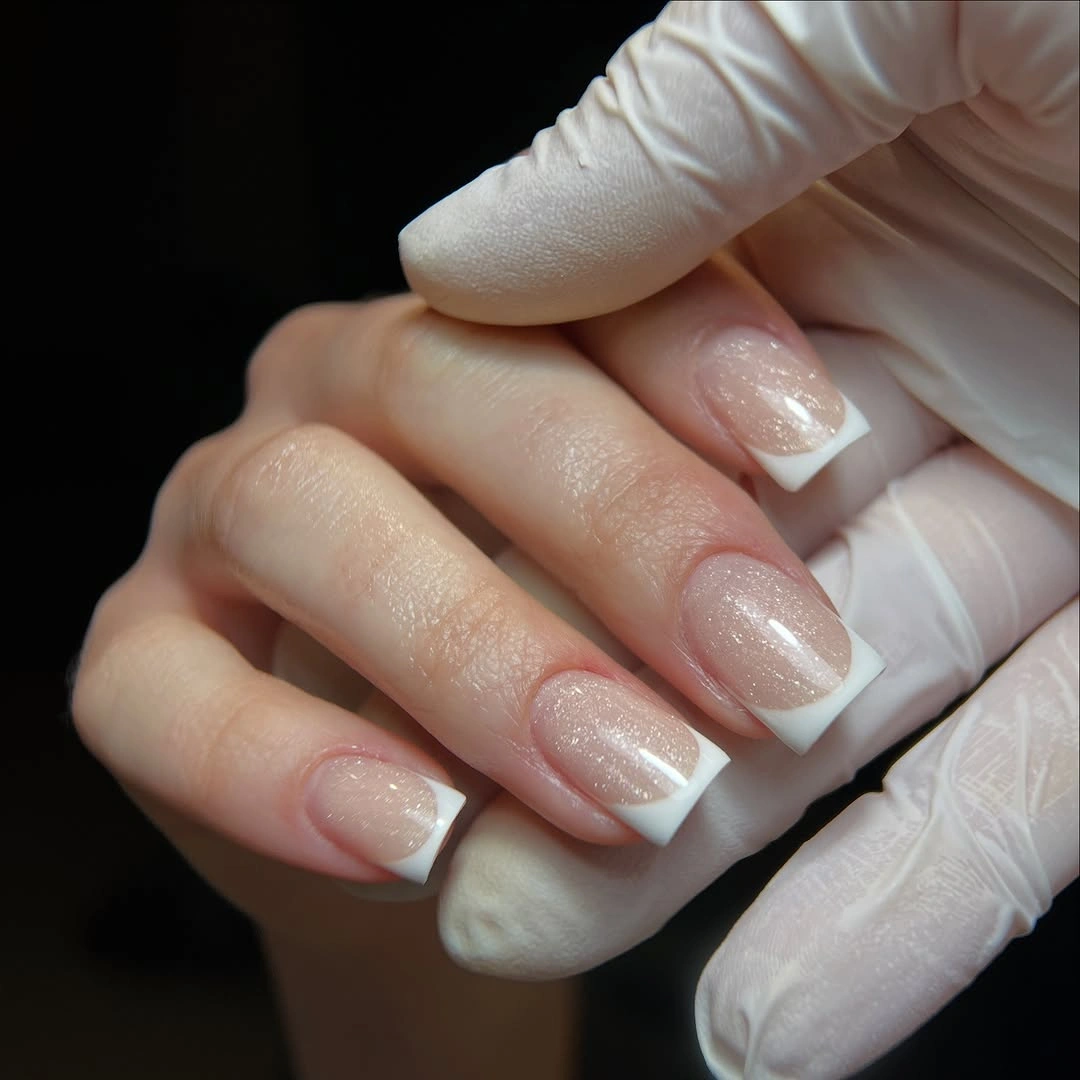
If you want the French line to feel warmer for autumn, shift the tip toward cream while keeping the same width and shape. A shorter square will make the design even more graphic, while a soft oval will reduce the sharpness of the edge. The useful rule is to change one element at a time, because the quiet balance already comes from the relationship between base, tip, and spacing.
The limitation is that a clean pale manicure leaves little visual cover for uneven edges or surface changes. That is also its strength: the result works with almost any surrounding color because it does not demand attention through decoration. Choose it when you want a reset that looks complete through precision rather than through a large statement.
Pink French Nails With Reflective Accent Tips
This variation keeps the soft pink square base and white tips, then places turquoise, silver, and pink reflective-looking details on only a few ends. The classic structure remains visible because the accents are concentrated instead of scattered across every nail. That small change turns a familiar French manicure into something more expressive without removing the open space that makes the original feel clean.
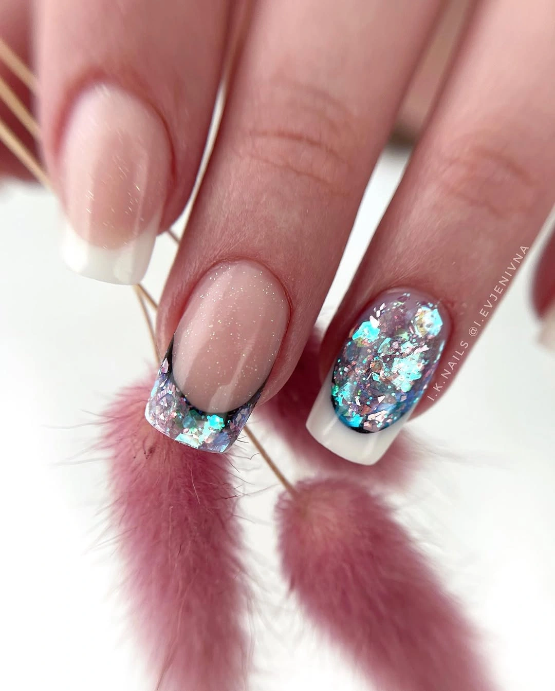
To keep the update crisp, choose one reflective family and repeat it on two accent nails rather than combining several colors. A plain white tip can stay on the remaining fingers, giving the eye a resting point between the decorative ends. Shortening the square shape will make the accents feel compact, while a longer length gives them more room but increases their visual emphasis.
The tradeoff is that reflective details can quickly overtake the pale base if every tip becomes equally bright. The design works best when the French line remains the recognizable structure and the accent acts as a controlled interruption. Choose it when you want a small refresh rather than a completely new manicure language.
Long Pink Squares With Cool Layered Tips
Long square nails extend the pale pink base into crisp white sections and blue, silver, or purple reflective-looking details near the tips. The length gives the layered placement space to remain legible, while the light base prevents the cool accents from becoming too dense. Against the soft feathered setting, the manicure reads as bright and dimensional without needing a darker color to create depth.
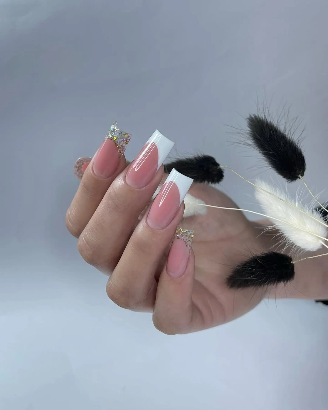
If you want the same layered idea on a shorter nail, keep one pale tip section and remove the extra reflective break from the neighboring fingers. A soft square will keep the design graphic, while an almond shape will make the edge feel more fluid. The important adjustment is preserving visible space between the color zones so the tip does not turn into one indistinct block.
The limitation is that long squares amplify every boundary and can make several cool accents feel more formal than intended. A shorter version will look fresher and easier to pair with daily clothes, but it will also reduce the sense of layered movement. Choose the longer shape when tip placement is the feature you want people to notice first.
Short Black Squares With Silver Contrast Nearby
Glossy black short square nails create a decisive break from the pale French ideas, and the nearby silver chain introduces a cool industrial contrast. The manicure itself stays almost completely plain, so the dark surface and compact shape provide the visual reset. Because the black field is uninterrupted, the light accessory feels like a supporting reference rather than another motif on every nail.
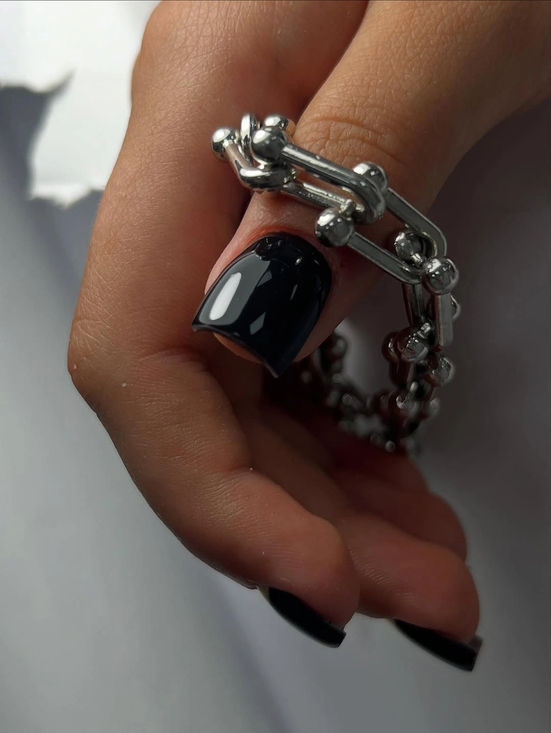
For a cleaner nail-led version, keep the black surface plain and use one small silver-looking detail on a single finger instead of relying on an accessory around the hand. A rounded square will soften the graphic edge, while deep plum or brown will keep the dark mood with less severity. This is a good example of strengthening one defining decision instead of layering several dark effects.
The tradeoff is that solid black can feel more formal or stark than the pale designs before it, especially on a short shape where the color becomes a compact block. That clarity is useful when you want a sharp visual reset, but it may need a warmer clothing color nearby to avoid looking too cold. Choose it when simplicity itself is the statement.
Orange And Violet With Graphic Mixed Placement
Long nails combine vivid orange, purple, pale sections, and dark or white curves in different arrangements across the hands. The mismatched placement feels intentional because the strong hues repeat even when the exact design changes from finger to finger. This is less about one motif than about keeping several high-energy colors inside a clear visual family.
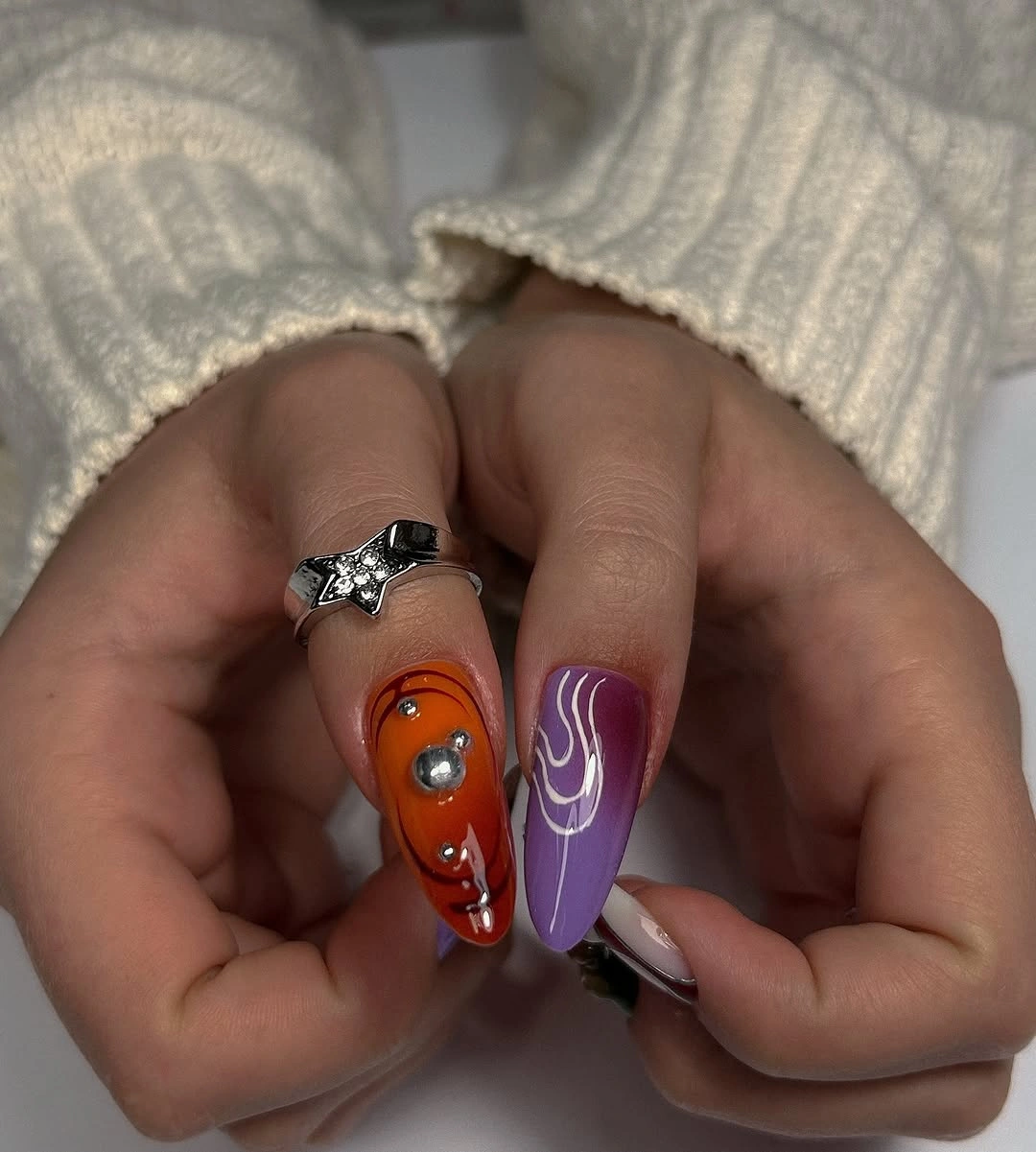
If the full set feels too busy, assign orange to two accent nails and let violet or a pale base lead the remaining fingers. A shorter shape will also reduce the amount of color visible at once, while keeping the graphic curves on one or two nails preserves the sense of movement. The cleanest adaptation decides which hue should be dominant before choosing the supporting accents.
The limitation is that mismatched designs lose their freshness when every finger has equal weight. Repetition in color or base space gives the eye a path, while adding another unrelated shade would interrupt it. Choose this direction when you enjoy variety and are willing to edit the palette so the result feels curated rather than merely crowded.
Saturated Warm And Cool Color Blocks
This long set pushes brightness further with red-orange, blue, green, and yellow sections arranged as layered curved or graphic blocks. The nails become small color fields, and the base shape matters less than how the warm and cool areas meet. Because every finger offers a different event, the repeated saturation is what keeps the composition connected from hand to hand.
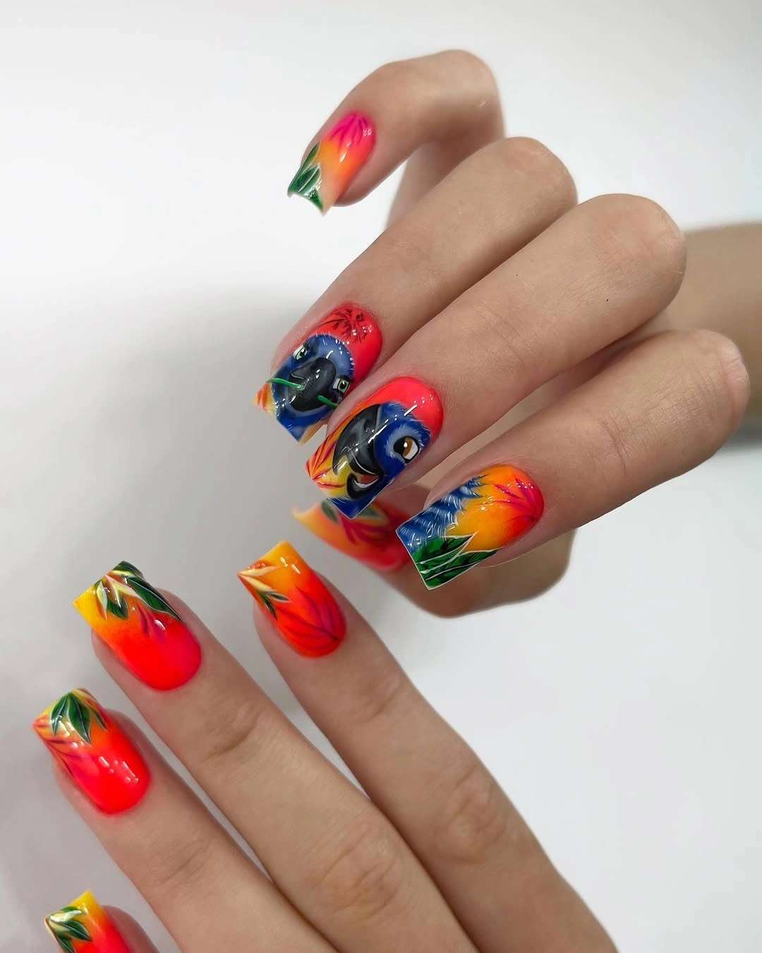
To create a fresher everyday version, keep the warm color on two nails and use one cool accent against a pale base on the rest. Shortening the length will make the blocks appear more compact, while reducing the number of colors will give the hand more visual breathing room. Start with the color map before worrying about any named style, because placement is the defining feature here.
The tradeoff is that a saturated set can compete with patterned clothing, bright makeup, or jewelry. Its energy is the appeal, but the same energy means it may need a quiet outfit to look intentional. Choose it when you want the manicure to be the main color statement, and simplify the supporting elements around it.
White-On-White Curves With Quiet Texture
Medium white square nails use a milky base and subtle white flowing lines that appear raised through shadow and surface change. There is almost no color contrast, so the eye notices the curves only after the clean shape, making the manicure feel calm but not empty. The design is a strong example of freshness coming from spacing and texture rather than from a new color.
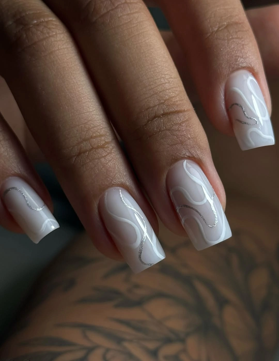
If you want the effect to read more clearly, keep the lines on two accent nails and leave the rest as smooth white. A shorter square will make the pattern feel contained, while a soft matte-looking surface would lower the reflection and emphasize the shape. The best adaptation protects the pale breathing room, because crowding would remove the quiet quality that makes the texture interesting.
The limitation is that tone-on-tone detail may be visible only at close range and can look plain in flat lighting. That is useful when you want a discreet manicure, but less helpful if you need a bold color statement. Choose it when the goal is a clean update with depth that rewards a second look rather than immediate contrast.
Deep Plum On A Compact Square Shape
Short-to-medium square nails coated in deep plum create a dark solid option that sits between black and red. The color appears close to brown-violet, giving it seasonal depth without a motif or contrasting tip, while the glossy surface keeps the compact shape from looking dull. This is a fresh reset through restraint: one rich color, one clear boundary, and no extra event competing for attention.
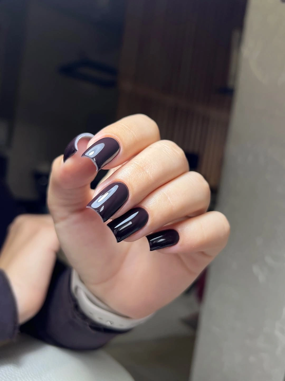
For a softer interpretation, keep the square length short and move the tone toward a muted berry or warmer cocoa-plum. A matte-looking surface would quiet the reflection, while gloss adds dimension and makes the dark shade look cleaner. Changing the undertone is more useful here than adding art, because the plain field is what gives the manicure its clarity.
The tradeoff is that deep plum can feel heavier than the white and translucent ideas nearby, especially if the outfit is also dark. That weight can be a benefit when you want a grounded accent, but a lighter neckline or bright ring can create the contrast that keeps the hand from disappearing. Choose it when a compact dark color feels more refreshing than another decorative design.
Short Glossy Red With A Clear Boundary
Bright glossy red on short square nails is direct, warm, and easy to read from across the room. The even surface has no visible motif, so the consistent length and clean edges become the structure that keeps the shade looking polished. Compared with the deeper plum, this red creates a sharper reset through warmth and saturation rather than through darkness.
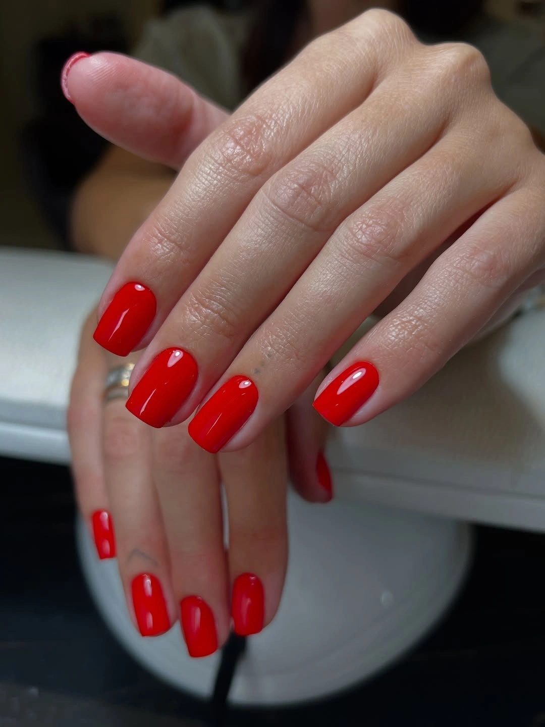
If you want a slightly quieter result, shift the red toward berry, brick, or a deeper tomato tone without changing the square outline. A shorter edge keeps the color crisp, while a rounded shape would make the manicure feel softer and less graphic. The important part is preserving the uninterrupted field, because adding unrelated details would weaken the simple color decision.
The limitation is that a solid bright surface shows uneven edges easily, so the minimal design rewards a consistent perimeter. Its advantage is that it can sit beside strong clothing without creating a separate pattern problem. Choose it when you want warmth and clarity to do all the work, with no need to explain the design through decoration.
Translucent White With Blue Iridescent Tips
Long tapered nails carry a translucent pale base and blue-aqua reflective color near the tips, creating a light-catching effect without turning the whole nail opaque. The clear space through the center keeps the set airy, while the cool edge gives the shape a defined stopping point. It feels fresh because the color appears to move with the light rather than sitting as one flat block.
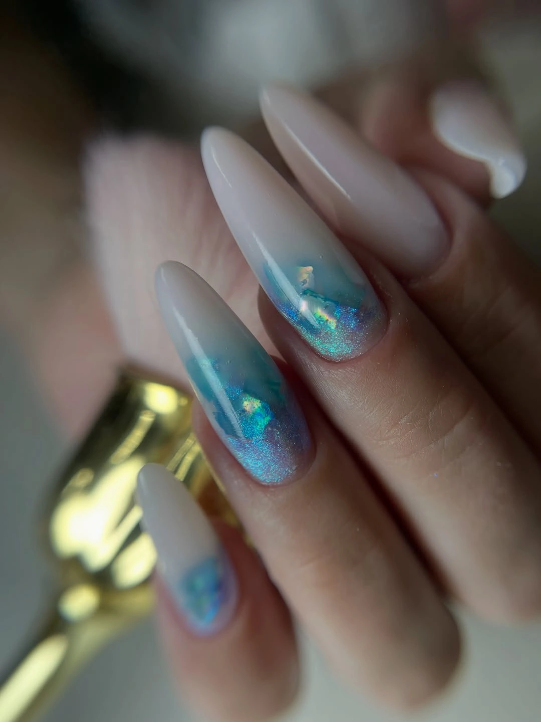
For a more practical version, use the blue tip on two fingers and keep the remaining nails translucent or softly white. A shorter almond will make the reflective area feel less dramatic, while a deeper blue will create stronger contrast with less visible length. Keep the base open when adapting it, because the transparency is what makes the edge feel luminous instead of heavy.
The tradeoff is that reflective pale color can change noticeably with the surrounding light and may look quieter in a flat room. That variability is part of its appeal, but it means the design is less predictable than solid red or plum. Choose it when you enjoy a finish that rewards movement and want freshness to come from light rather than from a loud motif.
Ornate White And Lavender With Gold Details
Long pointed nails combine white, lavender, pearly-looking surfaces, curved gold lines, and several small reflective or raised-looking details. The decoration is dense, but the pale palette keeps it from becoming visually dark, while the repeated soft colors give the separate accents a common direction. This is a deliberately maximal option where the surface, not the base color alone, creates the focal point.
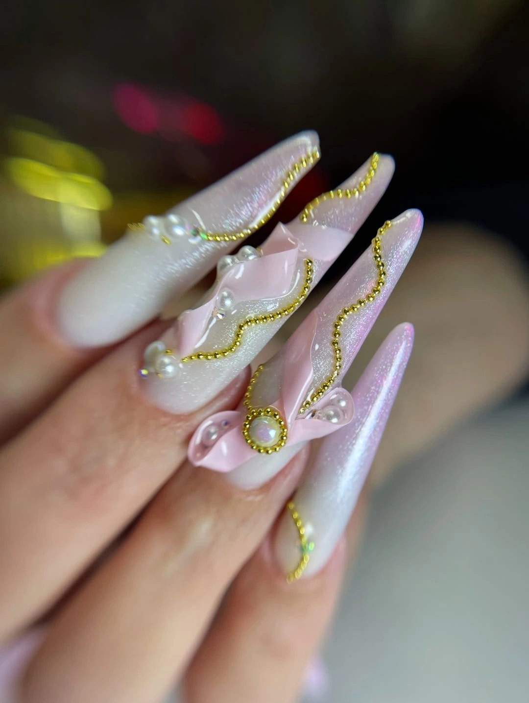
If you want to keep the jewelry-like feeling without carrying the full density, choose a plain white base and place the gold or lavender details on one accent nail. A shorter almond will also reduce the visual commitment, while a longer pointed shape gives the fine lines more room to remain legible. Edit the number of details before changing the palette, because the pale colors already provide enough freshness.
The limitation is that multiple small accents need spacing to stay readable, and a very long pointed shape can make the result feel occasion-specific. That drama is the purpose of the full version, but it is not the only way to use the idea. Choose it when you want the manicure to behave like jewelry, or borrow one curve and one soft color for an everyday reset.
Translucent Lavender With Fine White Geometry
Long tapered nails use a translucent pale base, lavender-blue tips, and thin white lines that cross or trace the surface. The open base remains visible, so the geometry feels airy rather than opaque or crowded, and the line work gives the cool color a clear structure. This is a fresh update through spacing: the manicure has detail, but the detail is allowed to breathe.
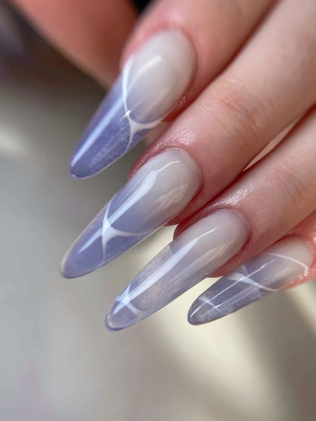
To make the design easier to wear, keep the lines on two accent nails or reduce their number so each crossing remains clear. A shorter almond will compress the geometry, while a soft square will make the white lines feel more architectural. Preserve the translucent center when adapting it, because covering that area would remove the contrast between open base and defined edge.
The tradeoff is that delicate geometry can become visually confusing if too many lines meet in one small space. Its strength is the balance between precision and airiness, so the design needs fewer marks than a fully decorated set. Choose it when you want a modern, cool-toned manicure that feels organized without becoming heavy.
Milky Nails With Small Scattered Accents
Pale milky nails carry small silver-looking pieces, pastel dots, and reflective accents scattered in different sizes and placements. The base keeps the set light, while the variation gives each finger a tiny focal point rather than one large central motif. The overall impression is delicate because the accents are spaced across open color instead of filling the entire surface.
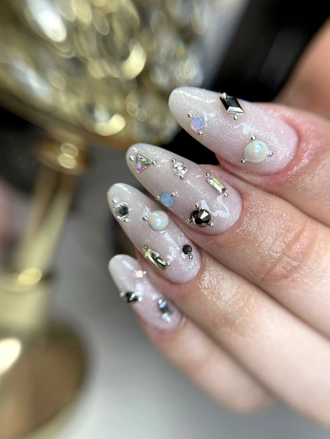
If you want a cleaner result, choose one metallic family and place it on alternating fingers, leaving several nails completely plain. A shorter tapered shape will make the accents feel more compact, while a warmer milky base can add depth without introducing another color. The design stays fresh when the details remain small enough that the pale field is still the first thing you notice.
The limitation is that scattered accents can look accidental if their scale and spacing are too uneven. Variation is useful, but a repeated point size or shared placement gives the eye enough rhythm to understand the set. Choose it when you like subtle decoration and are willing to keep the background open rather than filling every available space.
Textured White On A Short Square
Short-to-medium square nails use white as both color and surface, with a fine shimmer or soft texture changing how the light moves across the field. There is no obvious motif, so the distinction from plain white comes from the finish and the controlled square outline. This is a quiet reset for anyone who wants a fresh manicure that becomes more interesting only when viewed closely.
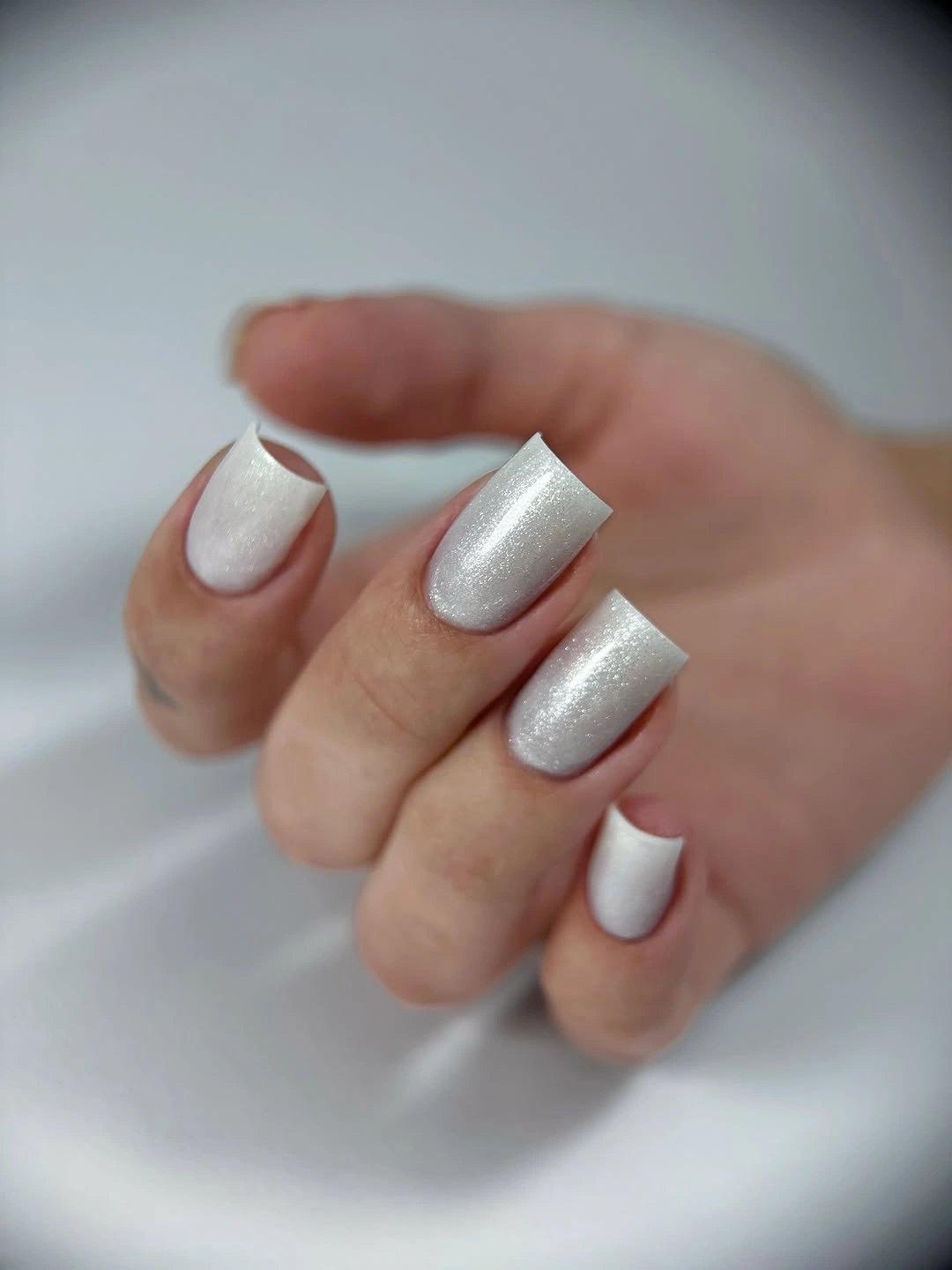
For a sharper version, keep the texture on the main nails and add one smooth white accent to make the difference visible. A shorter square preserves the compact clarity, while an oval will make the same pale surface feel softer. The practical choice is whether you want the finish to be the defining detail or simply a small change that keeps white from looking flat.
The tradeoff is that a subtle texture may disappear under some lighting and may not satisfy someone looking for strong contrast. That restraint is exactly what makes it compatible with bold clothing or bright jewelry. Choose it when freshness means clean edges and quiet depth, not an immediate statement across the room.
Translucent Squares With Warm Spotted Tips
Long square nails keep a pale translucent base and place orange-brown and black irregular spots near the tips. The warm pattern is contained at the edge, so the manicure gains an autumn reference without covering the whole nail or losing the open center. This placement also creates a clear visual rhythm: calm base first, expressive tip second.
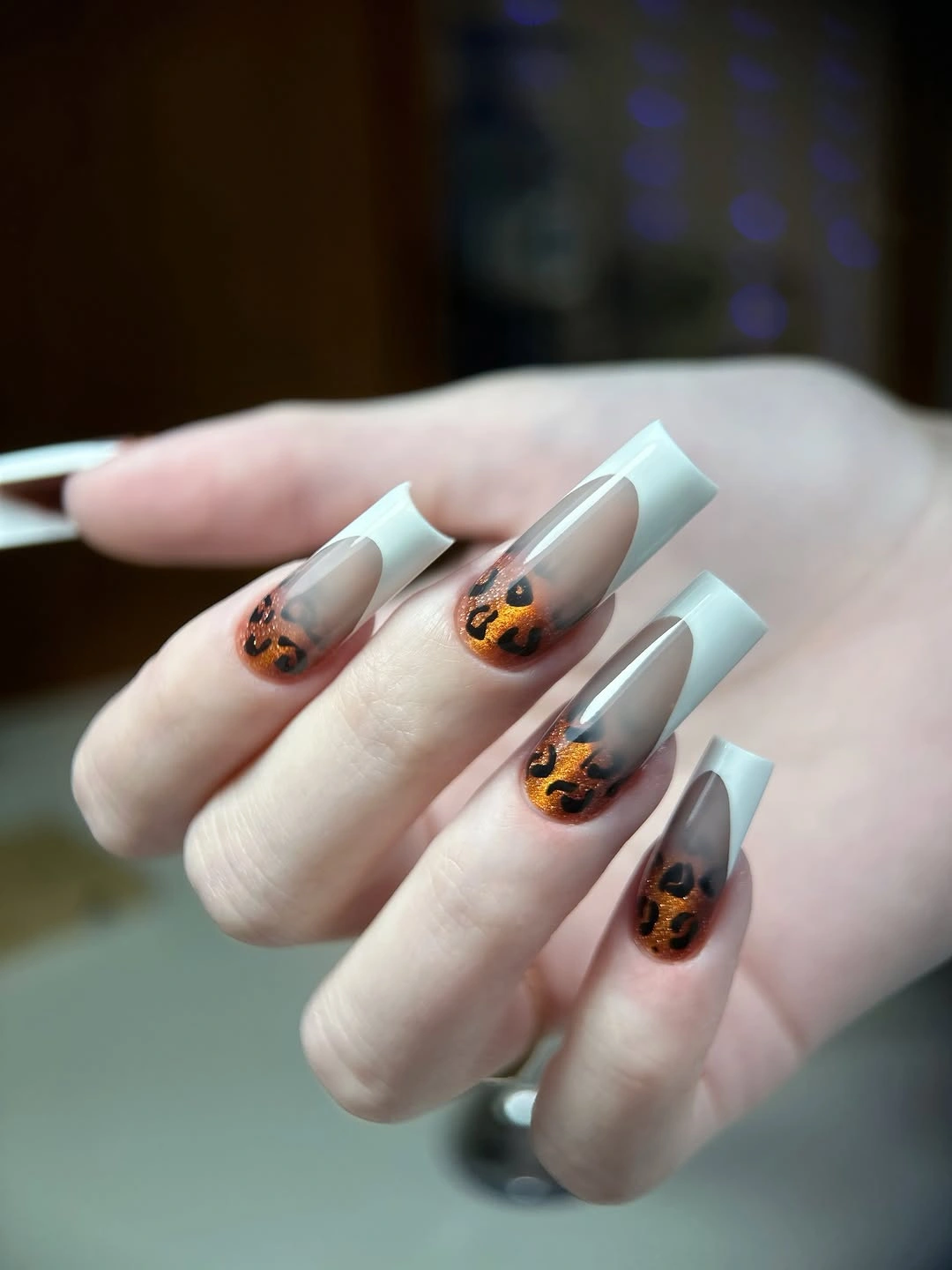
If you want less commitment, keep the spotted tip on one or two nails and use a plain warm nude on the rest. A shorter square will make the spots more compact, while a soft almond will reduce the graphic feel of the straight sidewalls. The design is easiest to refresh when the motif stays at the edge, because that leaves the base available for other clothing colors.
The limitation is that a spotted pattern can become busy when the tips are too wide or repeated without enough open space. The pale base acts as a visual pause, so protect it instead of adding another motif. Choose this version when you want a warm autumn reference that still feels light and current.
Blue And White Blocks With Reflective Edges
These medium-long nails combine bright blue, white, and pale translucent sections, with small reflective specks appearing near some edges. The blue is strong, but the white breaks it into readable blocks so the set does not become one saturated field. That spacing makes the cool palette feel fresh and deliberate even though it sits outside the usual red-and-brown autumn shorthand.
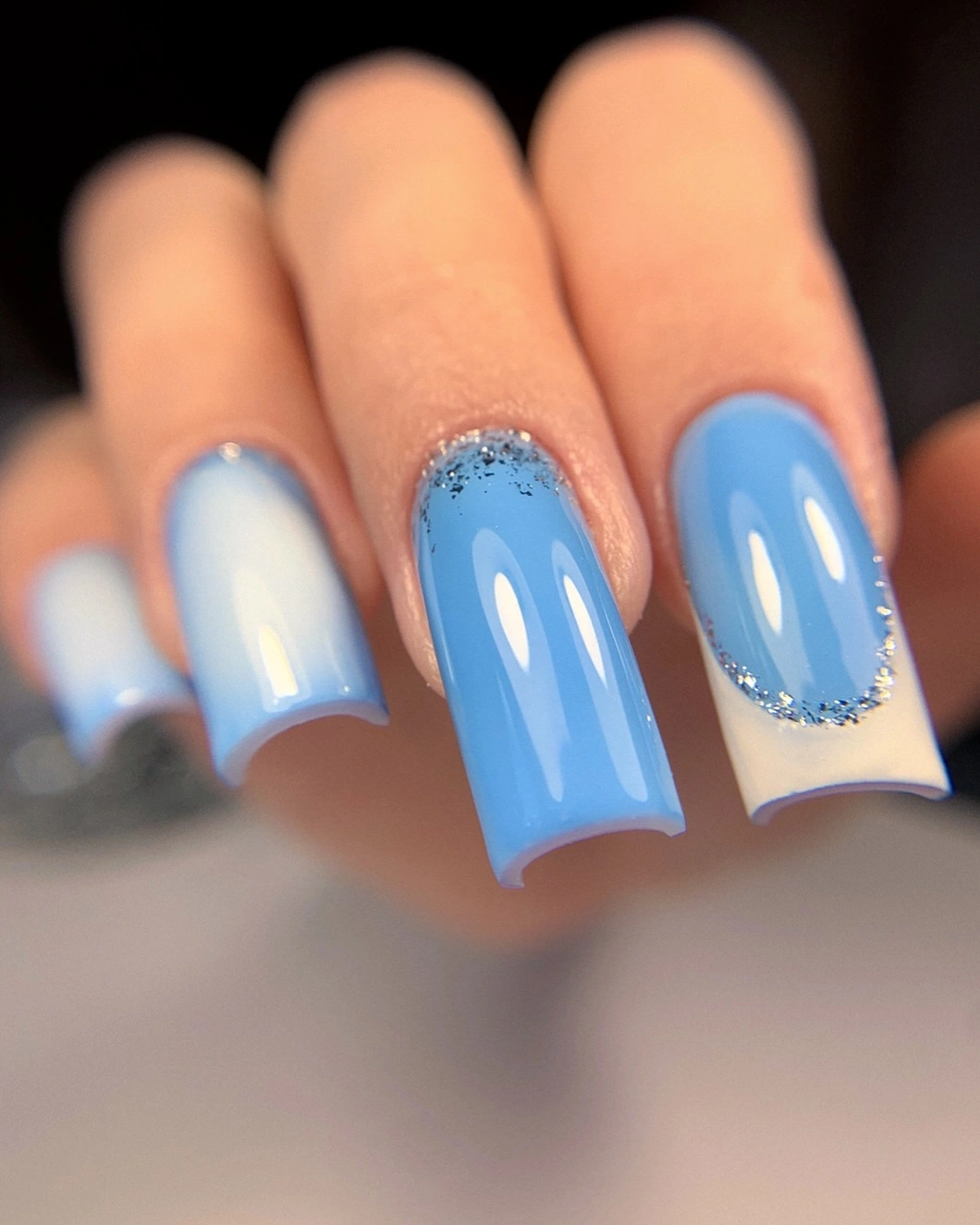
For a cleaner adaptation, repeat one blue tone on fewer fingers and let white or pale translucent nails create the resting points. A shorter shape will reduce the amount of saturated color visible at once, while a muted teal can soften the contrast without abandoning the cool direction. Keep the reflective edge small, because it works best as a light-catching finish rather than another main color.
The tradeoff is that bright blue can dominate a wardrobe faster than a muted seasonal tone. That is useful when you want the manicure to lead, but a quiet outfit may be needed to keep the composition balanced. Choose it when you want a crisp color reset and are comfortable making cool blue the main decision.
Amber Brown With Decorative Surface Marks
Long amber-brown nails bring the strongest autumn warmth in the collection, using a translucent-looking base and raised-looking curves, small sun-like marks, and metallic accents. The brown field gives the design depth, while the separate surface details keep the set from becoming a plain solid color. It feels rich because the same warm family appears in both the background and the decorative marks.
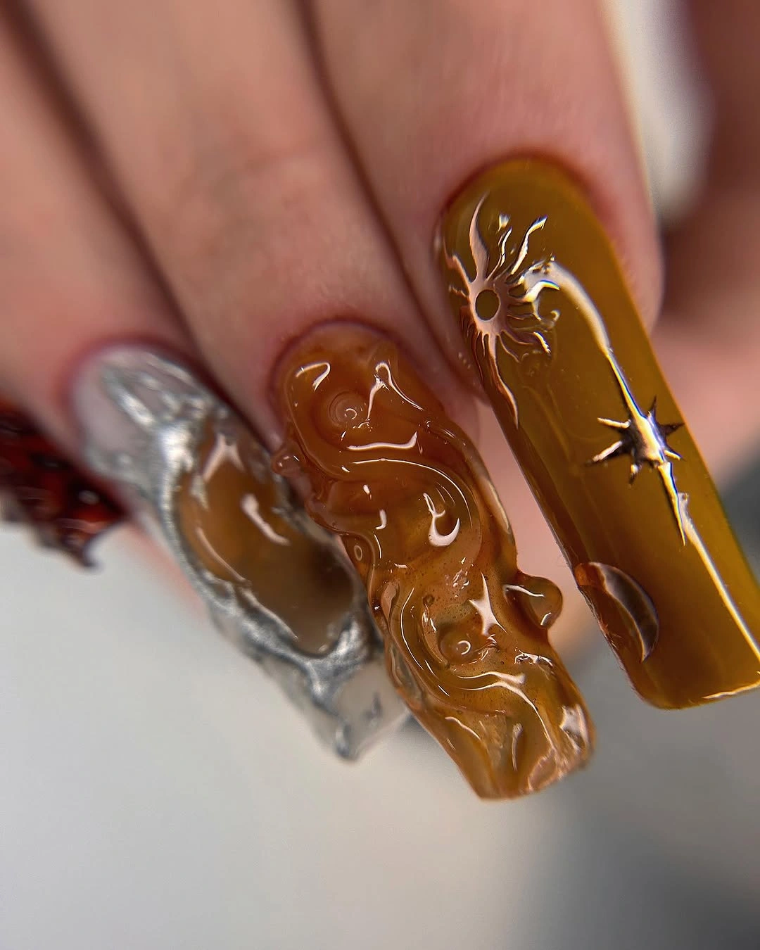
If you want to make this direction fresher and lighter, keep the amber tone on two accent nails and use a plain warm nude on the rest. A shorter square will reduce the visual weight, while removing some of the surface marks will let the color itself become the focal point. The best edit changes density before changing the warm palette that gives the set its identity.
The limitation is that a deep translucent-looking brown with multiple accents can feel heavy on a long shape. That weight is useful for an evening statement, but it may compete with textured clothing or bold jewelry. Choose it when you want depth and decoration together, or borrow only the amber color for a cleaner everyday finish.
Green French Tips On A White Field
Medium square nails update the familiar French structure with crisp green tips over a white or pale base. The color placement is clean and repeated, so the manicure feels fresh through one purposeful change rather than through a collection of competing effects. The green edge provides seasonal direction while the pale field keeps the shape bright and easy to read.
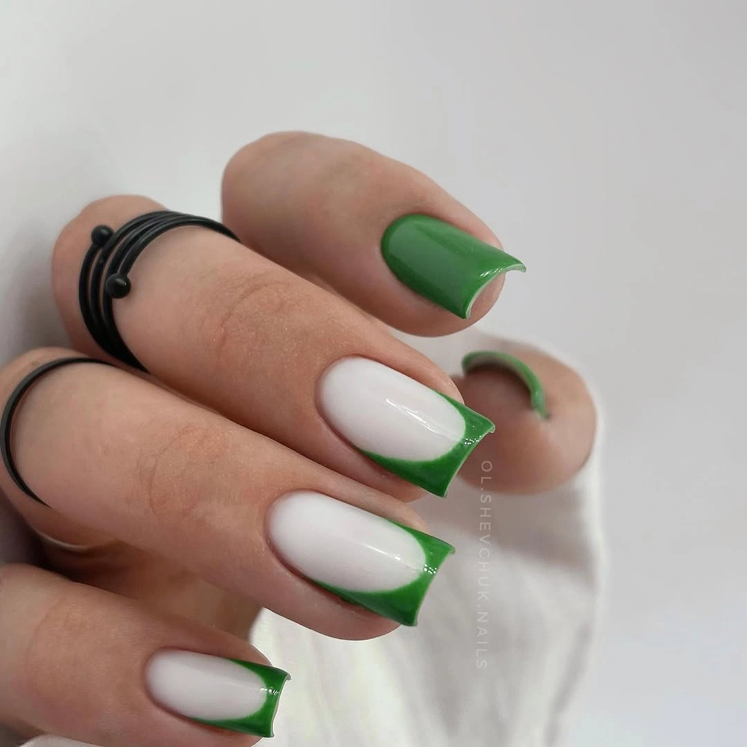
To adjust the mood, use olive, forest, or muted sage while leaving the tip width unchanged. A shorter square will make the line more compact, while a soft oval will make the green edge feel gentler and less architectural. This design is a useful bridge between solid color and nail art because the structure stays simple even when the shade changes.
The tradeoff is that a colored French tip can look too crisp if the rest of the styling is equally formal. A warmer green or softer base will lower that effect, while bright green can make the manicure feel more graphic and modern. Choose it when one clean edge is enough to refresh the look without covering the whole nail.
Cobalt Blue As One Clear Statement
Saturated cobalt-blue square nails make color the entire focal point, with a glossy surface and no visible motif to interrupt the strong field. The consistent length gives the bright shade a firm boundary, so the manicure feels graphic and composed rather than scattered. This is a fresh choice for someone who wants to step outside warm autumn colors without adding complicated art.
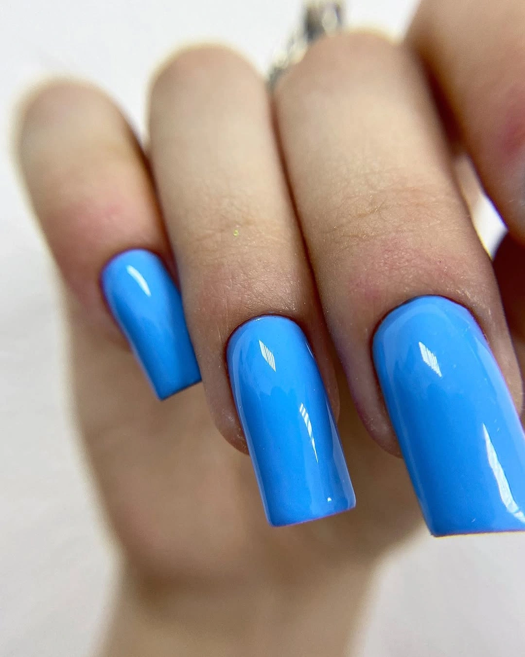
If the full cobalt feels too intense, shift toward navy, denim blue, or a shorter square while keeping the surface plain. A single cobalt accent among pale nails can also preserve the color idea with less visual weight. Avoid adding several unrelated motifs, because the strength of this look comes from letting one saturated decision remain uninterrupted.
The limitation is that a solid bright color leaves very little space to hide uneven edges or surface changes. Its reward is immediate clarity and strong compatibility with neutral clothing, silver jewelry, or a simple outfit. Choose it when you want freshness through contrast and are comfortable letting blue become the first thing noticed.
Reflective Silver Squares With One Accent
Long square nails use a reflective silver-looking surface as the main event, then add one bright decorative accent near a finger. The cool field catches light across the whole hand, while the single ornament prevents the monochrome finish from becoming completely uniform. The result is statement-driven but still organized because the accent supports the surface instead of competing with several colors.
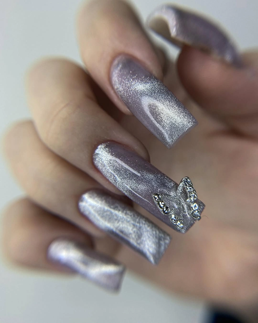
For a less dramatic version, use the reflective silver on one or two nails over a pale base and keep the remaining fingers smooth nude. A shorter length will make the finish feel more compact, while a single small accent can preserve the jewelry-like quality. The cleanest adaptation changes coverage, not the idea of letting reflection provide the focal point.
The tradeoff is that a highly reflective surface can feel more evening-oriented than the fresh white or green French options. That is useful when the manicure needs to stand out, but it may be too much beside glittering accessories or busy clothing. Choose it when finish is your main design decision and the rest of the styling can stay relatively quiet.
Speckled Pale Blue With An Olive Anchor
Short square nails combine pale blue-white surfaces with fine darker speckles and at least one muted olive-green accent. The speckled base feels airy and slightly irregular, while the olive nail supplies the earthy weight that keeps the cool palette from floating away. This pairing creates freshness through contrast between soft light color and one grounded accent, not through saturation.
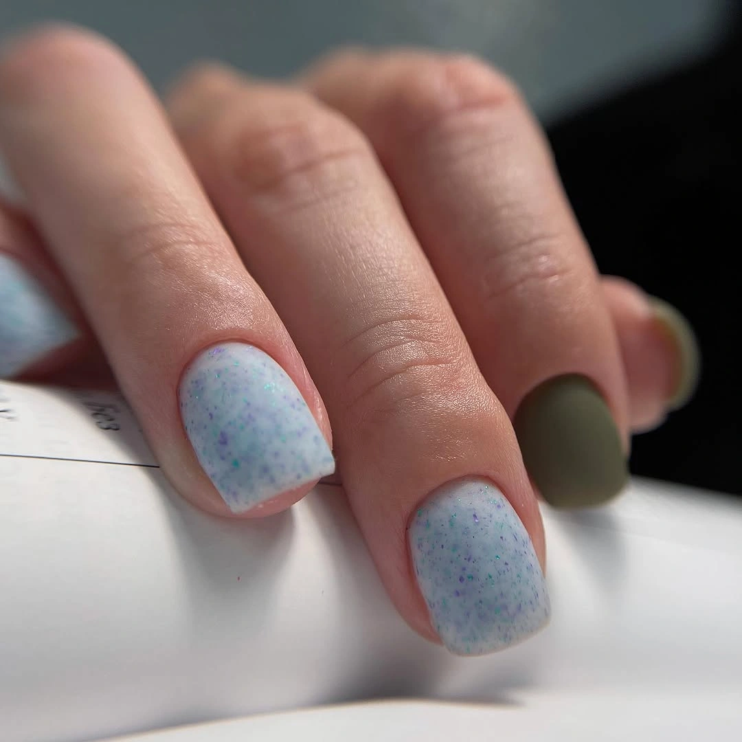
If you want more cohesion, repeat the olive on two nails or use a small olive edge instead of a full accent finger. A shorter square already keeps the palette compact, while a soft oval would make the speckled blue feel gentler. Preserve the difference between pale background and muted anchor, because flattening them into one color family would remove the reason the set feels balanced.
The limitation is that a pale speckled surface may read quieter than expected beside glossy blue or reflective silver. That is also its appeal for readers who want a low-key change that still has a point of view. Choose it when freshness means breathing room, small variation, and a color pairing that does not need to announce itself.
Short Glossy Burgundy To Close The Palette
Short rounded nails in deep burgundy bring the collection back to a warm, compact solid color. The glossy surface catches a narrow band of light, making the wine tone look richer without any visible motif or extra accent. Compared with the earlier red and plum, this shade feels darker and warmer at the same time, which gives the final idea a quiet sense of completion.
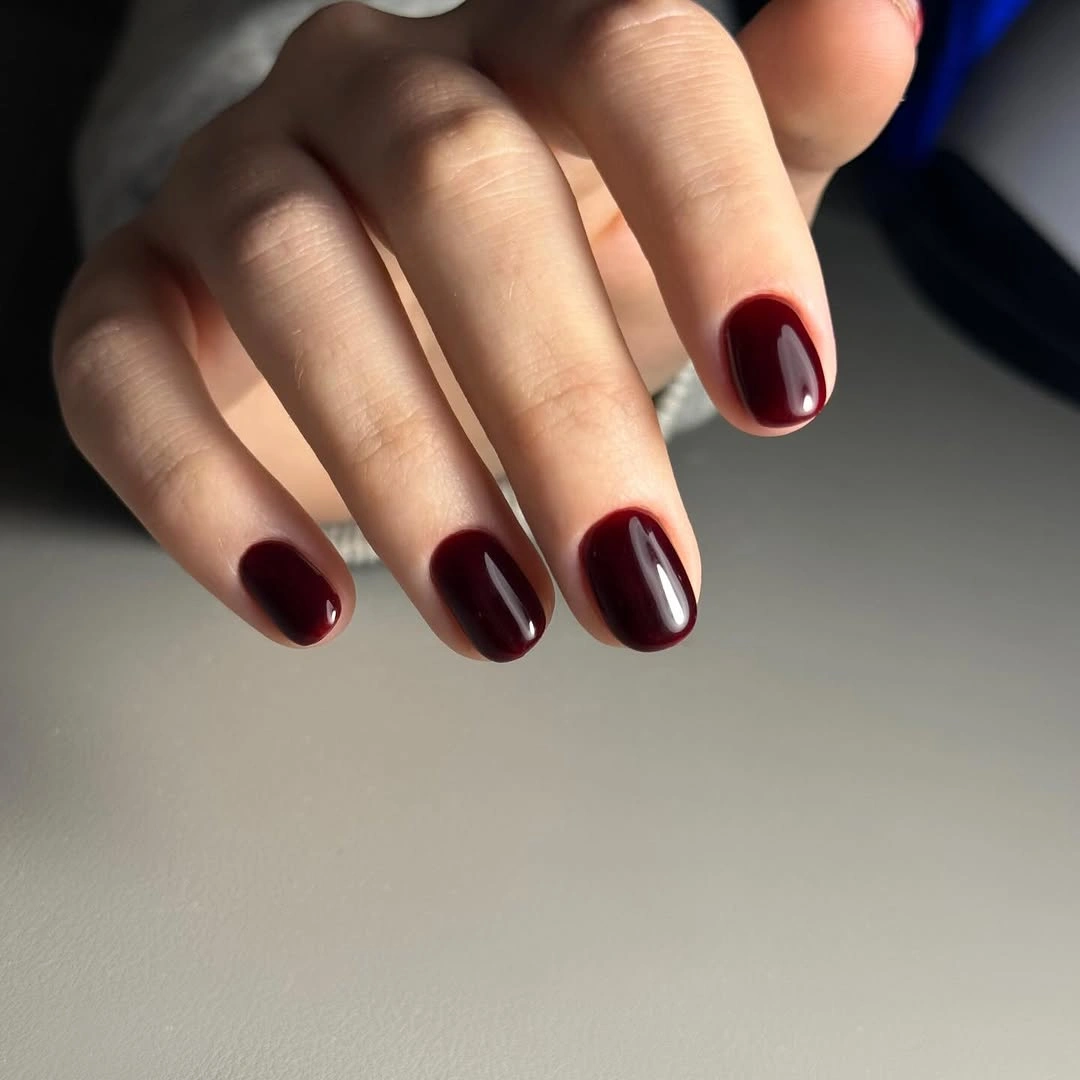
For a fresher everyday version, keep the rounded short shape and move the tone toward berry or softened oxblood. A longer almond will make the same color more dramatic, while a matte-looking finish will reduce the reflective effect and make the hand feel quieter. The simplest adaptation is to preserve the compact boundary so the deep shade remains polished instead of heavy.
The tradeoff is that burgundy can blend into dark clothing more easily than cobalt or white, especially when the shape is short. A lighter sleeve, warm metal ring, or clean background can give the color enough contrast to remain visible. Choose it when you want the collection to end on depth and shine rather than another high-energy accent.