
Early Fall Nails 2026: Subtle Color, Gloss, and Smart Accents
At first glance, early fall nails do not have to abandon summer color or rush toward the deepest browns. The strongest references here use one clear decision at a time: a muted navy mark, a warm French edge, a pale yellow base, or a single saturated shade. Looking closely at shape, finish, and placement makes each idea easier to adapt to a shorter length or a quieter wardrobe.
Inside these examples, small details carry more weight than a long list of decorations. A dark base can feel light when the marks stay open, while a simple red or blue manicure becomes more seasonal through the surrounding knit, denim, or soft fabric. Use the visible balance as a guide, and change color, length, or accent density only when that change keeps the original logic intact.
Small White Marks Soften Muted Navy
The first manicure builds its character from restraint. Short rounded-square nails are covered in a muted navy that reads almost blue-gray, while small pale curves and dots sit near the tips and sides. Most of each nail remains open, so the decoration acts as a light interruption rather than a competing pattern. White fabric around the hand reinforces that quiet contrast.
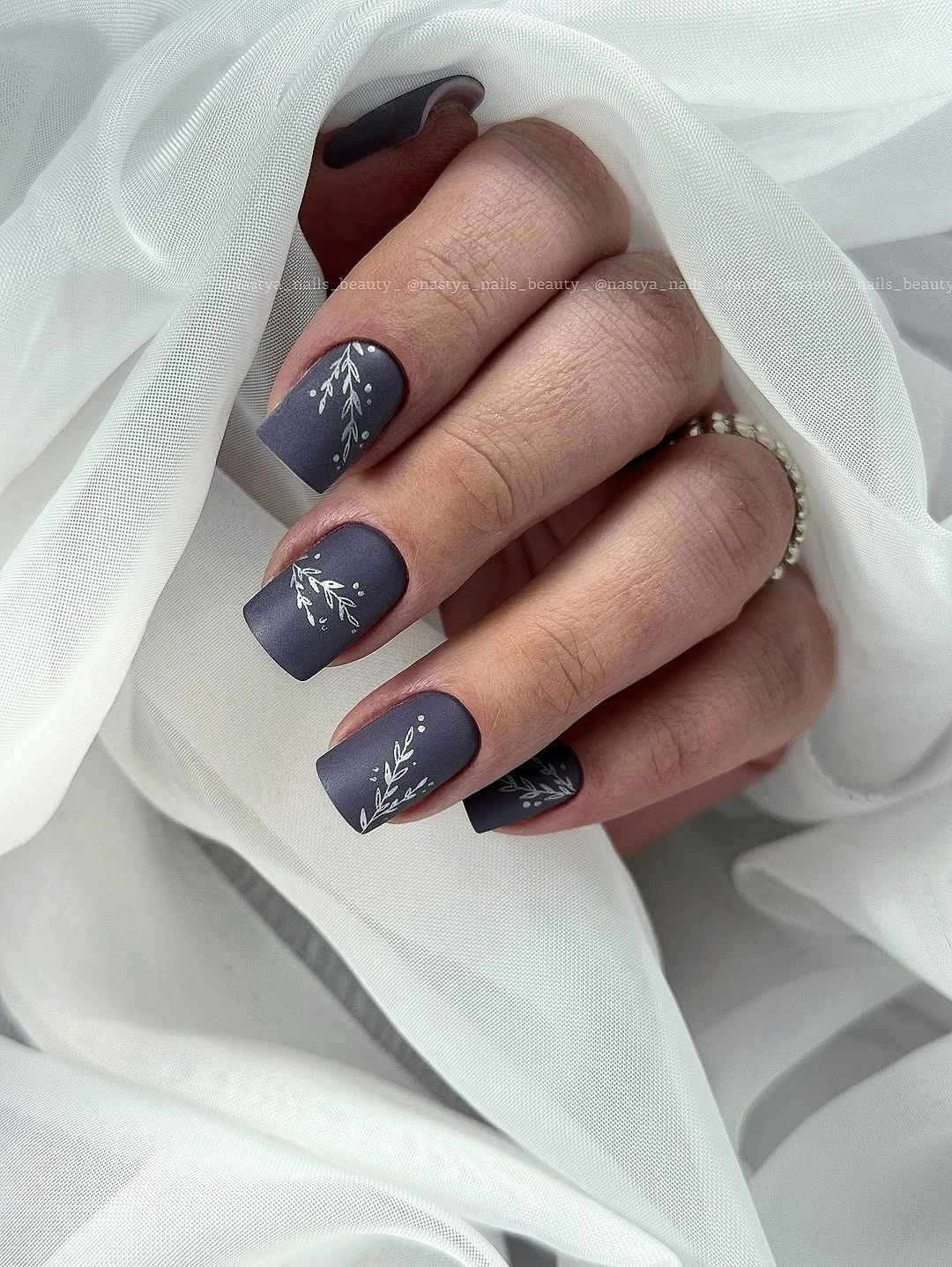
That limited placement is why the dark color does not feel visually heavy. The eye notices the pale marks, then returns to the broad blue surface and the compact outline of the nails. A similarly small detail can make a dark base feel more considered without requiring a complicated motif, especially when the marks are kept slightly different from nail to nail.
For a shorter version, keep the navy base and move one pale curve toward the upper corner of each accent nail instead of repeating marks everywhere. The small scale is also the practical limit: as the edge grows out, fine lines can look less intentional, so a simple refresh of the open navy surface will be easier than trying to preserve a dense drawing.
One Glossy Pink Choice Keeps It Clean
Here the defining detail is the absence of decoration. Short rounded-square nails carry one warm medium pink from base to tip, with a glossy surface that lets the color provide all the emphasis. The corners are soft and the length is compact, so the manicure reads as a deliberate everyday color choice rather than a shortened version of a longer design.
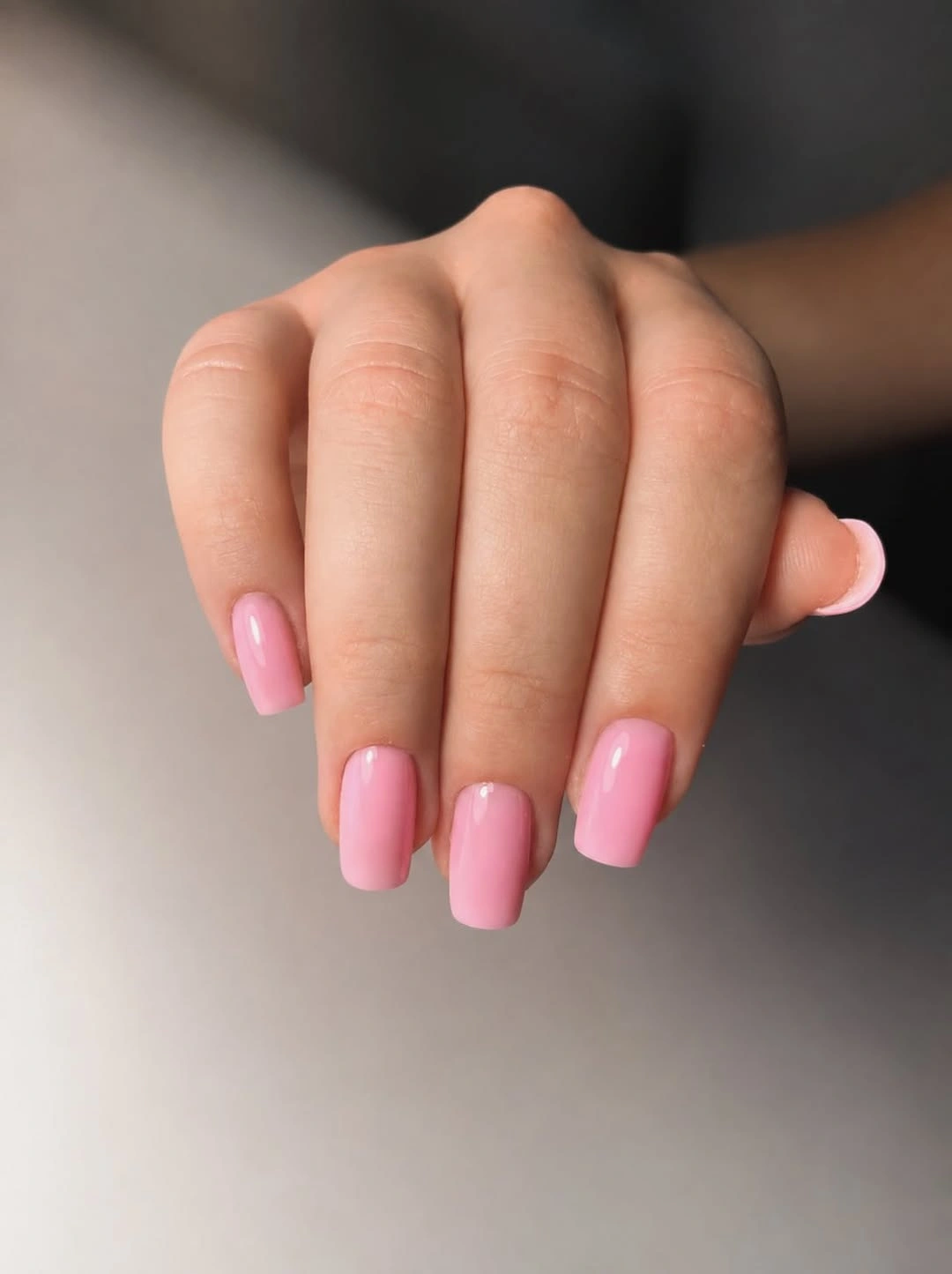
A single shade works because the silhouette is tidy enough to give the pink a clear boundary. There is no accent nail competing for attention, and the blurred neutral background leaves the hand as the only color focus. That makes the set a useful reminder that seasonal interest can come from undertone and finish, not from adding another motif.
To shift the look toward fall, keep the same short shape and choose a slightly deeper rose, muted berry, or dusty pink. Gloss will reveal chips sooner than a flatter surface, but the lack of line work means maintenance stays straightforward. A clean edge matters more here than perfect uniformity of shade, because the plain design is read at close range.
Deep Red Edges Give Sheer Bases Structure
The third manicure concentrates its strongest color at the perimeter. Long square nails show a translucent pink base with dark red tips, while one visible nail carries the red across the full surface. The straight French edge creates a repeated horizontal rhythm, and the single solid nail prevents the set from feeling mechanically identical from finger to finger.
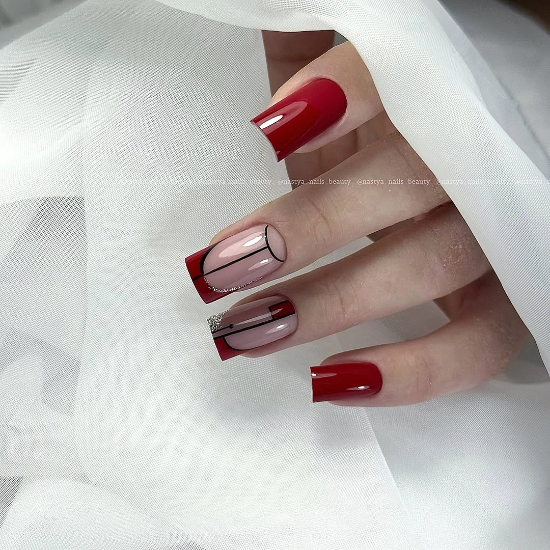
Sheer space between the cuticle and the tip keeps the red readable without filling the whole long shape. That balance is especially useful in early fall, when a warm red can look rich but still feel light if the base remains visible. The square outline adds graphic weight, so the clear tip line does not need extra glitter, lines, or texture to hold attention.
A shorter adaptation can use a narrow red edge on a squoval shape, or keep one fully red accent while reducing the tip width on the others. The tradeoff is length: long square corners make the color blocking crisp, but they also become the first feature to feel awkward during daily tasks. A softer edge preserves the contrast with less visual weight.
Speckled Pale Yellow Keeps the Base Visible
Pale yellow is the main decision in this long almond set, but the scattered dark speckles keep it from reading as a flat pastel. The marks vary in size and spacing across the nails, so the surface feels loosely illustrated rather than arranged in a strict grid. Because the base remains the larger visual field, the design stays bright even where the dark dots cluster.
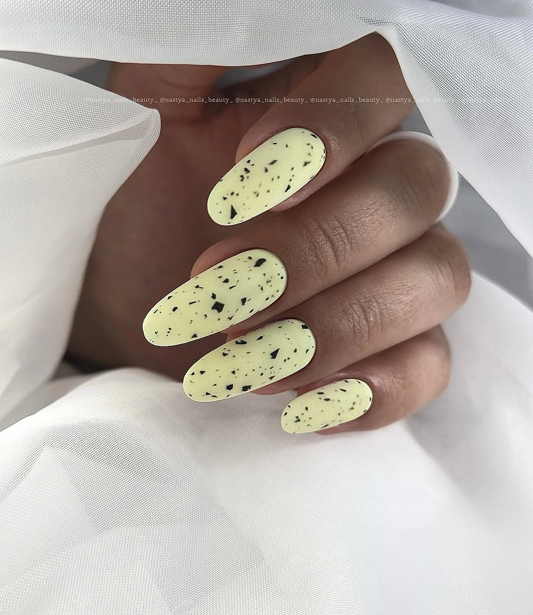
The contrast works through scale. Dark marks are easy to see against the buttery background, yet their irregular edges stop the pattern from becoming too formal. White fabric behind the hand continues the light palette, allowing the speckles to supply the only strong interruption. The result has an early-fall direction without relying on a heavy brown or red base.
On shorter nails, reduce the number of marks rather than shrinking them until they become noise. A warm cream or muted mustard can replace the pale yellow if the set needs more depth, while the same random spacing keeps the idea recognizable. The realistic limitation is density: once too much of the base disappears, the playful contrast becomes a crowded print.
Cool Pale Blue Uses Length as Its Detail
This long almond manicure is almost entirely about a cool pale blue that shifts softly toward milky white in the highlights. There is no visible artwork to compete with the tapered shape, so the rounded point and smooth reflective surface become the design. The restrained palette feels airy against the plain background, even though the length gives the hand a clear presence.
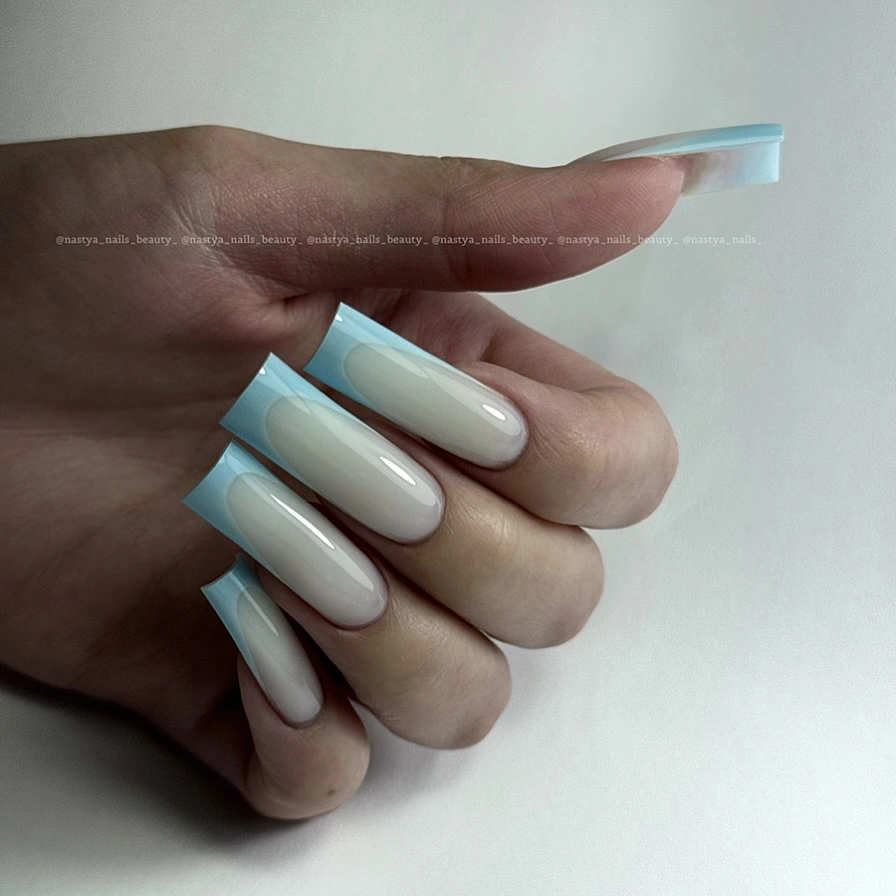
The cool color does not need to be forced into a dark seasonal story. Its early-fall role comes from the polished almond outline and the way the pale shade can sit beside gray, cream, or denim. With no motif to repeat, the eye follows the contour from base to tip, which makes the manicure feel finished through proportion rather than decoration.
For everyday wear, shorten the almond shape while keeping the blue almost unchanged. A slightly grayer or dustier version would also sit more quietly with autumn clothing, but the bright pale base can remain if the rest of the outfit is muted. The main limitation is the length itself, since a simple color cannot disguise a tip that becomes inconvenient.
Orange French Tips Bridge Two Seasons
Warm orange appears only along the almond edges in this casual manicure. The bases look sheer and quiet, while the bright tips follow the tapered outline in a clean band. A denim sleeve adds a cool blue counterpoint, making the orange appear warmer and more deliberate than it would against a blank background. The design stays lively without covering the whole nail.
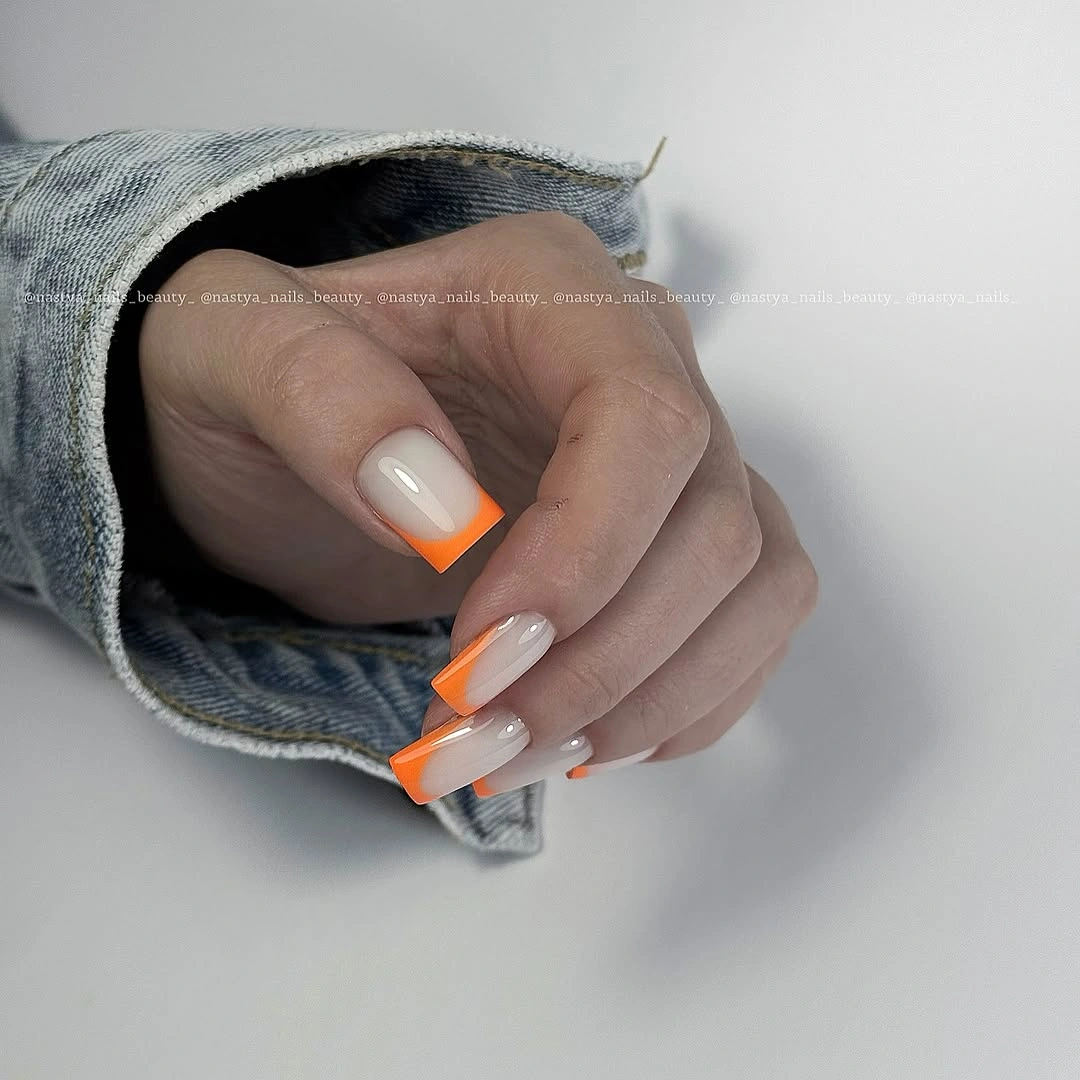
Concentrating color at the edge leaves room for the neutral base to balance the saturation. That is why the set can move from late summer toward early fall without needing a darker shade immediately. The denim context also shows how useful contrast can be: blue clothing cools the orange, while a cream or brown knit would make it feel more grounded.
Keep the tip narrow on a shorter almond, or replace the bright orange with rust, terracotta, or a muted pumpkin tone. The edge has to remain even because the eye reads the orange as a continuous frame. If the line becomes too thick at a short length, the base disappears and the manicure loses the light bridge that makes the idea wearable.
Pale Yellow Lets Selective Art Lead
Selective placement controls the seventh look. One visible nail is a solid pale yellow anchor, while the neighboring nails combine a light base with red-and-white graphic marks. The decorated surfaces appear livelier, but the plain yellow nail gives the hand a pause before the eye moves back into the artwork. That anchor is more important than identifying the tiny illustration precisely.
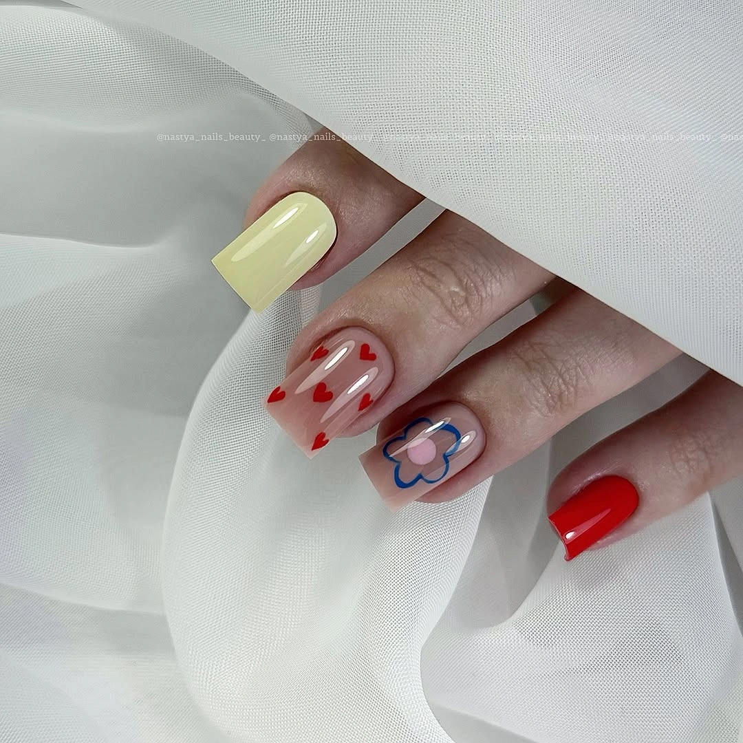
The arrangement works because the accent colors repeat across a limited group rather than spreading without a center. Red provides the sharpest contrast, white keeps the pattern connected to the pale base, and the solid nail prevents the design from becoming a continuous block of detail. The white fabric supports the same light-to-bright relationship around the hand.
To adapt the idea, keep one illustrated accent and make the rest pale yellow or soft cream. A shorter nail can carry the same red-and-white energy if the marks are simplified into one curve or dot rather than a tiny scene. The exact drawing should remain open to interpretation, because the useful lesson is the anchor-and-accent arrangement, not a name for the small image.
Muted Mauve Needs Only One Point of Light
Muted mauve and dusty pink form the quiet base of this short rounded manicure. Most nails appear solid, but one small reflective or jeweled detail catches the light near the surface. The accent is deliberately tiny, and the white fabric around the hand leaves enough visual space for that point to register without turning the set into a jewelry display.
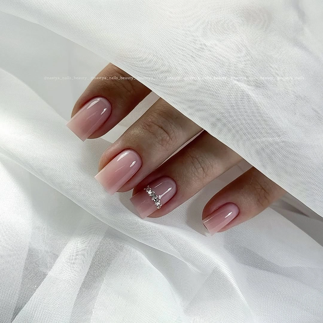
The scale of the detail matters more than its exact material. A small bright point interrupts the calm base, then lets the eye return to the rounded shape and soft color. That sequence makes the manicure feel finished at close range while staying quiet from a distance. The muted palette also gives the accent room to shine without needing additional contrast.
Keep the detail on one nail if the goal is a practical everyday version, and shift the base toward taupe-pink or warm beige for a more grounded autumn note. If the accent is raised, it may catch on knit fabric, so a flat reflective line can preserve the idea with less upkeep. The short shape already supplies the restraint this design needs.
Two Pale Shades Create a Soft Rhythm
Pale yellow and milky white alternate across these long almond nails, creating variation without strong color opposition. The shades remain close in brightness, so the eye first notices the tapered silhouette and only then follows the quiet change from one light nail to the next. White fabric blends with the milky surfaces and makes the yellow appear softer rather than louder.
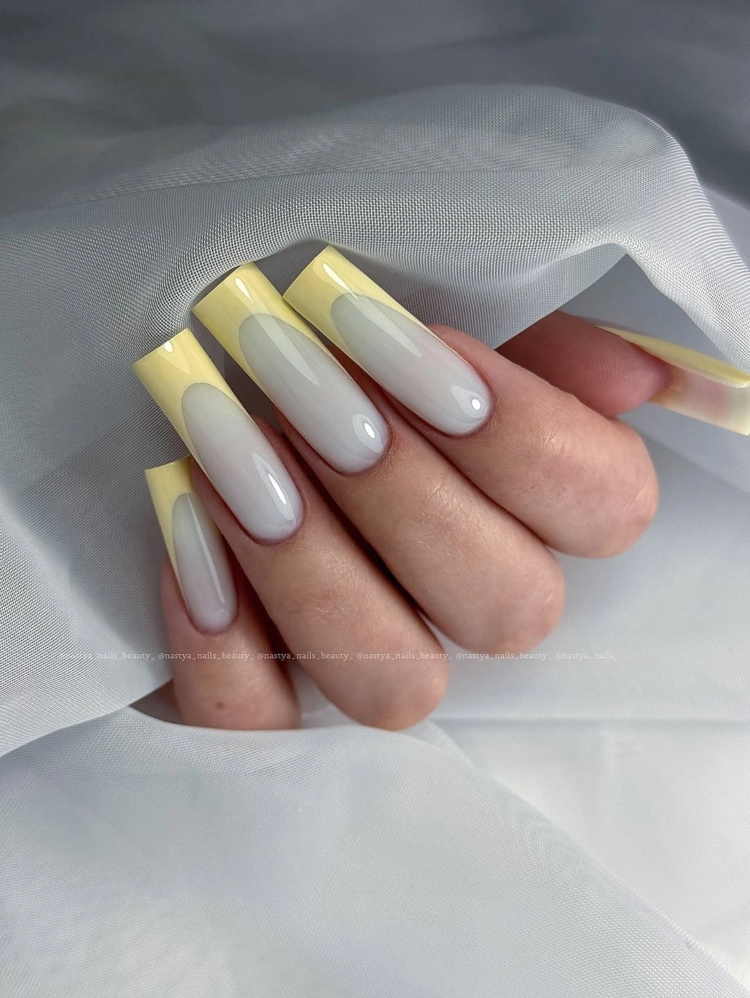
Low contrast can be useful when the shape is already long. A sharper color difference would add another focal point, but the near-neutrals let the almond contour stay in charge. The alternating sequence also gives the set more movement than a one-color manicure while avoiding the repeated artwork that would compete with the open space between the fingers.
For a shorter adaptation, place yellow only on two accent nails or use a pale yellow tip over a milky base. A warmer cream can replace the white if the palette needs to sit closer to autumn clothing. The limitation is visual delicacy: when both shades become too similar, the rhythm disappears, so a small undertone difference still needs to remain visible.
Fine Metallic Lines Keep Pink From Going Flat
Soft pink remains the main surface in this medium rounded almond manicure, while thin reflective details appear near selected tips and sides. The accents look linear and delicate rather than filled in, so the hand still reads pink first. A neutral pose and light background give those small glints enough room to show without making the manicure feel densely decorated.
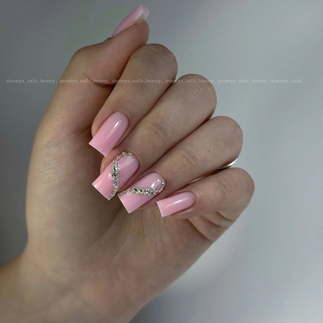
Fine lines add structure because they introduce direction. Instead of changing the whole palette, they guide the eye along the curve of the nail and echo the small jewelry details around the hand. That makes the set a useful example of how a quiet base can take on more character through placement, even when the accent color stays close to neutral metal.
One metallic line on a single accent nail is the easiest translation for daily wear. A muted berry or rose-brown base would move the same idea toward fall, but keep the decoration light so the pink remains the larger field. If the visible detail sits above the surface, it may catch on fabric, which is a reason to favor a flat line when practicality matters.
Lime Green Makes Length the Focal Point
Very long tapered nails in vivid lime green leave no question about the focal point. The color is solid, highly saturated, and free of visible art, while the narrow squared or coffin-like ends extend the statement well beyond the finger. Because the surface stays plain, the eye can read the relationship between electric color and extreme length without distraction.
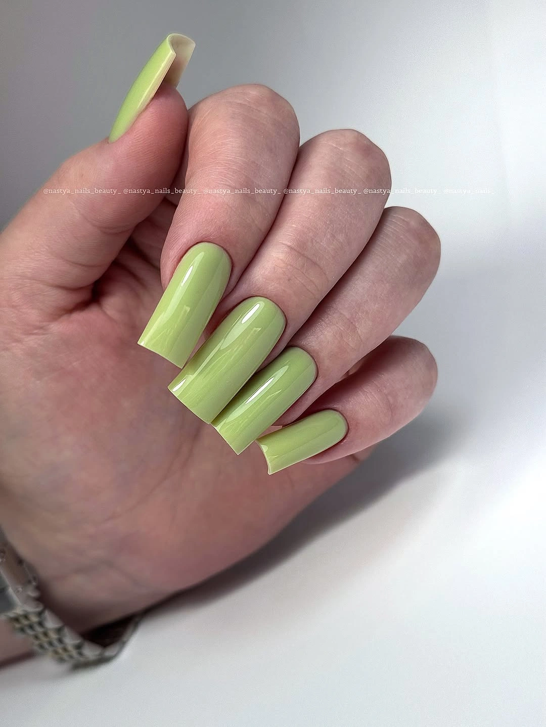
Simplicity helps the bright green hold together. Adding patterns would compete with the already strong scale, while the unbroken color makes the exaggerated shape feel intentional rather than accidental. A neutral background gives the green enough space, and the absence of jewelry-like detail keeps the manicure focused on one high-energy decision.
For a more wearable version, keep lime on a medium almond or use it on two accent nails with muted cream companions. The functional tradeoff here is not subtle: extreme length changes how the hand moves and how clothing is handled. A shorter shape preserves the color impact while removing the need to maintain a dramatic tip every day.
Charcoal Gray Lets Shine Outline the Shape
Long square nails in charcoal gray look almost architectural because the surface is dark, glossy, and nearly free of decoration. Broad pale reflections trace the curve of each nail and may suggest a fine edge, but the defining evidence is the clean gray field and straight tip. White fabric intensifies the contrast and keeps the dark neutral easy to read.
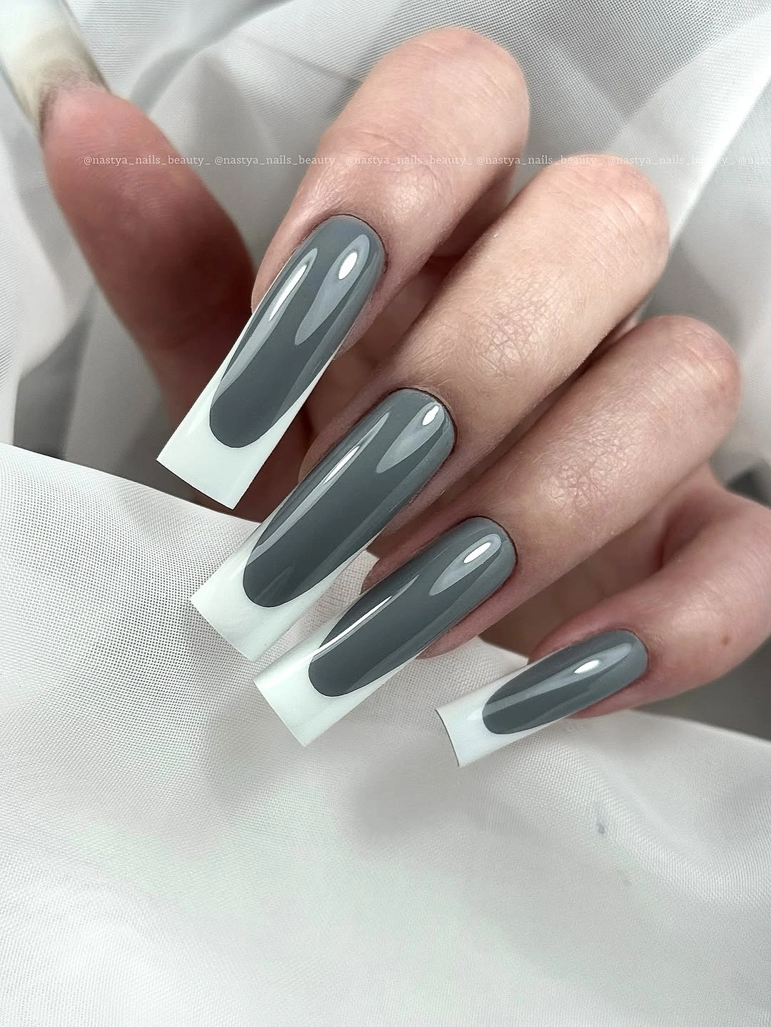
The manicure succeeds through surface control. A smooth shine supplies enough movement for a plain color, while the square shape gives the reflections a sharper boundary than a rounded tip would. The result feels seasonal through depth rather than through a named motif, which makes it easier to coordinate with both cool and warm fall layers.
A shorter square or squoval would make the same charcoal tone less demanding, and one pale outline could be added only if the surface needs more definition. Keep the edge interpretation cautious because some of the light line may be reflection. The longer length remains the honest limitation: it makes the color graphic, but it also makes corners more noticeable during wear.
Fine Diagonal Texture Changes Cream
Pale cream or yellow is the base of this long almond design, but repeated fine diagonal lines give the surface a brushed, ridged, or woven impression. The marks stay close to the base color and run in a consistent direction, so they are visible only after the larger shape and soft palette have registered. White fabric keeps the tonal effect quiet.
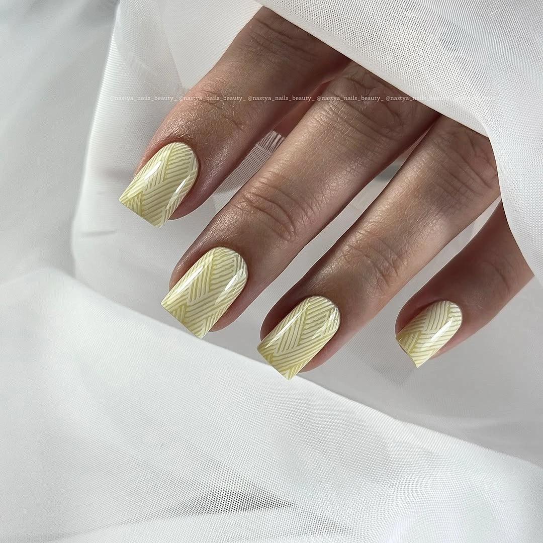
Tone-on-tone texture adds depth without introducing another strong color. The repeated direction creates rhythm across the hand, yet the lines do not form a large graphic motif that would shorten the visual space. That makes the manicure feel detailed on inspection while still reading as a pale neutral from farther away, a useful balance for early fall layers.
Use the texture on one or two accent nails if the goal is a simpler set, or shift the base toward warm cream and keep the lines only slightly darker. The exact construction is not visible, so it is safer to copy the directional effect than to name a technique. Fine marks may also show wear at the tips sooner than a plain color, which is the main upkeep consideration.
Short Red Gloss Looks Focused With Knitwear
Bright red covers these short rounded-square nails with no visible artwork, making the compact outline part of the design. The color is saturated and glossy, while the gray knit sleeve supplies a muted frame that keeps the hand from feeling too bright. Because the tips are short and curved, the red reads focused rather than elongated or theatrical.
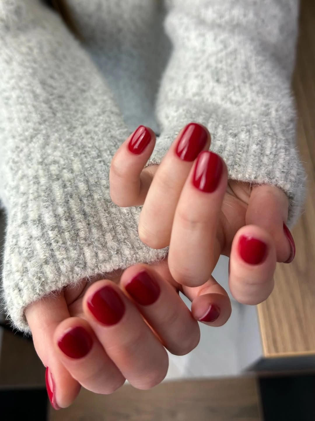
The surrounding knit demonstrates how styling can change the same red. Gray absorbs some of the brightness and turns the manicure into a clear seasonal accent, while the even shape keeps the color tidy. There is no need for a second shade or a decorative nail because the contrast between saturated red, pale skin, and soft gray already provides enough structure.
A deeper berry or brick red would move the set toward autumn without changing its practical proportions. Keep the short rounded shape if daily tasks matter, and use the same solid surface for easy refreshes. Gloss can reveal chips, but the lack of line work means a small edge repair will not disrupt a larger pattern or require matching neighboring details.
Lavender Lets One Blue Accent Speak Clearly
Most of this long almond manicure is pale lavender, while one visible accent carries dense blue-and-white line work. The cool illustration supplies the detail, but the quieter lavender companions prevent it from spreading across the entire hand. White fabric echoes the pale base and makes the fine accent appear crisp without changing the soft overall palette.
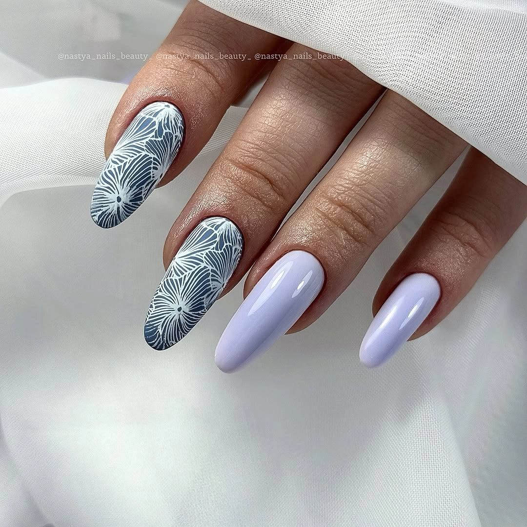
The strongest choice is the contrast between a calm field and one concentrated area of lines. Blue gives the accent more definition than a tone-on-tone lavender drawing would, while the solid nails create relief before the eye returns to the detailed surface. The exact motif is less important than the placement: one focal nail can carry a complicated visual idea.
For shorter nails, keep the lavender base and reduce the illustration to one blue curve, leaf-like stroke, or abstract cluster on a single accent. Avoid trying to preserve every tiny line, because detail density can overwhelm a compact tip. The long almond shape also adds drama on its own, so shortening it can make the same color story easier to wear.
Cobalt Blue Uses Reflection Instead of Artwork
Medium-long square nails in saturated cobalt blue rely on a smooth surface and large white reflections. The color is uniform from nail to nail, and the squared corners give each glossy highlight a clear boundary. White fabric beneath the hand intensifies the blue, so the manicure feels vivid without needing glitter, a French edge, or a contrasting accent.
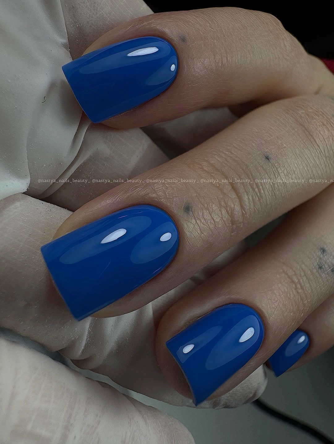
Reflection supplies the variation here. As the hand turns, the bright highlight moves across the blue field and keeps the solid shade from looking static. That is enough visual information for a bold early-fall color, especially when the shape remains consistent and the background stays quiet. The design is strong because it does not ask a motif to compete with saturation.
Ink blue or a slightly grayer cobalt can make the set feel more autumnal, while a shorter square keeps the same clean edge with less length. Gloss will show chips sooner than a textured finish, but the repair is uncomplicated because every nail carries the same surface. The most useful adjustment is therefore tone or length, not extra decoration.
Milky White Makes Extreme Length Look Intentional
Very long pale nails taper into narrow points in this side-lit reference. The ivory-white surface is solid and quiet, with no visible artwork, so the silhouette and the dark background become the visual story. Shadow around the hand makes the pale tips look even more sculptural, while the simple color prevents the extreme shape from competing with a busy pattern.
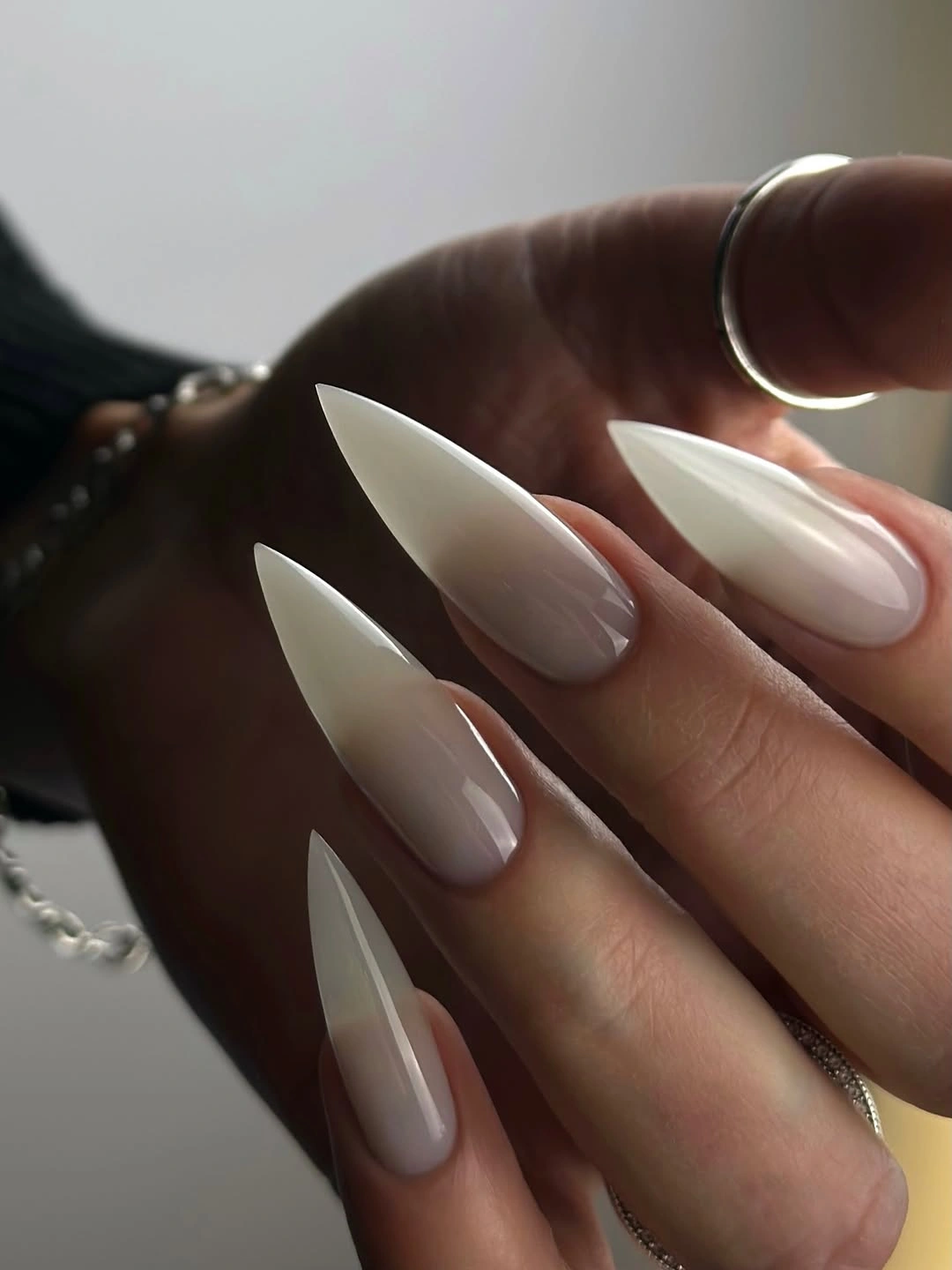
Length can be the detail when the base is this restrained. A patterned surface would make the nails feel even denser, but the unbroken ivory allows the eye to follow the narrow point and the changing light. That makes the set a strong reference for readers who like sculptural form yet prefer a color that remains visually calm.
Translate the idea to a medium almond if the point would interfere with work, clothing, or ordinary hand movement. Sheer ivory can also soften the contrast against skin while keeping the pale silhouette. The realistic limitation is unavoidable: a plain color will not hide an extreme tip, so the shape must be chosen for actual comfort rather than copied only for its drama.
Long White Squares Pair With Soft Layers
Long square nails in milky white take a quieter route than the pointed set before them. The tips are straight, the surface appears evenly glossy, and no artwork interrupts the pale field. A knit sleeve and gray background create a soft setting, making the manicure feel connected to layered clothing rather than styled as a high-contrast statement.
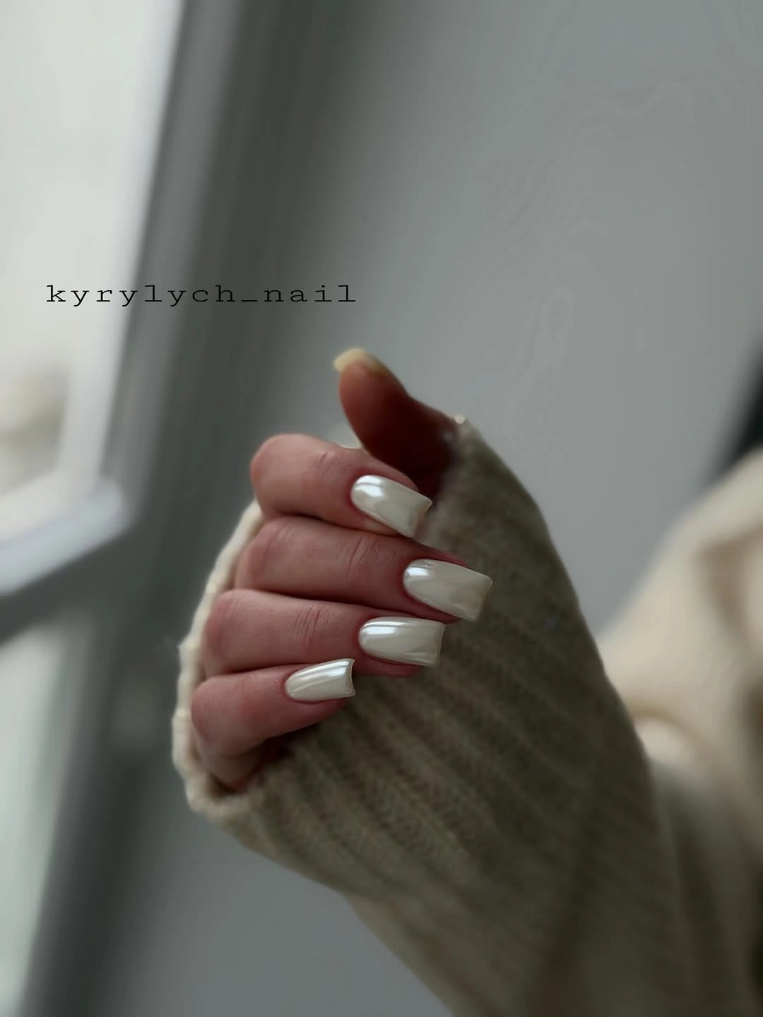
The square edge gives the white color a clearer boundary, while the muted surroundings keep it from looking stark. That relationship is useful when a light manicure needs to work with fall textures: the nails stay clean, and the knit provides warmth without adding another bright accent. The absence of art also makes the shape easy to evaluate honestly.
Shorten the square into a squoval if corners feel impractical, or add a barely gray sheer accent to two nails when a little variation is needed. Pale glossy surfaces can show staining and edge wear more easily than dark colors, so clean borders matter. Beyond that maintenance point, the plain construction keeps the design straightforward to refresh.
Electric Blue Gains Energy From Pink
Bright blue square nails appear against a vivid pink sweater, and that surrounding color is part of the manicure’s evidence. The nails themselves are solid, glossy, and medium-long, with straight tips that hold the saturated blue in a crisp block. Nothing else competes for attention, so the relationship between the two bold colors becomes the defining detail.
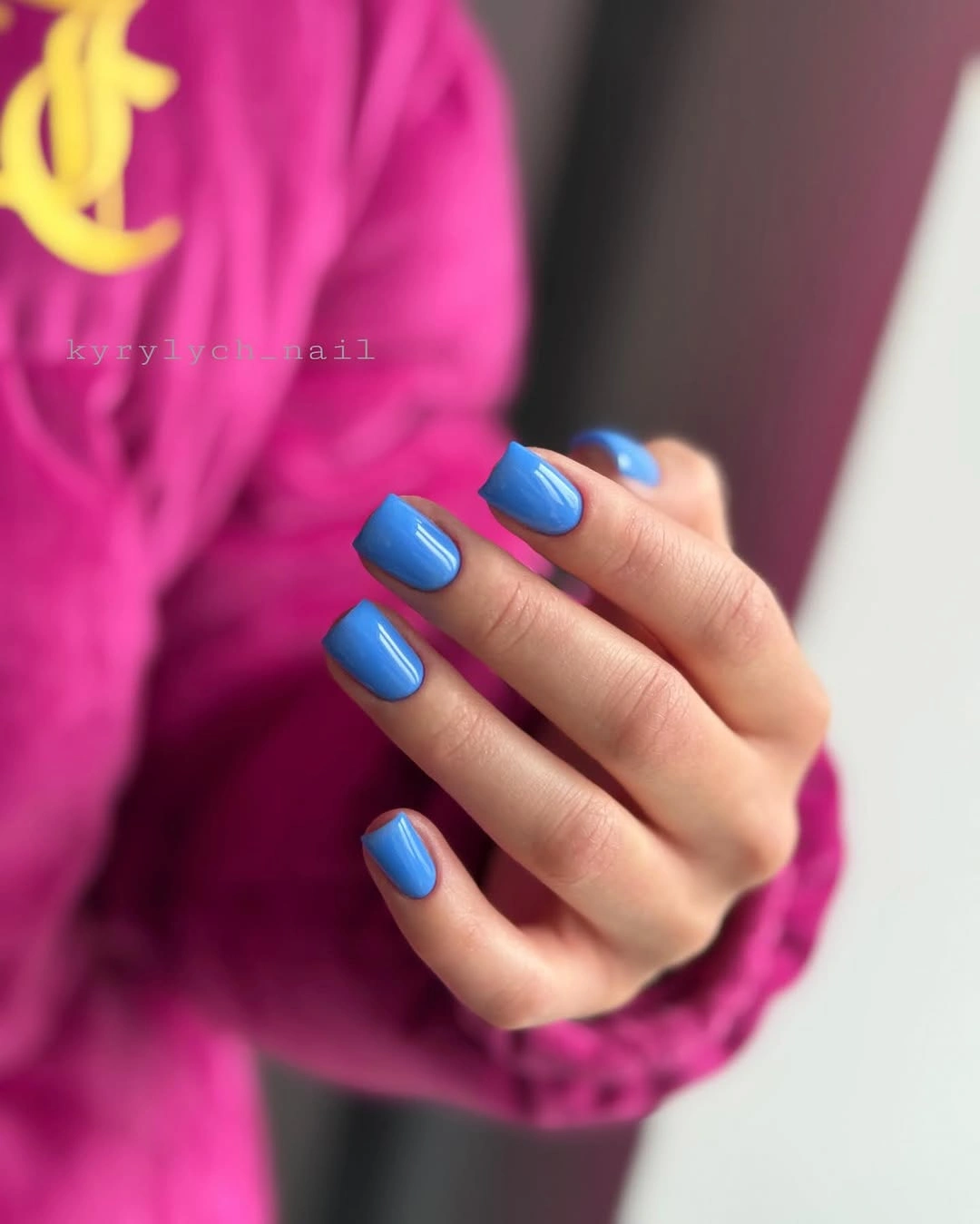
Pink and blue create a deliberate complementary tension, making the manicure look brighter than it would beside gray or cream. The square silhouette keeps the color pairing graphic, while the plain surface prevents the styling from becoming visually noisy. This is a useful example of a manicure whose context changes its impact without changing the polish decision itself.
If the clothing is already colorful, keep the blue solid and choose a neutral sleeve to let it stand alone. For a quieter set, shorten the square or use electric blue on two accent nails with a pale base. The practical tradeoff is moderate length rather than artwork: the shape remains visible in daily wear, so shortening it is the cleanest adjustment.
Red-Orange Anchors Small Illustrated Accents
Most nails in this medium almond set are vivid red-orange, while selected nails carry dark line work and small pale illustrated details. The solid nails act as anchors around the more intricate surfaces, and the glossy finish keeps the saturated color unified. Because the hand shows both plain and decorated nails together, the balance is easier to read than the tiny motifs themselves.
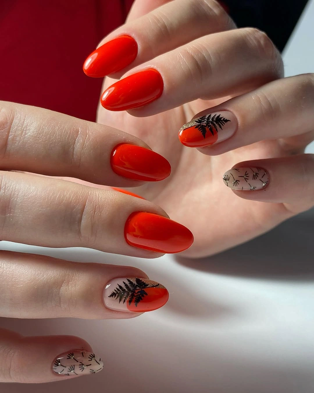
The design stays coherent through repetition of the warm base. Red-orange appears often enough to remain the main color, while black and pale marks supply short interruptions rather than a second full palette. That arrangement gives the accents a job: they add personality at selected points, but they do not erase the strong seasonal color that holds the set together.
Use two illustrated nails and leave the rest solid if the same idea needs less upkeep. Rust, brick, or muted paprika can replace the bright red-orange for a deeper fall direction, although the contrast of the small marks should remain clear. Detailed accents are the honest limitation, since they will need more careful edge maintenance than the plain glossy companions.
Olive Brown Gains Weight From Metallic Relief
Short rounded-square nails in olive-brown provide a dark base for raised gold-toned and bronze-looking accents. Several nails stay glossy and mostly solid, while selected surfaces carry sculptural bands, leaf-like shapes, or embossed-looking texture. Rings around the hand echo the jewelry direction, but the manicure remains central because the metallic details are placed directly on the nail surfaces.
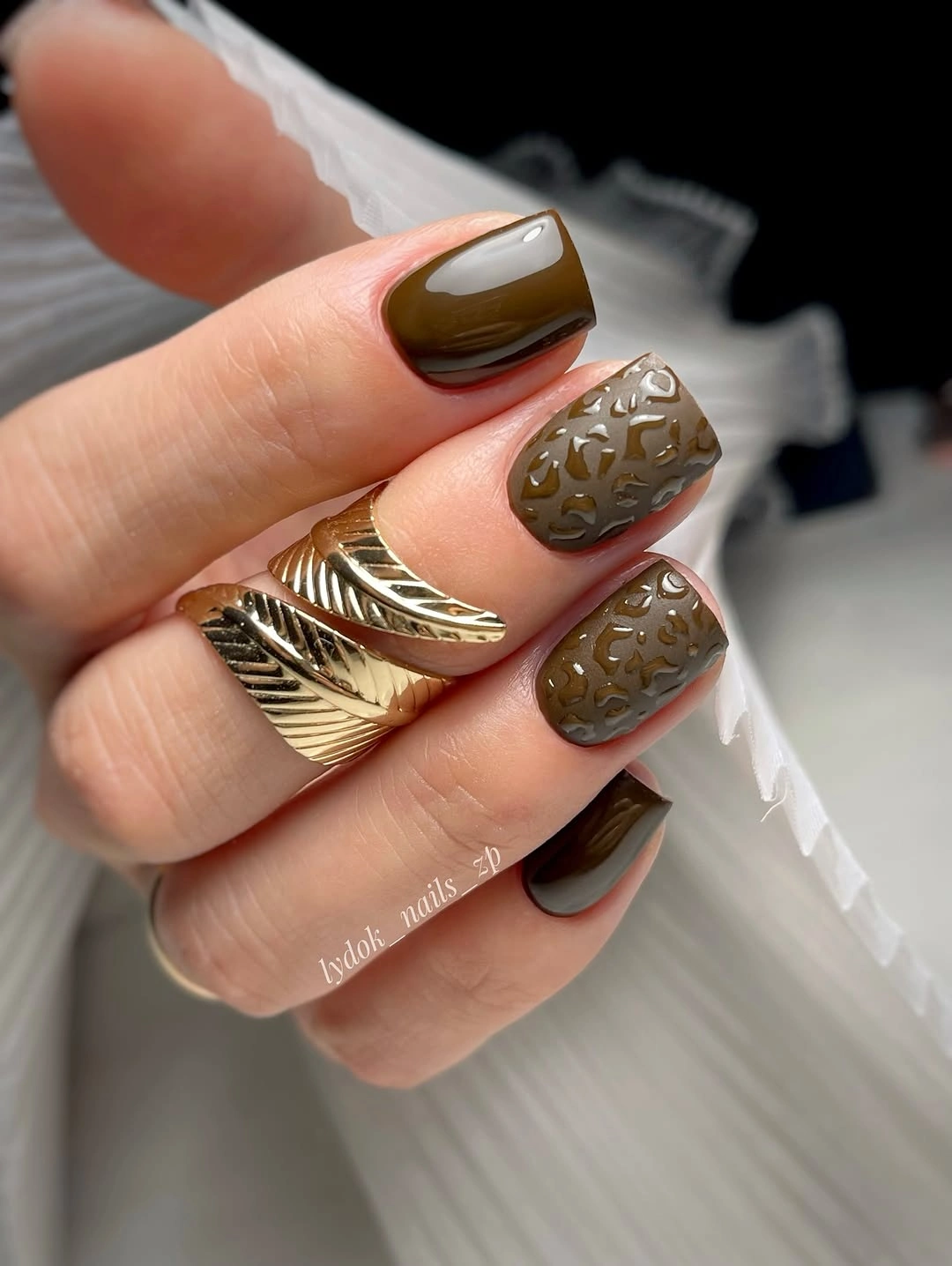
The compact shape keeps the heavier decoration under control. Dark olive-brown supplies continuity, and the reflective accents add depth without requiring every nail to be covered. The connection to the rings is also a useful styling lesson: a dark neutral can support metallic detail when the surrounding accessories repeat the same visual temperature without introducing many extra colors.
For a practical version, leave the base olive-brown and use one metallic accent nail with a flatter line or small shape. Raised details can catch on knit fabric, while short corners already make the set easier to wear. Keep the exact metal and construction open to interpretation; the transferable idea is the contrast between a deep earthy base and a small sculptural highlight.
Deep Purple Closes With A Compact Silhouette
Deep purple covers the final short rounded-square set from base to tip, with glossy highlights and no visible artwork. The color sits close to berry or violet in the charcoal-sleeve setting, but the manicure stays a single shade rather than becoming a collage of fall references. The compact outline gives the dark color a neat boundary and keeps the hand visually grounded.
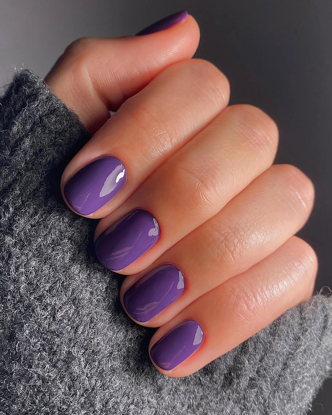
Seasonal mood comes from depth and context here. Gray knit fabric absorbs some brightness and lets the violet read as a calm dark accent, while the shine prevents the surface from disappearing completely. Because there is no pattern to decode, the eye can focus on how the short shape keeps a saturated color approachable for daily styling.
Plum, eggplant, or a warmer berry can shift the undertone without changing the structure. Keep the rounded square if comfort and easy coordination matter, and use the same solid surface for a quick refresh. Gloss will reveal edge wear, but the plain design has a forgiving repair path because no neighboring line, speckle, or accent needs to be matched.