
Fall Dip Nails 2026: Glossy Color, Tiny Details, and Easy Shapes
One small edge can decide whether a dark manicure looks sleek or heavy. When the color ends cleanly, the shine catches along the right curve, and the length leaves enough breathing room around the fingertip, the eye reads the whole hand as balanced. If one of those details is out of proportion, even a carefully chosen shade can feel louder than intended. That is the tension behind fall dip nails: the finish is visible, but the control is quiet.
Use a simple test before choosing a design: look at the place your eye lands first, then ask whether the shape supports it or competes with it. A compact nail can carry strong contrast; a longer nail needs open space; a reflective surface needs fewer nearby distractions. The site’s fall nail inspiration can help compare proportions, but daily movement, clothing, and tolerance for edge upkeep should make the final call.
Short Glossy Black With Softened Corners
The compact shape is doing important work here. The nails are short, squared without looking harsh, and coated in an opaque near-black that catches a clean vertical reflection. Because there is no visible motif competing with the color, the eye reads the rounded corners and surface shine first. That makes the manicure feel deliberate rather than unfinished, even though the design is only one shade.
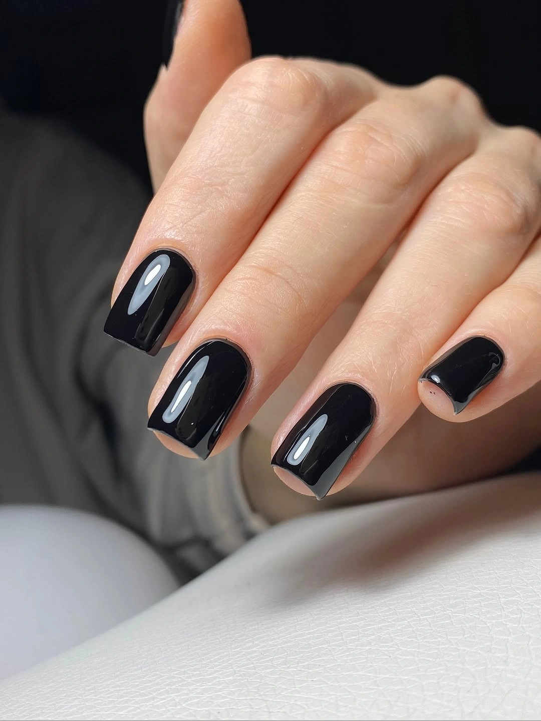
For a similar result, keep the length short enough that the dark color forms a neat block instead of stretching into a heavy column. A softly softened corner is more forgiving than a sharply filed square when the polish is this deep, while a glossy surface gives the black a changing highlight as the hand moves. The contrast is strongest with cream, gray, denim, or a simple gold accent nearby.
The tradeoff is visible upkeep: a small chip or uneven side edge will stand out against near-black. If you want the same mood with less maintenance pressure, preserve the compact outline and switch to a deep brown or wine tone. That keeps the visual weight grounded while making minor edge changes less stark than they would be on pure black.
Sheer Blush Almond With Quiet Length
This long almond manicure gains its presence from transparency and taper rather than decoration. The blush-pink base stays light and glossy, allowing the almond outline to lengthen the fingers without introducing a hard color boundary. The result is delicate, but not invisible: the narrow tip and continuous reflective surface give the neutral enough structure to hold attention.
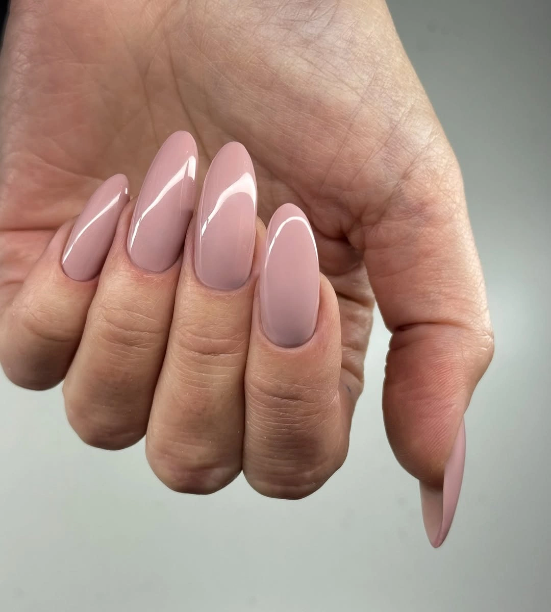
Choose this direction when you want a neutral that feels extended and graceful, and let the shape remain the main event. A medium almond would keep the same soft line with a little more practical balance, while a shorter oval could preserve the pale color without making the tip the first thing people notice. Keep surrounding accessories simple so the transparency does not compete with busy metal or print.
Length is the honest limitation. A long almond outline asks for more awareness during typing, fastening, or reaching into a bag than a short square does, even when the color itself is understated. If the silhouette is the part you love, reduce the length before changing the blush tone; that preserves the visual idea while making the manicure easier to live with day to day.
Bright Yellow Kept Compact And Glossy
The yellow is vivid enough to become the entire focal point, so the short rounded shape is a smart counterweight. There are no accents, gradients, or contrasting tips to dilute the color; every visible nail repeats the same saturated field and glossy surface. That repetition makes the manicure feel intentional, while the compact length prevents the brightness from becoming too visually expansive.
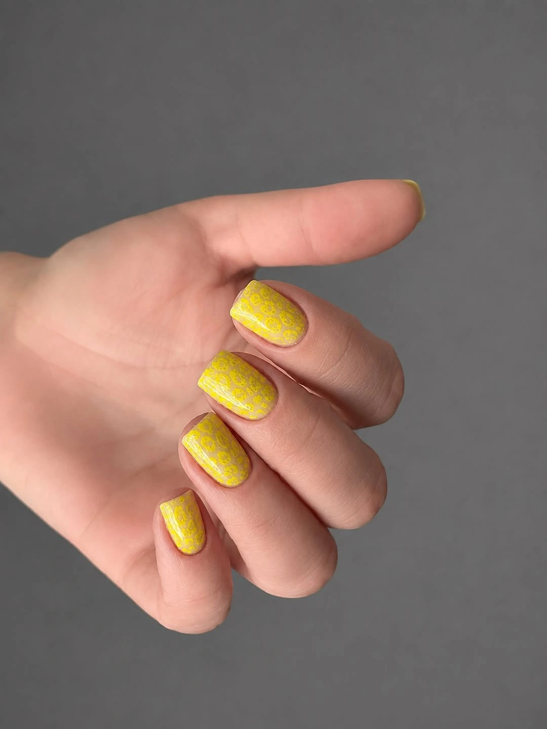
Use a small canvas when trying a strong yellow, especially if you usually wear muted fall colors. The rounded edge softens the brightness, and a simple finish lets the shade look clear rather than interrupted. Cream knitwear, denim, olive clothing, or quiet jewelry can support it without creating a second focal point. If the color feels too loud, keep it on two accent nails and use a warm nude elsewhere.
The practical limitation is not the color itself but the balance around it. Bright yellow can fight with equally bright clothing, and a saturated edge shows wear as soon as the polish pulls away from the tip. A shorter nail makes touch-ups easier and keeps the look cheerful rather than overworked, so resist adding extra art unless the base still has enough open space.
Ivory Square With Scattered Color Flecks
The pale ivory base leaves generous open space around tiny red, green, and darker flecks, which is why the mixed palette stays calm. The medium square shape supplies order, while the irregular marks prevent the manicure from feeling like a plain neutral. A small dot-like accent adds a focal point without changing the overall scale of the design.
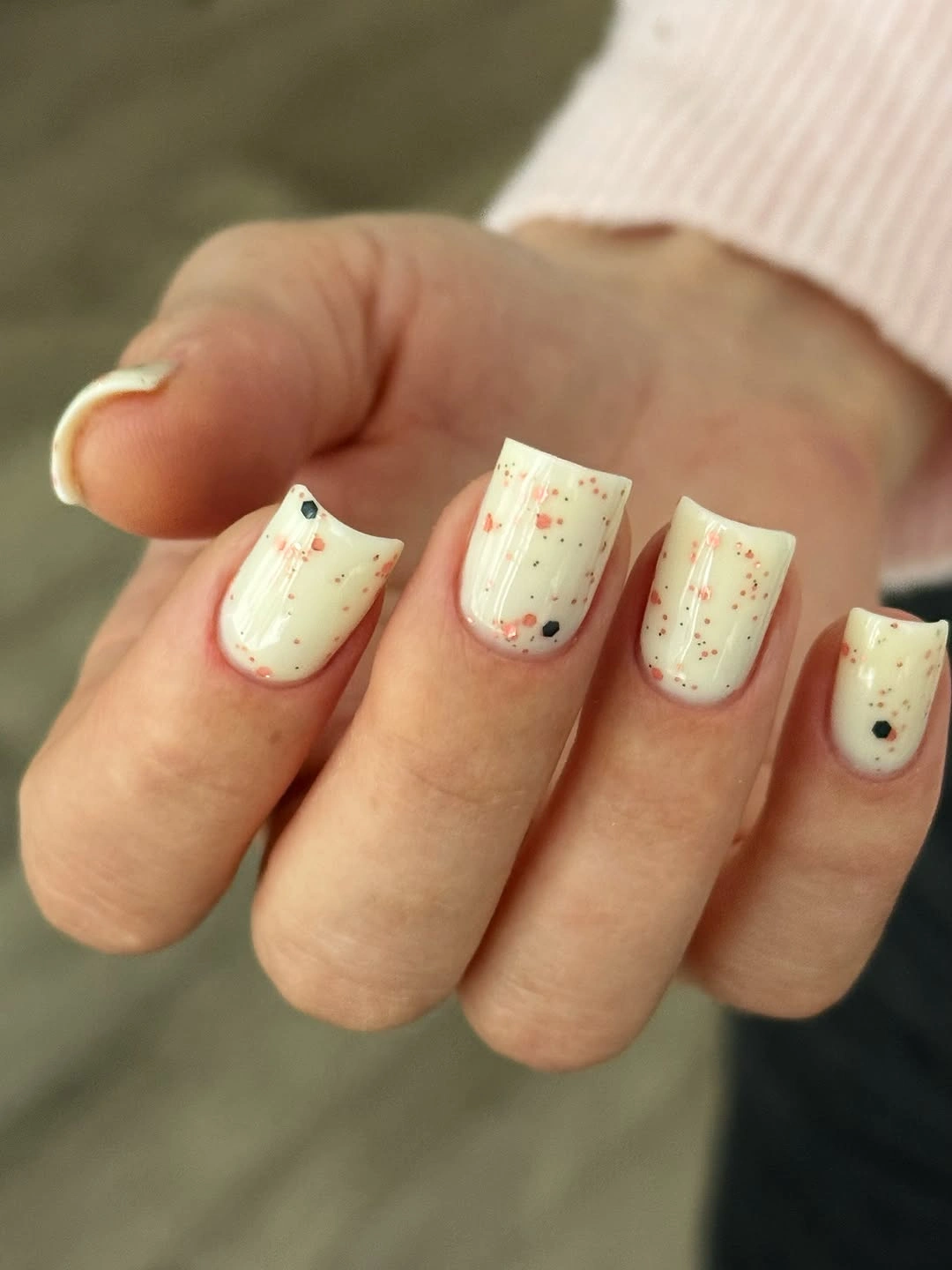
The useful decision is spacing. Let the ivory remain the largest visible area, then distribute the small marks unevenly so the set has rhythm instead of a repeated stamp. On a shorter square, fewer flecks will read more clearly; on a longer shape, the same palette can support a slightly wider scatter. Keep patterned clothing restrained because the nails already contain several small color notes.
This design is festive without needing dense coverage, but fine marks can lose definition if the nail becomes too short or if several colors are added on top of the existing mix. If you want a quieter version, choose one warm fleck and one cool fleck rather than repeating the whole palette. The ivory base should remain the relief that makes every small accent visible.
Cool Blue Tips On A Short White Base
The pale base and vivid blue edge create a crisp boundary that makes the short square shape look graphic. Blue is confined to the tips and small variations rather than spread over the full nail, so the manicure gets color without losing the calm center. The squared edge reinforces that clean horizontal line and gives the design a tidy, almost architectural rhythm.
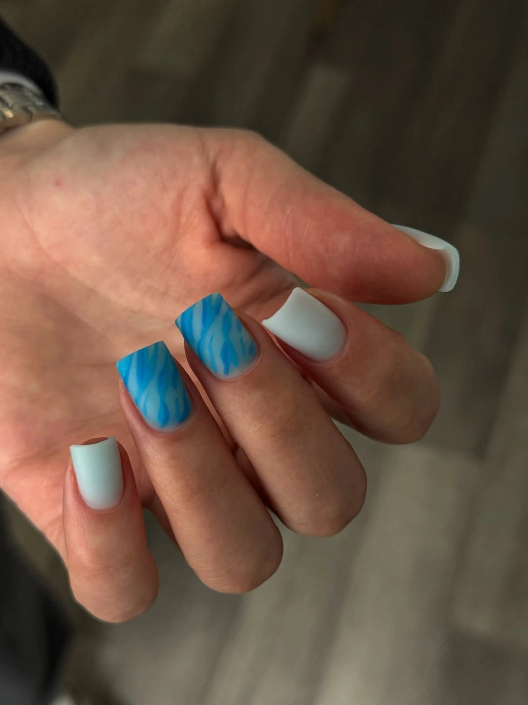
Keep the tip narrow when the nail is short; a wide blue band can take over the whole design and make the nail look shorter. A slim edge works with denim, gray, white, or silver accessories, while a pale base keeps the result lighter than a full blue coat. If you need more softness, curve the boundary slightly instead of adding another motif.
The honest upkeep issue is the crisp border. Growth and small chips show at the free edge sooner than they would on a blended neutral, so the design benefits from regular edge checks. For an easier version, use the blue only on two or three fingers and leave the remaining nails pale. The color relationship remains clear without asking every tip to stay perfect.
Black And White Print With Almond Movement
The black-and-white pattern fills the long almond surface, but the limited palette prevents it from becoming visually chaotic. Spots and dark areas vary from nail to nail, so the repeated print has movement instead of looking mechanically copied. The almond taper supplies a second rhythm: the pattern is busy, yet the outline keeps the hand moving toward a clear point.
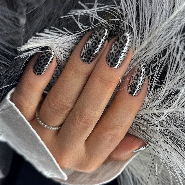
When an all-over motif is this dense, shape becomes the editing tool. A long almond gives the pattern enough room to breathe, while a shorter version should keep the print to one or two accent nails and leave the others pale. Pairing it with a solid black, cream, or denim outfit lets the repeated contrast stay legible without competing with another print.
The tradeoff is maintenance and visual commitment. A full pattern leaves less empty space for growth to hide, and the longer tip makes the statement harder to tone down after the appointment. If you want the same animal-inspired energy with more flexibility, preserve the black-and-white palette but move the motif to the tips or a single accent. The design will still read through contrast, not coverage.
Lavender Squares Framed By Open Hearts
Lavender supplies a quiet block of color, while thin white heart outlines add personality without covering the base. The hearts are open rather than filled, so the purple remains the dominant visual field and the short square shape keeps the repeated motif legible. That balance is what makes the design playful without turning it into a dense novelty manicure.
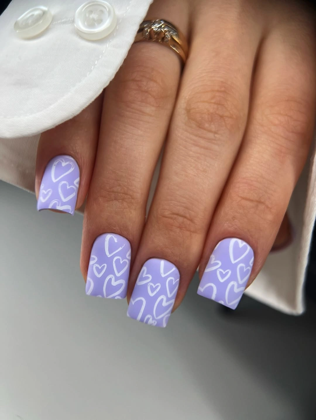
Keep the outlines airy and vary their placement slightly so they feel drawn across the set rather than stamped into identical boxes. Short squares give the motif enough room to read, but if the nails are very short, one heart per accent nail will be clearer than several tiny outlines. White, gray, denim, and soft pink clothing can echo the palette without adding another strong pattern.
The fine line is the limitation. Thin hearts need enough contrast and open space to remain recognizable, and a crowded version can lose the gentle quality that makes the lavender work. A practical edit is to keep the purple base on every nail and place the hearts on only two fingers. That preserves the idea while reducing the amount of linework that needs to stay crisp.
Milky Short Nails With Hot Pink Curves
The milky base is mostly open, with hot-pink curved marks placed near the side or tip to create an abstract petal-like rhythm. Because the accents are asymmetrical, the manicure avoids the stiffness of a repeated border, while the rounded short shape keeps the color close to the fingertip. The eye notices the pink first, then the empty space that lets each curve breathe.
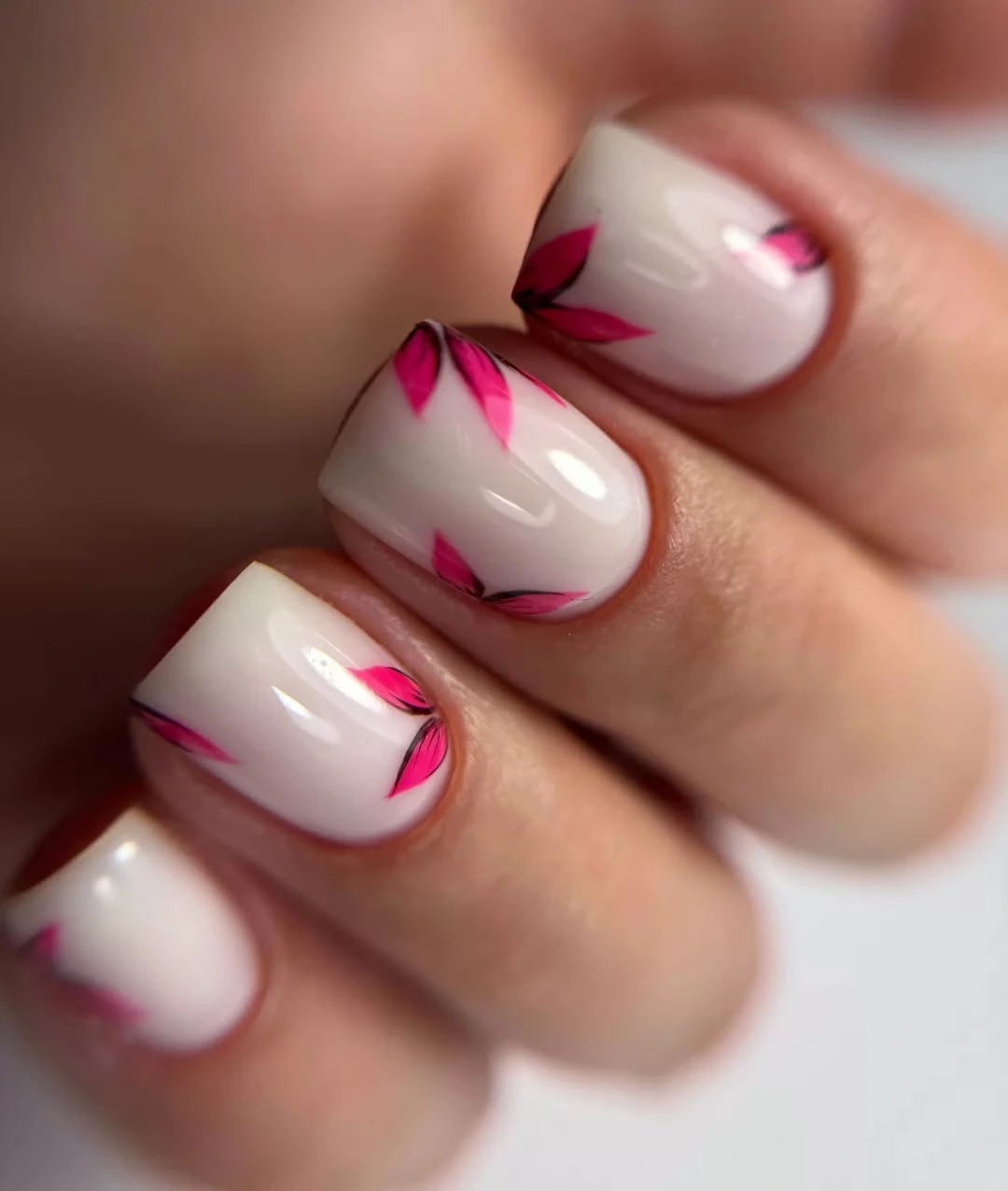
Use the curve as the recognizable element and leave the center of the nail calm. On a shorter nail, a single side stroke can carry the same movement more successfully than several small petals. The pale base pairs naturally with denim, gray, or pink clothing, and the bright accent is easy to repeat in a small accessory without making the whole look match too literally.
The design becomes less wearable when the pink marks spread across every open area, so restraint matters more than adding a second color. If you need a lower-maintenance version, keep the hot pink on two accent nails and use a glossy milky finish elsewhere. The contrast will still register, but the simpler nails create visual relief and make the curved detail feel more intentional.
Nude Almond Tips With Brown Print And One Flower
The nude base gives the long almond shape a clean center, while brown-and-black spotted tips add the fall contrast at the ends. A small white floral-looking accent introduces a softer interruption, so the set is not only a print repeated across every nail. Concentrating the pattern away from the cuticle keeps the design lighter than a full-coverage animal motif.
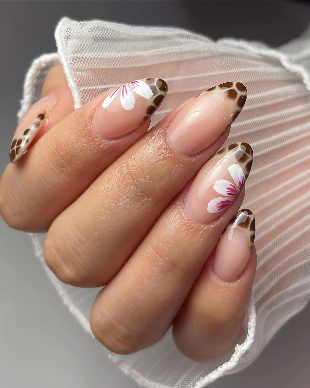
The most useful adaptation is to preserve the placement rather than the exact number of marks. On a shorter almond or oval, keep the brown pattern near the tip and reserve the white flower for one finger. The nude center will continue to lengthen the shape, while the warm brown stays easier to pair with cream, chocolate, olive, or denim than a full black print. For more ways to balance color and detail, compare the site’s fall manicure ideas with color and detail.
Long almond length still makes this a statement manicure, even though the base is light. The patterned edge may also need more careful upkeep because uneven growth changes the visual border. If you want a quieter version, use the spotted tip on two nails and a plain nude on the rest. The contrast survives through placement, and the set gains more breathing room.
Glossy Blush Almond With No Extra Motif
Here the almond outline is the design. The medium length is long enough to create a graceful taper, but the uniform blush-pink surface remains simple and glossy from cuticle to tip. Without a contrasting edge or decorative mark, the eye follows the continuous silhouette and the soft reflection, which makes the manicure feel polished through proportion rather than ornament.
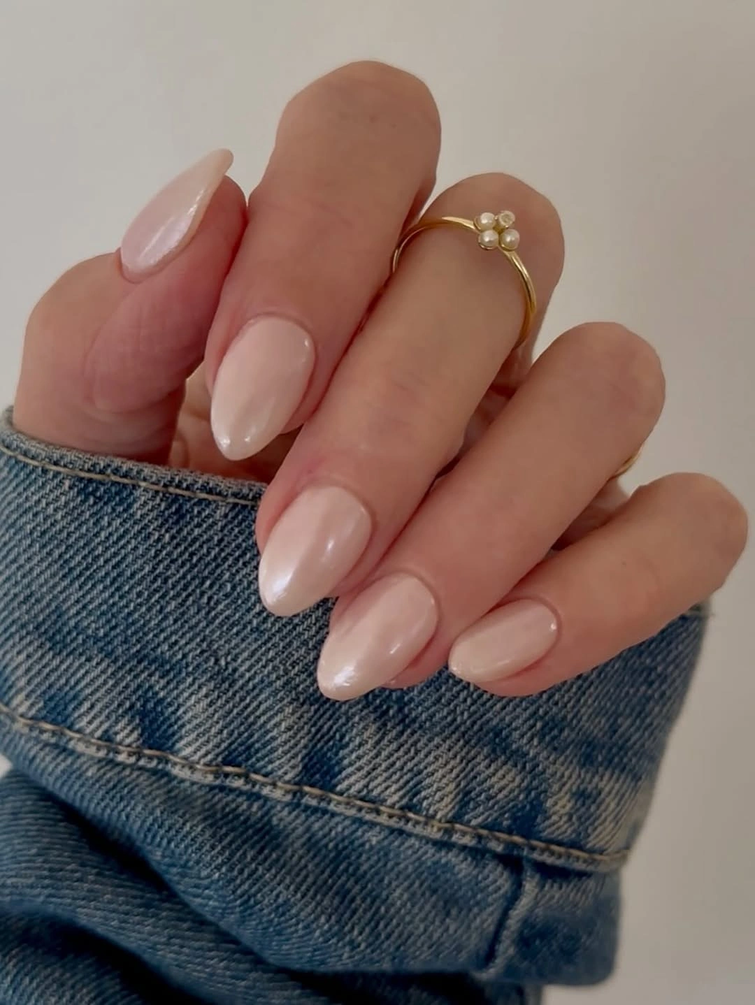
This is a good choice when you want a neutral that still looks styled. Keep the color close to a soft pink and let the medium almond do the elongating; adding a strong accent would change the calm visual hierarchy. Denim, gray knits, and warm brown accessories can frame the manicure without competing with its low-contrast surface.
The limitation is subtlety. If you prefer visible nail art, the plain base may feel too quiet, and the tapered shape can be less convenient than a short square. A controlled variation is one tiny reflective detail on a single nail, but stop there. The value of this set comes from the uninterrupted blush surface, so decoration should remain a small interruption rather than a new theme.
Glossy Olive Green In A Medium Square
Olive green gives this medium square manicure its fall character without relying on a motif. The color is solid, glossy, and deep enough to contrast with the pale pot and green plant nearby, yet it remains softer than black because of its muted earthy undertone. The medium square is important: it contains the color and keeps the hand from looking overwhelmed by one dark field.
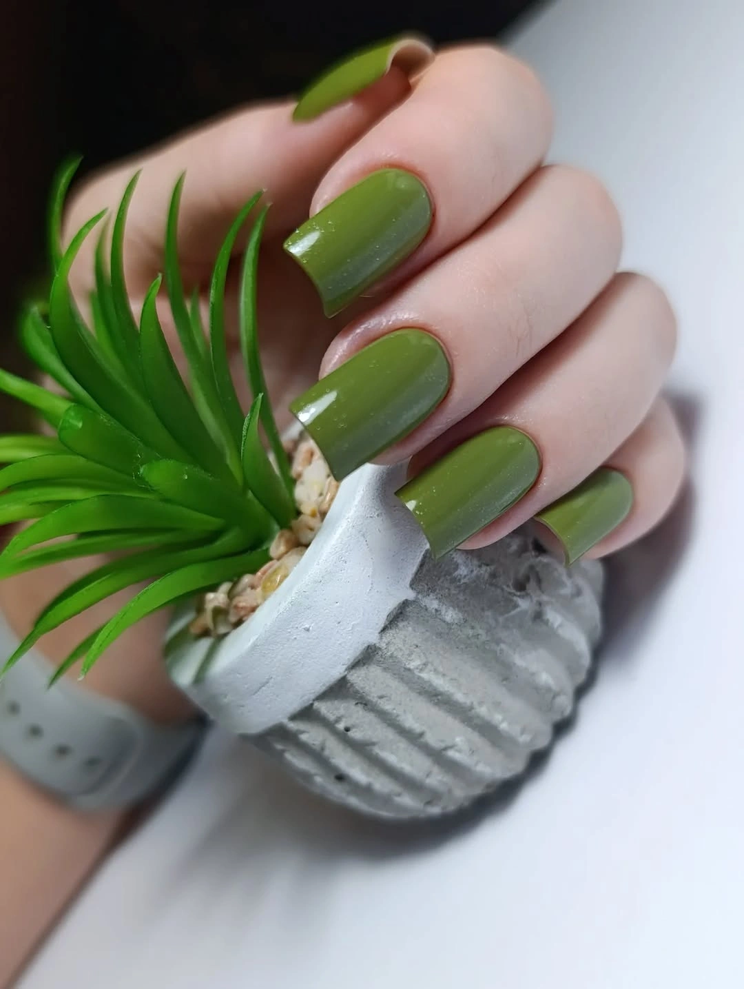
Choose olive when you want a grounded alternative to brown, burgundy, or black. The clean surface makes the undertone easy to notice, so the rest of the styling can stay simple: cream, denim, gray, and muted gold all support it. If a full olive set feels too strong, keep the same color on two or three nails and use a pale neutral on the remaining fingers.
A solid dark mid-tone shows chips clearly, but it is easier to maintain visually than a fine pattern because there are no lines to keep aligned. The realistic tradeoff is that olive can look dull in low light if the surface loses its reflection. Preserve the glossy finish and avoid adding several competing accents; the color already supplies the seasonal information.
Pale Almond Base With Tiny Graphic Accents
The long almond canvas is pale and mostly open, with small dark dots, fine marks, and reflective points placed near the center of selected nails. Those accents are not loud, but they prevent the neutral from disappearing. The design works through scale: the details are tiny compared with the full nail, and that difference makes the elongated shape feel intentional rather than blank.
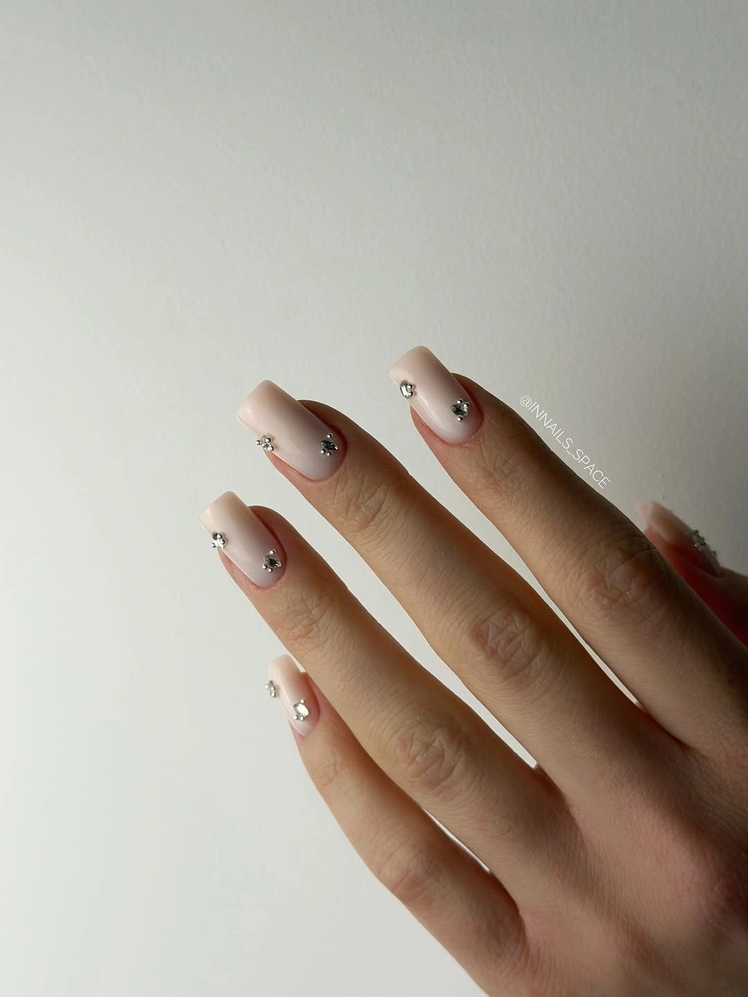
Keep the marks spaced and let the nude base remain the larger visual area. A shorter almond can use one dot or line per accent nail, while a longer version can support a small cluster if the marks stay separated. This palette works with office clothing, denim, and simple jewelry because the accents provide structure without introducing a strong seasonal color.
The main limitation is resolution on a small nail. If too many micro accents are added, they can blur into a dark patch and lose the light quality that makes the manicure appealing. A useful edit is to choose either the dark marks or the reflective points for a shorter set, not both. The result keeps the same idea through controlled contrast and easier maintenance.
Pastel Almonds With Small Coral And Green Notes
The medium almond shape holds several soft colors at once: pale pastel areas are joined by small coral and green details, with tiny reflective points on selected fingers. The colors do not appear as one large block, so the hand has a varied rhythm while the repeated almond outline keeps it coherent. The design feels custom because the accents are distributed rather than copied identically.
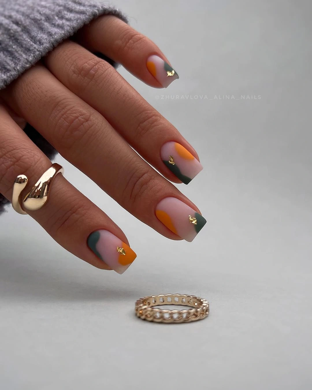
Choose one dominant base color before adding the smaller notes. That keeps a mixed palette from turning into visual noise, especially on a medium nail where every accent is easy to see. A shorter version could keep the coral on one nail and green on another, while the rest stay pale. Neutral clothing lets the color relationships remain the focal point.
The honest tradeoff is coordination. Several colors give the manicure more personality, but they also make it harder to match every outfit or accessory. If you want the same layered feeling with less commitment, reduce the palette to two accent colors and repeat one of them on a single detail. The almond outline and light base will still provide continuity between the fingers.
Sparse Floral Details On A Long Pale Shape
This second pale floral direction is close in spirit to the earlier delicate set, but the useful focus here is spacing. The long tapered nails leave broad quiet areas around small white floral-looking marks and reflective points, while the soft gray setting makes the pale surface easy to read. The decoration supports the shape instead of competing with it, so the result stays airy.
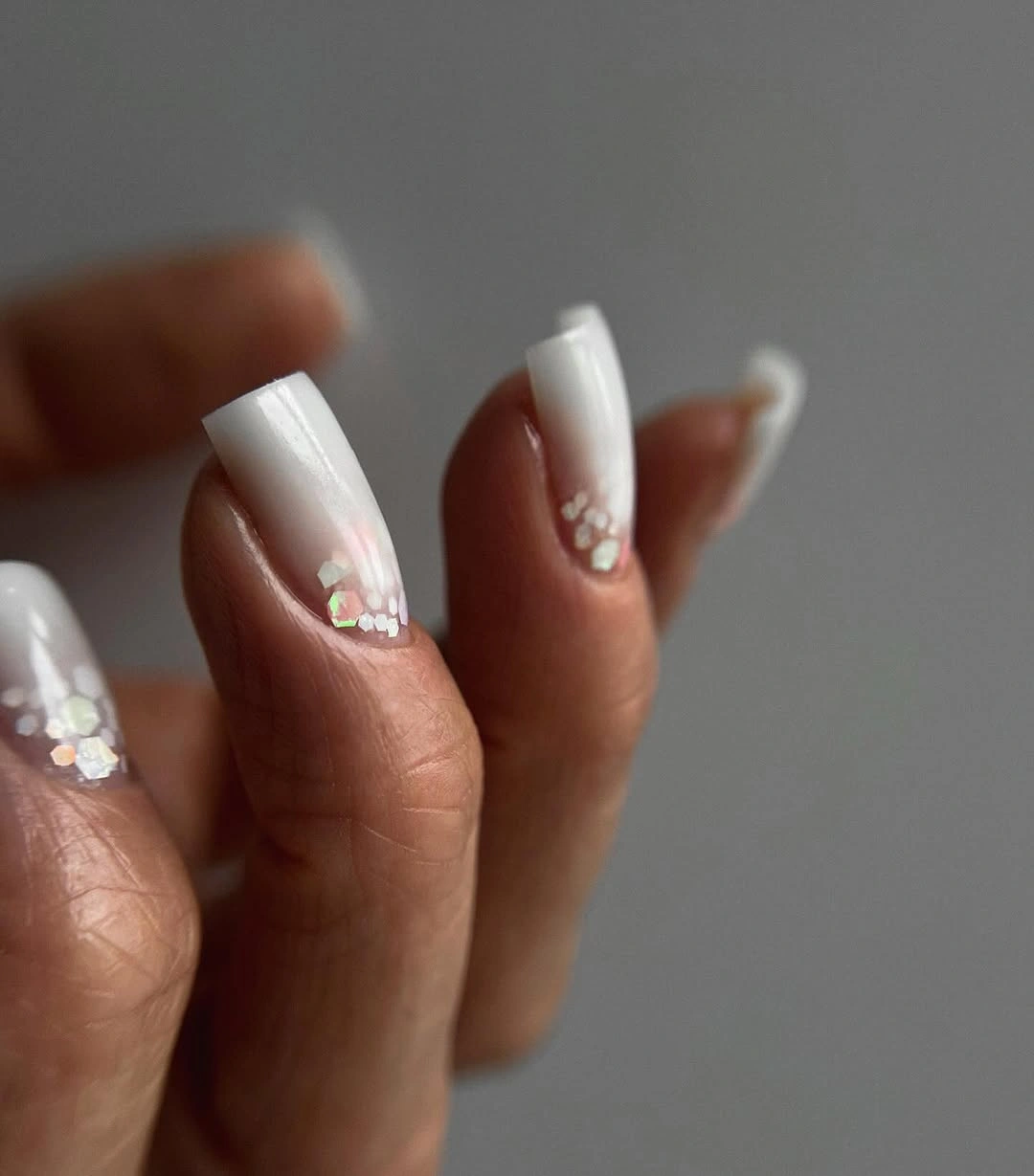
Think of the accents as punctuation rather than a repeated pattern. One small cluster near the center or tip can guide the eye, while untouched sections give the manicure relief. If the length is reduced, keep the same spacing and remove some marks instead of shrinking everything until it becomes crowded. The light palette works well with gray knits, cream, and understated jewelry.
The visual similarity to another floral sparkle set is a reason to make the maintenance choice explicit. A plain pale nail is easier to repair than one carrying several small details, and the longer the shape, the more likely the tip will catch attention. Keep the floral idea on two or three fingers if daily wear matters. The remaining neutral nails will make the accents feel more deliberate.
Reflective Silver Curves On Pointed Length
Silver lines and layered curved details create the movement here, not a broad color field. The long pointed nails appear pale or translucent underneath, while reflective elements catch the light in different directions and make the surface feel dimensional. Rings and denim sit in the setting, but the manicure remains central because the metallic rhythm follows each fingertip.
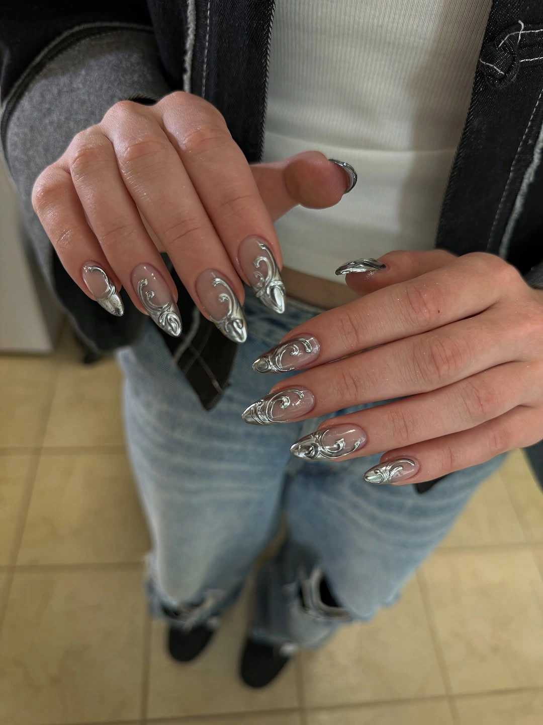
Keep the silver concentrated on a few curves when adapting the look. Long pointed length gives the lines space to travel, but a shorter almond can preserve the same movement with one reflective stroke on each accent nail. Let the rest of the styling stay matte or simple so the highlights remain distinct instead of competing with additional sparkle.
This is the most demanding silhouette in the article, and the visual impact comes partly from that length. Pointed tips require more care in daily tasks, while layered reflective details can make a small repair obvious. If practicality matters, shorten the shape first and reduce the number of curves second. The core idea is directional shine, not maximum surface coverage.
Deep Burgundy On A Short Square
The short square keeps the deep burgundy color crisp and contained. There is no motif to interrupt the glossy surface, so the eye reads the wine-like red as a single block with a strong reflective edge. That simplicity gives the shade room to feel seasonal without becoming formal or overly dramatic, and the compact shape keeps the hand practical.
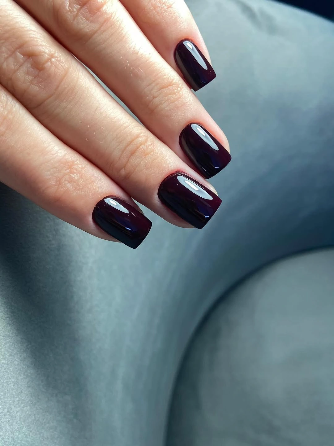
Use this proportion when you want a dark red that works through color alone. A short square is enough to show the undertone, while cream, charcoal, denim, and warm metal accessories can support it without creating another focal point. If you prefer softer contrast, choose a medium rounded square rather than adding glitter or art to the base. Readers comparing length can also use these short fall nails as a practical reference.
The dark surface is honest about wear: small chips and uneven corners appear quickly, especially near the free edge. The benefit is that the design is easy to refresh because there are no lines or placements to recreate. Keep the length compact, preserve the reflection, and let the burgundy remain the strongest note instead of adding several competing details.
Pale Blue White With One Concentrated Accent
The pale blue-white base is intentionally quiet, but one visible finger carries a small blue floral or beaded-looking detail that gives the set a focal point. Medium square nails keep the color relationship orderly, and the cool base lets the accent feel clear without turning the manicure into a full blue design. The result depends on restraint more than on saturation.
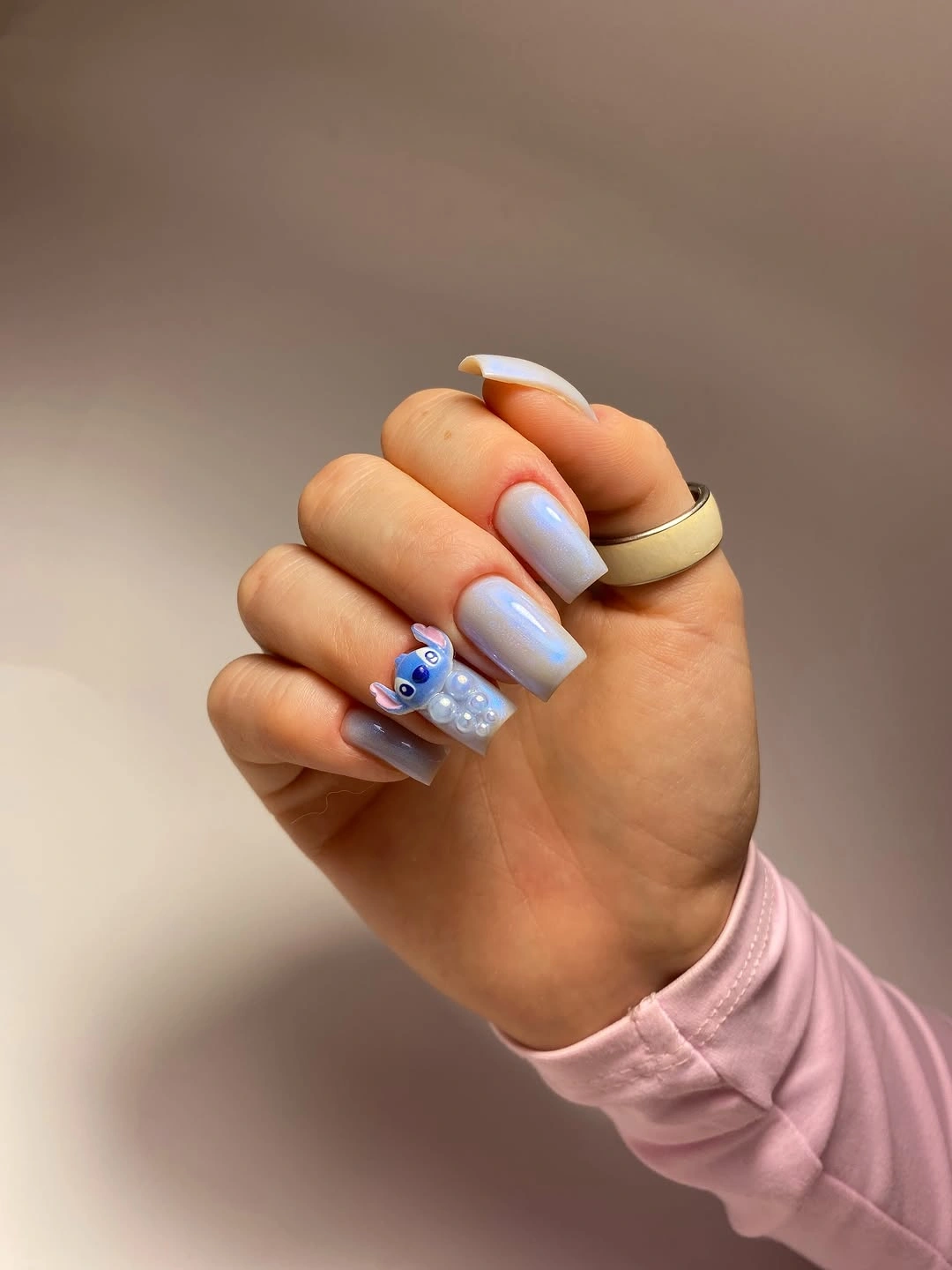
Use the accent as a controlled color note. Keep the other nails pale and let the blue detail repeat only once or twice, especially if the shape is shortened. Silver jewelry, white clothing, and cool gray layers can echo the palette, while warmer browns will create a stronger contrast if you want the blue to stand out more visibly.
The light base can feel less seasonal than olive or burgundy, which is both its advantage and its limitation. It moves easily between seasons but may not satisfy someone looking for a strongly autumnal manicure. Add warmth through one muted accessory or a tiny neutral detail, not a second bright color. The clean pale field should remain the visual relief around the accent.
Vivid Pink Purple On A Pointed Silhouette
The saturated pink-purple color is amplified by long pointed nails, so the shape and hue work as one statement. Glossy highlights run along the length and make the color appear especially vivid against the outdoor green background. There is no separate motif; the manicure relies on the tension between a sharp outline and an energetic, highly concentrated shade.
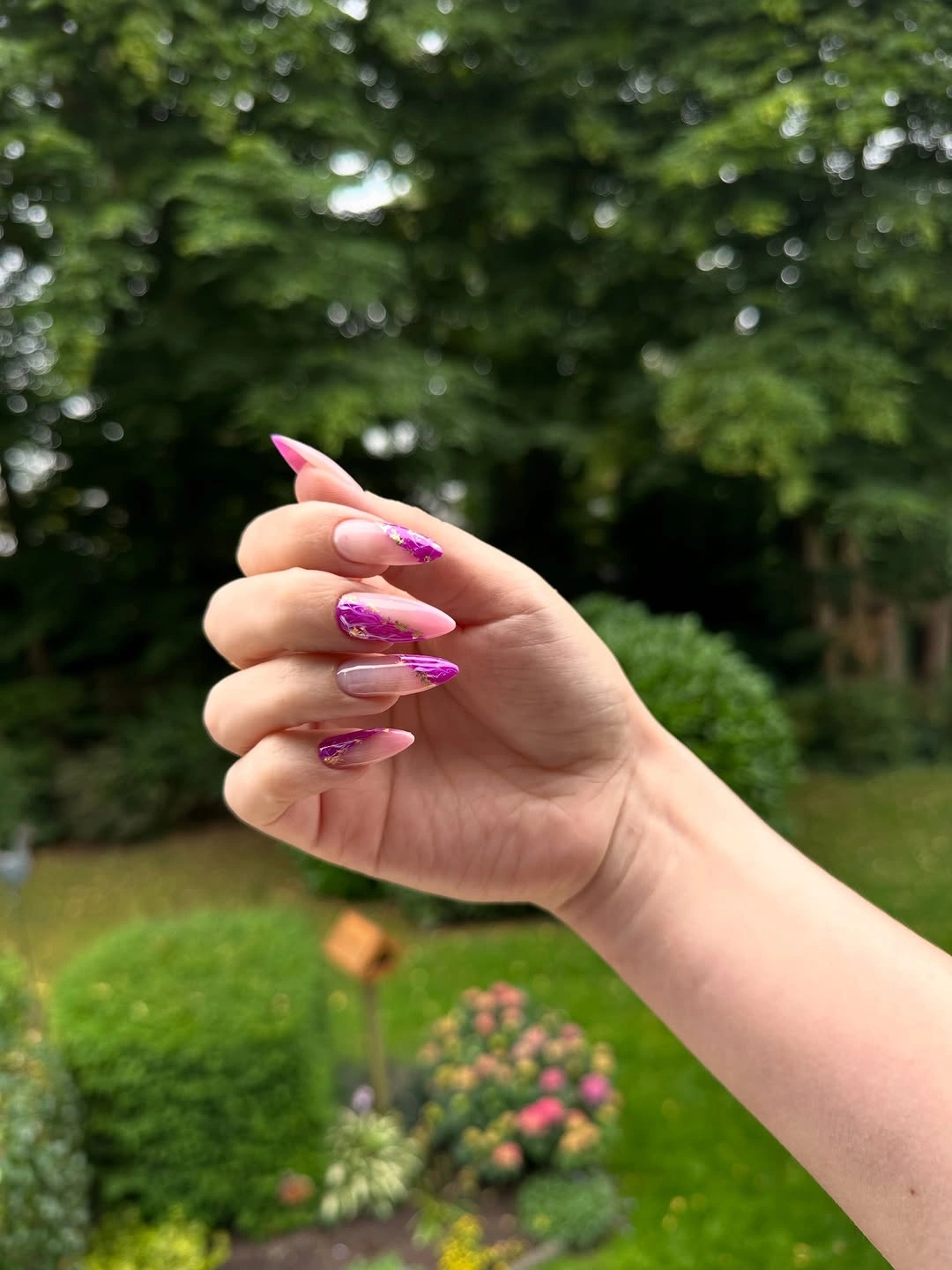
If you like the color but not the maintenance of a pointed tip, move it to a shorter almond or rounded shape before changing the shade. That edit reduces the visual intensity without making the manicure dull. Neutral clothing, denim, and simple silver jewelry give the color space, while another vivid accessory could pull attention away from the hand. If undertone is a concern, compare the broader guide to fall nail designs for every skin tone before choosing the final shade.
The tradeoff is commitment. A long pointed outline is more noticeable in daily movement, and a bright color makes the tips impossible to ignore when they wear. A practical version uses the same pink-purple on a medium shape or keeps the pointed length only on a few accent nails. The mood comes from saturation and shine, not from making every fingertip as long as possible.
Milky Squares With Electric Blue Edges
The milky base stays broad and calm while a narrow electric-blue line marks the free edge. On the short square shape, that boundary reads immediately because the corners and tip line share the same crisp geometry. The design is more minimal than a full blue manicure but more energetic than a plain white one, which makes the proportion especially useful.
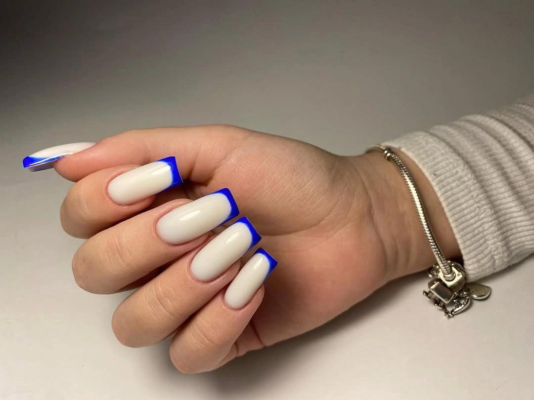
Keep the blue edge narrow enough that the milky center remains the dominant area. That allows the design to work on very short nails and with simple office clothing, while a slightly curved tip can soften the graphic effect. If you want a less uniform set, use the blue on two fingers and leave the remaining nails milky rather than introducing a third color.
The crisp boundary needs regular attention because growth changes the ratio between white and blue. The positive side is easy editing: if a tip feels too strong, make the blue thinner instead of removing the whole idea. Preserve the contrast, keep the surface smooth, and avoid extra art that would compete with the clean edge doing most of the visual work.
Milky Pink French With Fine Iridescent Light
The familiar white French edge is softened by a fine iridescent shimmer that flashes across the pale pink base. The medium square shape gives the classic tip a firm frame, while the small multicolor reflections add movement without becoming chunky glitter. Because the shimmer stays fine, the manicure remains light and orderly rather than turning into a separate sparkle theme.
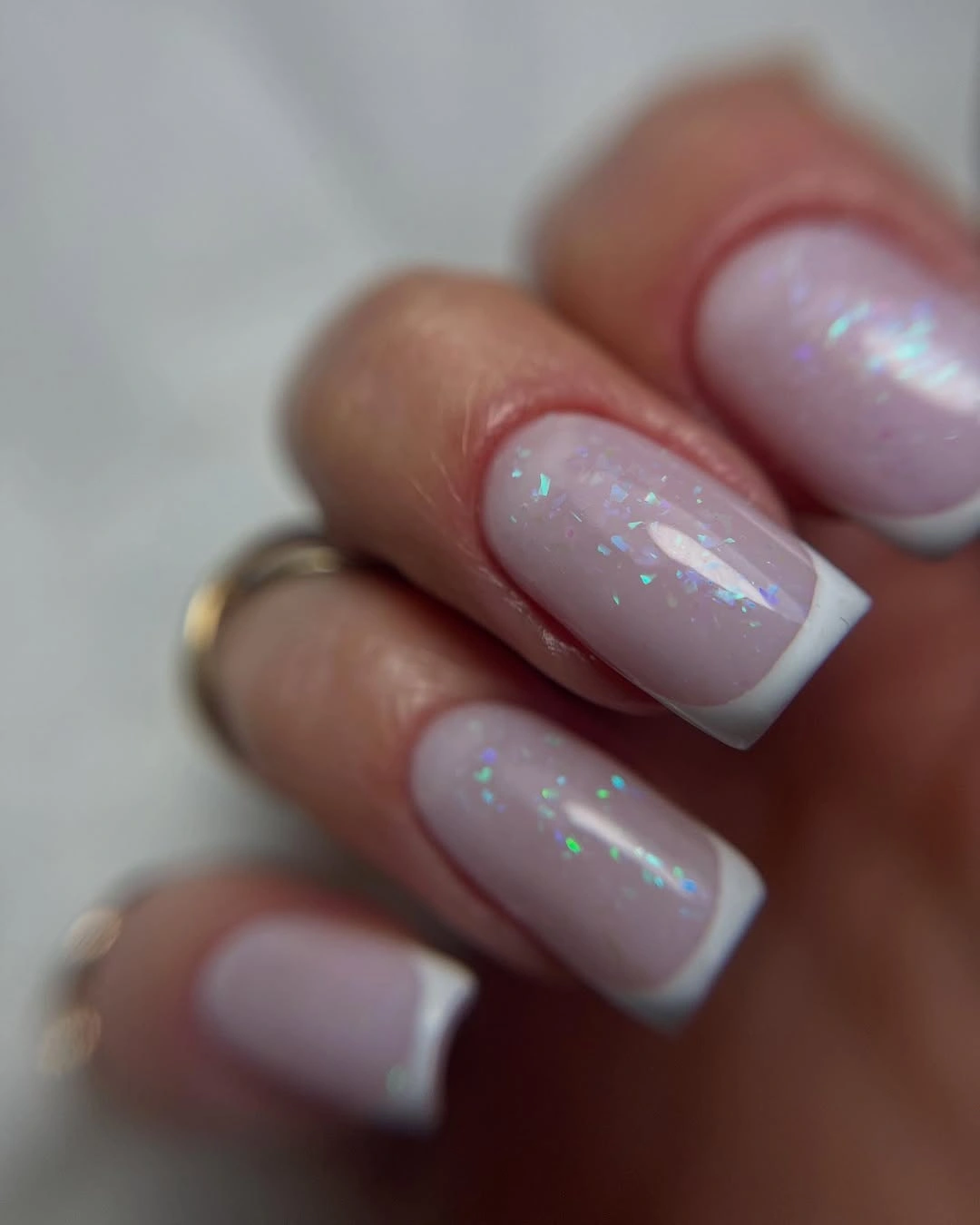
Let the French line provide the structure and use the shimmer as the secondary layer. This works well when you want a dressier neutral for fall events, but the pale base also pairs with gray knits, cream, and soft pink during the day. On shorter nails, keep the edge thin and the shimmer even so neither element crowds the small surface.
The light palette shows edge wear more quickly than a dark solid color, and a fine shimmer can look uneven if it collects in one area. A lower-maintenance version keeps the shimmer on one accent nail or uses a plain milky base on the thumbs. The design should still read as French first, with the reflective veil adding atmosphere rather than taking over the manicure.
All-Over Purple Glitter On Medium Squares
The purple color and fine glitter are distributed evenly across the medium square nails, so texture becomes the defining detail. Instead of isolated sparkles, the entire surface catches light as one field, creating a richer effect than plain purple while keeping the shape simple. The uniform coverage gives the set a confident finish without needing a motif or contrasting accent.
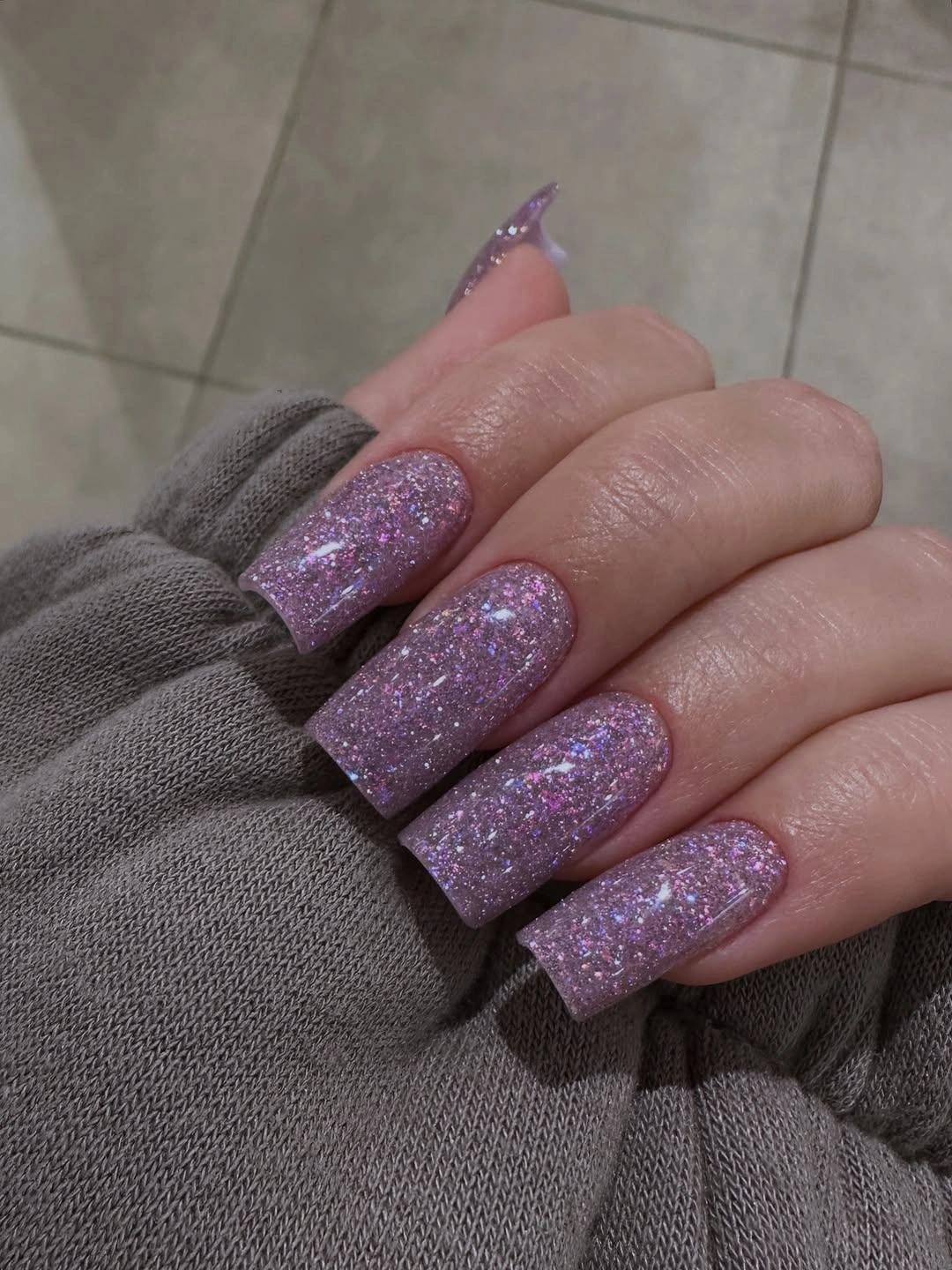
Use a medium square to contain a full glitter finish. The shape gives the texture enough area to show, but it keeps the manicure from becoming visually too long or ornate. Keep clothing and jewelry quieter if you want the purple to be the accessory; cream, gray, black, and soft brown all give the glitter a clean background. For a wider shape-and-detail comparison, see these fall nail ideas from soft to statement.
The honest limitation is commitment to shine. Fine glitter still catches attention in every light, and a repair may be more visible if the surrounding sparkle does not match exactly. For a calmer version, keep the glitter on two or three nails and use a glossy purple or pale neutral on the rest. The surface texture remains the idea, but the hand gains more visual breathing room.