
Fall Gel Nails Ideas 2026: Bright Color and Easy Contrast
One bright red, pale pink, or mint detail can change the whole direction of fall gel nails, and the most useful ideas usually have a clear color relationship underneath the excitement. A solid red can rely on shape, a black-and-white print can use one pink anchor, and a creamy yellow set can stay calm with one high-contrast accent. The goal is to see how each color choice is organized.
A quick look across these references reveals different strategies rather than one march from light to dark. Some use a single shade with a strong finish, while others place color at the edge, on one accent nail, or inside a loose pattern. Keep the part that makes the design coherent, then adjust length, undertone, or detail density so the finished manicure still feels natural to wear.
Solid Red Lets A Stiletto Do The Talking
Vivid red fills this very long stiletto manicure from base to sharp point. There is no second shade or visible artwork, so the color and the extreme taper share the entire spotlight. Pale fabric around the hand makes the red look even stronger, while the clean surface prevents the length from competing with a busy print or a cluster of small details.
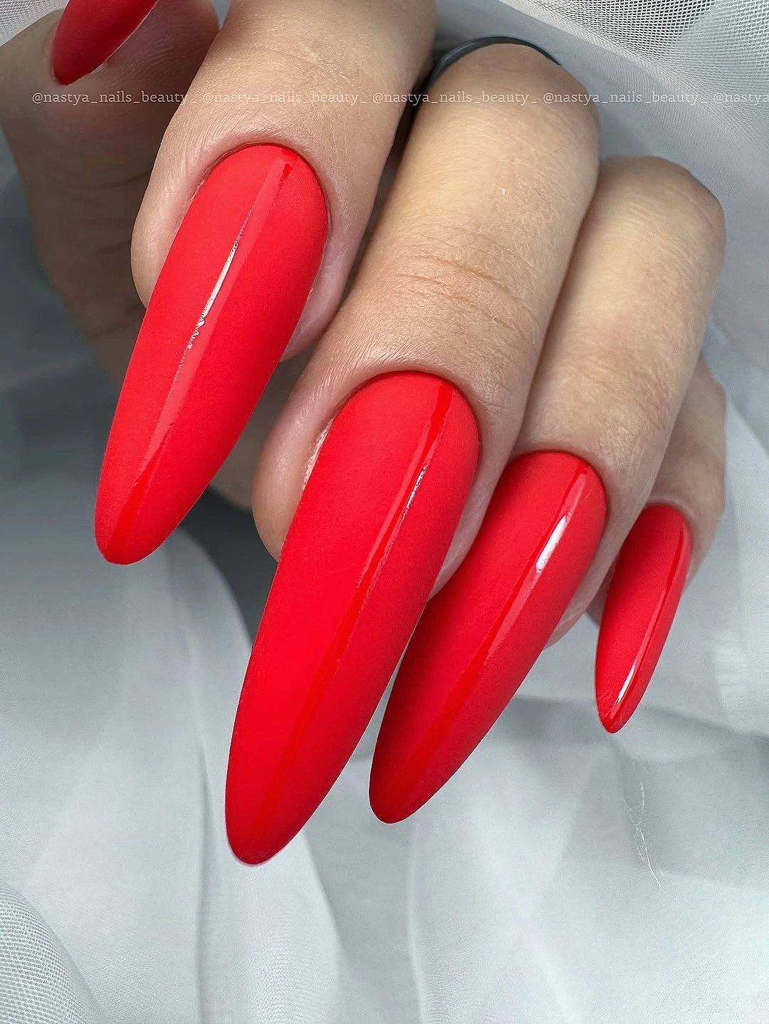
The design feels organized because the red repeats without interruption. A graphic accent would add another focal point, but the saturated surface already creates a clear line toward every tip. That simplicity makes the silhouette easier to study: the manicure is about how far the color extends and how the sharp points change the hand’s proportion.
Keep the red on a medium almond if the full length is too demanding, or use two stiletto accents with a shorter red companion set. A darker cherry or brick red would bring the same energy into a more grounded fall palette. The main tradeoff remains practical rather than decorative, since the extreme tip is the feature most likely to affect daily movement.
Black-White Patches Find A Pink Focus
Irregular black patches sit over white on several long square nails, while one glossy nail appears bright hot pink. The monochrome pattern provides movement, but the pink accent is the first color the eye notices. White fabric around the hand reinforces the pale part of the print, making the single vivid nail feel like a planned color moment instead of an unrelated interruption.
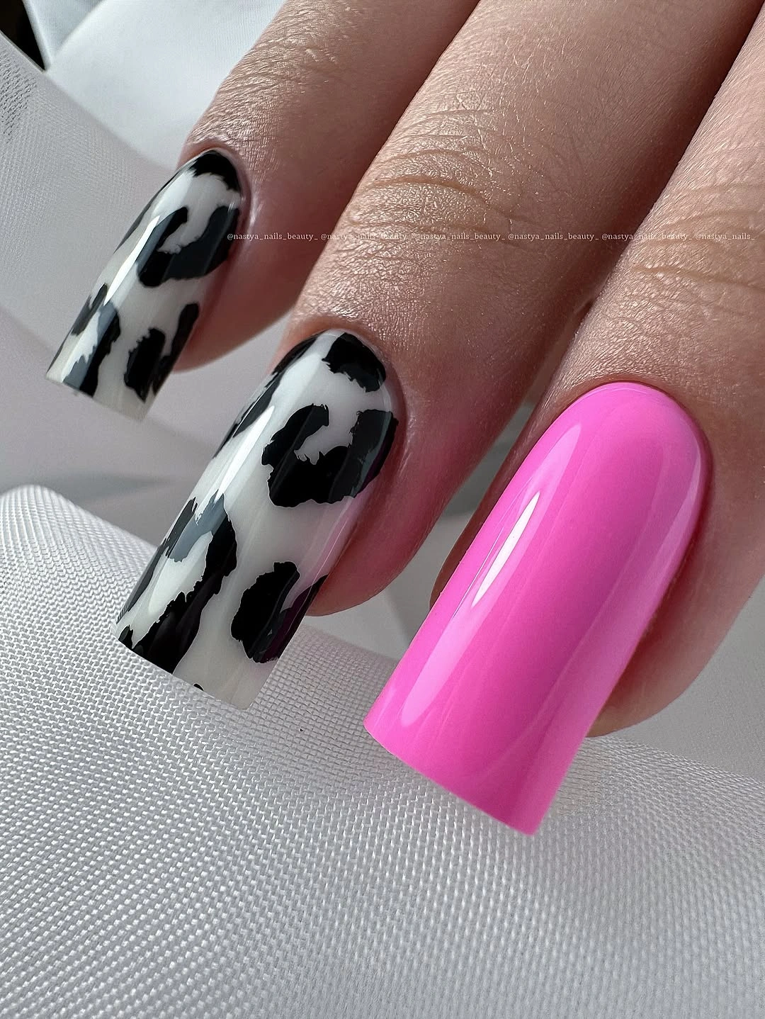
Color organization keeps a lively print readable. Black supplies the strongest outline, white opens the pattern, and pink becomes the warm focal point because it appears only once. The long square shape gives the irregular patches enough room to breathe, but the accent nail prevents the set from becoming a continuous field of black and white.
Use the print on two nails and keep the others pink, white, or sheer if a shorter version is needed. For a deeper seasonal shift, replace hot pink with berry or red while keeping the patch contrast. Do not worry about naming the exact print; the useful structure is uneven monochrome marks supported by one saturated anchor and enough open base to separate them.
Milky White Lets Mint Swirls Stay Airy
Long pale nails begin with a milky white base, then add soft gray-green wisps and small mint marks. The pattern is uneven and translucent-looking, so the green moves through the surface rather than forming a hard repeated grid. White textile around the hand keeps the palette light and gives the delicate color changes room to show.
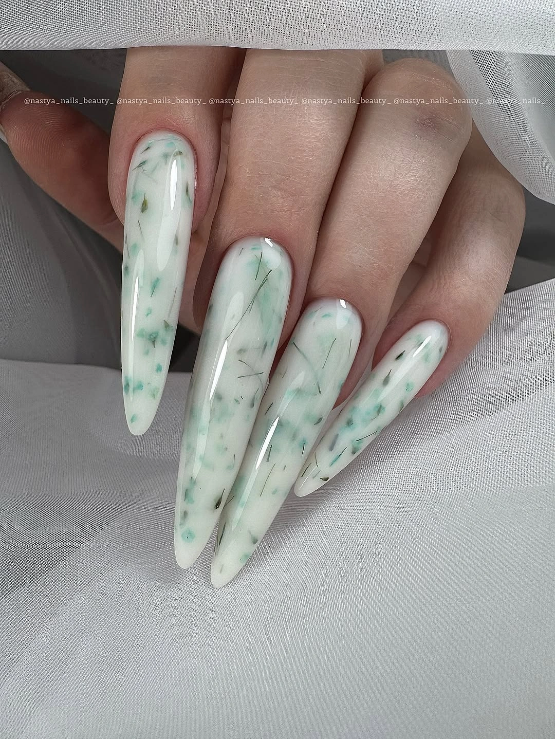
The key color relationship is low contrast. Mint supplies enough change to make each nail feel individual, while the milky base keeps the set calm and connected. That balance is more playful than plain white but less forceful than a dark print, which makes the design easy to shift toward sage, gray-green, or a warmer cream without losing its airy character.
On a shorter shape, keep the wisps on one or two accent nails and leave the companions milky. A few larger marks will read more clearly than many tiny dots, especially when the tip is compact. The exact technique is not visible, so adapt the color movement and open spacing rather than trying to reproduce a specific marble or gel process.
Long Red Squares Make Familiar Color Graphic
Bright red returns here in a long square shape, but the straight edge changes its personality. The surface is smooth and glossy, the color is solid, and strong highlights follow the wide tips. A pale background leaves the red fully exposed, so the crisp square boundary becomes the extra design element that turns a familiar shade into a sharper visual block.
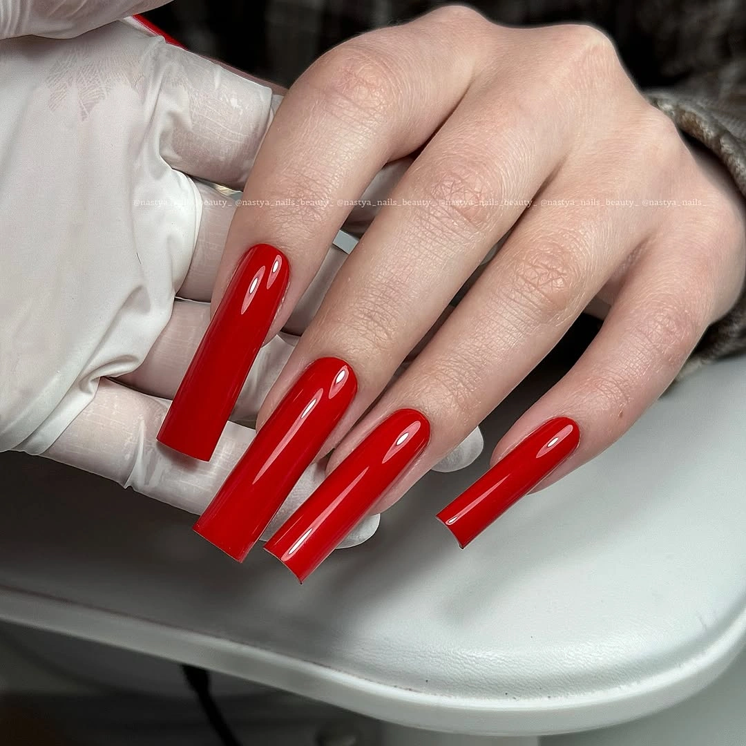
Shape organizes the brightness. Without artwork, the eye reads the red as one continuous field, then notices how the straight tips make the hand look more graphic than the rounded version later in the collection. That comparison shows why a color can feel new even when the palette has not changed: the edge changes where the visual weight sits.
Round the corners into a squoval if the square feels too rigid, or switch the red to deep tomato or brick. A shorter version will keep the saturated impact while making the tips easier to use around clothing and tools. Since the surface is plain, the adaptation can stay simple; changing length or undertone is enough to move the idea into a different season.
Soft Pink Keeps The Short Shape Open
Short rounded-square nails in pale pink offer a quiet pause after the strong reds and print. The color is even, the surface looks glossy, and no artwork competes with the compact outline. A white background keeps the set light, allowing the soft pink to read as a clean neutral rather than as a bright statement or a decorative centerpiece.
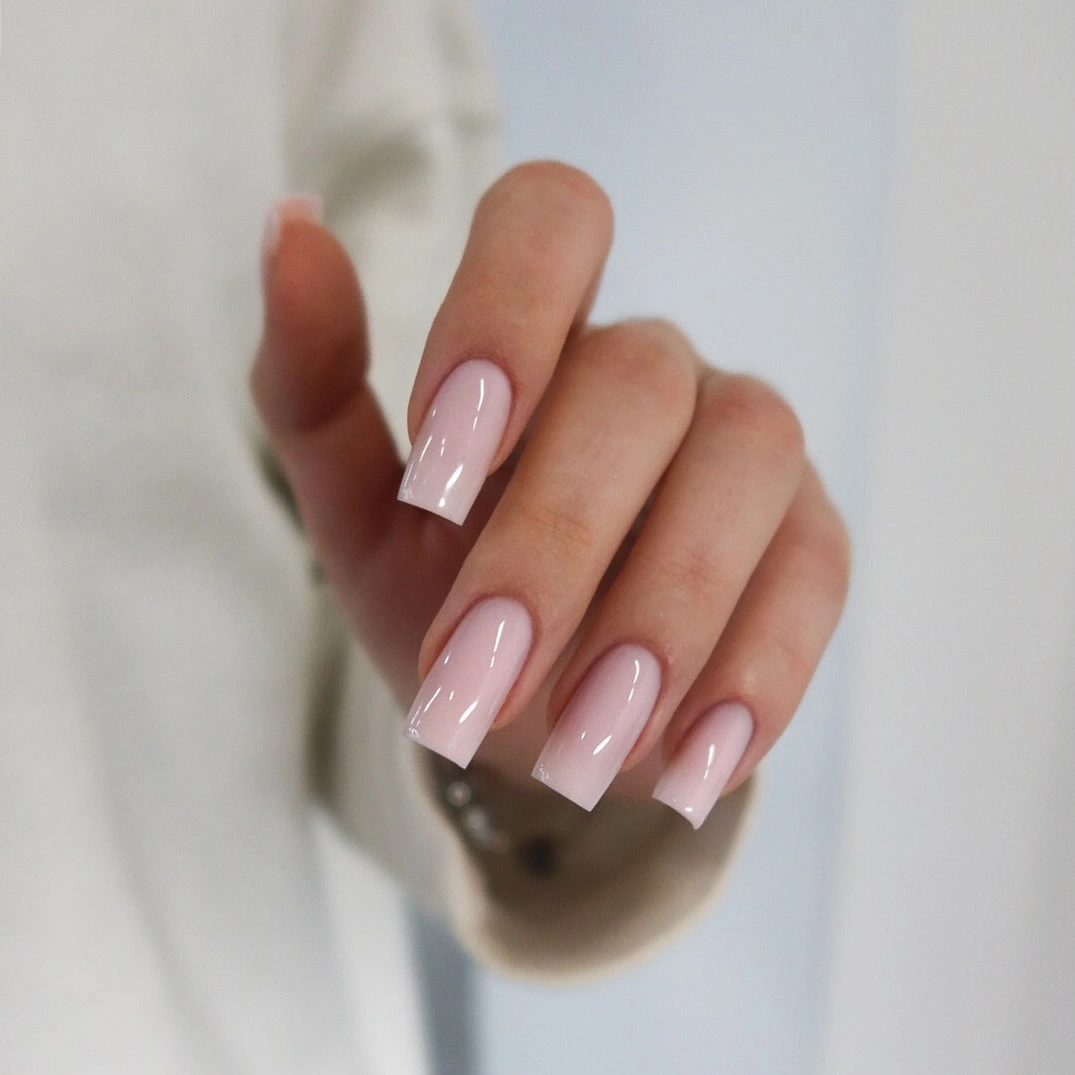
The low-contrast palette is useful because it leaves space for clothing, rings, or another color elsewhere in the look. The rounded corners keep the pale shade from appearing too formal, while the even length makes the manicure feel tidy without needing a second tone. Sometimes the fun option is the quiet base that lets the next color stand out.
Use blush, sheer beige, or a warmer pink if the set needs more fall warmth, and keep the short shape for the same easy balance. Pale glossy surfaces can show edge wear or staining, but there is no artwork to repair or align. A clean border and a consistent curve will matter more than adding decoration to a design that succeeds through openness.
Chocolate Brown Uses Curve To Soften Depth
Medium-long almond nails carry a deep chocolate brown from base to tip. The color is solid and glossy, while the curved shape prevents the dark neutral from forming a heavy square block. Gray clothing around the hand keeps the palette muted and lets the brown read as a rich fall shade without relying on glitter, print, or a contrasting accent nail.
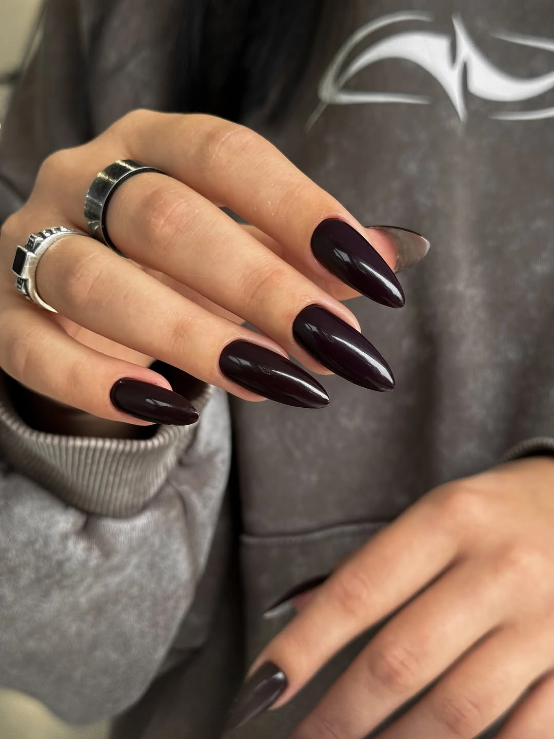
The shape and undertone support one another. Brown is softer than black, and almond tips continue that softness by tapering the color toward a rounded point. The result has enough depth for autumn styling but remains adaptable to cream, gray, or denim. A plain surface also gives the viewer a clear sense of how the shade behaves under light.
Espresso or warm chestnut can shift the color without changing the structure, while a shorter almond will make it easier for everyday wear. Keep the gloss if the goal is a sleek look, or use a satin surface to reduce the intensity. The medium-long length is the main tradeoff, since it adds polish but still asks for care around ordinary tasks.
Nude Space Balances Black And Pattern
This medium coffin design combines a pale nude base, black French tips, and selected accents with tan-and-black irregular patches. A few small reflective details appear near the decorated nails, but the nude space remains visible and keeps the composition from becoming dense. A burgundy garment around the hand adds fall warmth without competing with the black edge.
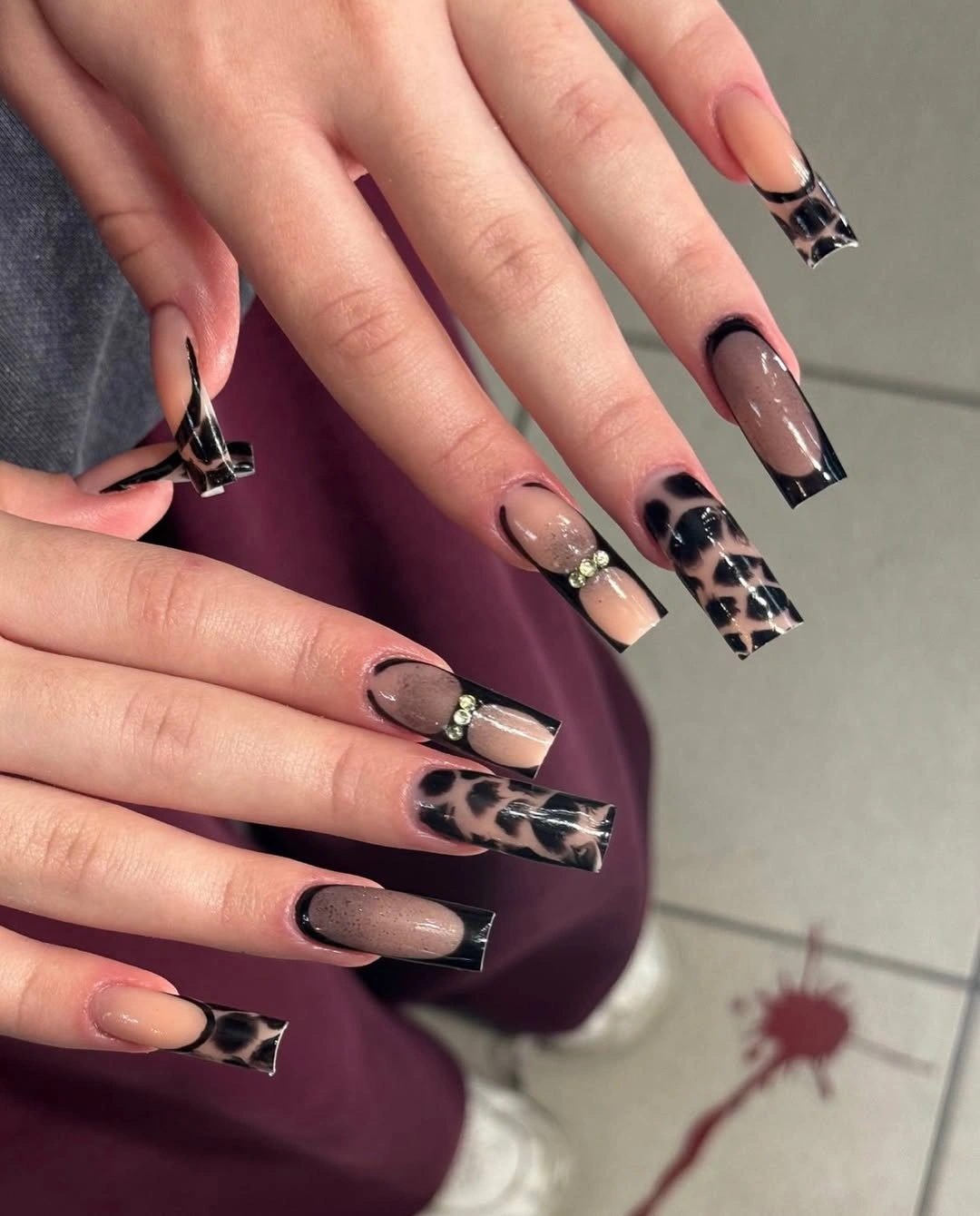
The color story works because the neutral base separates the dark tips from the patterned accents. Black gives the manicure structure, tan brings warmth, and the open nude areas keep the eye moving instead of stopping at one packed surface. The result feels playful through contrast and variation, yet the repeated tip color keeps the set coordinated.
Use one patterned accent and plain black tips if the full mix feels busy, or shorten the coffin into a rounded square. A deeper brown can replace tan for a quieter fall direction, while the nude base should stay visible as the relief color. The exact print is uncertain, so the reliable adaptation is the color layering and the controlled amount of pattern.
Pewter Gray Adds Shine Without Glitter
Most nails in this dimly lit reference appear silver-gray and smooth, while one visible nail carries a narrow pale abstract line. The base looks reflective or metallic, but the design stays restrained because the cool surface remains the larger field. Rings and dark clothing add small echoes of shine, giving the manicure a modern neutral direction without a bright decorative cluster.
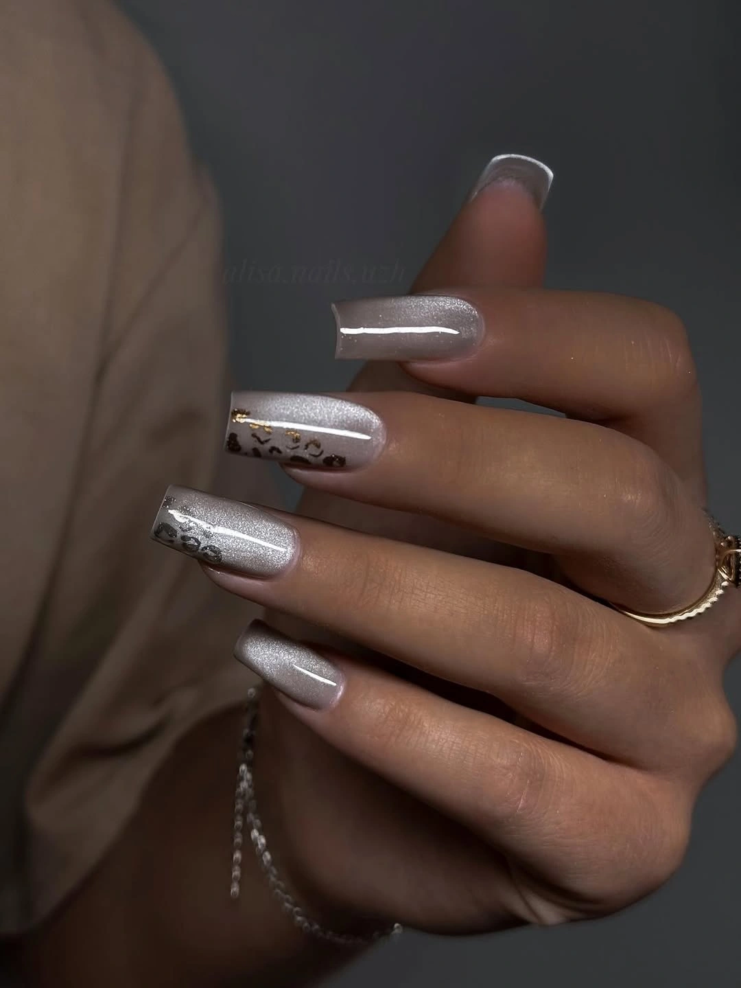
Gray is doing more than filling space. Its cool undertone creates a bridge between pale light and dark clothing, while the reflective surface keeps the set from looking flat. The single line gives the eye a place to pause, then returns attention to the pewter field. That is a fun color moment built through temperature and finish rather than extra shades.
Keep the line on one accent nail and use muted pewter or charcoal if a more autumnal version is wanted. A shorter rounded square will hold the same balance, and the finish can remain understated. The exact surface may not be true metallic or chrome, so describe and copy the cool shine without attaching a technical name that the view does not prove.
Curved Pink Lines Echo The Rounded Tip
Soft pink nails sit above small flowers, with brighter curved lines or tip accents appearing along selected edges. The base stays pale and open, while the saturated pink follows the rounded shape instead of forming a rigid straight French line. The floral setting adds a gentle seasonal cue, but the manicure’s main color relationship remains pink against pink with different intensity.
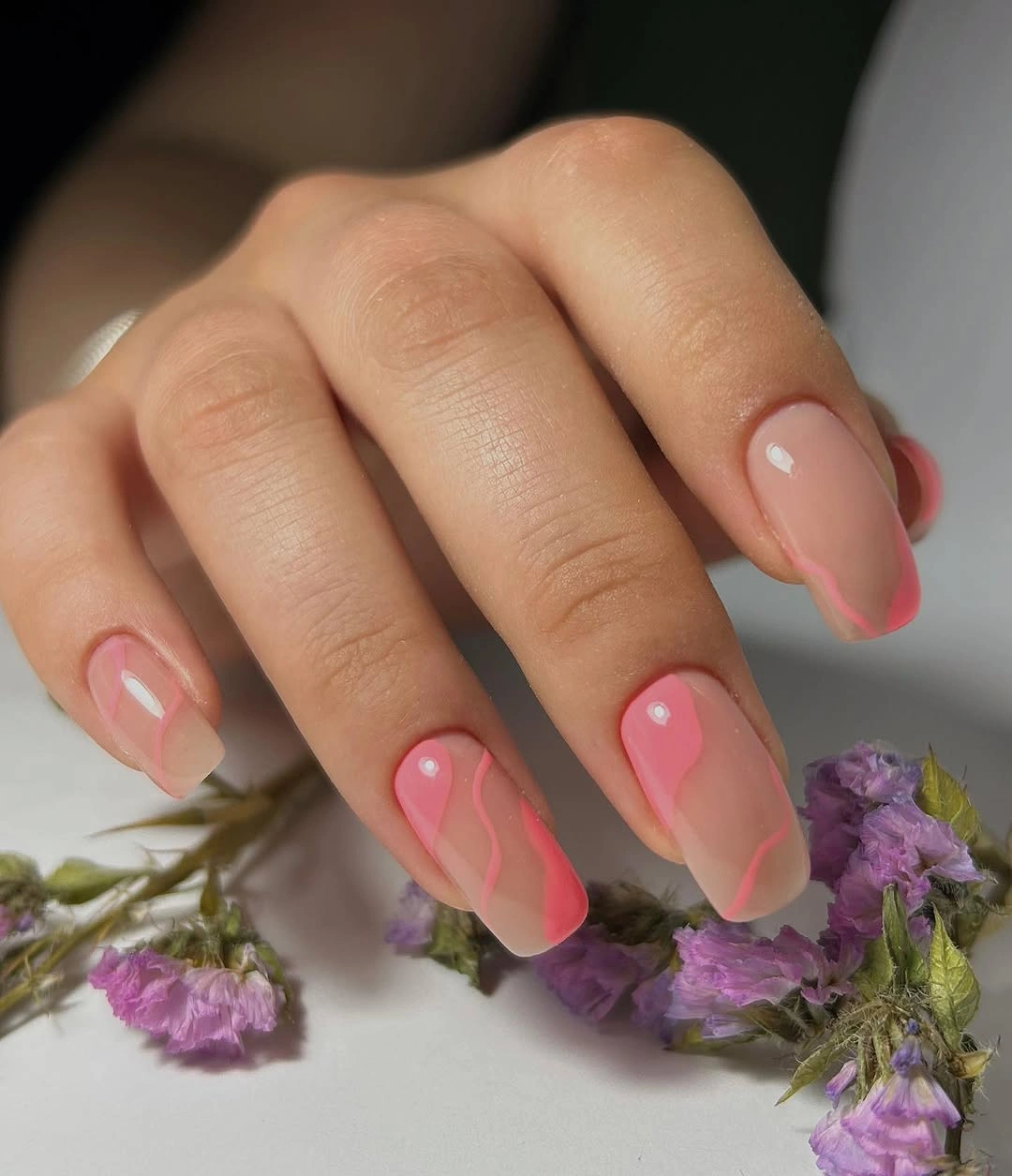
Repeating the curve of the nail makes the brighter color feel integrated. A straight line would create a harder graphic break, while these arcs keep the hand soft and let the base remain visible. The close flowers support that lightness, but the idea can stand alone because the color and shape already explain one another without needing a named motif.
Use one curved accent on each hand or shift the brighter line toward coral, berry, or rust for a fall color moment. Medium rounded nails give the lines enough room, yet a shorter tip may need fewer curves. The practical adjustment is scale: keep the base open and avoid filling the whole nail when the appeal comes from a narrow moving edge.
White Almonds Turn Contrast Into A Shape
Long almond nails are solid white and sharply tapered, with no visible artwork to interrupt the pale field. A dark reflective surface behind the hand gives the manicure its contrast, making the tips look almost sculptural. The color is simple, but the long contour supplies enough visual information to keep the set from feeling blank.
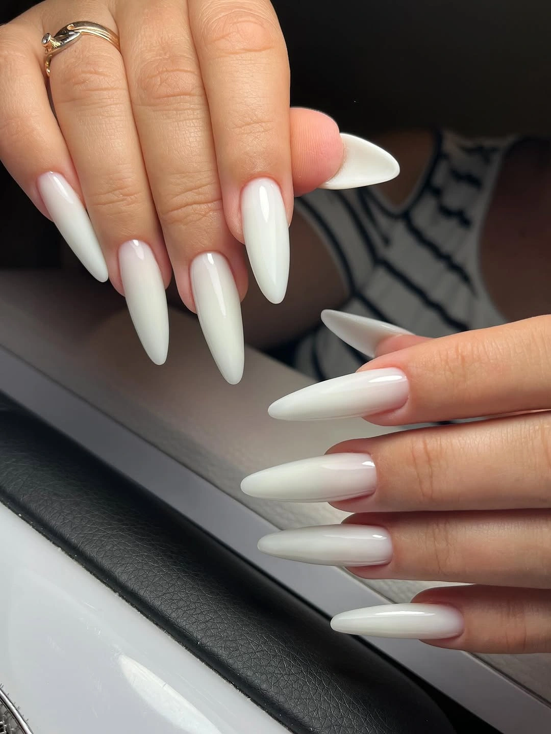
The relationship between white and the dark setting is the real color decision. White becomes more defined when the background supplies a deep frame, while the almond point keeps the transition from looking blocky. This is a useful example of letting context amplify a light manicure without adding another nail shade or turning the surface into a full design.
Ivory or pale beige would soften the contrast, and a shorter almond would keep the same silhouette with less functional pressure. Because the base is plain, the look can be adapted through surrounding clothing as easily as through polish. The long point remains the honest limitation, so choose the shape for your routine before copying the color relationship.
Medium Red Keeps The Collection Grounded
Bright red appears again, but these medium rounded nails create a friendlier proportion than the long stiletto and square references. The surface is glossy and solid, with curved tips that soften the saturated color. A pale background keeps the red clear, allowing the manicure to work as a classic fall color while remaining compact enough for everyday styling.
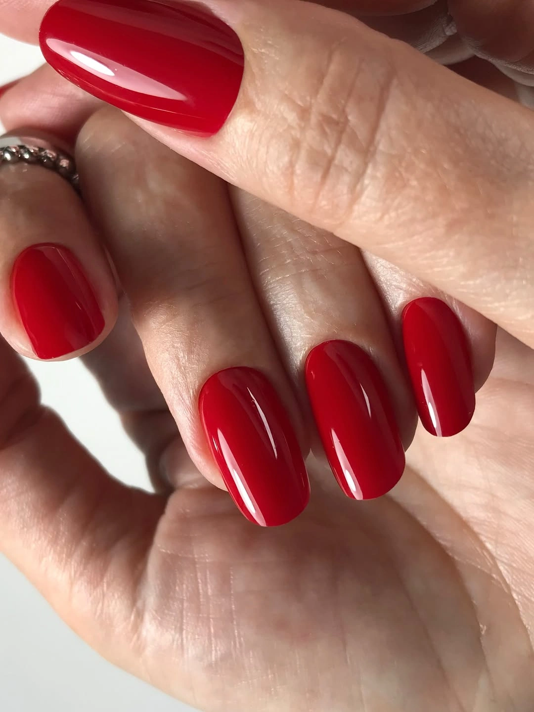
Length changes the emotional temperature of the same shade. Medium rounded tips make red feel more approachable, while the smooth gloss keeps it lively without adding visual clutter. The set proves that a strong color does not need an extreme silhouette to become the focal point; proportion alone can make the look calmer and easier to pair with clothing.
Use cranberry or brick if the bright red needs a deeper undertone, and keep the rounded shape if comfort matters. A solid surface means color is the only element to refresh, so there is no pattern to preserve through grow-out. If you want a little contrast, place the deeper shade on one nail rather than adding multiple motifs to an already clear base.
Navy Curves Frame Milky White
Long almond nails begin with a milky base, then add dark blue curved edges and glitter near several tips. The navy detail hugs the contour instead of filling the center, while the pale surface remains the larger field. White feathers around the hand repeat the lightness of the base, making the cool contrast feel airy even with the darker line work.
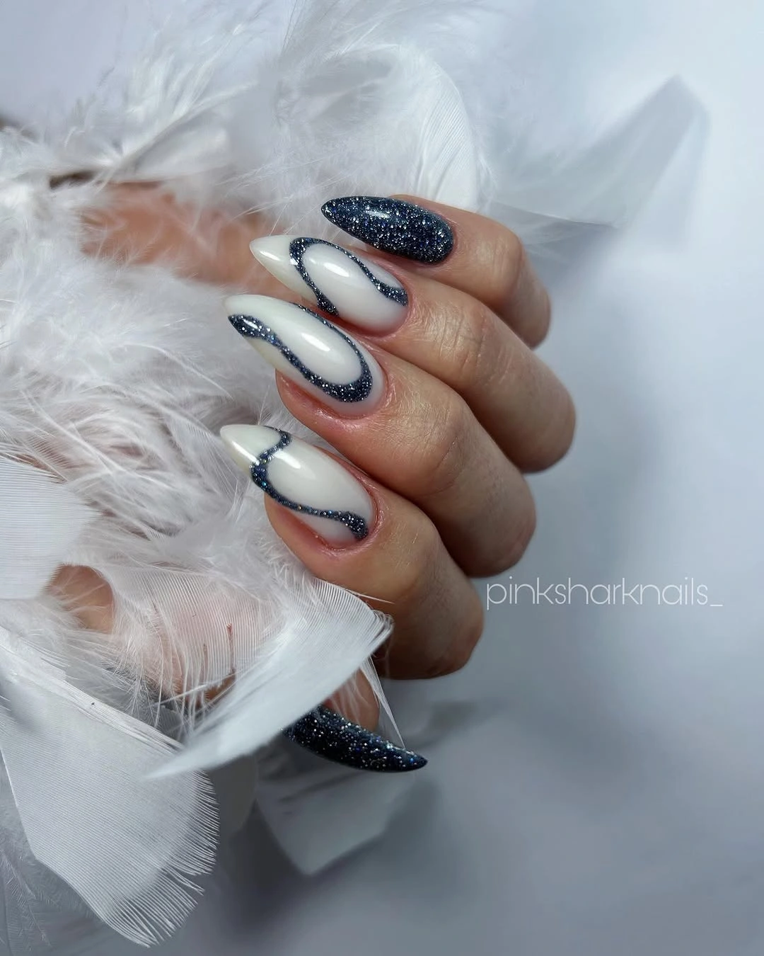
Perimeter placement creates the design’s rhythm. Dark blue gives the pale nail a frame, and the glitter appears close to the tip where it can catch light without covering the entire surface. The colors stay connected because navy and silver are both cool, while the milky center provides the neutral space that lets the edging remain crisp.
Keep navy on two accent nails or replace the glitter with a matte blue line for a calmer version. A shorter almond still offers enough curve for the perimeter idea, but it may need a narrower edge so the base does not disappear. Do not force a technical name onto the detail; the useful instruction is to concentrate contrast near the contour.
Warm Brown Shimmer Meets A Matching Sleeve
Short rounded-square nails in warm brown show small metallic flecks and lighter reflective patches across the surface. The finish appears softly shimmery rather than mirror-bright, so the color stays earthy while still catching light. A brown sleeve repeats the warm family around the hand, creating a coordinated palette without adding a separate accent color.
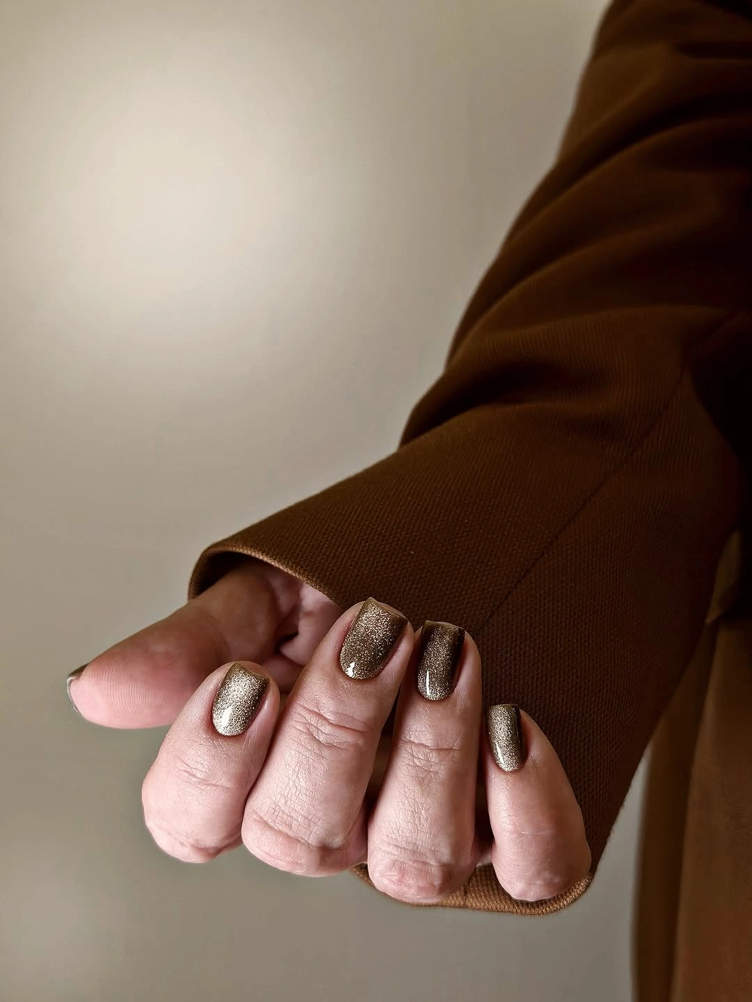
The shimmer changes the brown from a flat block into a surface with small points of movement. Because the reflective detail is spread through the base instead of isolated in one motif, the manicure remains compact and easy to understand. The matching sleeve also shows how a warm neutral can feel more seasonal through surrounding texture than through a dramatic color shift.
Bronze, muted olive, or ochre can replace the brown while keeping the same short outline, and shimmer can be limited to two accent nails for less visual activity. Short nails already keep the color practical. The finish may reveal uneven texture or edge cleanup more than a flat cream would, so a careful border matters more than adding additional art.
Cream Base Makes Pink Swirls Feel Light
Medium rounded-square nails use a creamy pale base with thin pink and soft coral lines that curve across selected surfaces. The background stays visible between the lines, so the design feels airy rather than filled. Against a dark setting, the pale base becomes the main light source, while the pink accents add movement without turning the manicure into a high-contrast print.
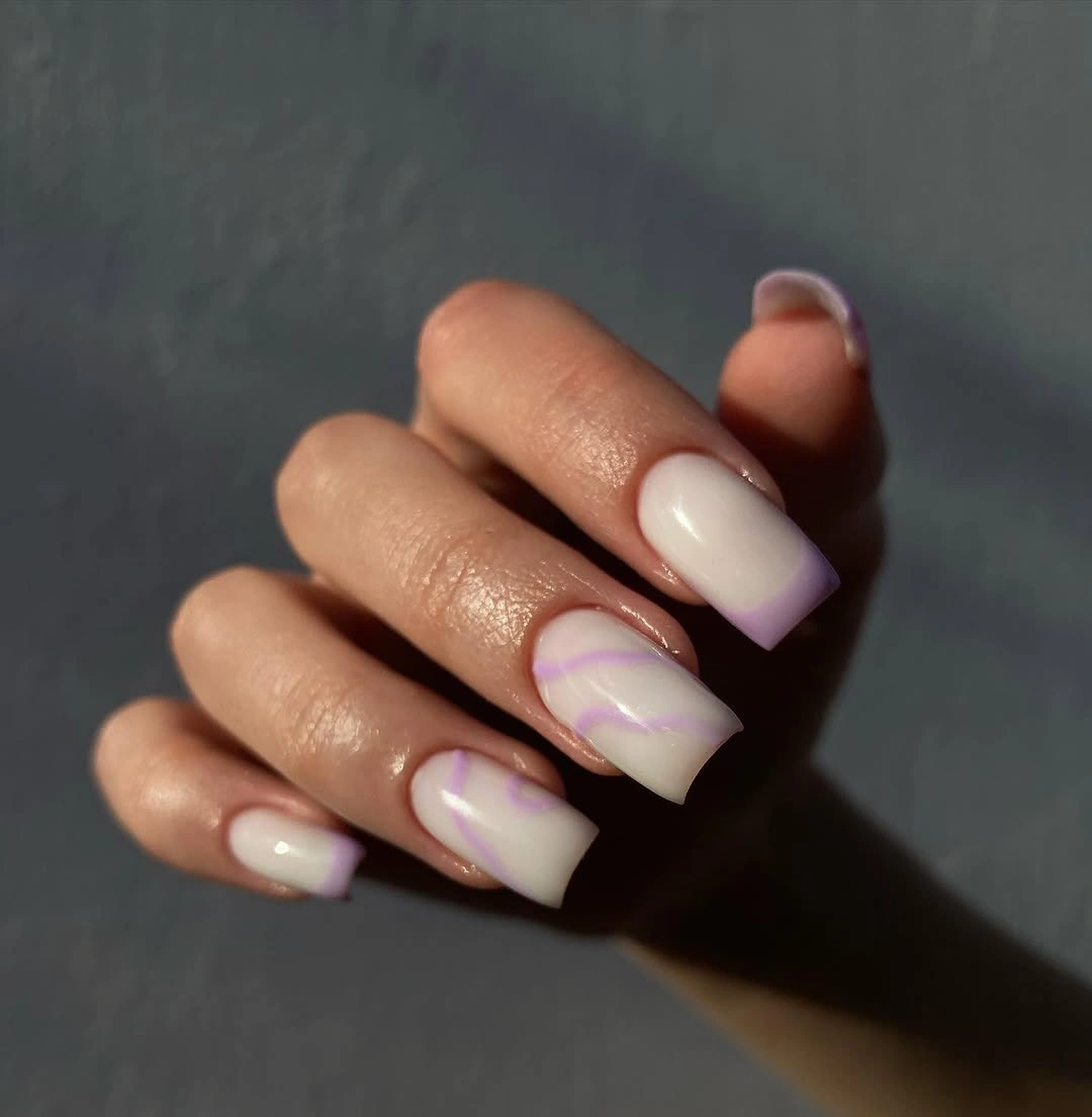
The palette succeeds because the lines share warmth with the cream. A cooler black mark would create a sharper break, but pink and coral keep the abstract shapes connected to the base. The curved movement also suits the rounded tip, giving the manicure a coherent rhythm even though each visible nail appears to carry a slightly different arrangement.
Use one curved line on each accent nail if several swirls feel too busy, or deepen the pink toward berry for a fall color moment. A medium shape gives the marks room, but shortening the tips may require fewer strokes. The exact abstract motif is open, so preserve the open cream space and warm contrast rather than trying to reproduce a particular drawing.
Bright Yellow Stays Strong On Its Own
Medium-long almond nails carry a vivid yellow with no visible artwork or companion shade. The surface is glossy and smooth, and a dark background makes the color appear even brighter. Because the shape tapers gently rather than ending in an extreme point, the manicure feels bold through saturation while remaining easier to translate than the longer red designs.
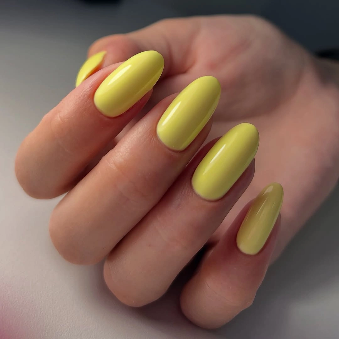
Yellow can move into fall when the setting supplies depth. The dark background absorbs the excess brightness and leaves the nails as a deliberate focal point, while the solid surface keeps the color from becoming scattered. This is a color moment built on restraint: the shade is loud, but the design language around it is simple.
Ochre, mustard, or muted golden yellow will feel more seasonal without changing the almond outline. Two accent nails can also carry the bright version while the companions become cream or brown. Glossy saturation may show edge wear clearly, but a plain set is easier to refresh than one with several small details, so color and length are the safest adjustments.
Gold Details Dress Up A Nude Base
Several medium almond nails stay pale nude, while selected accents add fine gold lines, small reflective details, and a dark tan-and-black pattern. The neutral companions create open space around the ornament, and rings near the hand repeat the gold direction without taking focus from the nail surfaces. The palette feels delicate because the strongest decoration is concentrated rather than spread everywhere.
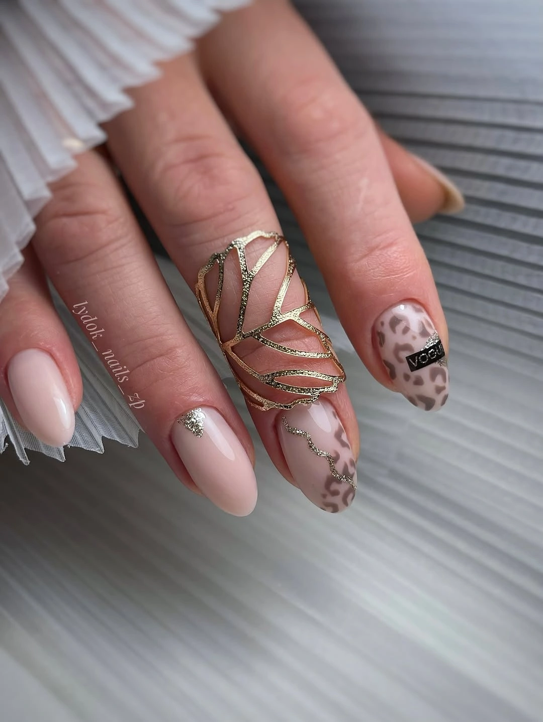
The base controls the amount of information. Nude lets the gold lines read like jewelry, while the darker patterned accent supplies one stronger interruption and stops the pale set from becoming too quiet. The almond curve gives the fine details a graceful path, and the repeated neutral nails provide relief before the eye returns to the decorated fingers.
Keep one gold accent and replace the patterned nail with a simple dark curve if the design needs less upkeep. A warmer cream or soft blush can stand in for nude, while bronze will lower the shine for fall. The exact pattern and metal are not certain, so keep the adaptation focused on open base, concentrated ornament, and one darker focal point.
Pale Pink Works With A Busy Wrist
Short rounded-square nails in pale pink appear beside a smartwatch, giving the manicure an everyday context rather than a formal one. The surface is even and glossy, the length is compact, and no artwork competes with the accessory. Soft white and pink create a low-contrast base that can sit quietly beside a watch, rings, or patterned clothing.
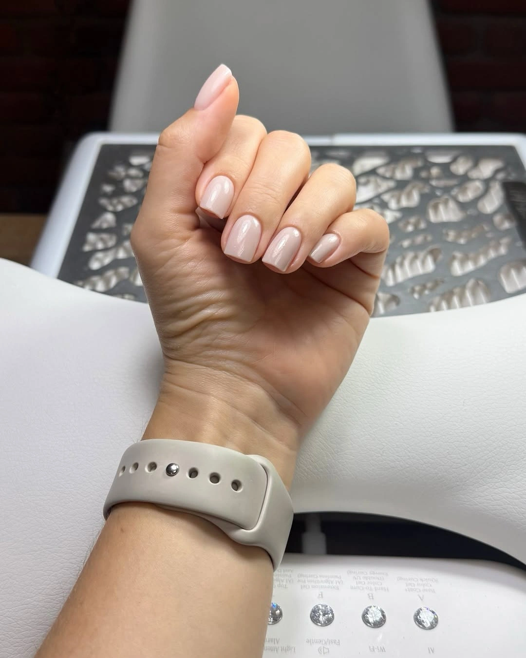
The accessory makes the color relationship easy to understand. A bright design could compete with the watch face or strap, but pale pink supplies a clean background and lets the wrist remain visually balanced. Rounded corners reinforce that practical feeling, while the solid surface keeps the manicure recognizable even when the hand is moving or partly covered.
Sheer beige, soft mauve, or warm blush can replace the pink, and the short shape should remain if the goal is an active daily set. Light gloss may reveal edge wear, but there is no line work to preserve. The useful change is undertone, not added decoration, because the manicure already succeeds by leaving room for the accessory and the rest of the outfit.
Pale Blue Tips Add A Quiet Graphic Edge
Medium square nails combine a pale base with light blue tips or edge accents, while one visible nail carries a darker curved detail. The blue remains narrow and close to the perimeter, so the milky center stays open. A gray background supports the cool palette and keeps the contrast gentle rather than pushing the French structure into a hard black-and-white graphic.
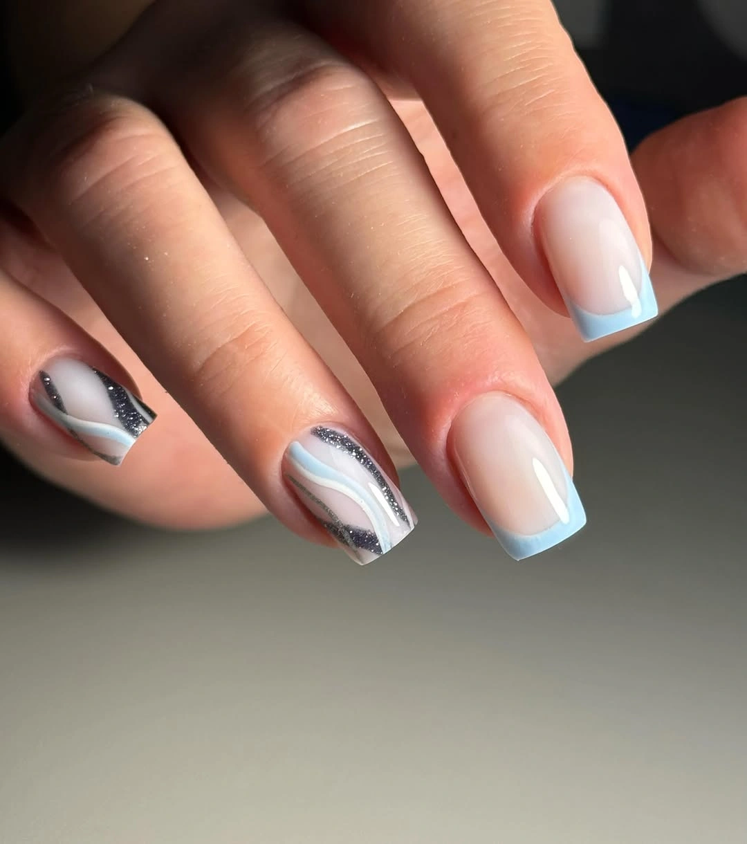
The color relationship is soft because both the base and the edge are light. Pale blue supplies definition without overpowering the hand, and the darker accent appears only as a small interruption. That gives the manicure a playful color moment while preserving plenty of neutral space. The medium square shape also keeps the tip line visible without requiring extreme length.
Use blue on two accent nails or shift it toward gray-green for a more autumnal version. A shorter squoval may need a thinner edge, but the structure can stay the same. The exact placement is partly hidden by the crop, so adapt the narrow cool border and single dark interruption rather than forcing every nail into an identical line.
Matte Yellow Lowers The Brightness
Short-to-medium rounded-square nails carry a warm yellow that appears softly matte or satin rather than highly glossy. The compact shape keeps the color neat, while a pink background adds a gentle warm contrast. Because the surface is quiet, the shade reads closer to muted yellow or cream than to a summer neon, giving it a calmer path into fall.
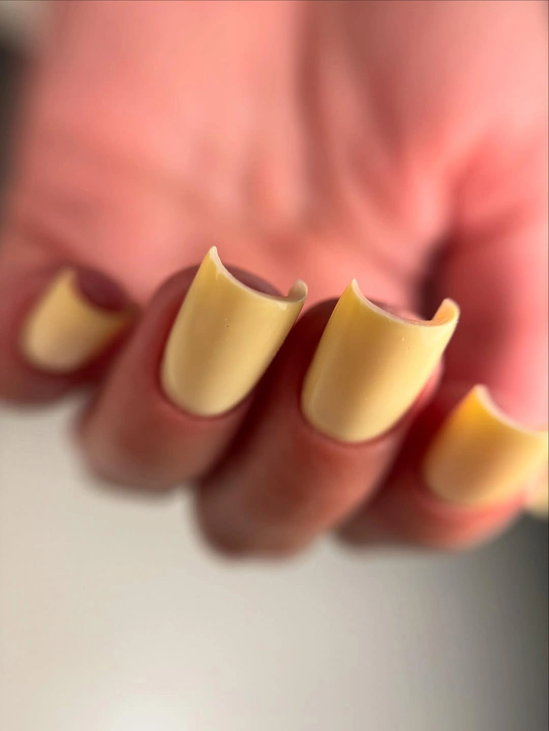
Finish changes the color relationship even when the pigment stays bright. Without strong reflection, the yellow loses some intensity and becomes more tactile, while the rounded shape keeps it approachable. The pink background makes the palette cheerful but not chaotic because both colors remain soft around the edges and the nails carry no competing motif.
Mustard or ochre can deepen the idea, while two glossy accent nails would add a controlled finish contrast if desired. Matte-looking surfaces may reveal uneven texture and edge wear sooner than a high gloss, so the border needs attention. Keep the mark-free base intact; the design gets its personality from softened color and finish, not from extra decoration.
White French Tips Meet A Sheer Sleeve
Long square nails use a translucent pink-nude base with clean white tips, creating a familiar French structure. The edge is crisp and easy to follow, while a sheer bow-like sleeve and dark clothing frame the light manicure. Because the tip color stays limited to the perimeter, the pale base remains visible and prevents the long shape from becoming visually solid.
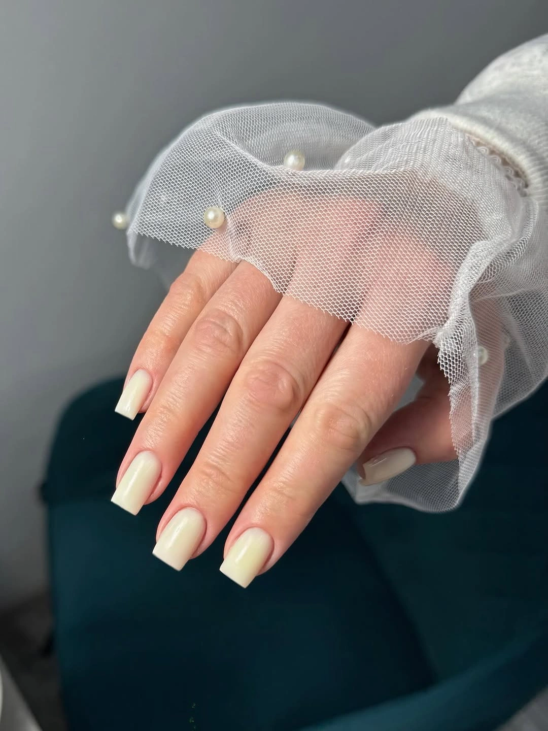
Contrast is concentrated exactly where the shape changes direction. White defines the straight tip, and the sheer base softens the area near the hand, so the design feels classic without becoming stark. Dark clothing makes the light manicure pop, while the sleeve adds texture rather than another strong color. The result is organized through edge, base, and setting.
Use a thinner tip on a shorter squoval, or change white to warm cream for a gentler fall version. Long square corners give the French line a graphic effect but can be less practical during daily work. Since the structure is simple, reducing length is enough to make the set easier without losing the pale base and bright perimeter contrast.
Gray Arcs Give French Tips A New Route
Medium coffin nails fade from pinkish bases into white tips, then add fine gray arcs across the pale structure. A small reflective detail appears near one nail, but the main visual story stays pink, white, and gray. Rings and a neutral tabletop support the delicate palette, allowing the manicure to feel decorated while keeping the French foundation visible.
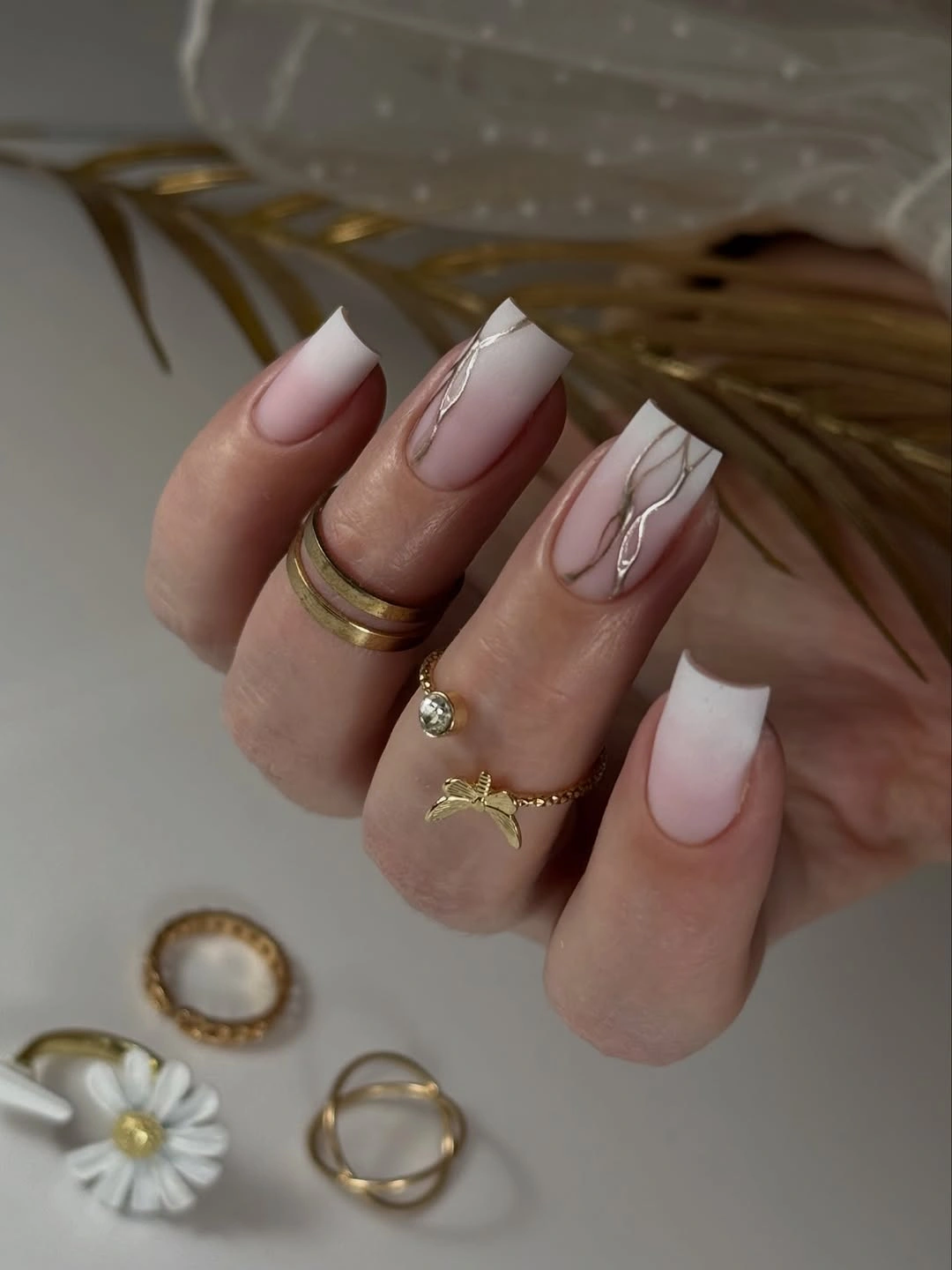
The gray lines add movement without replacing the tip. They cross the light space in thin paths, so the eye sees the familiar French contrast first and the abstract detail second. That order keeps the design cohesive: white gives the hand a clear edge, pink warms the base, and gray supplies a cool note that stops the pale palette from becoming flat.
Use one gray arc per accent nail and keep the rest of the French structure plain if the pattern feels too detailed. A rounded square and shorter tip can make the same color story more practical. The small reflective element does not need a name; the stronger lesson is to layer fine lines over a recognizable base while leaving enough pale space around them.
Creamy Yellow Lets One Graphic Nail Pop
Most nails here are creamy pale yellow, while one visible nail carries irregular black-and-white marks. The soft companions make the high-contrast accent easy to locate, and the neutral background keeps both colors clear. The design has a bright center but avoids becoming a full graphic set because the black and white appear in only one concentrated area.
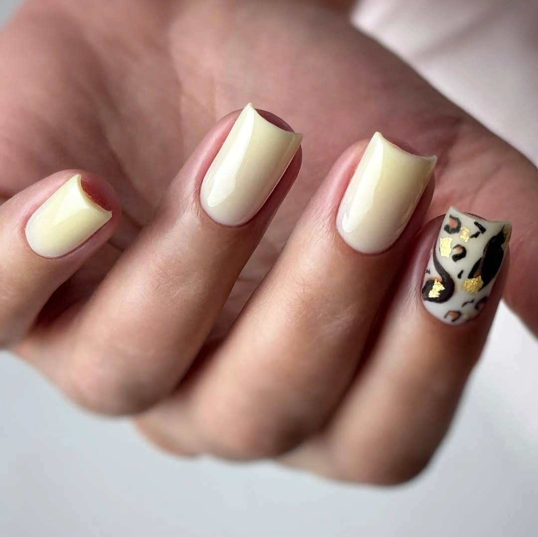
Selective contrast is the reason this color combination holds together. Creamy yellow supplies warmth and repetition, while black and white add a sharp visual break on the accent nail. If every nail carried the same marks, the pale base would disappear; here the lighter companions act as relief and let the bold pattern have a clear job.
Keep one accent and shift the yellow toward cream or muted mustard for a deeper fall tone. A shorter rounded square can carry the same graphic nail without needing to shrink every mark too far. The exact abstract motif is not clear enough to identify, so preserve the relationship of soft companions and one high-contrast focus rather than copying an uncertain name.
Milky White Ends With Leafy Green Contrast
Short-to-medium rounded nails in milky white close the collection against broad green leaves. The manicure is solid, glossy, and free of visible artwork, so the natural background supplies the contrast and the seasonal context. The compact shape keeps the pale color easy to wear, while the deep foliage makes the white look fresh rather than plain or overly formal.
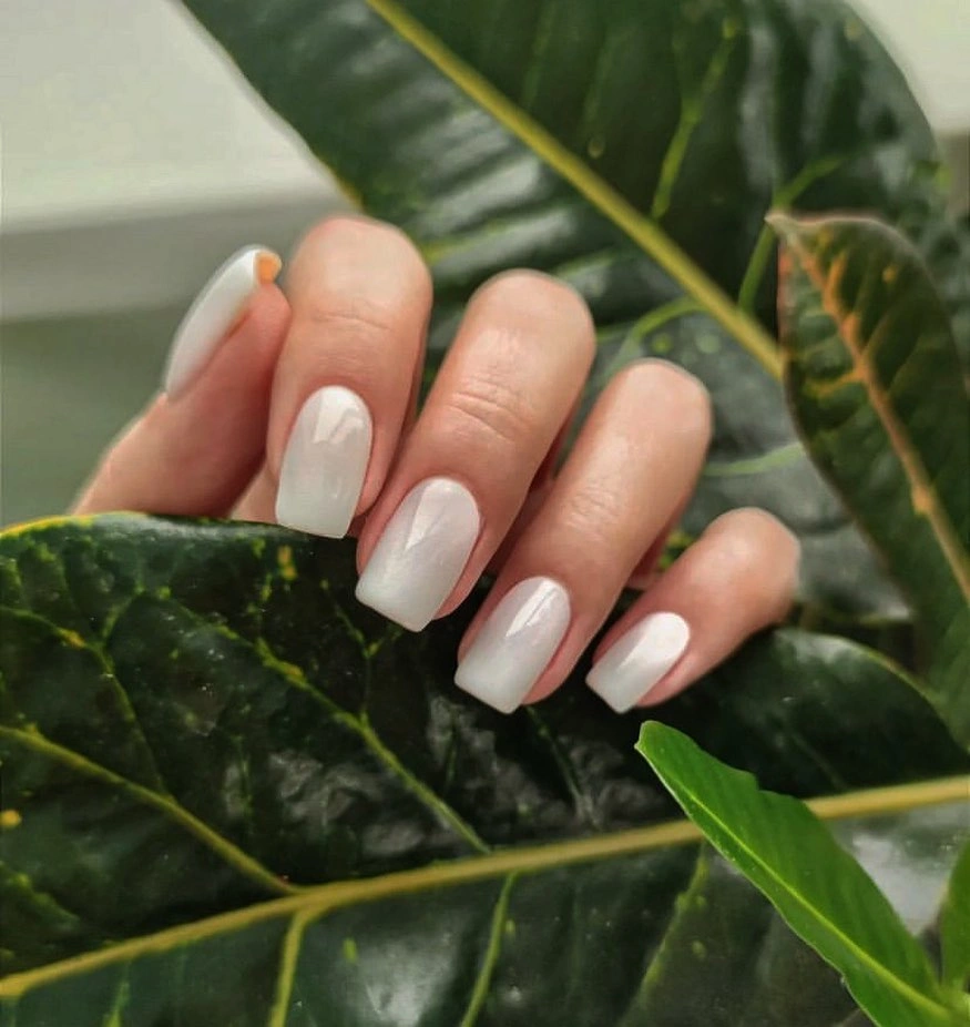
The palette works because the surroundings provide a dark earthy frame without entering the nail design. White remains the larger field, and green creates enough depth to make the hand stand out. That is a useful reminder that a simple manicure can feel seasonal through styling and contrast alone, especially when the shape leaves room for patterned clothing or botanical color nearby.
Warm ivory or sheer pink can replace the white, and one green accent nail could echo the leaves for a more literal fall variation. Keep the rounded length if the set needs to stay practical, since pale edges show wear but the shape is easy to manage. The clean base should remain the focus; adding many marks would remove the calm contrast that makes the ending work.