
Fall Nail Art Ideas 2026 with Small Details That Matter
A manicure can lose its balance because of a detail smaller than a grain of rice. A mark placed too close to an edge, a bright spot repeated once too often, or a quiet surface interrupted without purpose can change the hand from considered to cluttered. Good nail art begins when the smallest decision has a reason to be there, not when every available space is filled.
Judge each detail by its consequence. Notice what it pulls forward, what it leaves open, and how its position changes when the nail is shorter or the hand is in motion. Keep the mark that creates rhythm or relief; remove the one that only adds noise. That simple edit usually gives the manicure more character than another layer of decoration.
Forest Green Meets Creamy Abstract Marks
Short square nails make the first small decision easy to spot: a pale accent nail interrupts glossy forest green and deep burgundy-brown. That light surface carries irregular brown and cream marks, while the surrounding fingers stay solid and reflective. The set feels coordinated because the warm-dark colors repeat, not because every nail uses the same motif or finish.
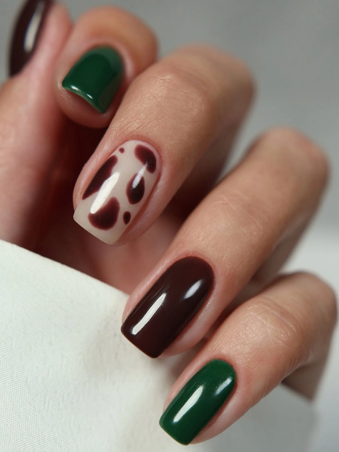
The contrast works through spacing. The abstract accent has enough light around it to read as a focal point, and the solid green nails keep the mixed colors from spreading into visual noise. If your nails are even shorter, keep the cream art on one finger and alternate the green with the burgundy; the palette will remain seasonal while the detail stays legible.
Several colors on a small canvas need an order of importance, otherwise the eye has nowhere to settle. Treat the pale nail as the detail and the darker fingers as the frame, then keep the gloss consistent enough to tie the surfaces together. This is a useful starting point for fall nail art designs because the decision is visible without being oversized.
Milky Pink with a Soft Pearl Veil
Every nail here is short and gently squared, with a milky blush-pink base and a fine pearl-like reflection. There is no painted motif competing for attention, so the eye reads the tidy outline, even coverage, and slight shift in light across the surface. The detail-first lesson is that a finish can be the accent when the color itself remains quiet.
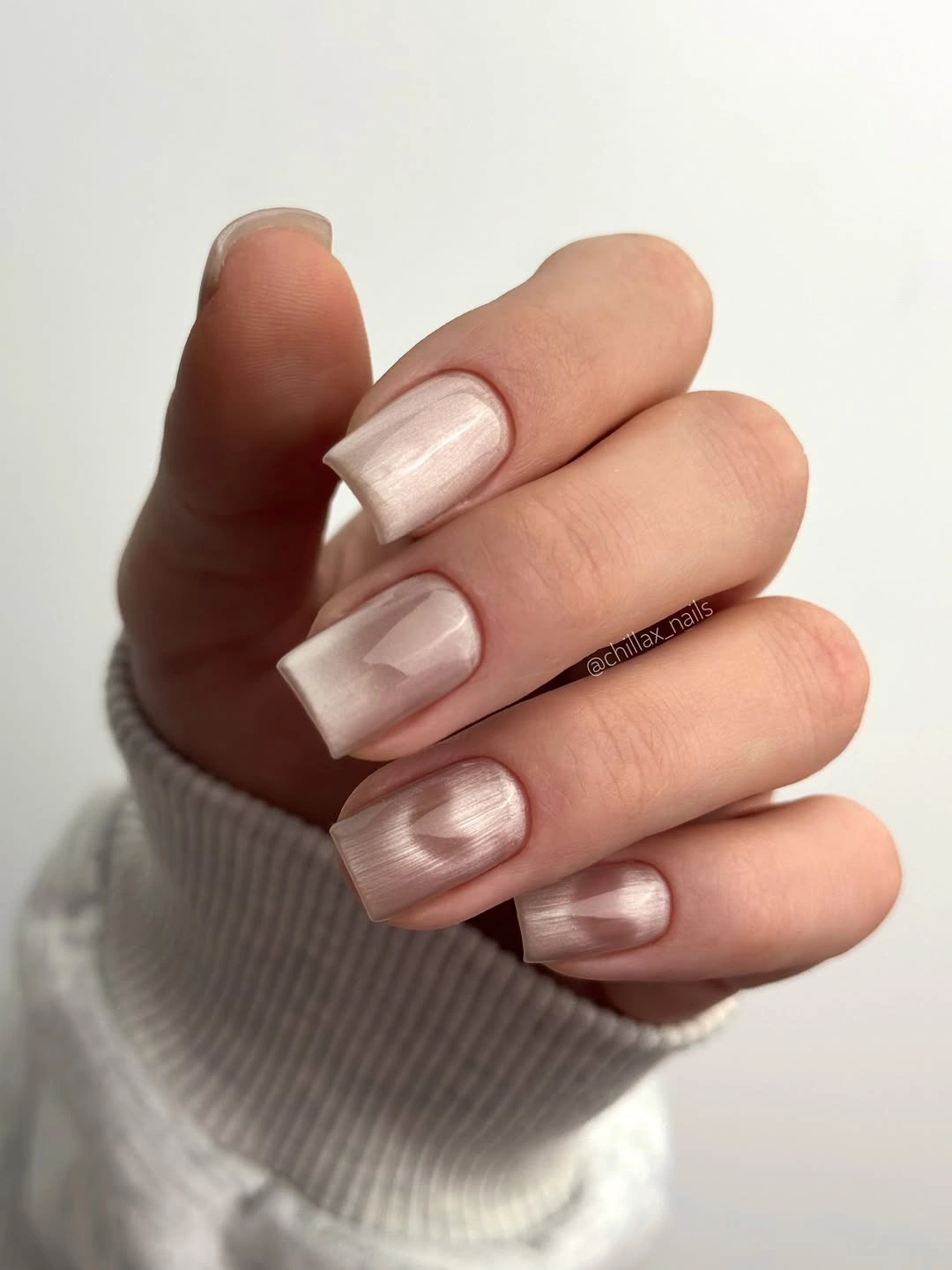
The pale tone feels polished because it is not completely flat. A soft reflective veil gives the hand dimension beside knits, denim, or darker fall layers, while the compact shape keeps the manicure practical. For very short nails, keep the base sheer enough to look light but not so transparent that uneven coverage becomes the main visible feature.
Light finishes are less forgiving around the cuticle and free edge, so the neatness of the outline matters more than an extra embellishment would. If the color seems too delicate, a warmer cream or a touch more pearl will add presence without changing the structure. The restraint is the point; adding a motif would remove the quiet surface detail that makes this set work.
Black Curves on a Nude Almond Base
Thin black lines are placed over a sheer nude-pink base, and each curve bends differently across the almond nails. The marks are narrow enough to leave generous open space, so the design reads as a study in placement rather than a filled pattern. The medium-long outline gives the lines a longer route, but the pale base keeps the overall effect light.
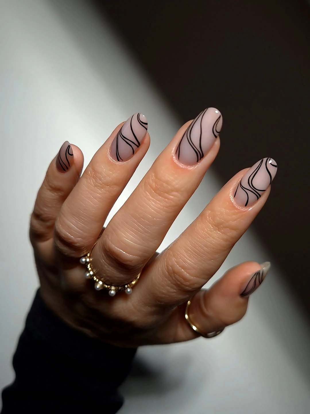
The smallest visible feature is the distance between one line and the next. That breathing room lets the black remain graphic without making the hand feel crowded, and it also gives the eye a sense of movement from finger to finger. On shorter nails, preserve the nude background and place one curve on two accent fingers instead of compressing several lines into every surface.
Linework like this is strongest when the starting point and direction feel intentional. A curve that follows the sidewall can lengthen the look, while one that turns inward can create a softer focal point near the center. Keep the design away from the free edge when possible, since growth changes the spacing and can turn a clean line into a busy border.
Sage Green with Reflective Round Accents
Muted sage green covers most of the short square nails, while two surfaces carry pale circular accents and cloudy iridescent patches. The rounded details are not scattered randomly; they sit inside the green field and create small points of light. That placement keeps the color calm while giving the manicure a visible change in texture and reflection.
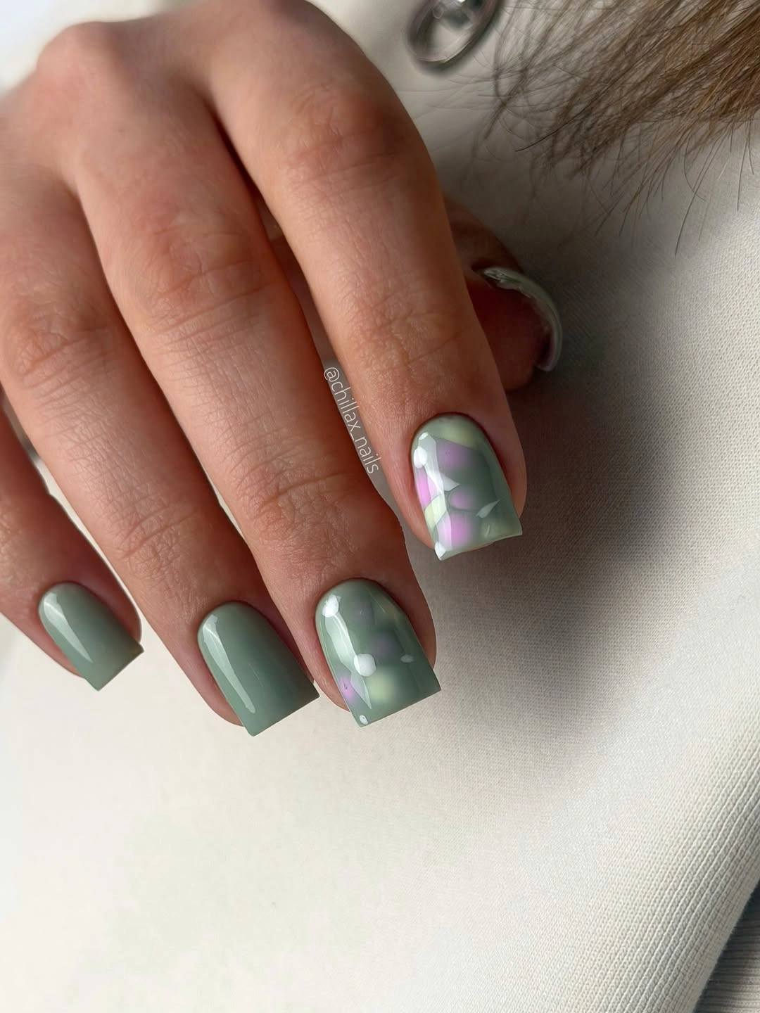
The circles work because their shape contrasts with the straight sides of the square nail. A single reflective spot near the center can create the same balance on a shorter canvas, especially if the remaining fingers stay solid sage. Letting the accent occupy only part of the surface also preserves negative space and prevents the pale color from taking over the hand.
Round accents need a clean edge to look deliberate, and glossy patches can reveal a rough perimeter once the hand moves. If you prefer a flatter finish, replace the cloudy areas with one pale painted dot and keep the sage base satin or glossy. The visual logic stays intact: one repeated round detail interrupts a field of muted green.
Milky White with Barely There Relief
These short square nails use a soft milky white surface with subtle pale reflections and almost no contrast. The interesting detail is the gentle relief created by light across the nail rather than a visible motif, which lets the shape and finish carry the manicure. It feels clean without becoming stark because the white remains slightly creamy instead of paper-bright.
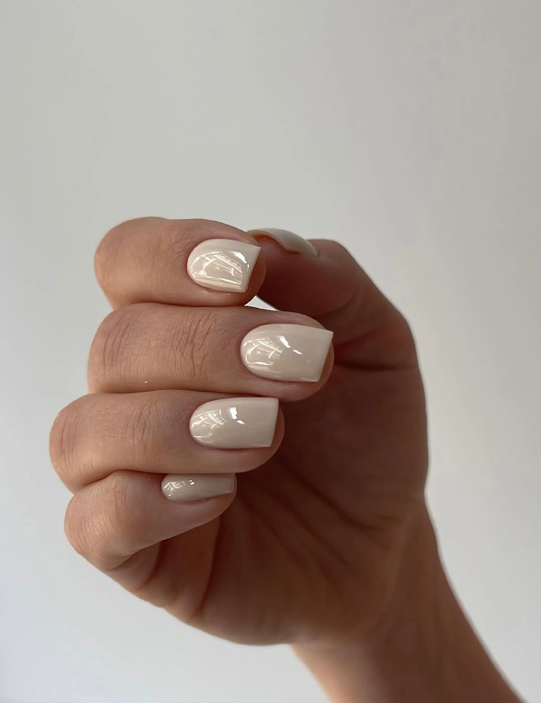
The compact outline keeps the neutral surface from looking unfinished. A short squoval would give a similar result if the square corners feel too crisp, and a sheer layer can make the color sit closer to the natural tone of the hand. The important choice is to keep the surface even and the reflective change quiet enough that it reads as polish, not decoration.
Very pale coverage exposes every uneven patch, so a simple manicure still needs a considered edge. Pair it with textured clothing or darker accessories when you want the hands to provide relief rather than another focal point. If you add anything, use one almost invisible line or a single pearl accent; more detail would compete with the subtle finish.
Opaque White Framed by Dark Knit Texture
The same compact square language looks much sharper when the nails turn opaque white and the hand is framed by a deep brown-black sweater. Each surface is clean and glossy, with no motif at all, so the surrounding contrast becomes the supporting detail. The manicure reads crisp because the dark sleeve supplies a visual border that the nail design itself does not need to create.
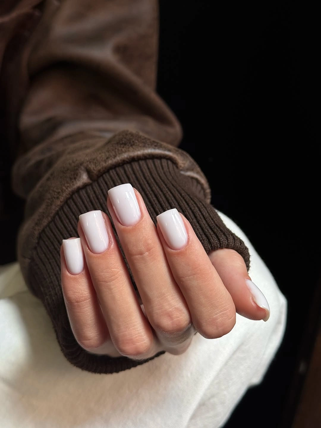
That surrounding contrast is easy to adapt. An ivory base will soften the effect, while a thin dark line along one tip can echo the sweater without covering the whole hand. Keep the shape short and the color even if you want the manicure to remain practical; white already has enough presence when its edge is neat and its finish is smooth.
Opaque white shows marks quickly, particularly at the free edge, so this is a color choice that rewards regular small repairs. It also pairs well with fall manicure ideas and colors that rely on contrast rather than dense art. The useful lesson is simple: the background can supply mood while the nails stay visually direct.
Pale Lime on a Short Square Shape
A glossy pale lime shade changes the article’s rhythm immediately because the color is light, bright, and slightly unexpected against a fall palette. The nails remain short and square, with no added art to dilute the shade. That clean shape matters: it keeps the color from feeling overly sweet or decorative and gives the hand a defined edge.
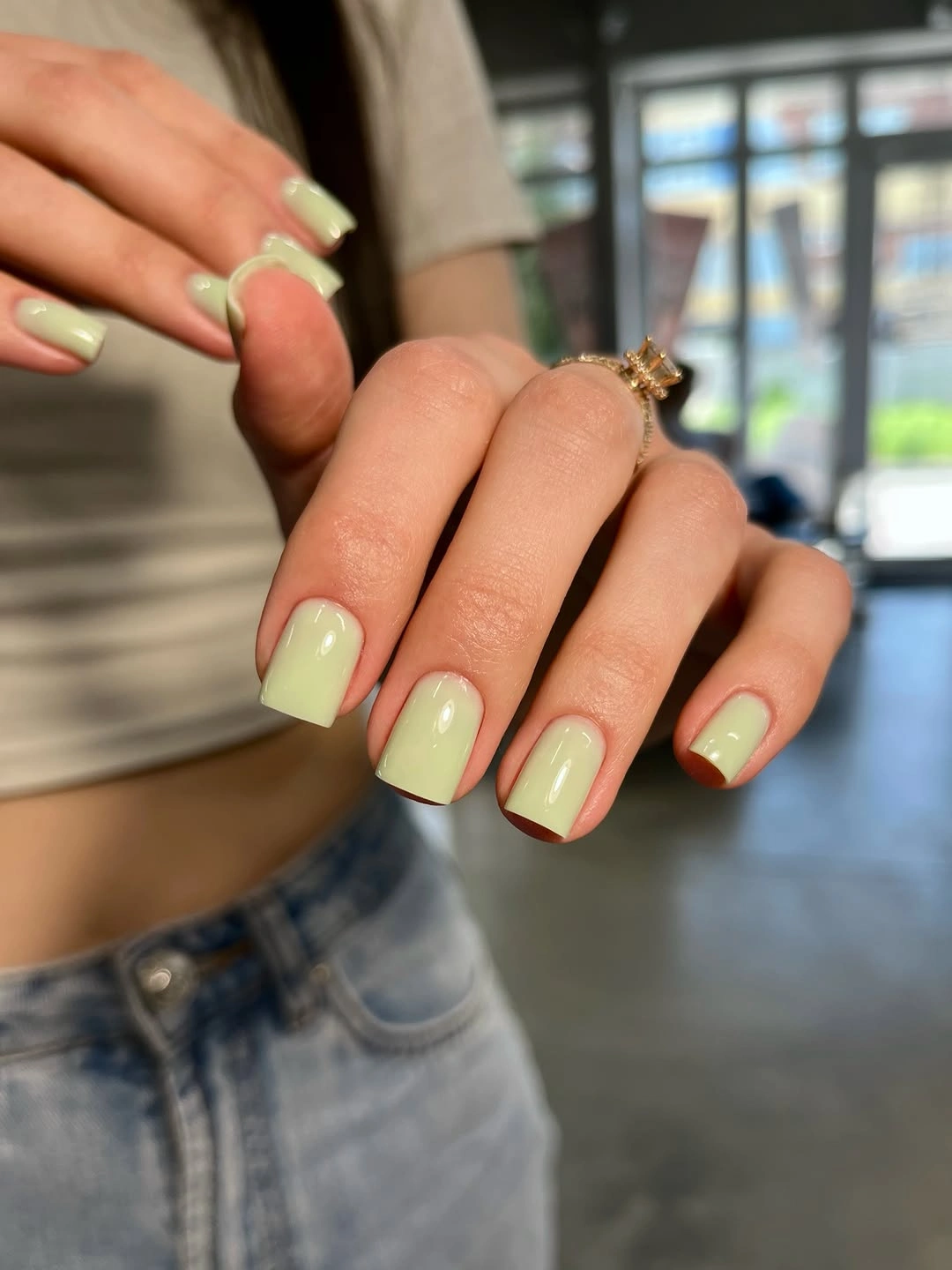
The surface works as a focal point because every finger carries the same decision. If a full hand of pale lime feels too strong, use it on two or three nails and pair it with cream or muted brown, keeping the square outline consistent. A slightly softer green can also make the look easier to coordinate while preserving the unexpected color note.
Bright pale polish can reveal uneven coverage, staining, or small gaps near the cuticle more readily than a deep shade. Keep the finish glossy and the edge simple, then let the color carry the personality. No motif is needed here; adding one would make the manicure less clear and weaken the visual impact of the unusual green.
Deep Burgundy with Rounded Short Tips
Short rounded-square nails in deep burgundy make a strong seasonal statement without relying on length or decoration. The color is glossy and nearly uniform, but its wine depth appears warmer where the light reaches the center. Because the corners are softened, the dark shade feels grounded rather than severe, and the hand stays easy to pair with everyday clothing.
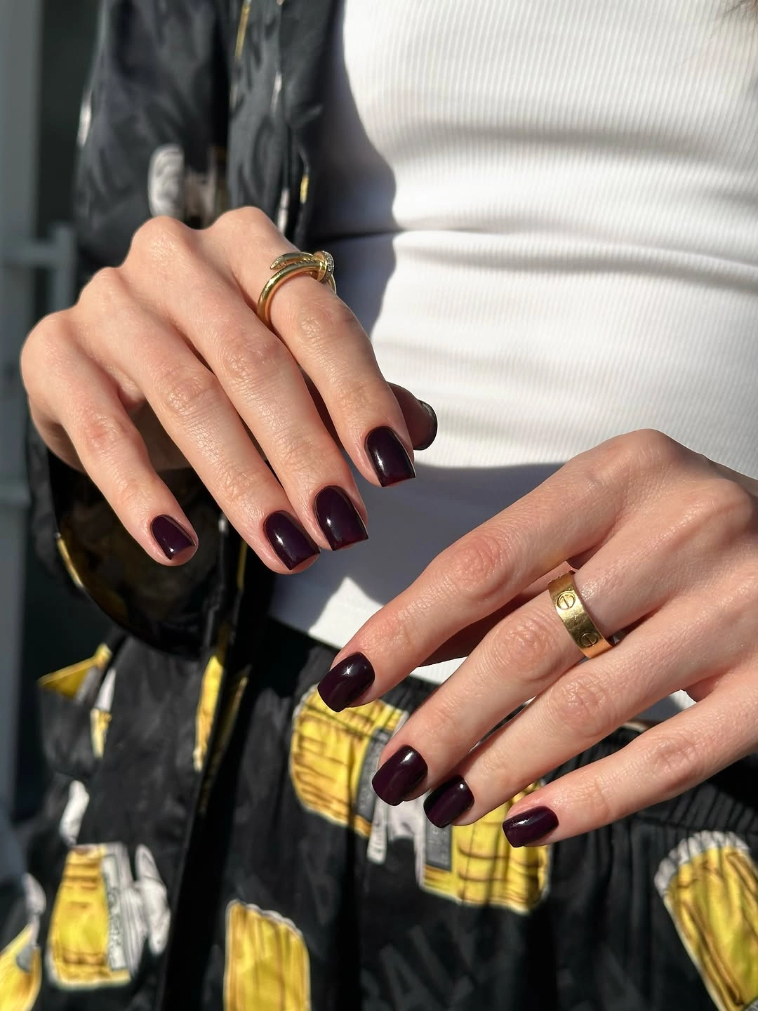
The rounded tip is the detail that keeps the color approachable. A squoval shape would produce a similar balance, while a single sheer accent nail could lighten the hand if the burgundy feels too dense. Keep the rest of the design plain so the color remains the focal decision instead of becoming one component in a crowded palette.
Dark gloss makes chips and cuticle gaps visible, so the simplicity needs a clean perimeter. If you like a softer finish, a muted cream or brown companion can reduce the contrast without changing the main color. This is a practical reference for fall short nail shapes because the seasonal depth comes from color rather than dramatic length.
Tiny Red Hearts on a Sheer Pink Base
Small bright red hearts sit on a translucent pink base, and the compact nails keep each motif easy to locate. The gray sweater frames the hand, but the manicure remains light because the hearts are tiny and spaced across otherwise quiet surfaces. The repeated shape supplies personality without changing the short outline or asking for several different colors.
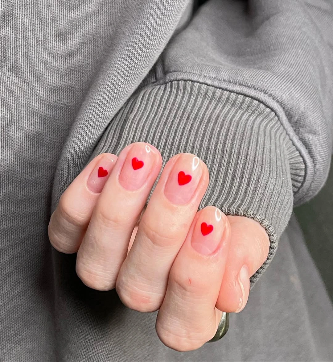
Motif scale is the key decision. One heart per nail feels deliberate because the pale background leaves room around it, while several hearts would change the mood and make the small canvas feel busy. For a subtler version, put one heart on each hand and keep the remaining nails sheer pink or a soft neutral with the same glossy finish.
Small shapes need crisp edges and enough distance from the free edge to survive normal growth. If the heart begins too close to the tip, its point can blur or disappear as the nail extends. The idea works best when the red stays bright but limited, so resist adding another accent color that would compete with the simple repeated mark.
Matte Red with One Controlled Sparkle
Long almond nails use a rich matte red base, and each nail carries one small reflective dot. The decoration is deliberately reduced to a single point, so the saturated color and elongated outline remain the main visual decisions. Matte texture keeps the red from appearing overly glossy, while the tiny accent gives the surface a measured interruption.
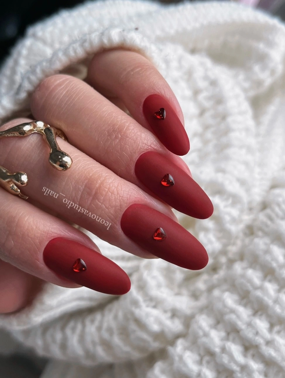
The centered dots create a quiet rhythm because they repeat at a similar scale without becoming a border. If the almond length feels too formal, move the same color onto a shorter oval and keep the dots on two fingers only. A glossy red tip could also add contrast, but the matte base is doing useful work by making the small points appear brighter.
Matte surfaces show fingerprints and changes in texture, while small embellishments may loosen before the base color looks worn. Place the details slightly inward and keep them small enough that a missing one does not ruin the whole composition. The design is strongest when the red remains solid and the sparkle acts as a note, not a second theme.
Milky Centers with Bright Red French Edges
Short square nails use pale milky centers and vivid red tips, creating a clean French structure with a clear seasonal shift. The red stays at the free edge, so the light base still occupies most of the surface and keeps the hand from feeling heavy. The straight square outline helps the tip read as a precise border rather than a random stripe.
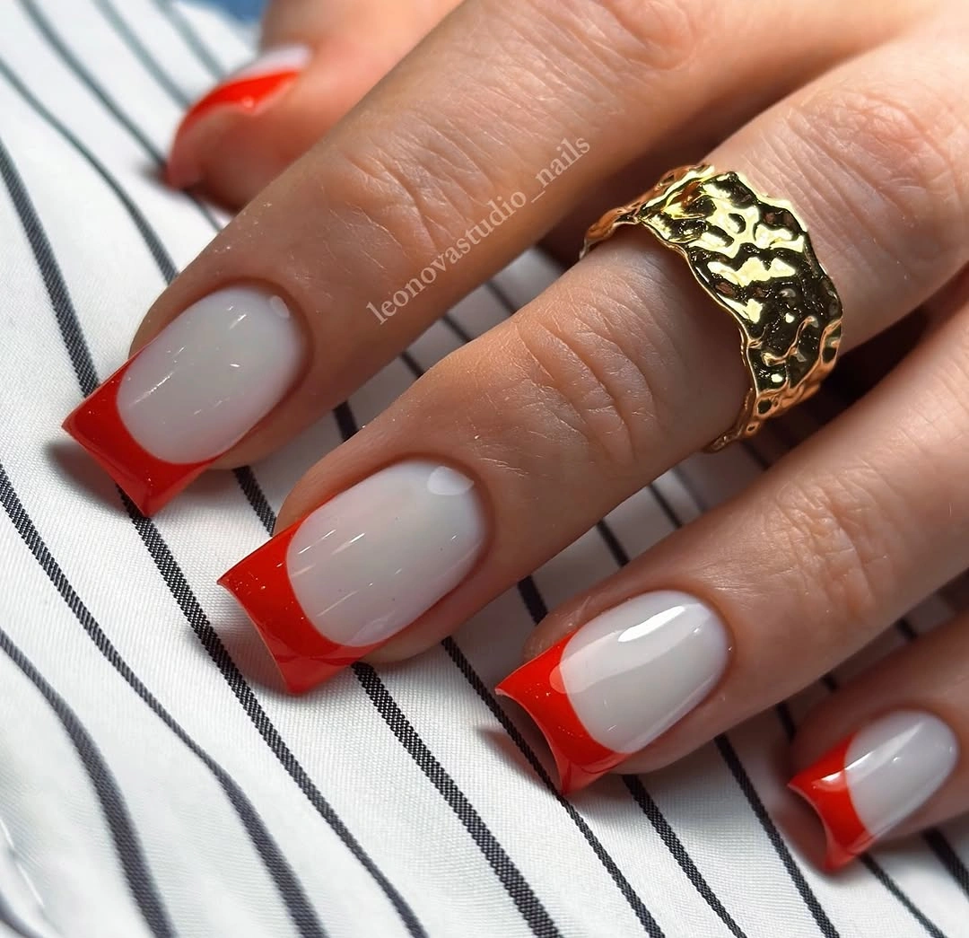
Tip width is the detail that controls the entire look. A narrow red edge feels crisp and wearable, while a broader one turns the manicure into a stronger color block. On very short nails, keep the border slim and slightly rounded with the natural tip; the visual contrast will remain clear without taking too much room from the pale base.
Because the bold color sits at the free edge, chips will be obvious and growth will change the proportion quickly. A red accent tip on two fingers is an easy edit if you want a lower-maintenance version, and a burgundy edge can make the contrast softer. The design is a good bridge between a neutral base and more detailed fall square nail designs.
Tonal Yellow Texture on Long Squares
Long square nails are fully yellow, but the surface appears textured or embossed in a closely related tone. The color remains continuous, so the eye notices the difference through shadow and raised-looking pattern rather than a second hue. That choice gives a large silhouette enough interest while preserving a very clear color story.
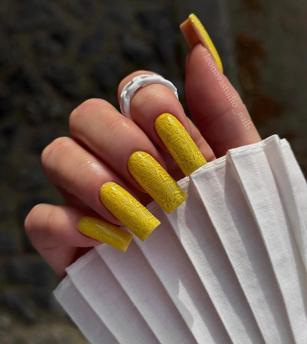
The texture works because the base and pattern stay close in value. A contrasting line would compete with the yellow, whereas a tonal finish lets the long corners and surface relief remain connected. For a shorter version, keep the texture on one or two accent nails and use a plain mustard or butter shade elsewhere so the small canvas does not become too dense.
Long square tips already require attention, and a textured surface can make uneven wear more visible near the edges. Choose a simpler pattern if you need a manicure that can handle frequent contact with fabric or tools. The design is most convincing when the yellow feels like one material with changing light, not a solid color carrying a separate printed motif.
Blue Violet Gradient with Raised Flowers
Long pointed nails move from blue into violet and pale translucent areas, while small raised flower-like accents sit on selected surfaces. The gradient gives the eye a path along the length, and the flowers provide concentrated points of detail near the center. The design depends on the relationship between movement and relief, not on one color alone.
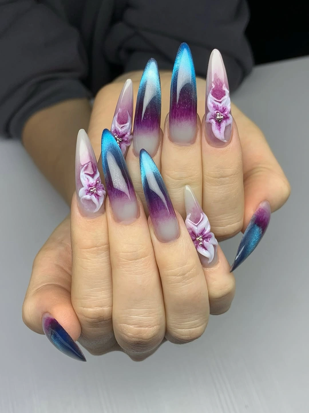
The raised details are most effective because they break the smooth gradient at only a few locations. If every nail carried the same flower density, the color transition would lose its breathing room. A shorter adaptation can keep the blue-violet fade on two fingers and replace the raised flowers with one painted mark, preserving the direction while lowering the upkeep cost.
Long points and dimensional-looking decoration create a real practical limit: the tips may catch, and small details can wear unevenly. Keep the strongest flower away from the free edge and let the gradient remain visible around it. This is a design to choose for impact, then simplify when you want the color movement to become part of regular wear.
Translucent Gray White Stiletto Shine
The long stiletto nails are pale gray-white and translucent-looking, with a smooth reflective surface that carries almost no visible art. Their length is dramatic, yet the color stays cool and restrained, so the eye reads the silhouette first and the gentle glassy reflection second. The lack of a motif makes the shape and finish unusually easy to evaluate.
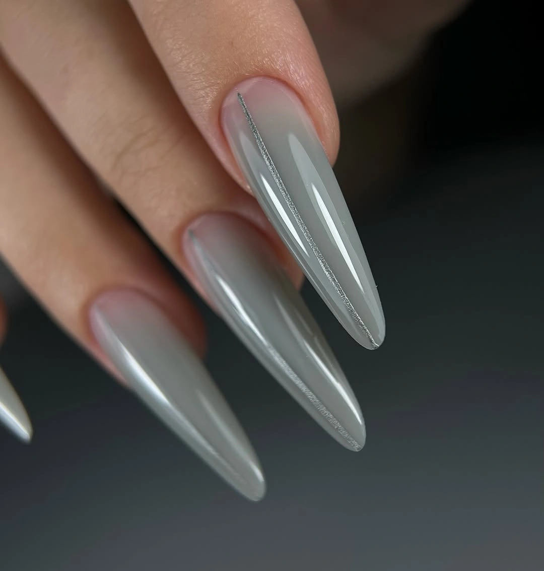
Cool translucency works because it leaves visual space around the sharp outline. A medium almond would make the same gray-white finish more practical, while a soft nude undertone could warm it without changing the clean structure. Keep the surface smooth and avoid adding contrast unless the simple silhouette feels too quiet for the occasion.
Translucent-looking nails can reveal uneven thickness or edge wear that an opaque color would hide, and long stiletto tips bring their own daily limitations. If the priority is a reliable manicure, shorten the point and use the same pale reflective finish. The visual lesson is that restraint can still look intentional when the surface and shape are carefully aligned.
Brown Tortoiseshell with One Clear Accent
Warm amber and brown patches create a glossy tortoiseshell effect across medium almond nails, while one accent surface becomes paler and more translucent. The irregular areas vary in depth and size, but the colors stay close enough to read as one natural pattern. The almond outline softens the stronger brown tones and gives the hand a flowing rather than blocky shape.
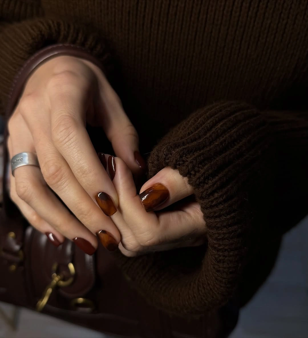
The accent nail matters because it breaks the repeated patchwork without introducing an unrelated color. A plain espresso or caramel finger would offer the same relief if you prefer less transparency, and a shorter oval can carry the warm pattern without demanding long edges. Keep the darker patches varied, since identical spots would make the surface look more printed than organic.
Irregular pattern is forgiving in matching but less forgiving in balance. Too much dark material on one side can make the hand feel uneven, while a worn accent nail can interrupt the color story. Place the lightest area where you want attention and let the remaining fingers support it quietly; this is more useful than adding another motif simply to create variety.
Reflective Charcoal on Long Almonds
Long almond nails are coated in a dark charcoal-black tone that catches narrow highlights without showing a separate design. The surface has more movement than a flat black, but the outline stays clean and the color remains the only major decision. A watch and dark clothing frame the hand, yet the manicure still reads as a sleek, focused field of reflection.
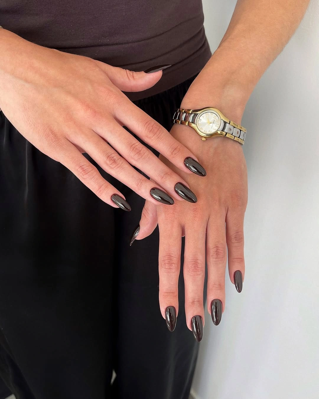
Shine placement is the small feature that keeps the dark color from disappearing. A shorter almond or oval can preserve the reflective line while reducing the dramatic length, and a slightly warmer charcoal may pair more gently with brown clothing or gold jewelry. Avoid adding art unless the surface alone no longer provides enough contrast for your style.
Glossy charcoal exposes scratches and uneven edges, particularly on a long almond where the eye follows the contour. Keep the finish consistent across fingers and let the clean shape create the polish. This is a strong example of detail-first editing: one reflective shift is enough when the base color and outline already have clarity.
Fine Shimmer Hidden Inside Purple Gloss
Short square nails carry a deep purple base with fine shimmer that becomes visible in the highlights. The color reads nearly solid from a distance, but the small reflective particles keep the surface from looking flat when the hand moves. The compact shape gives the shimmer a neat frame and keeps the design easy to read without extra art.
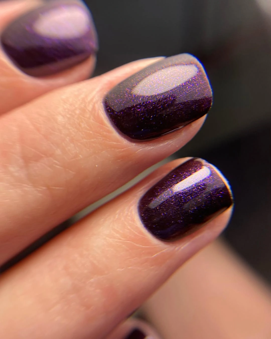
The shimmer is doing a supporting job rather than becoming a separate focal point. A berry-purple or deeper plum could create the same layered effect, and one accent finger can carry a brighter finish if a full hand feels too uniform. Keep the shape short and the top surface smooth so the tiny reflection remains the detail viewers notice first.
Fine particles can draw attention to surface dents or a loss of shine, so the simplicity still has a maintenance condition. A soft matte top would remove the reflective detail and change the whole reading, while a glossy surface keeps the purple alive. This is a useful middle ground between a plain color and a full glitter design.
Deep Navy with a Clean Gloss Line
Short square nails in saturated navy blue use the strongest possible detail sparingly: a smooth glossy surface with bright reflected lines. The color is deep enough to approach black in shadow, but the blue remains visible and gives the hand a cooler direction. There is no motif to interrupt the square outline, which makes the result concise and easy to judge.
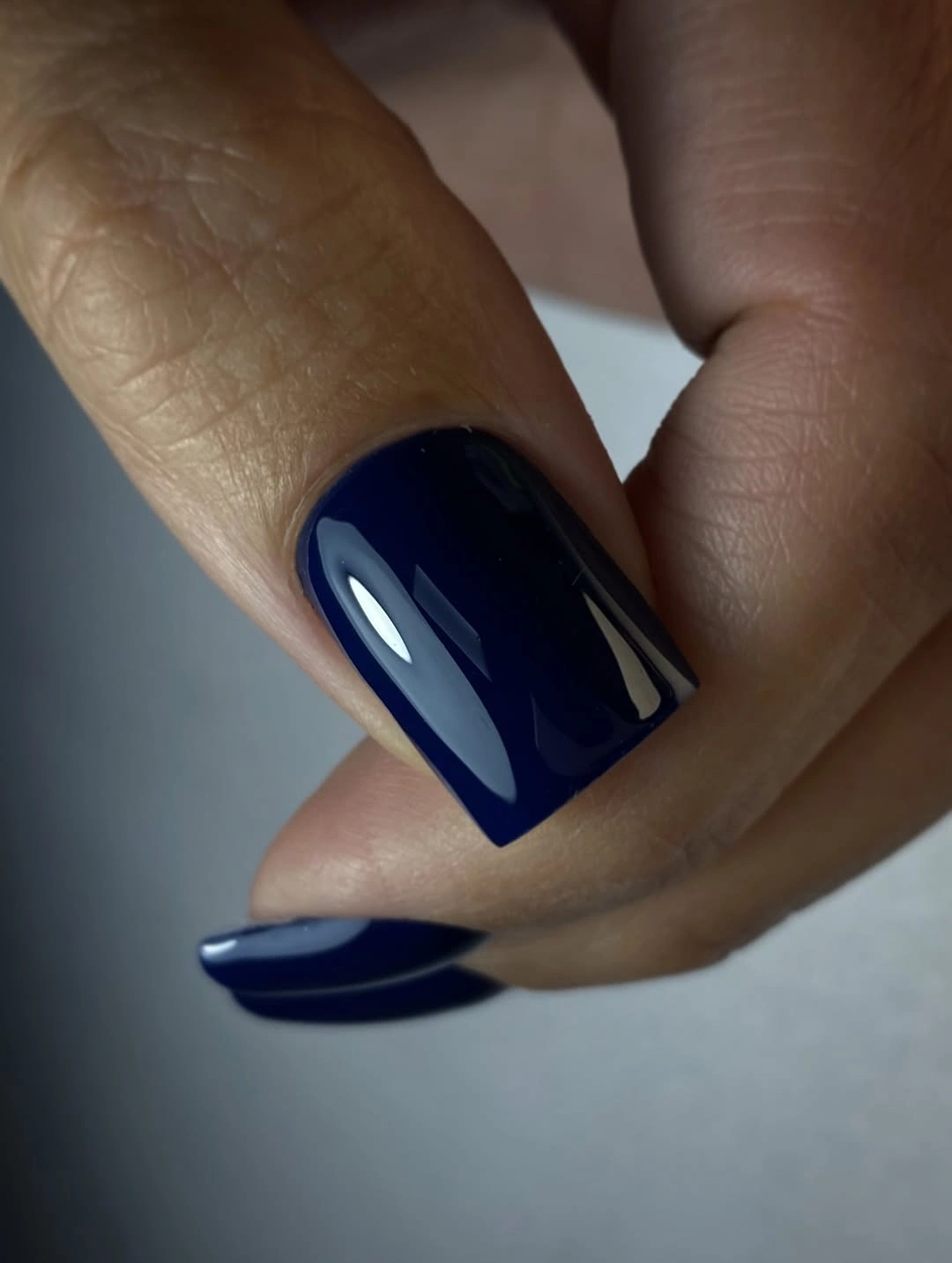
Navy changes the mood of a dark manicure without requiring extra decoration. Pair it with one sheer neutral accent if you need relief, or keep every finger solid when the goal is a clean color statement. On shorter nails, the square edge helps the blue look deliberate rather than disappearing into a small dark oval.
The reflected highlights show whether the surface is smooth, and the deep tone makes chips visible at the corners. Use a thinner application near the free edge and keep the finish even so the blue remains rich rather than heavy. The design succeeds through clarity, which is why a second color should be added only for a clear balancing reason.
Forest Green in a Compact Glossy Shape
Glossy forest green covers short square nails and appears almost black in the shadowed parts of the hand. The color becomes more apparent along the central highlights, giving the solid manicure a little depth without a motif or contrasting accent. The compact outline makes the green feel practical, while the tone still carries a clear seasonal association.
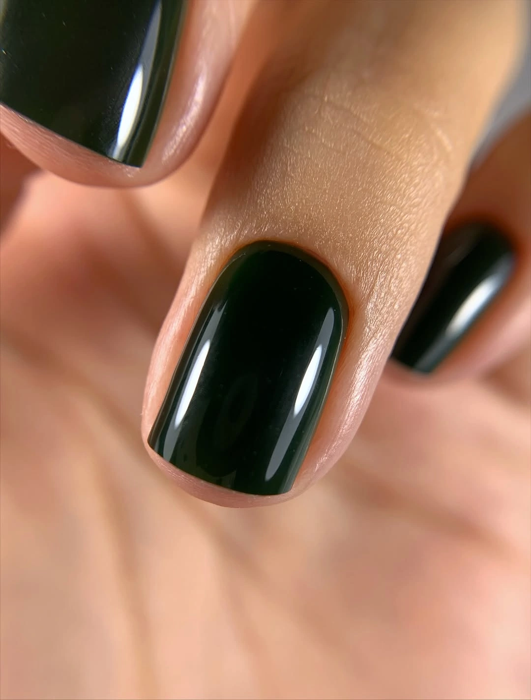
The green is strongest when its undertone remains visible, so a smooth glossy finish helps more than added art would. Pair it with nude or brown on one or two fingers if the full hand feels too dark, but keep the companion color quiet enough to leave the green in charge. A shorter squoval will hold the same balance when square corners feel too firm.
Deep green shares the maintenance demands of other dark solids: the edge and cuticle line will show wear quickly. That is a manageable tradeoff because the design has no tiny details to repair, and a small chip can be corrected without rebuilding a pattern. Let the color stay simple, then use clothing or jewelry to adjust the final contrast.
Chocolate Brown with a Centered Light Band
Short rounded nails in warm chocolate brown carry a brighter oval reflection through the center of each surface. The light band gives the solid color a directional quality without becoming a painted stripe, and the rounded outline keeps the effect compact. The result is a small study in how light placement can create depth inside one shade.
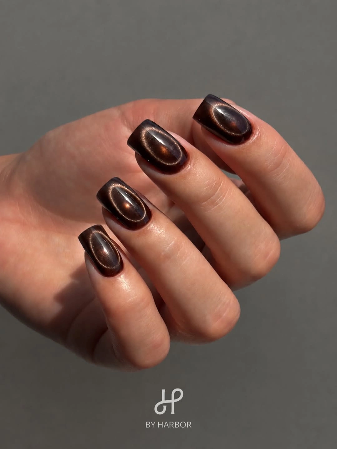
The centered reflection works because it repeats across the hand while the edges remain dark. A bronze-brown or espresso version can tilt the look warmer or deeper, and a shorter nail can keep the band visible as long as the surface remains smooth. If you add an accent, repeat the same reflective direction rather than introducing a separate motif.
Directional shine is less forgiving of dents because the bright line traces every change in the surface. Keep the finish even and avoid overloading the nail with extra texture. The design is practical when you want a finish that feels considered from close up but still reads as a clean, single color from a distance.
Pearly Beige for Soft Seasonal Light
Short square nails in pale beige-white use a satin pearl reflection that feels warmer than a cool milky pink. The surface remains smooth and nearly monochrome, but its light changes gently across the fingers and keeps the neutral from looking blank. The small square outline gives the shimmer a neat boundary without making it look formal.
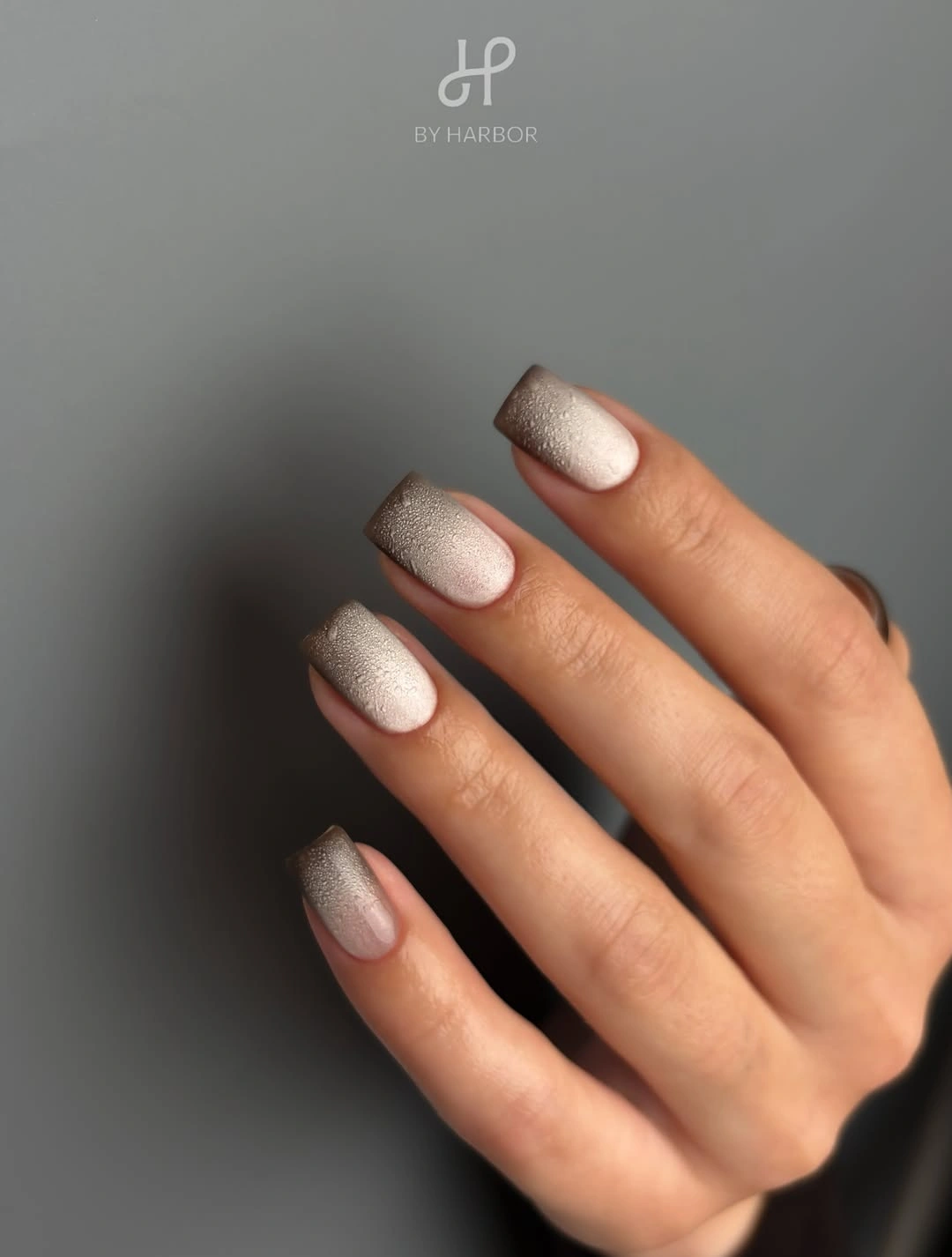
The undertone is the detail to watch. A warm pearl can sit comfortably beside brown, camel, or burgundy clothing, while a cooler white would create sharper contrast. Keep the coverage light and the shape compact if you want the hand to feel soft; adding a strong line or dark tip would move the manicure into a different visual job.
Pale shimmer shows marks and edge wear, so a clean finish matters more than the number of decorative elements. If the color looks too subtle, build the pearl slightly rather than adding glitter pieces that break the smooth reading. The result is useful when you want brightness that still feels connected to a richer fall palette.
Blue Purple Marbling with Concentrated Swirl
Short square nails close the article with saturated blue, violet, pink, and orange-like reflections flowing through an irregular abstract pattern. The swirls are compact but high-contrast, so each finger becomes a small focal surface while the square outline keeps the overall shape orderly. The finish appears especially active where the colors overlap and catch the light.
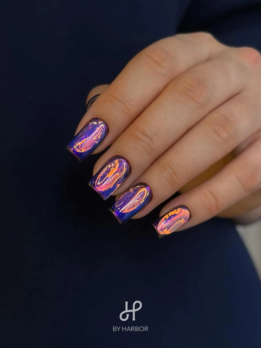
The strongest detail is the concentration of color near the center rather than the entire nail being equally busy. A deep blue solid on the remaining fingers would give the marbled accents relief, and two accent nails are usually enough for a wearable adaptation. If the shape grows shorter, reduce the number of color turns instead of shrinking every swirl until it loses definition.
High-contrast marbling has a real limit: uneven gloss or edge wear can make the pattern feel more chaotic, and the small canvas can become crowded quickly. Keep the base dark enough to anchor the bright reflections, then let the irregular movement remain the only decorative language. That preserves the detail-first appeal without turning every nail into competing visual noise.