
Fall Short Coffin Nails Designs With Color and Detail
Short coffin nails become more convincing when the edge is treated as an active line rather than leftover space. A tapered corner, a narrow tip, or a gap beside one small mark can decide whether the manicure looks light or crowded before any color is judged. That is the detail I would check first when saving an idea: where does the eye get a pause?
The fall mood is often built in the parts a quick scroll misses – the width of a border, the distance between two accents, and the amount of base left untouched. Look for that hidden structure before copying the shade. On a short coffin shape, restraint is not a lack of ambition; it is what lets one deliberate gesture look sharper.
Teal Flame Curves Over a Quiet Taupe Base
The smallest decision here is the thin black border around the teal curves, and it gives the whole manicure its rhythm. A pale taupe base keeps the long tapered coffin shape from looking dense, while the cool teal loops travel across the nails like controlled flames rather than broad blocks of color. Because the lines are placed on separate fingers, the eye can follow them without losing the neutral space between each accent.
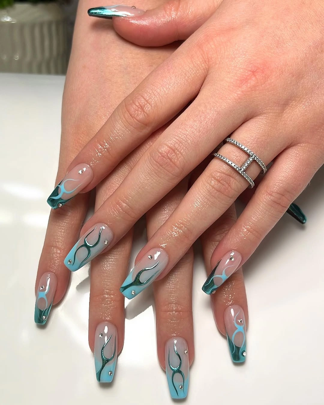
That open base is what makes the design adaptable. Keep the full teal movement when you have enough length for the curves to breathe, or move the strongest outline to two accent nails and leave the others taupe for a calmer short coffin version. A thinner border will also preserve the contrast if the nail bed is compact, while a heavier line would quickly turn the pale center into a crowded field.
The tradeoff is visibility: a light base shows edge wear and regrowth sooner than a darker solid color, especially on a long tip. Still, the design gains more from the empty taupe space than it would from extra decoration, so maintenance is better spent on keeping the outline crisp and the tapered corners even.
Dotted White and Burgundy Tips Share One Pink Base
Instead of repeating one French tip across every finger, this manicure splits the role between white dotted edges and darker burgundy tips. The blush pink base ties them together, and the small pale dots keep the two tip colors from feeling like separate ideas. Medium tapered squares give the contrasting edges enough room to read, while the burgundy accents pull attention toward a few selected fingers rather than the whole hand.
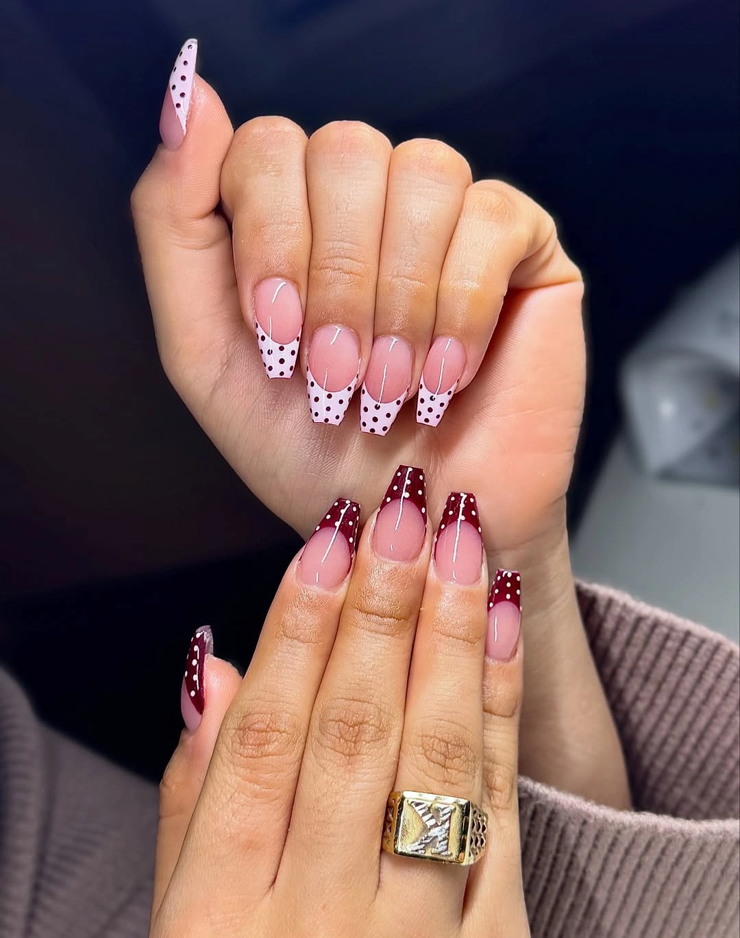
For a shorter interpretation, keep the dotted white edge on the middle finger and the burgundy tip on the ring finger, then use plain pink elsewhere. That preserves the visual conversation without forcing every small dot to fit into a reduced surface. If you prefer a more even arrangement, repeat the dot scale but let the burgundy stay solid, since too many tiny marks near a short edge can blur into one pale band.
The playful variation works because the accents have a shared scale. What needs attention is the spacing: dots that crowd the tip will compete with the color underneath, while a little breathing room lets the tapered outline remain part of the design. The result is decorative but still organized, with the darkest detail doing just enough work to anchor the softer pink.
Lime and Pastel Details Keep Short Nails Light
Bright lime could easily dominate a short manicure, yet here it appears as a narrow edge, a small green block, and a few pale yellow details instead of one uninterrupted neon surface. The sheer pink base softens those accents, and the outlined oval adds a clear focal point without needing a large motif. A short square shape gives every color a compact boundary, which keeps the mixed palette lively rather than sprawling.
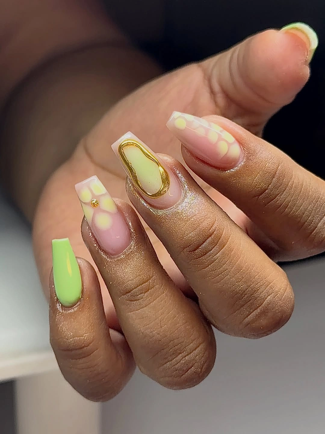
One practical way to borrow the idea is to choose the lime French edge and one outlined accent, then remove the extra yellow and green marks. That keeps the acid color visible while giving the short nail more open space. If the design is extended to a slightly longer coffin shape, the pastel blocks can move toward the center, but they should remain separated so the base still reads as part of the composition.
Small-scale color is the strength and the limitation here. The details feel fresh when their borders are clean, yet a crowded repetition would make the short surface look busy and reduce the impact of the lime edge. I would keep the brightest shade in the smallest area and let the translucent pink do the quiet work around it.
Blue Wave Tips Give the Nude Base Direction
The cobalt tip establishes a firm horizontal boundary, but the black-and-white curves stop it from looking like a plain block of blue. On the nude pink base, the waves create movement through the tip rather than across the entire nail, and the medium coffin length gives the lines enough room to stay legible. The contrast is bold, although the pale center keeps the manicure from feeling covered from cuticle to edge.
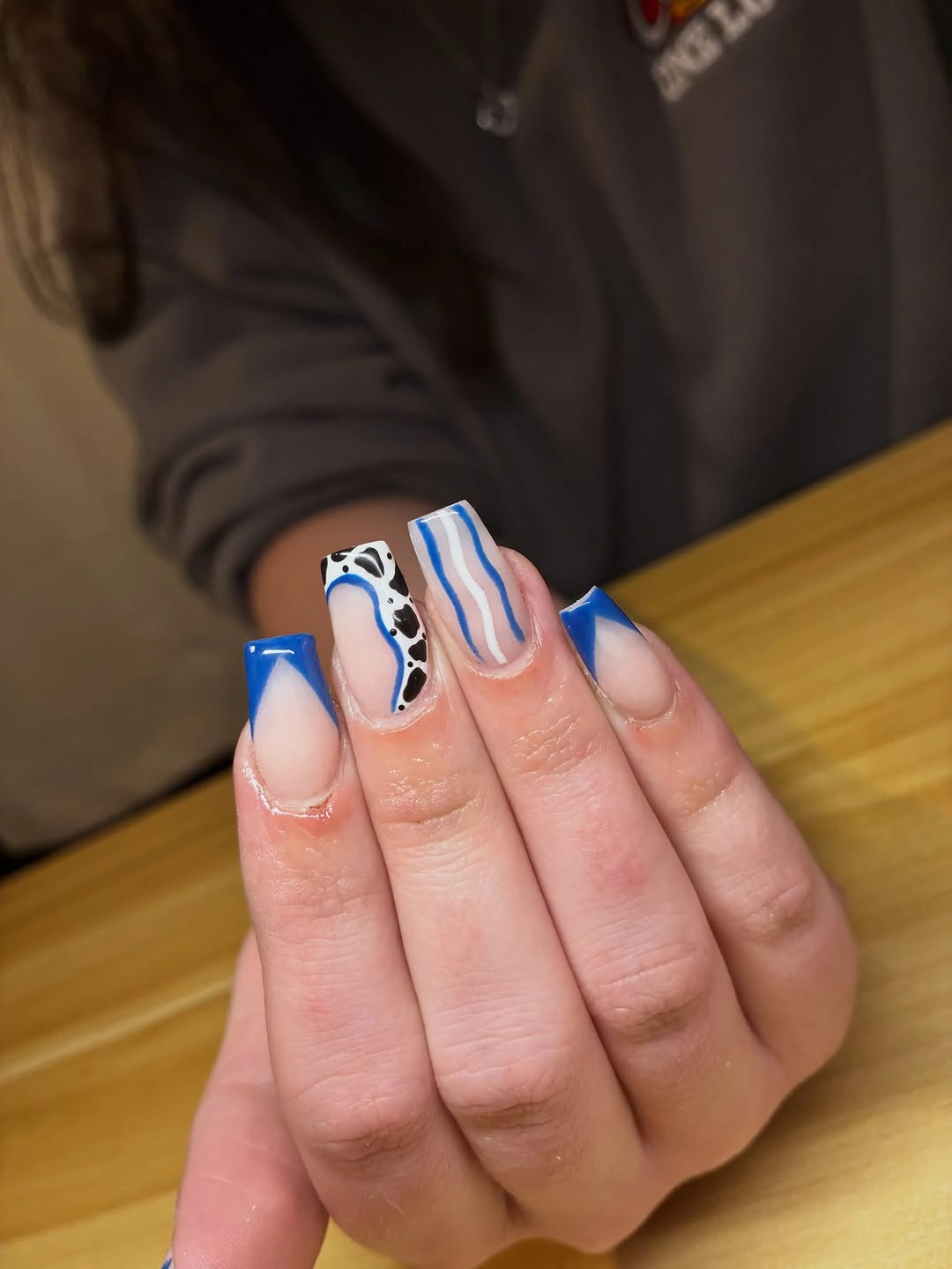
For a shorter version, keep the blue edge on every nail and place the black-and-white wave on only two fingers. That change protects the central idea – a graphic blue boundary with movement – while reducing the amount of fine linework that has to fit near a short tip. A softer navy or muted blue would also lower the contrast without losing the structure created by the French placement.
The design is most convincing when the wave direction varies slightly but the line weight stays related. If every curve becomes equally thick, the tip can read as a dark pattern instead of a blue edge with an accent. The practical note is simple: preserve the open nude area and the clean border, because those two spaces are what make the stronger color wearable.
Pink Star Tips Make a Short Square Feel Cheerful
Short square nails do not need a large illustration to feel playful. Here the hot pink tips provide the saturated color, while small white star-like marks interrupt the edge and give selected fingers a clear focal point. The base stays close to a soft pink, so the stars read as little flashes rather than a full white pattern, and the squared outline keeps the bright tips neat.
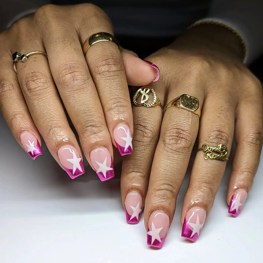
Keep the stars on the middle and ring fingers if you want the simplest repeat, then leave the index and little fingers as plain pink tips. That distribution creates a pause between accents and works especially well when the nail is short enough that a full star pattern would lose its shape. A single white mark can also replace the larger burst without changing the cheerful contrast.
What makes the look useful is its proportion: the strongest color remains at the edge, and the decoration does not cover the whole nail. White details will need enough separation to remain star-like, so shrinking the motif is better than squeezing several marks together. The finished impression stays bright because the base is calm and the accent is allowed to be small.
Pastel Blue Lets Two Patterned Nails Lead
Most of the hand is a soft powder blue, and that restraint gives the two patterned accent nails their purpose. Their yellow, pink, green, and pale marks are dense enough to feel collected, but the surrounding blue prevents the manicure from becoming a different print on every finger. The short square shape acts like a small frame, making the accent pair easy to notice without requiring a longer silhouette.
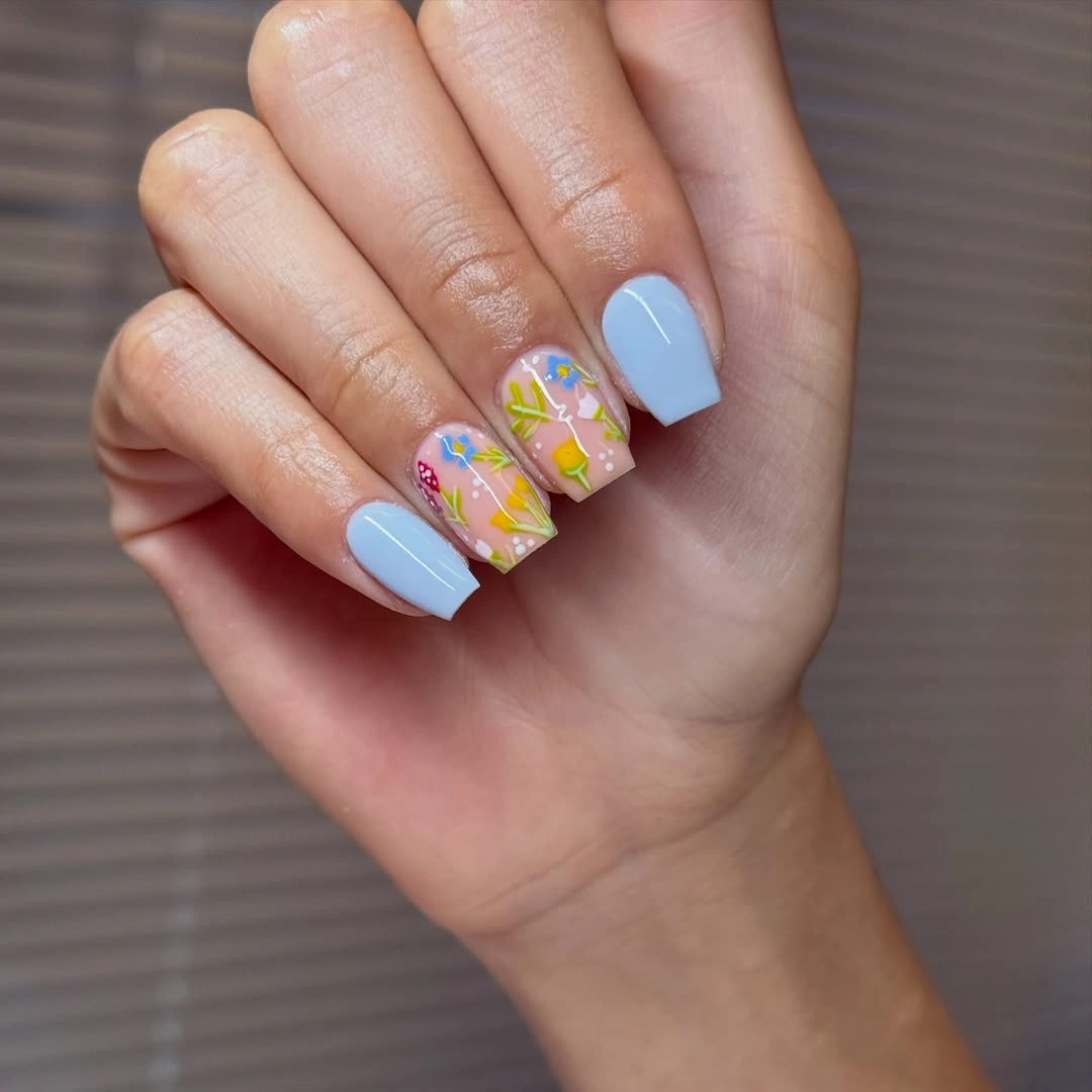
One patterned accent can be enough when adapting this idea. Leave the ring finger or middle finger detailed, keep the other nails blue, and choose one pastel from the accent as a tiny supporting dot if you want a link between them. A white base could replace the blue on a single nail, but it should stay mostly clear of extra marks so the original breathing room remains.
The balance depends on concentration. The small pattern works because it is surrounded by solid color, while repeating it across all fingers would remove the quiet blue pauses that make the colors readable. This is also a practical way to use a busy reference: copy the placement logic first and treat the individual tiny marks as optional.
Warm Beige Uses Shape Instead of Decoration
A nearly single-tone beige manicure can look intentional when the square outline is clean and the color has enough warmth to sit close to the hand. Here there is no competing motif; the interest comes from the quiet change between the beige surface and the warmer edge visible on the thumb. That makes the medium square proportion easy to study, because the shape is not hidden under art or sparkle.
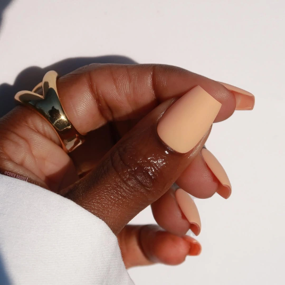
Use one warm nude across the whole set if you want the most direct interpretation. If a plain result feels too empty, add only a narrow warmer edge on one or two nails rather than introducing a new pattern. The same decision can move to a short coffin outline, but keeping the color close to the base will preserve the calm relationship between shade and silhouette.
Minimal color has an honest limitation: uneven edges, patchy coverage, and regrowth are easier to notice when nothing else distracts the eye. The upside is that the manicure remains easy to coordinate and easy to edit. A tidy border does more for this look than another accent would, so the maintenance focus should stay on proportion and surface consistency.
Sage Solids Frame a Milky Green Accent
Deep sage nails establish the darker side of this palette, while milky green accents carry pale marbling and tiny warm flecks. That contrast creates a clear center without turning the whole manicure into one dark block. The short rounded-square outline helps the green feel approachable, and the light accents give the fall color a softer finish than a full solid set would have.
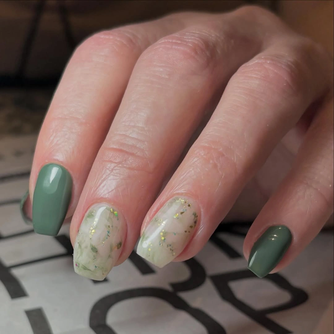
For an everyday adaptation, place the marbled treatment on one central nail and repeat deep sage on the rest. The pale accent will still provide the change in value, while the reduced number of flecks keeps the short surface from looking crowded. A milky base without the small warm marks is another easy simplification if you want the green contrast to remain the main idea.
The darker color anchors the hand, but it also makes the edge more visible as the manicure grows. The marbled nail needs a little empty space so the pale and green tones do not merge into a single cloudy patch. Keeping the accent lighter and the solids deeper is what gives the set its quiet fall rhythm.
Silver Sparkle Lets the Taper Do the Work
Every nail here uses a fine silver shimmer, so the manicure relies on reflection, length, and outline instead of separate motifs. The pale pink-neutral undertone keeps the sparkle from looking icy white, while the medium tapered square gives the uniform finish a clean directional shape. There is no need to add a second color because the light changes across the surface as the hand moves.
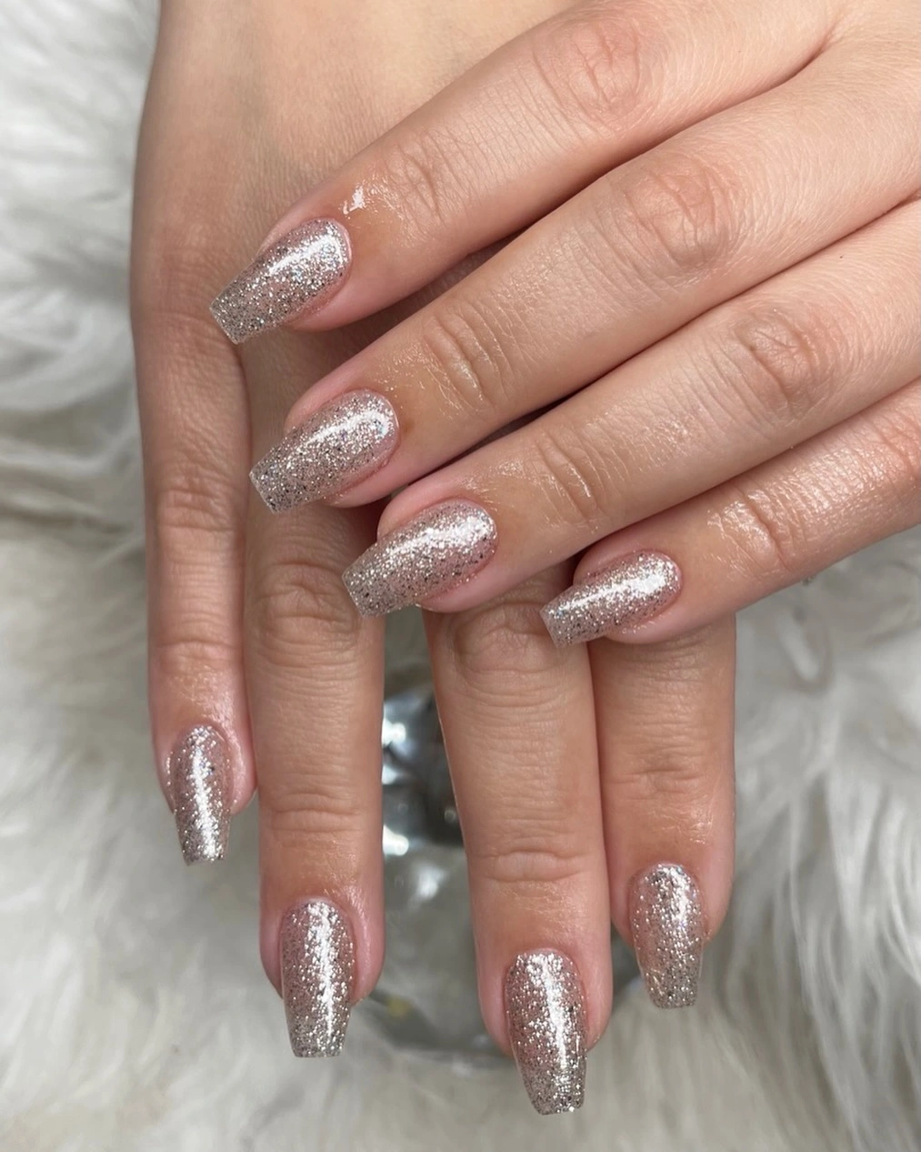
All-over sparkle is one of the easiest ideas to shorten because the surface does not depend on a large drawing. Keep the same silver on a short square, or place it on two accent fingers over a neutral base if you want more contrast. A soft pink undertone will keep the result warmer, whereas a cooler base will make the reflective finish appear brighter.
The tradeoff comes from the uniformity. A single finish feels clean and coordinated, but it also reveals texture, grow-out, and any change in the tip line without an accent to interrupt the view. That is not a reason to add more detail; it is a reason to let the tapered outline stay even and to use the sparkle as the only focal choice.
Muted Curves Keep an Almond Look Delicate
Soft pink is the base here, but the manicure becomes distinctive through small mauve and pale blue curves placed near the edges. They are quiet enough to stay delicate in outdoor light, and the medium almond shape gives each stroke a little lengthwise direction. Instead of filling the nail with contrast, the design uses a few muted marks to suggest movement around a calm center.
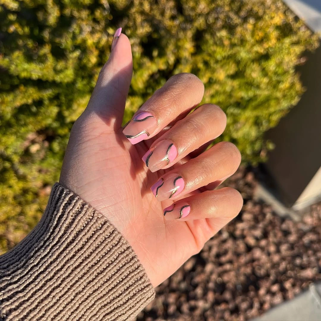
Choose one accent color if you want to make the idea easier to repeat. Mauve will give the pink base a warmer shadow, while pale blue will push the look cooler; either can sit on the ring and index fingers without changing the gentle scale. On shorter nails, a single curved stroke near the tip is safer than several small marks competing for the same space.
Lighting is part of the practical consideration because pale details can recede indoors or against light clothing. The design succeeds when the marks remain accents rather than becoming the first thing noticed, so stronger contrast is not automatically an improvement. Keep the almond edge clean and allow the muted color to remain slightly understated.
White Flower Accents Break Up Blush Pink
The blush base is deliberately simple, which gives the white flower-like accents enough contrast to feel special without covering every nail. The dark background makes the pale details easy to read, but the manicure itself stays centered on the pink surface and medium square shape. A small floral mark can therefore act as a focal point while the surrounding nails provide a visual pause.
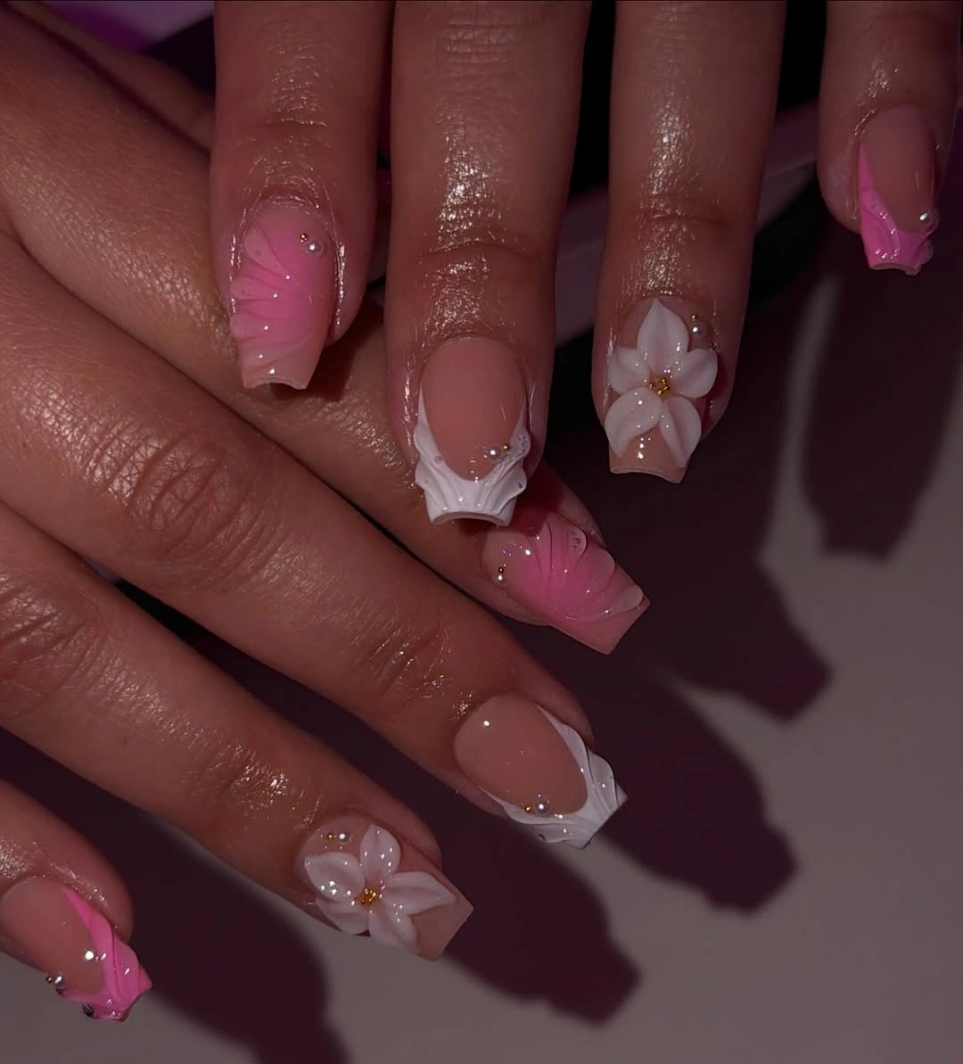
One white flower on the ring finger is enough for a wearable adaptation. Keep the remaining nails blush, or add only a tiny white dot nearby if you want the accent to feel connected without repeating the whole shape. On a shorter square, a single petal-like mark will stay clearer than several overlapping details near the edge.
The delicate element should remain proportionate to the base. White accents draw attention to the individual nail and may appear more raised or visually prominent than a smooth color, so they are best placed where there is room around them. The calm pink field is doing as much work as the flower; removing that space would make the design less airy.
Blue Botanical Strokes Sit Clearly on White
These almond nails use a white ground to make the cool blue marks crisp. Repeating leafy strokes, tiny dark points, and occasional pale yellow details create a botanical impression without needing a full illustration on each nail. The pattern has enough variation to feel hand-observed, while the pale background keeps the blue from becoming too heavy across the medium length.
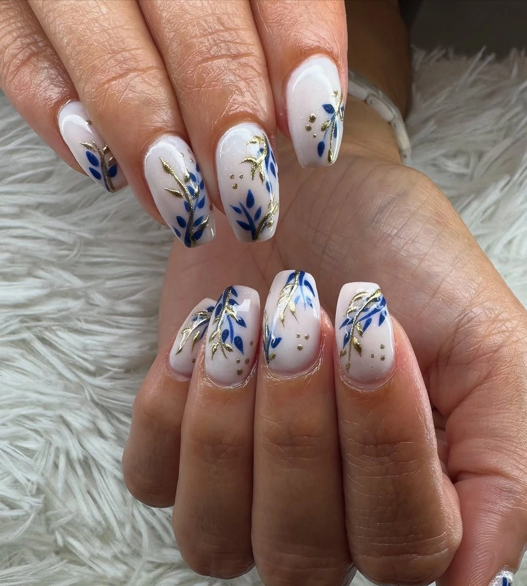
For a shorter version, keep the blue pattern on two nails and use plain white or a sheer pale base elsewhere. Fewer marks will preserve the leaf-like rhythm because each stroke has more room around it. If you want a warmer fall connection, a small muted yellow point can stay in the accent, but it should support the blue rather than become another full motif.
Fine linework benefits from the almond length, yet the same length can make dense detail feel more deliberate and statement-led. A practical limit is to reduce the number of strokes before changing the palette. The pattern works because the white surface remains visible between marks, giving the eye a clear route across the hand.
Black and White Geometry Sharpens a Sheer Base
A translucent-looking pink base leaves the center of these long almond nails open, so the graphic black-and-white tips carry the visual weight. The dark outline gives the manicure structure, while the white sections keep the contrast from becoming a single heavy band. Long almond length supports the angular placement and lets the tip design follow the taper rather than fight it.
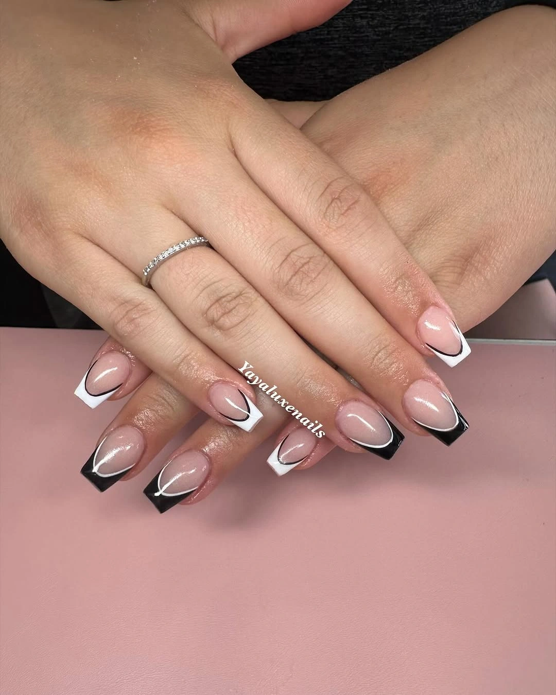
On a shorter shape, keep the black line as a narrow border and simplify the white area into one clean block. That preserves the relationship between open base and high-contrast edge without trying to reproduce every angle at a reduced scale. A medium coffin would make the geometry more direct, but leaving some pink visible is still essential to the balance.
The result is more statement-led than the pale solid looks, partly because the dark edge makes the length read immediately. That is the honest tradeoff: graphic tips have strong payoff but less room for imprecision. If the linework becomes uneven, the eye sees it quickly, so a simpler border often looks more polished than extra internal detail.
Blush Oval Color Keeps the Shape in Focus
Short oval nails in an even pale blush pink show how much a manicure can say through proportion alone. There is no contrasting tip, sparkle, or motif to distract from the rounded edge, so the soft color and tidy outline become the complete visual decision. The result feels calm because the surface is uniform and the shape does not try to look longer than it is.
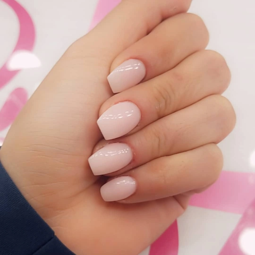
This is a useful base for a more personal version. Keep every nail blush if you want the quietest result, or add one tiny line on the ring finger while leaving the oval shape and pale field untouched. A short coffin can borrow the color, but the rounded outline is what gives this particular look its softness.
Plain pale color asks for clean coverage because there is nowhere for an uneven edge to hide. That makes maintenance visible, yet it also means the design is easy to understand and easy to adjust. The best change would be a small, intentional accent; adding several unrelated details would take away the reason this simple oval works.
Warm Framed Accents Add a Jewelry-Like Note
Blush pink remains the main color in this manicure, while small champagne and brown details appear near selected tips and centers. Their warm tone echoes the surrounding rings without depending on them, and the medium almond shape gives the accents a little room to sit apart from the cuticle. The design feels detailed only when viewed closely because the base stays smooth and light.
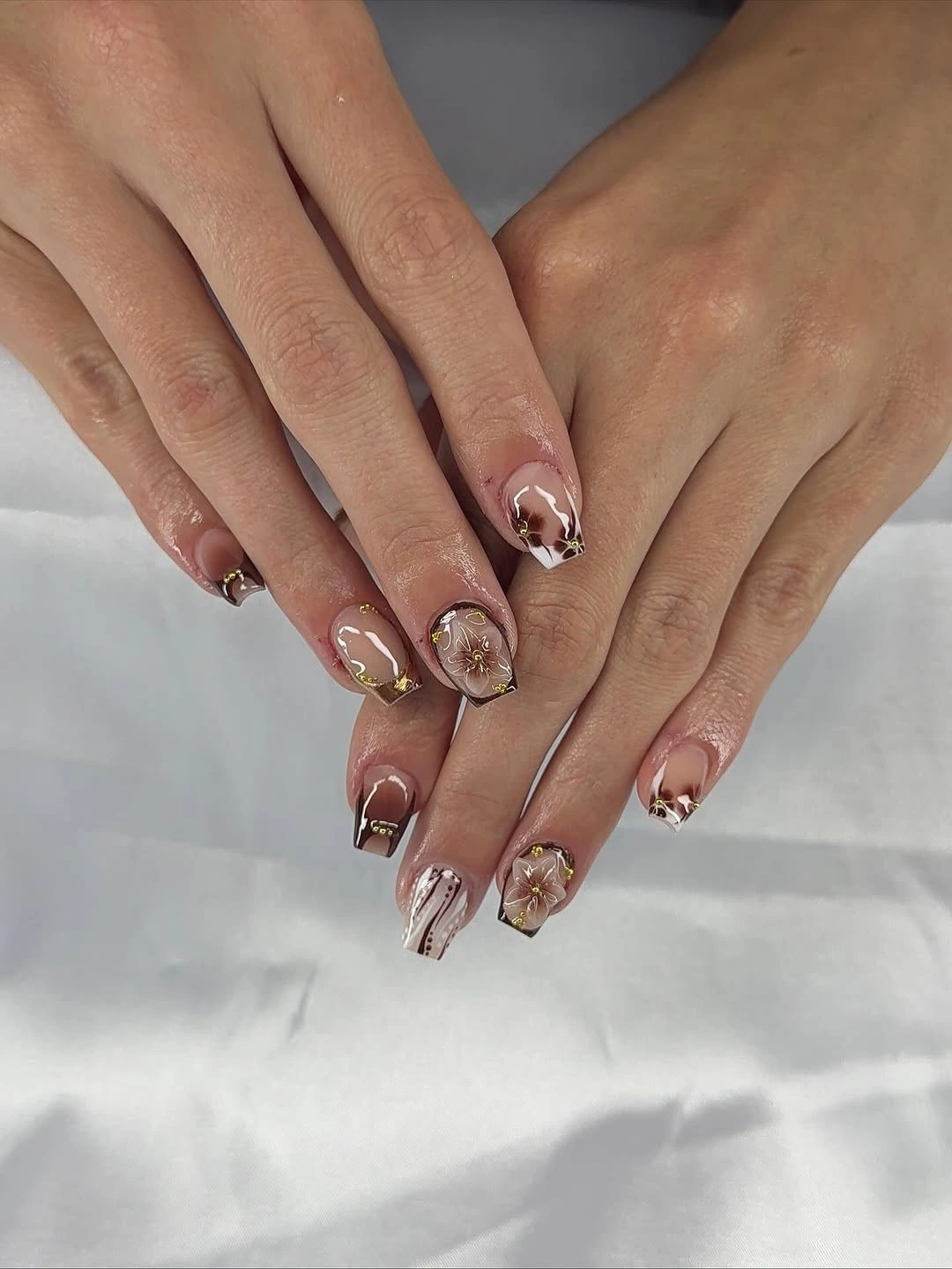
Move the framed detail to one nail and keep a thin warm line on another when adapting the look. That preserves the jewelry-like suggestion while reducing the number of small marks that must remain crisp. On a short square, use a single corner accent rather than a full frame so the pale base still has breathing room around it.
Small accents are easy to overstate in a written description, but their real strength is their scale. They reward a closer look without competing with the pink, and that makes them more wearable than a dense metallic pattern. Keep the warm marks isolated and let the almond outline carry the rest of the visual structure.
Pale Lilac Lets a Square Edge Feel Fresh
The pale lilac surface is nearly uniform, and the squared tips provide the structure that stops the cool pastel from looking indistinct. Soft fabric around the hand adds atmosphere, but the manicure itself stays focused on color and proportion. With no extra motif to interrupt the field, the eye reads the even lilac finish and the medium square edge together.
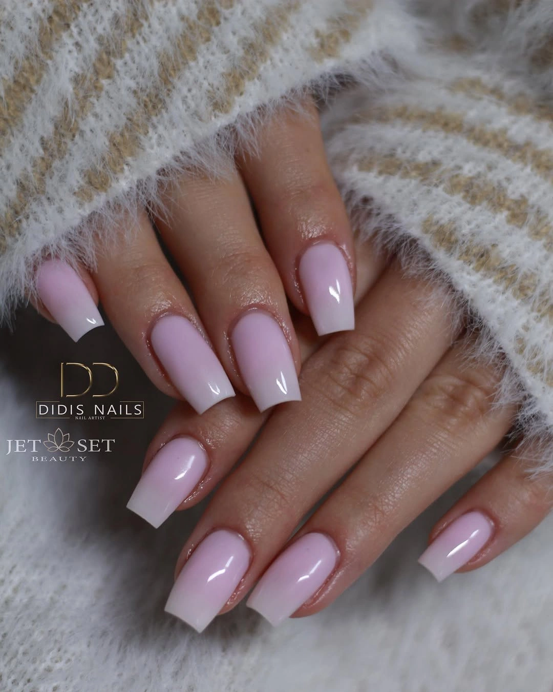
Use the same lilac on a shorter square if you want to keep the clean reset, or add one white accent nail when a completely solid set feels too quiet. The color can also move to a rounded shape, though changing the edge will make the manicure softer and less graphic than the supplied square silhouette.
Pastels show coverage changes, so the surface needs to stay consistent for the color to feel intentional. That small limitation is balanced by the freedom of the palette: lilac can sit beside warm neutrals or deeper fall shades without requiring a new pattern. A single controlled accent is enough if the set needs more contrast.
Gold-Like Flecks Give Nude Tips a Small Spark
Long nude pink nails use tiny warm flecks and star-like marks rather than a full metallic coating. The dark background makes the accents visible, but the nude base keeps the overall effect airy and lets the tapered square silhouette remain important. The decorative marks are concentrated on selected nails, creating a small surprise instead of a repeated glitter field.
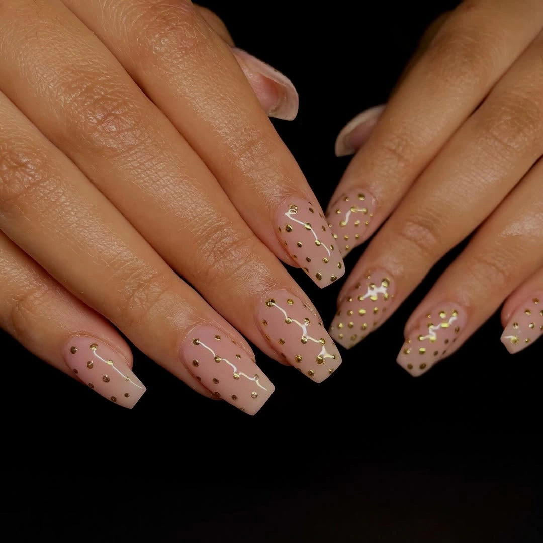
For a shorter version, collect the flecks on one accent finger and leave the other nails nude. The look will still have a point of light, while the reduced detail gives the square edge more room to show. If the nude base is close to the skin, a slightly darker warm mark will remain readable without expanding the motif.
The open base is both the strength and the maintenance note. It keeps the long shape visually light, but chips and regrowth can stand out against a pale color, especially at the squared corners. There is no need to solve that with more decoration; the cleaner choice is to keep the flecks sparse and the tip line even.
Red and Pink Panels Use Negative Space Carefully
Bright red tips, pink panels, thin white lines, and sheer openings share these medium coffin nails, but the design does not treat every section equally. The open pink areas give the eye a pause between stronger red shapes, while repeated diagonals keep the set connected across both hands. The graphic contrast feels lively because the base remains visible under the construction.
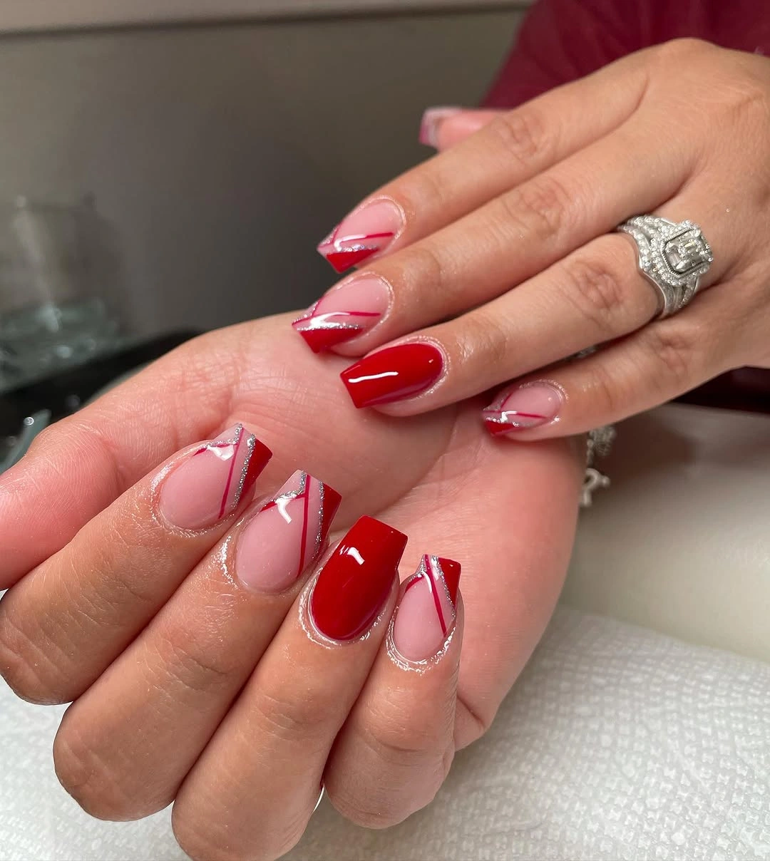
When shortening the manicure, keep one red diagonal and one pink section per accent nail, then let the remaining fingers use a simple red or sheer base. That maintains the idea of open space without asking several panels to fit on a small nail. A thin white line can stay as the link, but it should not become a second dominant border.
Geometry needs room to breathe. If the panels become too narrow, they will merge into a busy block and the negative space will stop feeling intentional. The strongest adaptation is therefore a reduction in shape count, not a change to random colors. Red supplies the focus; pink and the open sections make it wearable.
Plain Blush Almonds Let Jewelry Stay Secondary
Medium almond nails in pale pink look finished without a contrasting tip or a visible motif. Rings frame the hands, yet the manicure remains simple enough that the jewelry does not have to compete with a busy surface. The almond outline adds a slim direction to the soft color, making the all-over finish feel more considered than a shapeless neutral.
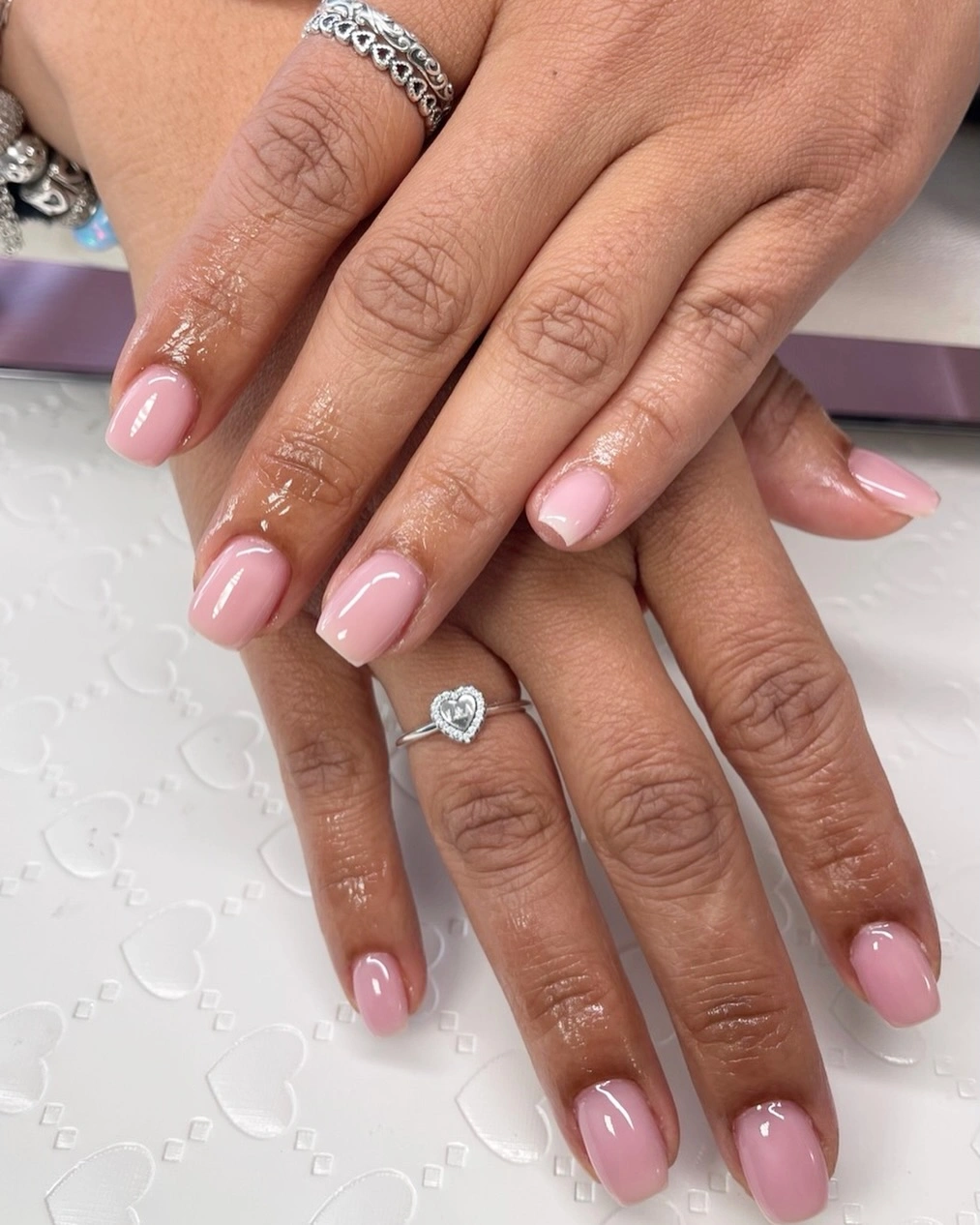
Use this color on a short oval for a quieter version, or add one thin edge in a darker fall tone if you want the shape to read more strongly. Keeping most nails plain is important; the strength comes from the calm relationship between the pale pink and the almond point, not from collecting extra accents.
A smooth monochrome manicure is easy to coordinate, but it gives little cover for patchiness or an uneven tip. That makes the practical recommendation straightforward: keep the surface even and let the almond shape remain the only strong line. The restraint gives any later accent more impact because the base is already visually clear.
Rose and Silver Reflection Follows the Taper
The long tapered square shape is echoed by a reflective fade from rose pink toward pale silver tips. Instead of placing a separate motif on the surface, the manicure lets color travel along the nail, visually extending the direction of the taper. A mauve edge on the thumb adds depth, but the main story remains the warm-to-cool transition and the changing light.
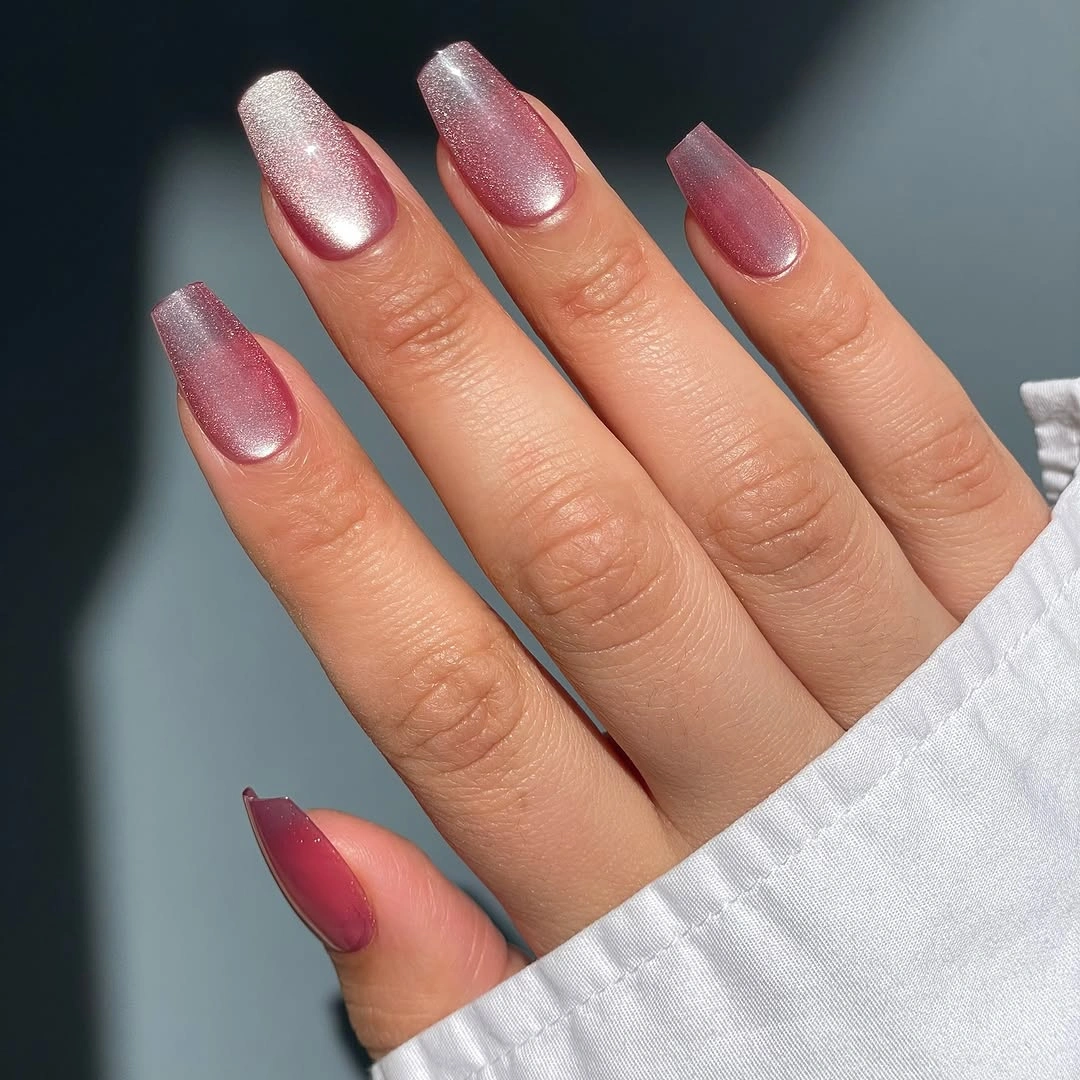
To make the idea more wearable, keep the rose tone over most of a shorter nail and let silver appear only at the tip. That keeps the gradient readable without making the bright section too dominant. Two accent nails can carry the full fade while the others stay rose, which is useful when the reflective finish feels stronger in direct light.
Color transitions do not look identical in every setting, so the fade may appear softer indoors and brighter under a direct highlight. The long shape gives it a clear path, but it also makes edge wear more noticeable. A controlled fade with enough rose base will usually age more quietly than a full reflective tip on every finger.
Thin French Edges Leave One Small Cluster
Short square nails use a sheer pink base and narrow white tips, then place a small pale cluster on one accent nail. That simple division keeps the manicure light while giving the eye one place to stop. The square outline is still clear because the tip line is thin, and the single cluster adds interest without changing the quiet scale of the set.
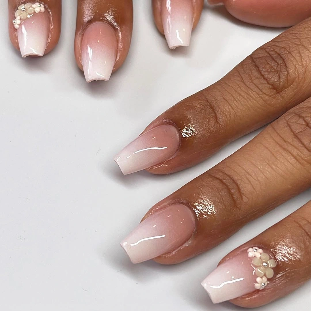
Repeat the cluster only on the ring finger when adapting the design, or remove it completely for a clean short French. If you want a little more fall depth, a champagne-toned mark can replace the pale cluster, but it should stay small enough that the thin white edge remains the first structural detail.
The accent works because it is isolated. A short nail has limited space around its border, and extra clusters would compete with the French line rather than support it. Keeping the base sheer pink and the tip narrow gives the manicure a practical simplicity; the one detail is enough to stop it feeling unfinished.
Checkerboard Tips Stay Softer on Nude Pink
Black-and-white checks appear mainly at the tips of these medium almond nails, while a nude pink base keeps the contrast from filling the whole surface. Narrow silver-like touches add a cool glint on selected edges, but the checker rhythm remains the defining feature. The almond curve gives the pattern a softer frame than a straight square would, which helps the high-contrast detail feel less severe.
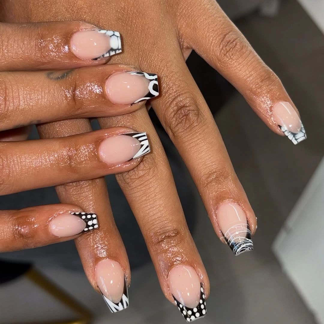
On a shorter nail, use one checkerboard accent or move a small checked corner to the ring finger. The pattern will stay recognizable if the squares have consistent spacing and enough nude around them. A plain black tip could replace the checks on the other fingers, but keeping the base pale is what prevents the design from becoming a full dark block.
Checker details need precision more than quantity. Uneven squares will show quickly against the nude background, and shrinking too many of them can turn the tip into visual noise. The useful lesson is to preserve the pattern at a readable scale, even if that means using it on fewer nails than the original set.
Mixed Mini Motifs Finish the Short Coffin Story
The final manicure brings together pink, white, black, yellow, green, curved sections, checks, and tiny dots on a short rounded-square base. It is deliberately more varied than the quiet single-color looks, yet the pink ground gives the different marks a common place to sit. Some nails stay mostly open, which keeps the playful details from turning into one continuous pattern.
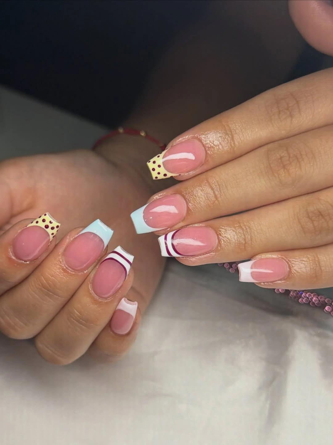
A useful adaptation is to choose only two motifs, such as a black check and one colored dot, then repeat those across two accent nails. The other fingers can stay pink or carry one pale curved edge. This keeps the lively fall palette while reducing the amount of small work competing on a short surface.
The design succeeds through variation with pauses. If every nail receives the same density, the eye loses the difference between the check, the curve, and the dot; if too many nails stay plain, the playful point disappears. Keeping a few pink spaces untouched gives the final look its balance and makes the short shape feel intentional rather than limited.