
Polka Dot Fall Nails for 2026: Bright Patterns, Clear Balance
Polka dots are not automatically playful; their mood comes from the space around them. A tiny mark against a warm nude can feel quiet and precise, while the same circle on a saturated red becomes a little burst of energy. That sensitivity to background gives a familiar pattern room to feel considered instead of looking like a quick fill for an otherwise empty nail.
Pick the base color before you decide the dot color, then let the empty area stay part of the design. Enough open surface makes a bold contrast look deliberate; less space makes even a gentle palette feel busy. The best fall French nail designs use the same discipline, treating the edge as a boundary rather than a place to layer every available detail.
Pink Panels With Black Dots and Gems
Long square nails combine pale pink bases, white panels, black dots, curving lines, and small reflective-looking gems. The white sections act as little graphic stages, giving the dots a defined area instead of scattering them over every surface. That layout is what keeps several sweet details organized, while the pink base prevents the black-and-white contrast from feeling too severe.
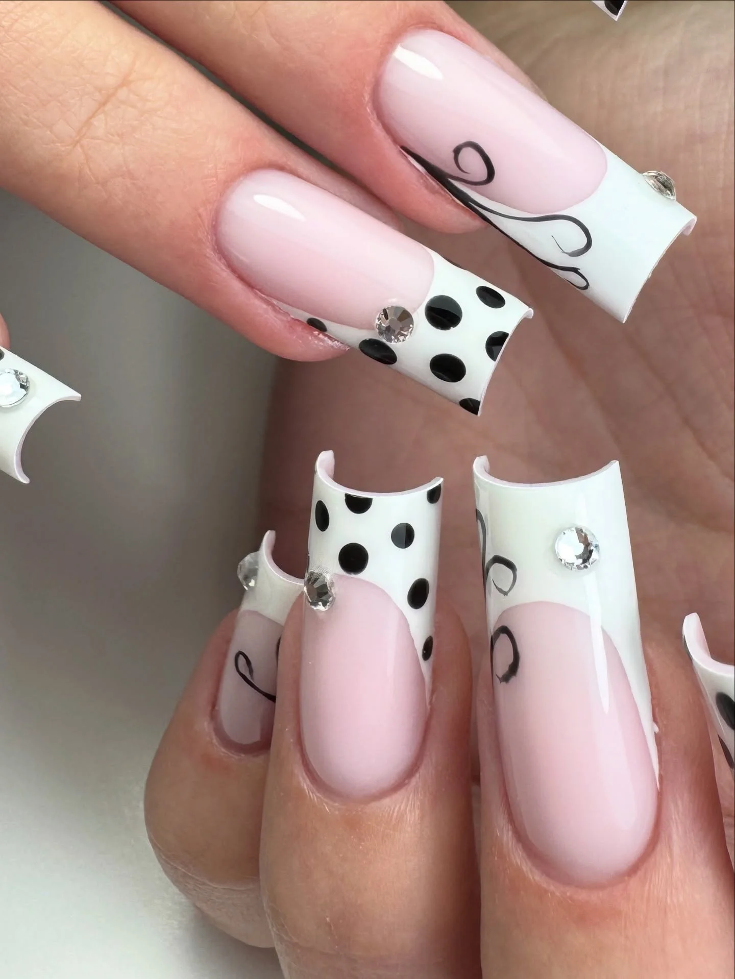
When a design contains dots, swirls, and a bright accent, assign each element a territory. Keep the dots inside the pale panel, let the lines move along one edge, and use the reflective detail once rather than everywhere. A shorter square would make the same mix more compact, but it would need fewer dots so the small areas remain readable.
The fun option here is not adding more motifs, but adjusting the scale of the existing ones. Larger dots create a bolder retro effect, while tiny dots make the panel feel more delicate. Leaving several pink nails comparatively open gives the eye a rest between the graphic sections and lets the gems remain a small surprise rather than a competing finish.
Peach Almonds With Dotted White Tips
Peach-nude almond nails use white tip areas scattered with small black dots, keeping the main base warm and clean. The dots sit near the edge, so the pattern follows the shape instead of covering it. That placement makes the long almond look lighter than a full black-and-white manicure, with the neutral center acting as a quiet buffer.
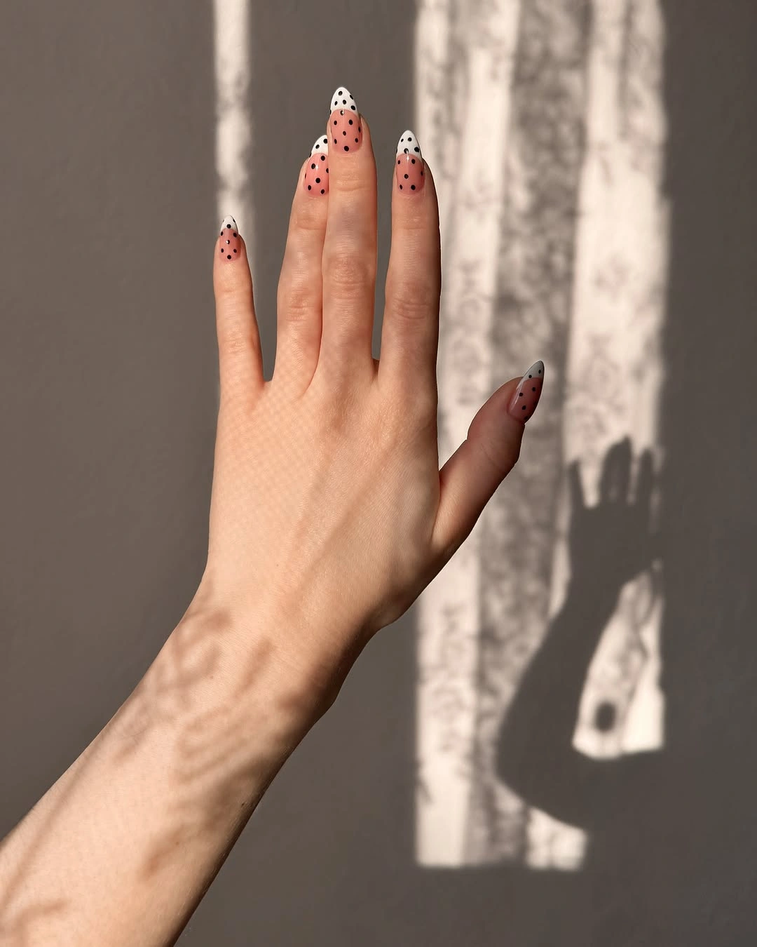
Tip placement is useful when you enjoy dots but prefer the natural nail area to remain visible. Keep the white curve slim enough that the peach base still leads, then vary the dot positions slightly to avoid a rigid grid. A soft pink or pale gray base could replace peach, but the strongest contrast still comes from a warm neutral beside crisp black.
The practical limit is crowding at the narrow end of an almond. Too many dots near the tip can merge into a dark band and hide the curved outline. Use fewer marks as the surface tapers, and let the white panel stay clear around them. That simple spacing choice gives the manicure its airy character without needing another accent nail.
Graphic Pink, Black, and White With Bow Detail
Long nails mix blush pink, black, and white panels with polka dots and one small black bow accent. The color blocks make the playful pieces feel intentionally placed rather than randomly layered, while the bow becomes a focal point because it is not repeated across the whole hand. Strong contrast is balanced by returning to the soft pink base on several nails.
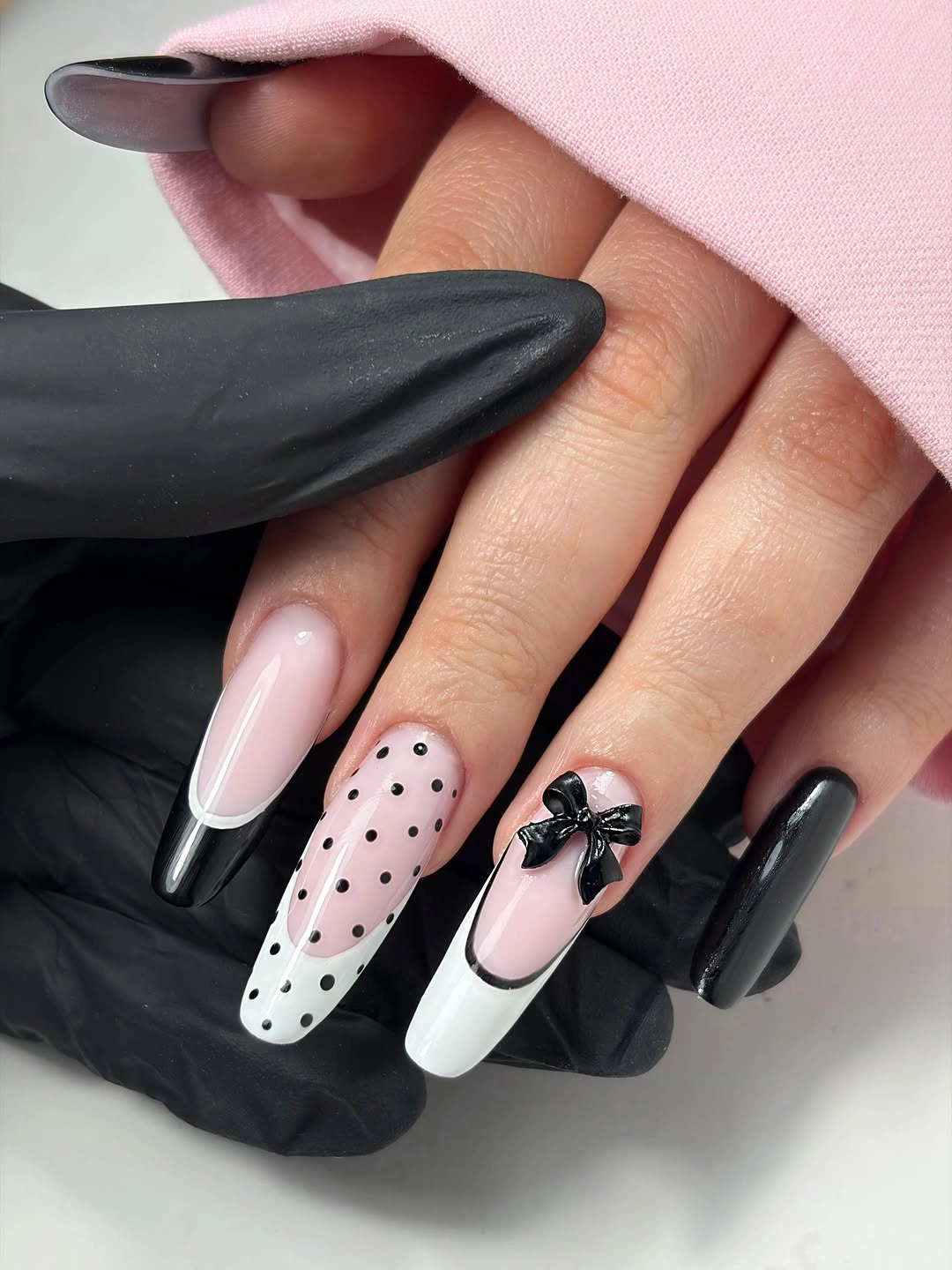
A graphic set like this benefits from one repeated signal and one special signal. The dots are the repeated signal, creating rhythm across different colors; the bow is the special signal, giving one nail a memorable pause. If the black feels too stark, a deep brown would warm the contrast without changing the useful organization of light panels and darker details.
Longer nails offer space for several elements, but they still need a hierarchy. Keep the bow small, let the dots stay similar in size, and avoid adding a separate flower or gem on every finger. The calm pink areas are doing important work here, making the bright graphic construction feel playful and composed instead of visually overloaded.
Sheer Dark Dots on Pointed Tips
Long pointed nails use translucent dark sections, black dots, and narrow dark French-style edges to create a light version of a high-contrast pattern. The sheer-looking areas leave part of the base visible, which makes the black dots feel less heavy than they would on an opaque background. The pointed silhouette adds drama, but the open space keeps it from becoming dense.
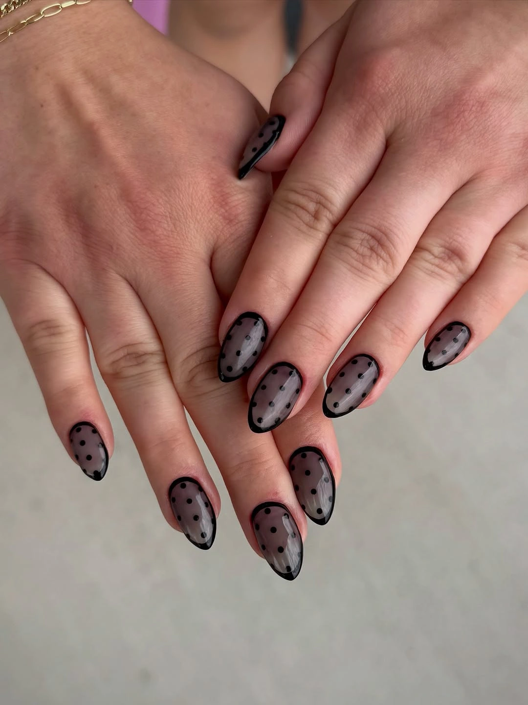
Transparency is a useful counterweight when you want a dark pattern on a long shape. Keep the opaque black limited to an edge or a few dots, then let the pale base show through around it. A muted burgundy could replace black for a softer fall version, though the sharp graphic clarity of the dots will be strongest with a dark neutral.
The trick is to preserve spacing near the narrow tip. Dots that are packed too closely there can obscure the pointed outline and make the nail appear blunt. Vary the placement down the length, leaving a little more clear area at the end. This keeps the pattern lively while allowing the silhouette to remain one of the main visual decisions.
Soft Pink Squares With Tiny White Details
Short pale pink squares carry tiny white dots and small bow-like details, creating a low-contrast interpretation of the pattern. The decorations are quiet enough that the soft base remains visible from a normal distance, which suits a compact shape. Rather than relying on sharp contrast, the manicure builds interest through small repeated marks and gentle texture.
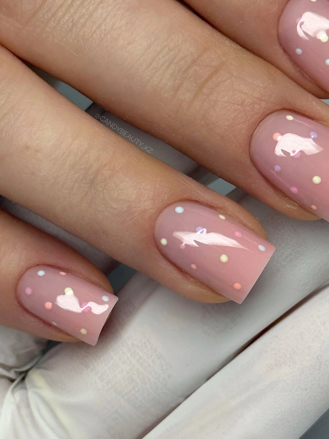
This direction works when you want the polka-dot idea to feel subtle rather than retro or graphic. Keep the dots small and allow the pink to occupy most of each nail, then use one tiny bow-like detail as an occasional accent. A milky nude base would make the effect even quieter, while a cooler blush would give the white details more separation.
Short squares have limited space, so a low-contrast design needs editing. Avoid putting a bow and several dots on every nail, because the charm comes from the small scale, not from quantity. Leave at least one finger nearly plain, then let the repeated white marks appear where they have enough pink background to remain distinctly visible.
Blush Almonds With Sparse Black Dots
Medium blush almond nails use widely spaced black dots, letting the pale base remain the larger visual field. The contrast is clear, but the placement is calm because each dot has room around it. That negative space makes the manicure a useful bridge between minimal nails and a more obvious polka-dot pattern, with the almond shape keeping the result soft.
To make dark dots feel lighter, reduce their number before reducing their color. A few black marks on a blush base can look cleaner than many gray marks, because the spacing supplies the softness. Shift the base toward peach for warmth or toward mauve for a moodier fall feeling, but keep the dots relatively small so the almond silhouette stays visible.
The most common visual mistake would be treating every nail as an identical canvas. Allow one nail to have fewer dots and another to carry a slightly different arrangement, while maintaining a consistent dot size. That variation makes the pattern feel naturally distributed across the hand and keeps the pale background from turning into a repetitive printed surface.
Green Squares With Spotted Graphic Contrast
Short square nails combine bright green with dark spotted graphic accents, creating a color-led take on the pattern. The solid green areas provide an energetic backdrop, while the darker marks give the set definition and a little edge. Because the shape is compact, the high contrast stays contained, making the combination feel more like a bold accent than a full maximalist statement.
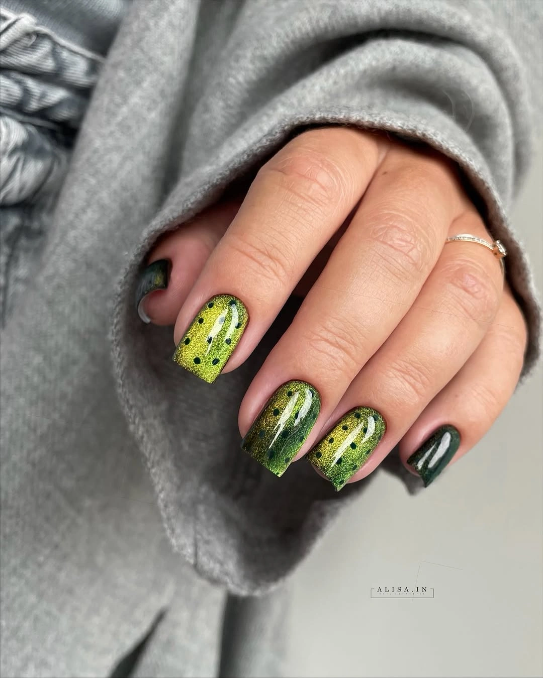
Bright green is already doing substantial visual work, so the pattern should remain selective. Let one or two nails carry the spotted detail and keep the others solid, allowing the color to establish the main rhythm. If lime is too punchy, a muted olive would bring the same idea closer to fall while preserving the helpful contrast with dark marks.
Graphic spots look most intentional when their edges remain simple and their scale is consistent. Adding a second unrelated texture, such as chrome or glitter, would pull the color story apart. The better adjustment is to change the green’s undertone or shorten the squares, keeping the pattern’s role clear and letting the bold color remain the first thing the eye notices.
Pale Pink Points With Even Black Dots
Long pale pink pointed nails use small, evenly scattered black dots to turn a soft base into a clean repeated pattern. The dark marks are similar in size and leave wide areas of pink between them, so the pointed form still reads clearly. That regularity gives the manicure a composed feel even though the contrast is strong and immediately visible.
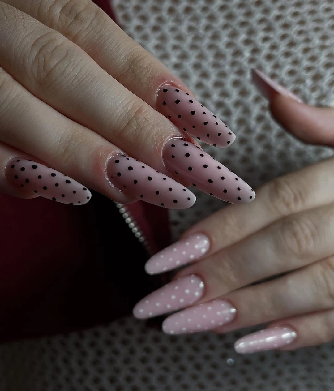
Even dot size is the useful anchor when the nail shape is long and narrow. You can vary placement slightly, but keeping the marks comparable prevents one area from appearing heavier than another. A pink base keeps the contrast friendly; a nude base would be more understated, while a bright red base would turn the same black dots into a sharper, more graphic color statement.
Long points invite decoration, yet this design proves that repetition can be enough. Resist the urge to add a flower, French edge, or metallic stripe on top of the dots. The ample pink space and consistent dot scale already create a full visual rhythm, with the taper of the nail giving the pattern direction without another separate motif.
Glossy Red Almonds With White Dot Rhythm
Long glossy red almond nails carry tiny white dots that brighten the saturated base without covering it. The white marks create a lively repeat, while the reflected red surface keeps the color warm and dimensional. Because the dots remain small, the manicure holds onto the elegant flow of the almond shape instead of becoming a dense red-and-white print.
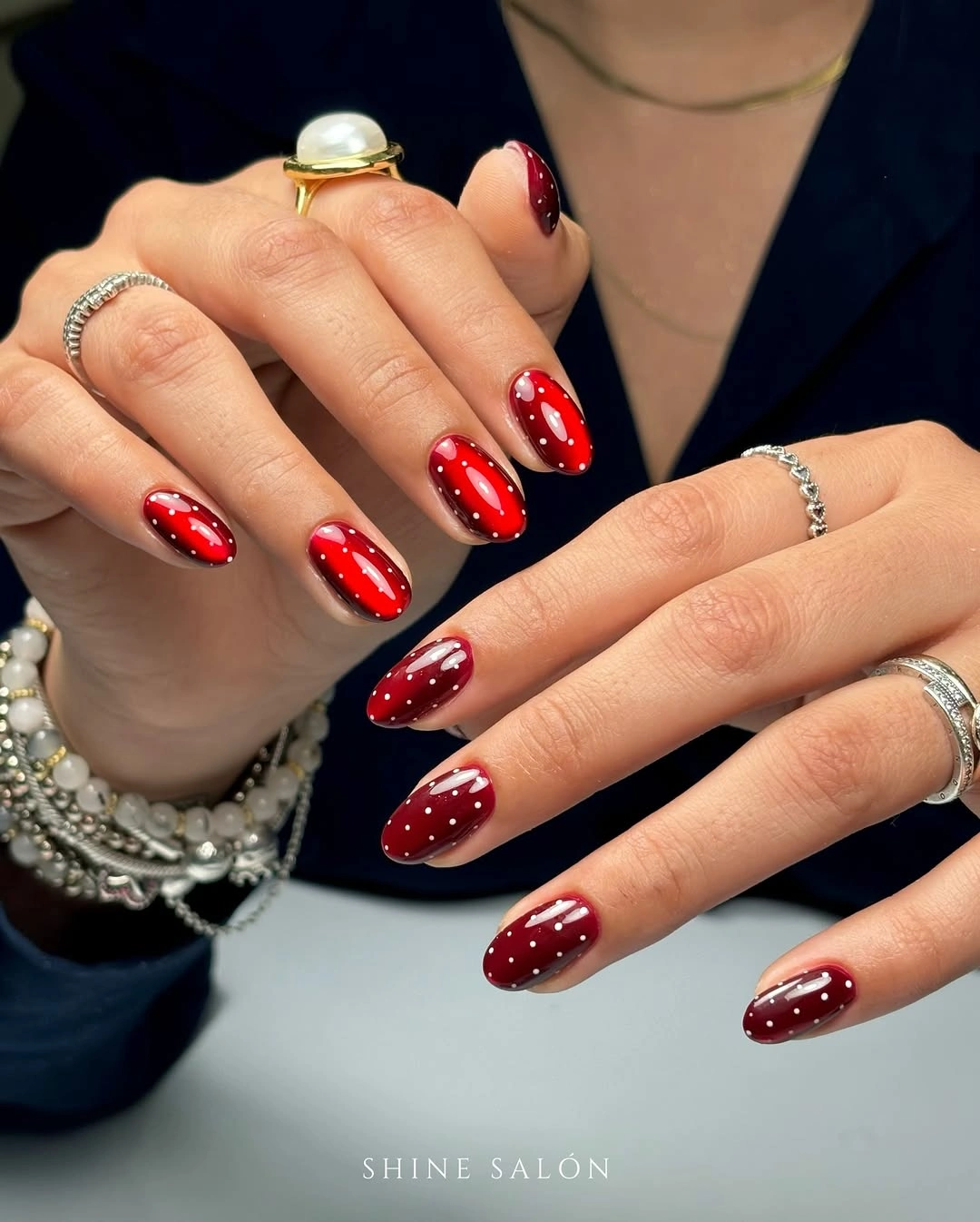
Red and white are naturally high contrast, so it helps to choose one dominant color and let the other arrive in smaller marks. The red should remain visible as a broad field, with the white dots acting like quick flashes across it. If you want a less vivid version, choose brick red or burgundy, but keep the dot scale modest to preserve the same clean rhythm.
There is no need to place every dot in an exact grid. Slightly varied positions can make the manicure feel more relaxed, provided the spacing stays open. Overcrowding the tips would make the white marks merge into a pale edge, so leave a little red around each dot and let the glossy surface continue to catch light between the pattern points.
Blue-Dotted Pink and White Points
Long pointed nails combine pale pink, white panels, blue dots, and one small blue flower accent. The cool blue links the pale base and the white areas, giving the pattern a coherent color thread rather than using dots as a purely black graphic. The flower is placed as a single special moment, which lets it decorate the set without becoming another repeated visual demand.
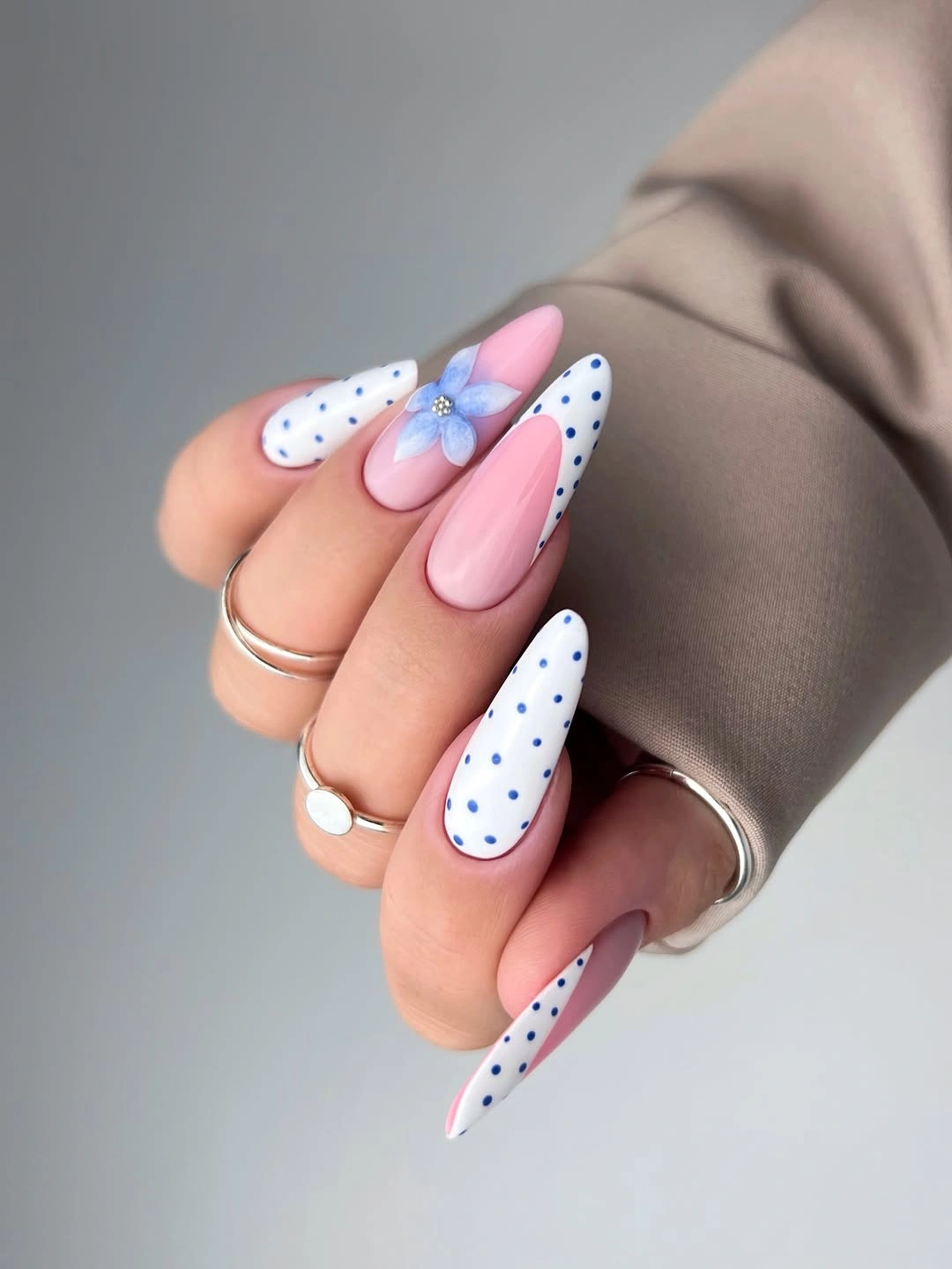
Blue is a smart choice when you want dots to feel fresh rather than stark. Keep the blue marks small and repeat them across more than one nail, then allow the flower to be the only more detailed element. A deeper denim blue would add fall weight, while a light periwinkle keeps the design airy, but both work best against the same pale neutral support.
The color balance depends on not introducing too many extra shades. Pink, white, and blue already create a complete color moment, so a yellow center or metallic detail should stay minimal if used at all. Let the pointed shape remain visible through open pink areas, and keep the floral accent small enough that the dots continue to read as the main pattern.
Nude Almonds With Tiny Black Speckles
Medium nude almond nails use tiny black dots and fine dark accents, making the pattern feel more like a delicate speckle than a bold retro print. The neutral base gives every mark contrast while still leaving the overall hand light. Because the dots are small and the shape is softly tapered, the design looks precise without demanding a large amount of visual attention.
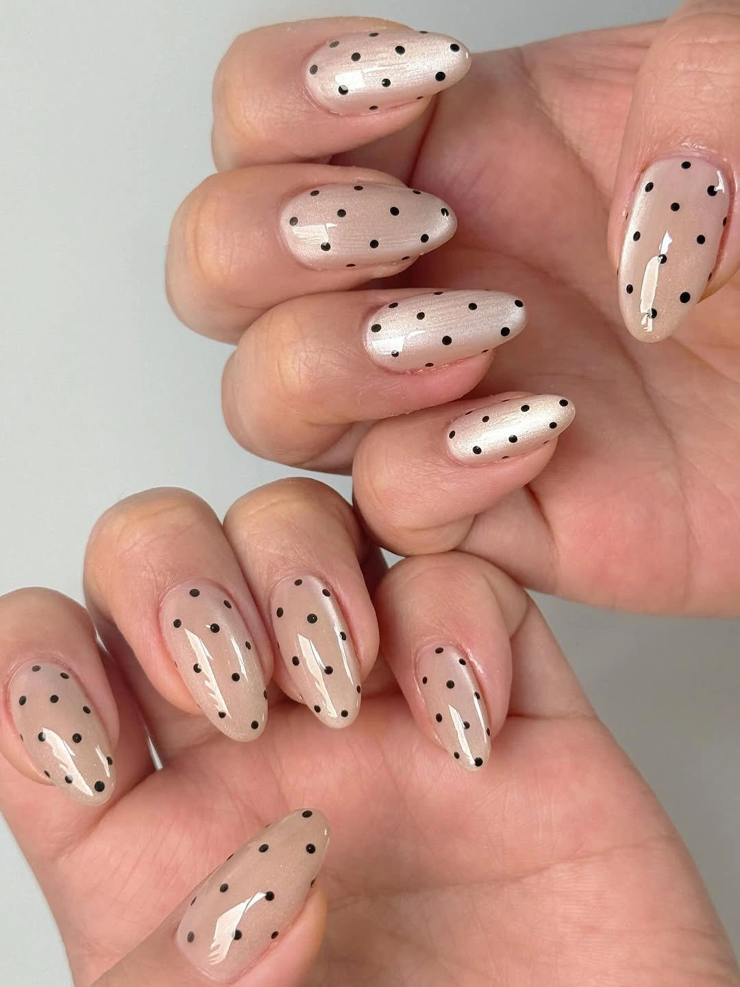
For a wearable polka-dot approach, reduce both the dot size and the number of colors. Black on nude remains legible, yet the neutral support keeps it from feeling harsh. A warm beige base makes the combination softer, while a cool beige makes the black appear crisper; either choice benefits from keeping the tiny accents confined to a few clear areas.
The understated effect disappears if the dots become inconsistent in scale. One oversized mark can suddenly shift the mood from fine detail to bold graphic art. Keep the speckles small, leave room around the cuticle and tip, and allow the almond silhouette to stay visible. The design is strongest when the viewer notices its texture before counting individual dots.
Red Almonds With a Reverse Dot Accent
Long red almond nails use small white dots, with one pale accent nail reversing the relationship through red dots on a light background. That inversion adds interest without changing the palette or introducing an unrelated shape. The solid red nails carry the color’s warmth, while the reversed nail creates a pause that makes the repeated dot motif feel more deliberate.
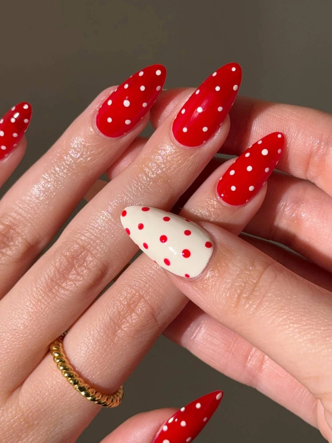
Reversing colors on a single nail is an easy way to vary a pattern while keeping the design coherent. It works because the same red and white appear on both surfaces, just with different proportions. If bright red is not your preference, a dark maroon and cream pairing can create the same structure with a more muted seasonal mood and the same readable contrast.
One reverse accent is usually enough. Repeating it on several fingers would blur the distinction between background and dot color, making the pattern less clear rather than more complex. Let the solid red nails provide the dominant field, keep the dots similar in size, and allow the pale accent to function as a single visual pivot within the warm manicure.
Nude and Brown Panels With Dotted Details
Short squares combine nude bases, brown panels, and small white or black dots, using recurring colors to connect several different nail layouts. The compact shape gives each panel a clear boundary, while the dots add a lighter repeated signal over the richer brown. It is a useful example of how varied nails can still feel unified when the palette remains narrow and familiar.
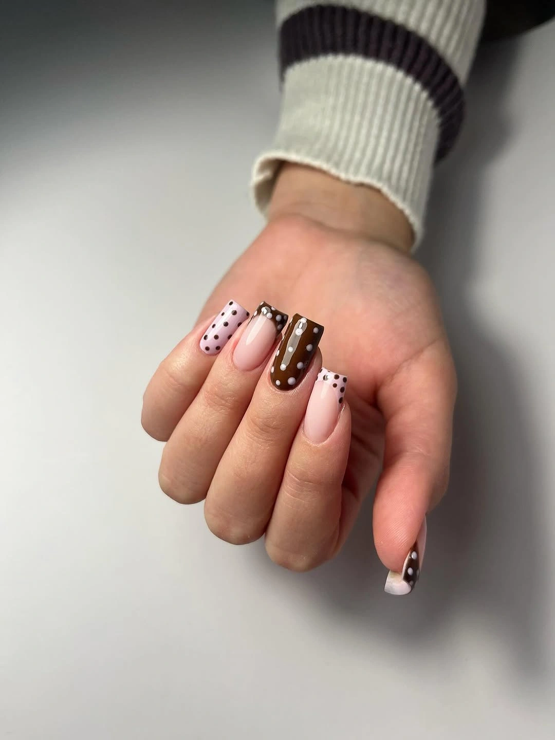
Brown creates a softer fall alternative to black, especially when it sits beside nude and cream. Choose one brown value and repeat it across the hand, then let the dots provide the contrast rather than adding a third bold color. A slightly lighter caramel would make the look warmer, while deep espresso would create a more graphic result against the neutral base.
Panel designs need enough empty space to be understood quickly. Keep a brown block broad, place dots within one portion of the nail, and avoid dividing every finger into several miniature zones. The repeated palette is what makes the variation work, so simplify the individual nails and let brown, nude, and tiny dots do the organizing instead of adding more unrelated accents.
Dark Chocolate Ovals With Muted Blue Dots
Short oval nails in dark chocolate-brown use muted blue dots rather than the expected white, creating a quieter color contrast. The cool blue lifts the deep base without making the pattern feel sharp, and the rounded shape supports that softer relationship. This is a more atmospheric direction for dots, built on temperature contrast instead of maximum light-dark separation.
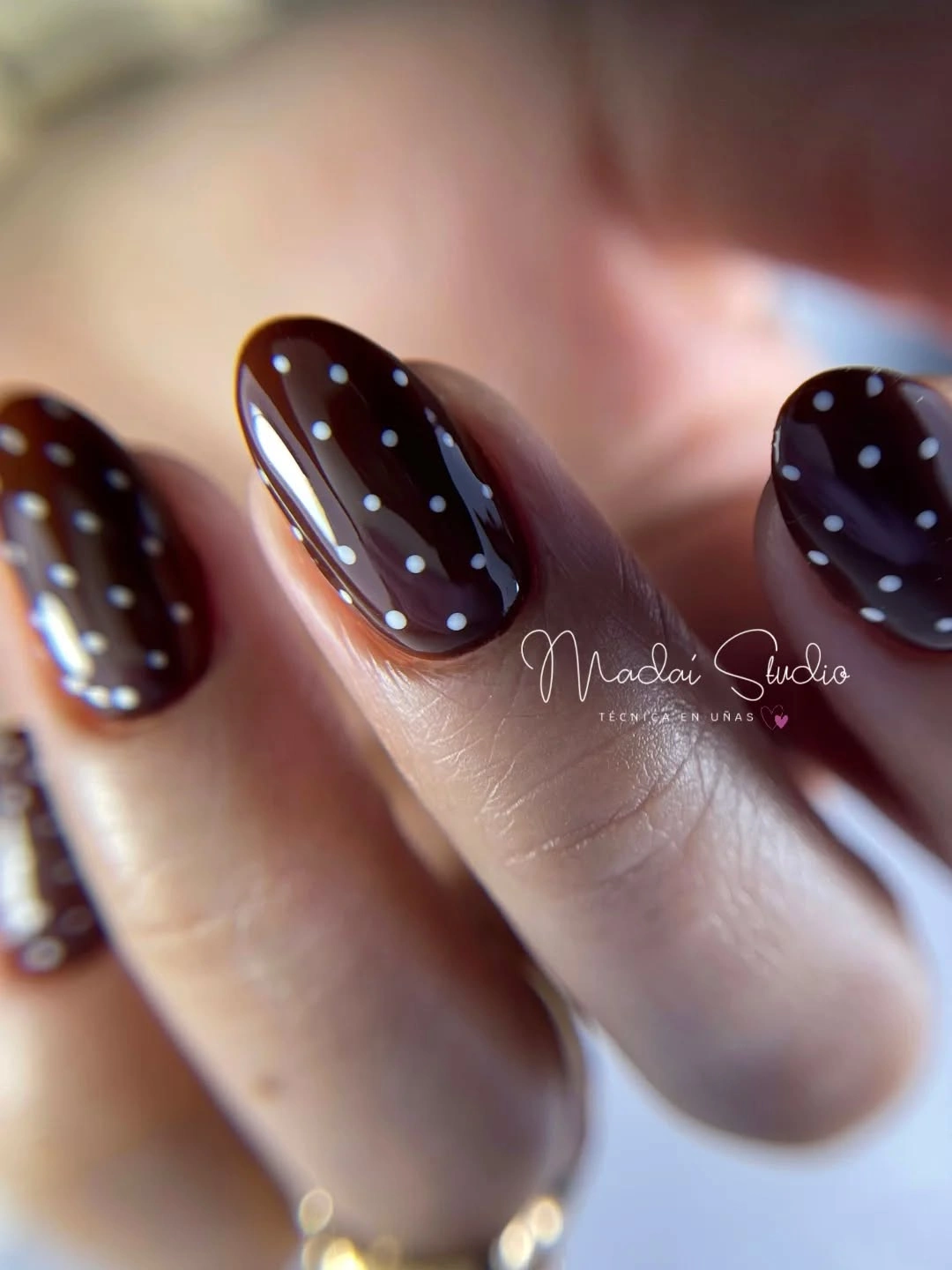
Using a softened blue on brown is helpful when you want color but do not want the pattern to dominate an outfit. Choose dots that are visibly cooler than the base but not neon-bright, then keep the rest of the nail plain. A dusty slate or muted periwinkle can create the same effect, preserving the gentle shift between warm background and cool decoration.
The success of this combination depends on the dots staying small and distinct. Large blue marks would turn the manicure into a two-color block, while fine dots let chocolate remain the primary read. Short ovals are especially suited to that balance because their rounded edge echoes the small circular pattern and keeps the overall impression calm rather than aggressive.
Short Nude Ovals With Pale Blue Dots
Short nude rounded nails with pale blue dots offer a light, tidy version of the pattern. The neutral base holds the color without competing with it, while the blue dots provide just enough cool contrast to be noticed. Because the length is compact, the repeated motif feels neat and low-commitment, more like a small visual texture than an elaborate nail art project.
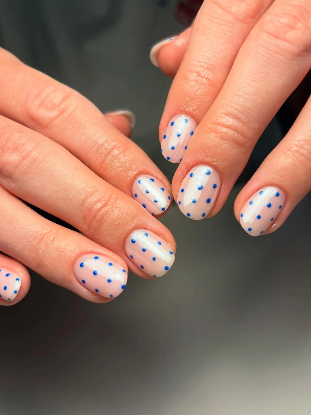
This direction is useful if you want a playful detail that still works with a flexible wardrobe. Keep the nude warm or neutral, then select a pale blue that does not overpower it. If the blue feels too springlike, move it toward dusty steel or gray-blue; the pattern will still read clearly while taking on a more muted seasonal character.
On short ovals, space is limited, so fewer dots are often better. Leave clear margins around the edges and avoid stacking several marks at the tip. The slight irregularity of placement can keep the manicure from feeling too uniform, but the dot size should remain consistent enough that the simple cool-and-neutral palette continues to look intentional.
Red and Yellow Dots With Warm Contrast
Medium nails mix red and yellow with small contrasting white dots, turning the pattern into a lively warm-color design. The dots are the visual thread that connects the two solids, so the palette does not split into separate red and yellow ideas. It is energetic, but the repetition gives it structure, making the color contrast feel planned rather than simply loud.
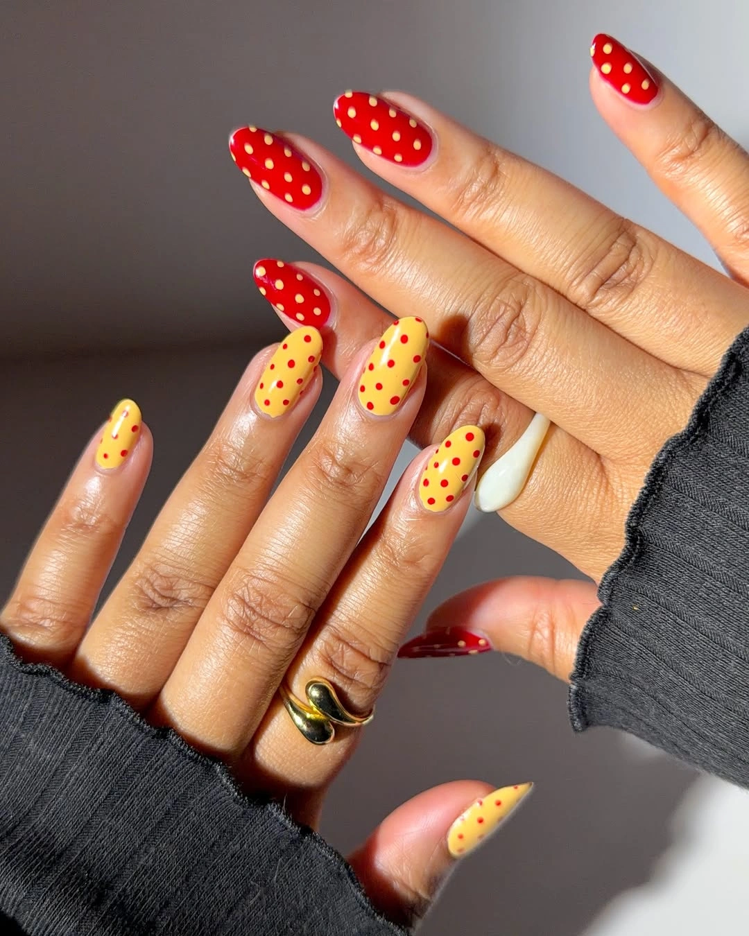
Warm colors need a clear shared element when they appear together. Here, the white dots perform that role, returning across both red and yellow surfaces and giving the eye something stable to follow. For a softer adaptation, replace the yellow with muted mustard or choose a deeper brick red, keeping the same pattern logic while lowering the brightness.
The palette is already punchy, so limit the number of accent types. Do not add blue flowers, black outlines, and glitter all at once, because the dots have already solved the connection between the colors. Let one or two nails remain predominantly solid, then use the repeated white marks to keep the warm contrast lively but coherent across the hand.
Lavender Squares With Small Dark Dots
Long lavender square nails use small dark dots to create contrast without abandoning the cool pastel mood. The regular dot size keeps the pale base from looking crowded, while the straight long tips give the pattern an orderly surface. Dark marks appear sharper against lavender than against beige, but the cool background still makes the effect feel more gentle than black on white.
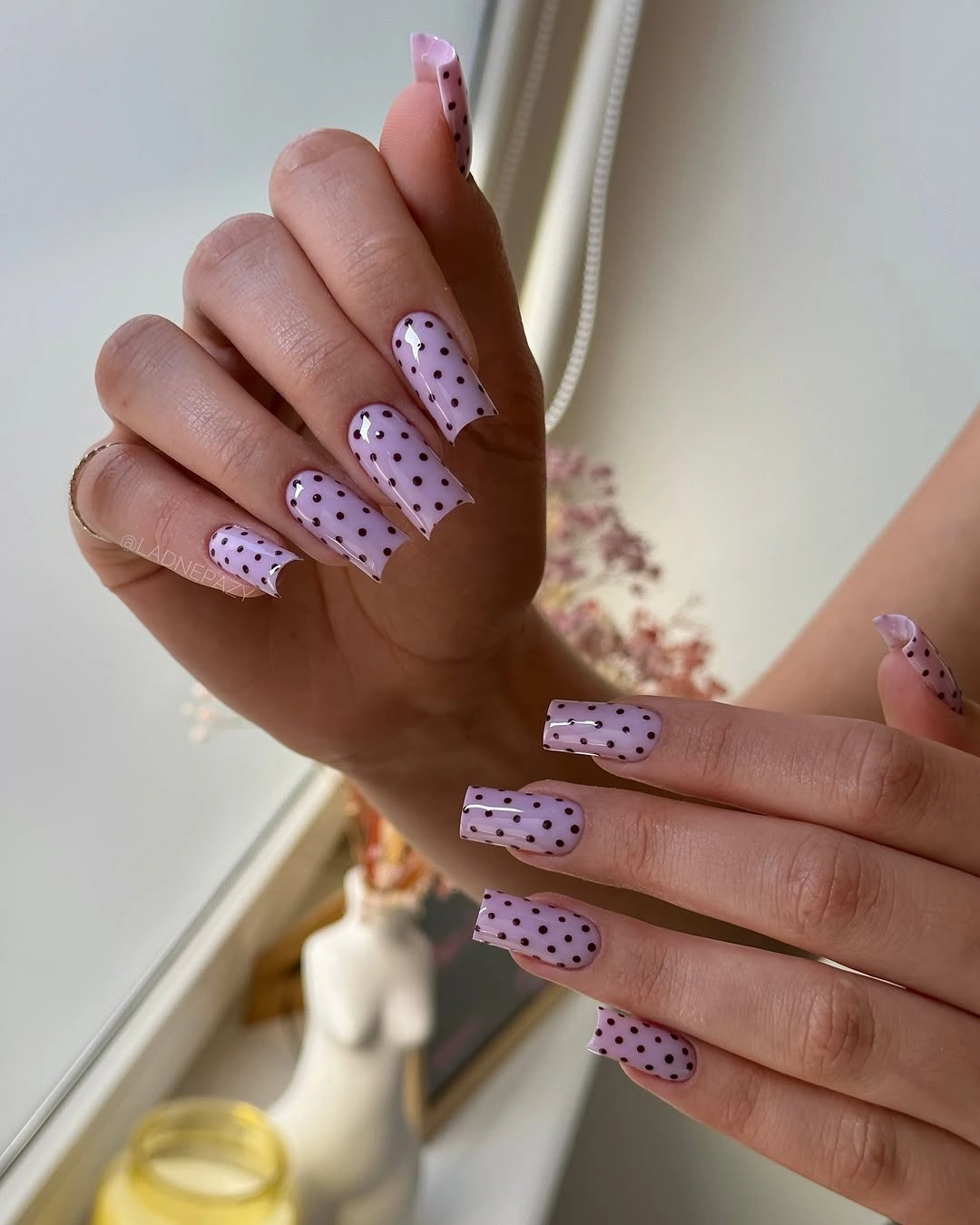
Lavender is a useful base when you want dots to feel decorative but not overly retro. A deep charcoal or softened plum dot will keep the palette cooler than pure black, while a wine-colored dot adds a seasonal note with less visual shock. The long square shape needs open spacing, so keep the marks small and let the pastel show between them.
One way to make this design more wearable is to reserve the dots for a few nails and leave the rest lavender. That would emphasize the color first and the pattern second. If you choose dots on every nail, keep their arrangement regular enough to feel calm; adding a separate French tip could make the long squares look overly segmented.
Soft Pink Almonds With Wine-Red Dots
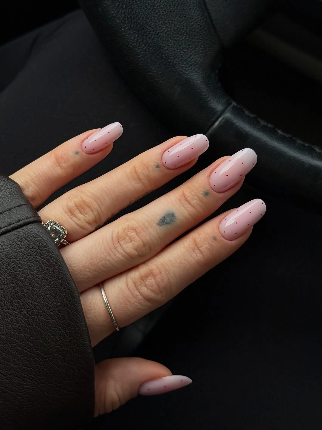
Long pale pink almond nails use small wine-red dots, creating a lower-contrast alternative to black polka dots. The deeper red echoes fall color while allowing the soft pink base to remain warm and visible. Because the colors sit closer together in intensity, the motif reads more like a gentle texture, with the almond silhouette providing the elegant line.
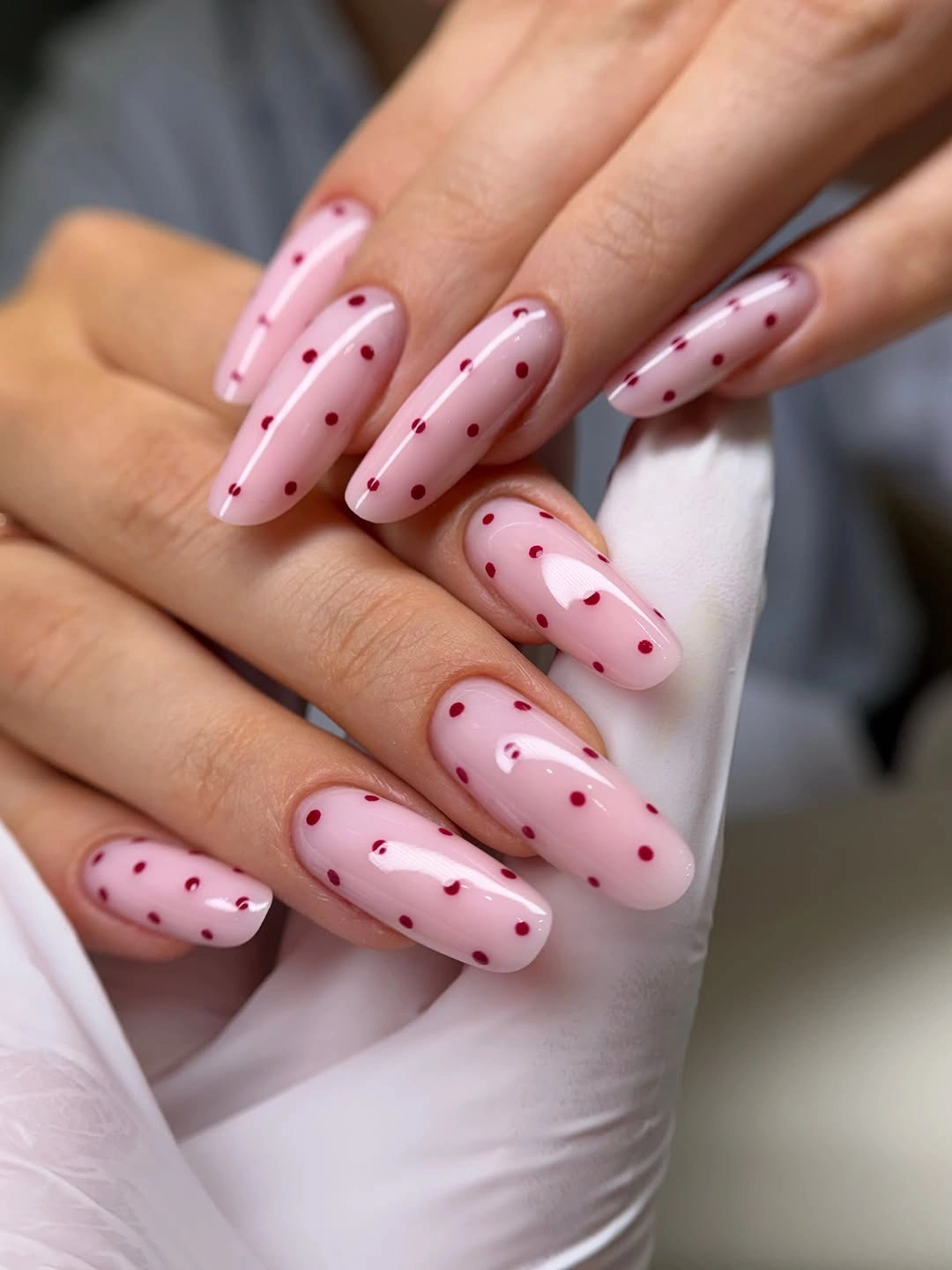
Color proximity is the reason this version feels quieter. Wine red still appears against pink, but it does not create the instant graphic edge of black. A reader who wants more contrast can deepen the dots toward burgundy; someone who wants less can use dusty rose. In both cases, keep the dots compact so the long almond shape remains a clear part of the design.
The pattern looks best when its dots are spaced broadly enough to preserve the pink field. Packing wine-red marks near the tip would create a heavy gradient and reduce the soft quality of the base. Let the darker color appear as small notes across the nail, then keep the remaining surface open so the manicure stays light, balanced, and easy to pair.
Short White Nails With Crisp Black Dots
Short white nails with neat black dots use the clearest possible version of the motif. The high contrast makes every mark immediately readable, while the compact length keeps the familiar black-and-white combination from feeling costume-like. A slight glossy surface adds a clean light reflection, helping the white background look polished rather than flat or chalky.
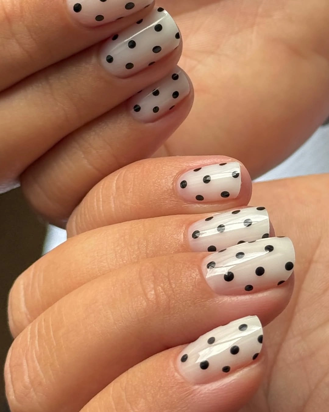
Classic contrast works when the dot scale matches the nail scale. On a short nail, small and medium dots have enough separation to stay distinct; oversized dots would swallow the white space. If the pure black-and-white pairing feels too sharp, switch black to espresso or white to cream, keeping the same pattern logic with a warmer, softer result.
This design is strongest when it remains simple. A bright flower, gem, or second color would compete with the immediate clarity of the dots. Keep the background truly light, repeat the black marks at a consistent size, and let the short length keep the whole idea crisp. The visual appeal is the clean rhythm between two colors, not a need for extra decoration.
Nude Tips With Dots and a Flower
Long nude nails combine dark tip details, black dots, and one small pale floral accent, using negative space to keep several graphic elements separate. The nude area is essential because it gives the dark marks breathing room and allows the flower to appear as a pause rather than another dense pattern. Each piece has a role, which keeps the overall look readable.
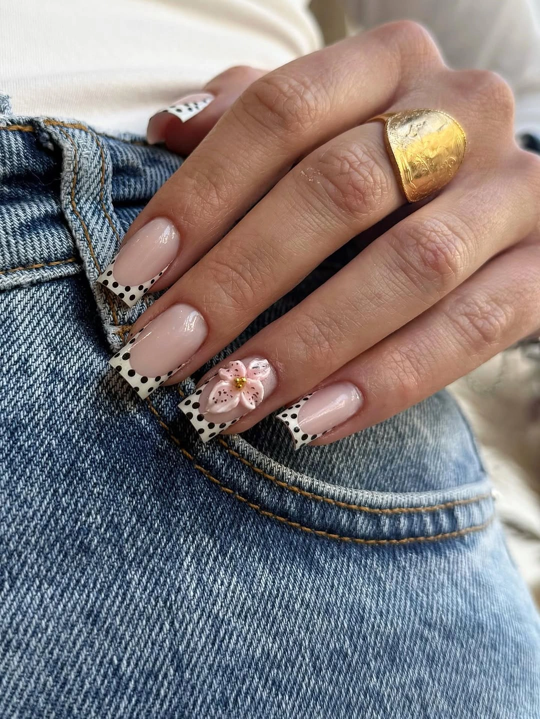
When dots and a flower appear together, decide which one is the pattern and which one is the accent. Here, the dots establish repetition, while the flower stays isolated. Keep the dark tip narrow enough that it does not crowd the nude center, then let the flower remain small. That order prevents the long nail from becoming a stack of unrelated decorative bands.
The best adjustment is usually removal. If the flower feels too sweet, keep the dots and dark tips; if the tips feel too bold, keep the flower and use a softer outline. Avoid adding another color unless it repeats somewhere else in the set. The open nude space is what lets the graphic details feel organized, so it should remain a major part of the surface.
Chocolate Short Nails With White Dots
Short rounded nails in dark chocolate brown use small white dots to brighten a deep neutral without introducing a second strong color. The white marks create a clear pattern, yet the brown base keeps the mood warmer and more grounded than standard black. This is a simple fall-leaning option where the dot motif feels cozy through color rather than through an explicit seasonal symbol.
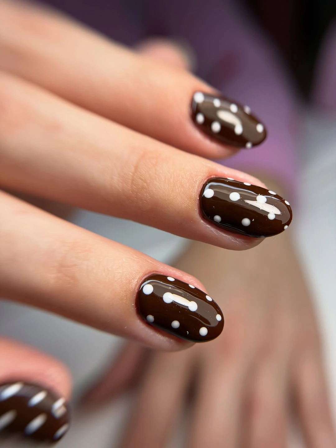
Chocolate is a flexible substitute for black when you want contrast that feels less severe. Pair it with cream, white, or pale blush dots, then keep the shape short and rounded for an easygoing finish. A lighter brown will make the pattern more casual, while a deeper espresso will make the dots pop more sharply, but both preserve the useful warmth of the base.
The final balance comes from allowing brown to remain broad and uninterrupted. Small white dots are enough to create rhythm, especially on a compact nail where each circle is immediately visible. Avoid adding stripes or glitter over the top, since another texture would dilute the clean relationship between dark neutral background and bright repeated marks that keeps this design coherent.