Maroon Fall Nails for 2026: Deep Gloss, Soft Contrast
Maroon becomes more intriguing in movement than in a bottle. In shade it can look almost black, then a narrow reflection reveals a red or plum undertone that changes the entire mood. That shifting depth explains why the color can feel intimate on a short nail and unmistakably sharp on a longer one, without relying on a seasonal symbol to establish its presence.
Start with the amount of shadow you actually enjoy wearing, then choose shape as the counterweight: rounded edges soften it, while a squared tip gives it a firmer outline. A familiar burgundy nail design becomes more personal once that balance is decided. The most convincing version is not the darkest option, but the one whose depth remains readable when the light changes.
Deep Wine Almonds With Glassy Light
Long almond nails in deep wine-maroon hold broad bright reflections that reveal the red beneath the near-black surface. The taper matters because it gives the color a continuous direction from cuticle to tip, instead of letting the dark pigment sit as a blunt block. Gloss is the key visible counterpoint here, keeping the inky tone dimensional rather than opaque.
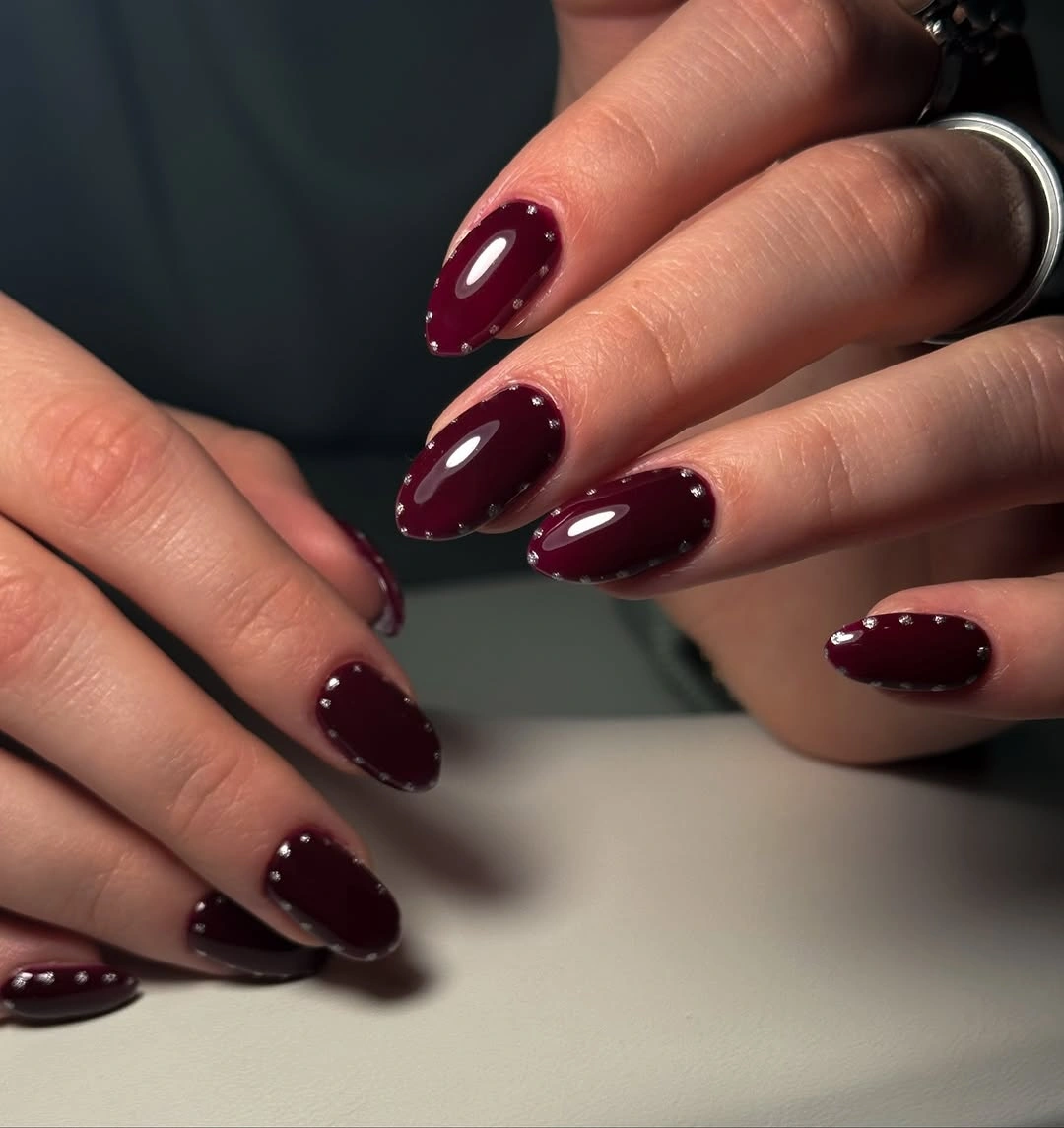
For a similar look, let the color remain unadorned and use the finish as the detail. A slightly shorter almond would soften the intensity without changing the palette, while a long square would make it more severe. Avoid adding gold or glitter merely because the shade is dark, since the reflected light already supplies a clean focal point.
The real tradeoff is upkeep around the outline. Deep wine makes uneven length easier to notice, particularly on a tapered tip where every edge is exposed. Choosing one uninterrupted color is strongest when the silhouette is consistently shaped, allowing the shadowy tone to feel sleek and continuous instead of depending on a decorative distraction.
Short Burgundy With a Rounded Quietness
Short rounded nails in glossy dark burgundy prove that a dense color does not require length to feel deliberate. The curved edges soften the visual weight of the shade, and the small white highlights keep each nail from disappearing into the background. It is a compact version of maroon that carries depth without asking the hand to perform a dramatic silhouette.
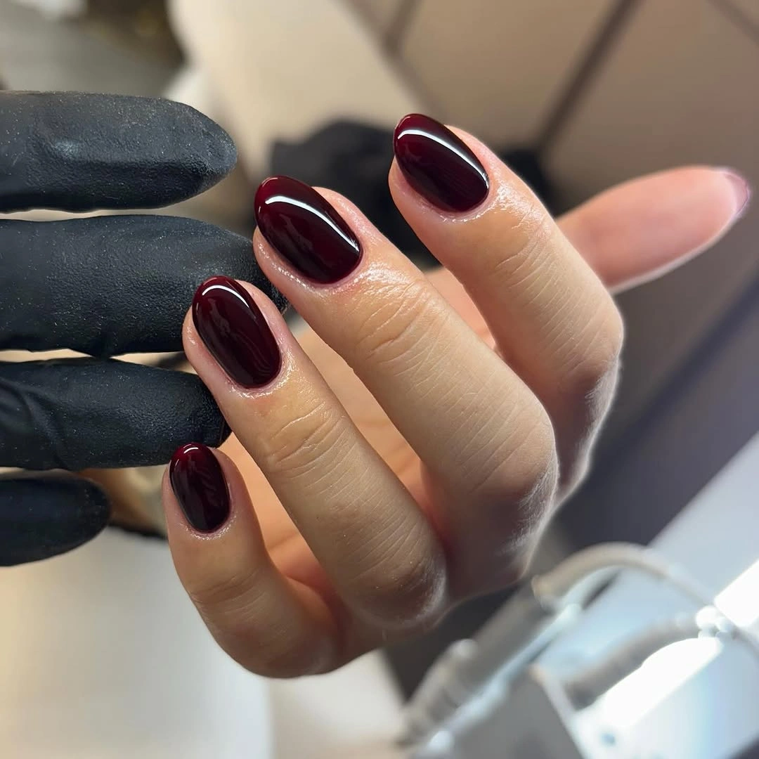
Readers who want maroon for daily wear can start here: keep the color solid, shorten the length, and let the rounded outline absorb some of the darkness. A brown-leaning wine would make the palette even quieter, while a brighter cherry version would push the same shape toward more visible warmth. Neither change needs extra art to feel considered.
On a compact nail, a broad accent can quickly take over the entire surface. That is why the polished solid finish works so well in this direction. It leaves enough room for the color to be read clearly, and it lets the darker edge near the sidewalls stay clean instead of competing with stripes, stones, or a crowded French tip.
Long Square Nails in Rich Maroon
Rich burgundy-maroon on long square nails has a more architectural presence than the same color on an almond shape. The straight free edge creates a crisp finish, while glossy streaks of light move vertically across the dark surface. Nothing interrupts the pigment, which is exactly why the color reads as controlled rather than merely intense.
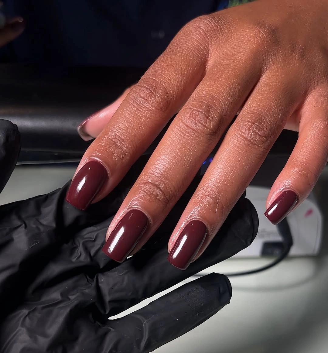
This shape is useful when you want depth to come from proportion rather than from a pattern. A reader could lower the drama by choosing a medium square or a softened corner, keeping the same deep color but reducing the hard graphic edge. The design does not need a second hue because the square silhouette already creates its own contrast.
Long squares make the manicure visible from a distance, so every added detail has more impact than it would on a short nail. Keep accessories and clothing patterns in a separate visual lane when wearing this kind of solid set. The dark red surface looks strongest when its reflective plane remains uninterrupted, with the outline supplying all the necessary tension.
Cherry-Maroon Rounds With Warm Highlights
The cherry-leaning maroon on medium rounded nails catches light in a way that feels warmer than almost-black burgundy. Its softer red core shows most clearly along the curved top edge, where the glossy finish creates a small bright arc. That movement makes the color feel more open, even though the overall palette still belongs to the darker side of fall.
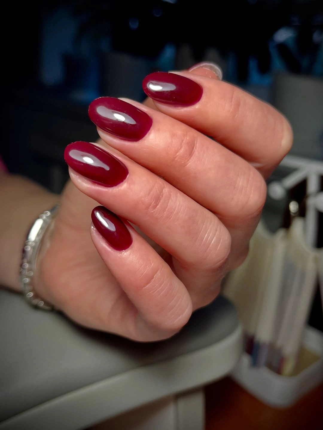
Warm maroon is a helpful middle point if pure red feels too bright and blackened wine feels too heavy. Keep the nail shape rounded or oval to preserve that gentler reading. A small change in undertone does more for the mood than adding a motif would, so choose the version of red that works with your clothing before considering an accent.
The limitation is that glossy warm red can show fingerprints or tiny surface imperfections more readily than a muted finish. That is not a reason to cover it with decoration. A clean solid surface is precisely what lets the warm highlight tell the story, giving this compact manicure an after-dark energy without leaning into anything theatrical.
Short Squares With Shadowed Burgundy Depth
Short square nails use a deep burgundy base with a subtly darker-looking edge, creating tone-on-tone dimension instead of a high-contrast border. The effect is quiet enough that the shape remains the first thing you notice. That makes this a good choice for someone who wants more than a plain solid color but does not want an obvious French tip.
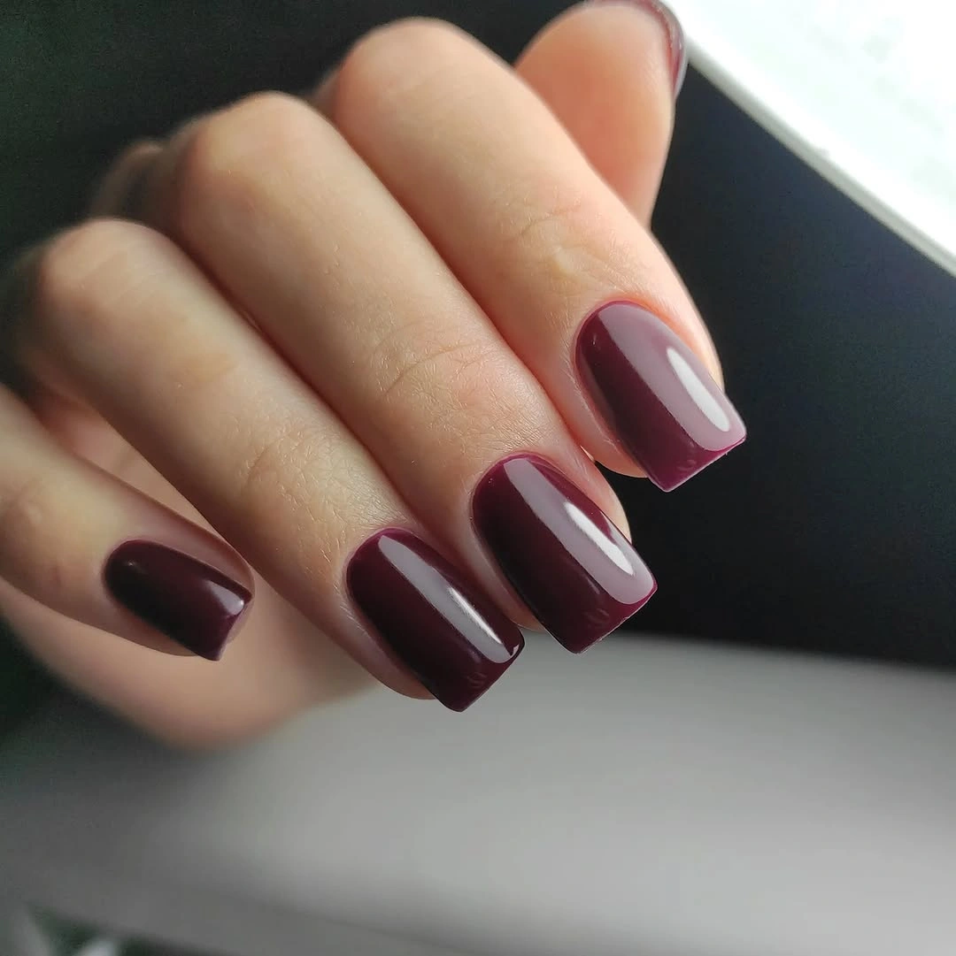
Keeping the two dark tones close together is what makes the detail feel refined. If the border became black, the short squares would look much sharper and more graphic; if it disappeared entirely, the manicure would return to a simple solid. The small value shift sits in between, giving the surface depth while preserving a restrained mood.
Because the contrast is subtle, placement needs to be consistent. Let the darker edge trace a clear boundary rather than wandering toward the center of the nail. A single faint outline can make a short shape feel more defined, but extra metallic dots or linework would distract from the shadow effect that gives the burgundy its quiet complexity.
Opaque Wine Squares With Clean Weight
Opaque wine burgundy on short-to-medium squares uses saturation as the main visual decision. The color is dense, the surface is even, and the straight-ish outline gives it a grounded, substantial feel. Without a pattern or color break, the manicure depends on an orderly silhouette and a finish that catches just enough light to keep the depth visible.
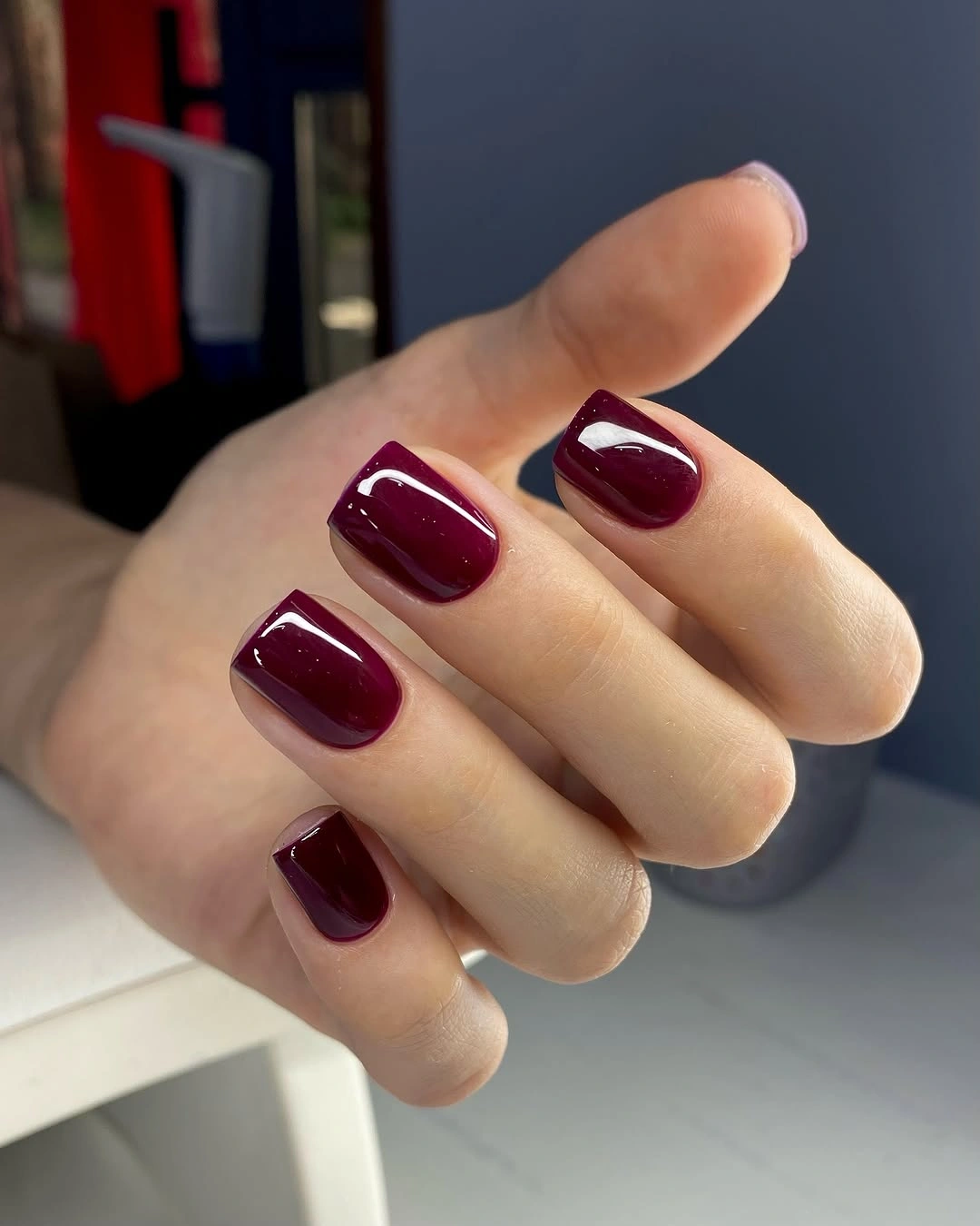
A square shape can make a dark shade feel more stable than a pointed one, especially if your style already includes structured coats, boots, or angular jewelry. Choose this route when you want one color to anchor the hand. A warmer wine reads more earthy, while a cooler plum-maroon shifts the same construction toward a quieter, more atmospheric direction.
The risk with any opaque dark solid is overcomplication. Adding a different accent to every finger would flatten the color’s impact by scattering attention. Leave the surface plain and let the weight come from value, edge, and reflection. That visual discipline is what separates an intentional dark manicure from a set that simply happens to be painted deep red.
Brown-Maroon Almonds With Earthy Warmth
Warm brown-maroon on medium almonds softens the jewel-like quality often associated with burgundy. The color sits closer to leather, cocoa, and dried leaves than to a saturated berry, while the almond taper keeps the surface graceful. Glossy light along the center makes the undertone easier to see, preventing the shade from reading as one undifferentiated dark field.
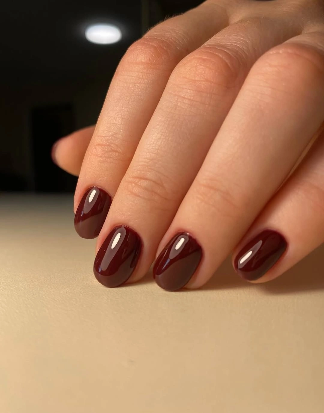
This undertone is useful for a fall manicure that needs to work alongside cream, denim, olive, or camel clothing. It brings seasonal warmth without requiring literal leaves or metallic decoration. If you prefer a cooler result, shift the same almond shape toward plum; if you want it even quieter, shorten the length and keep the red-brown color intact.
Brown-maroon succeeds when it is allowed to stay simple. A glossy solid surface gives the color enough dimension, whereas bright gold studs could push it toward a more formal look than the earthy undertone needs. The most wearable part of this direction is its low visual noise: one warm shade, one flowing shape, and a finish that lets it breathe.
Burgundy in a Tonal Reflection Study
Glossy burgundy nails appear beside matching dark red fabric and polish, making the image feel like a study in repeated tone and reflected light. The manicure does not need a motif because the surrounding materials already show how the color changes from velvet-dark to bright shine. That context highlights the way maroon can feel rich through texture rather than through extra ornament.
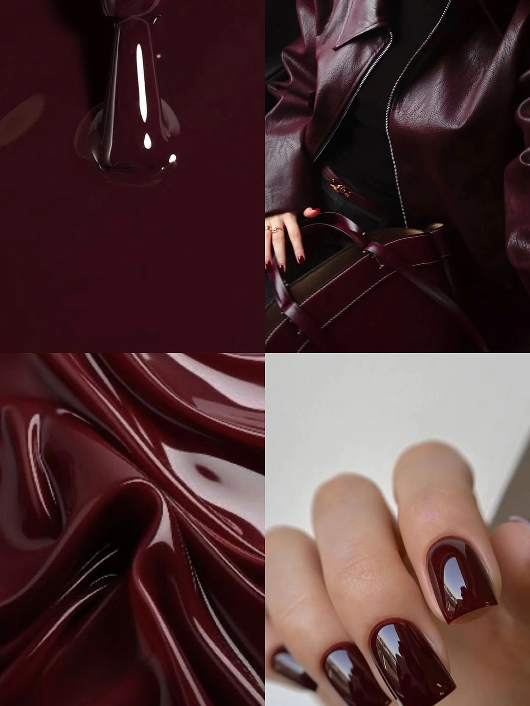
Tonal dressing does not mean matching every item exactly. A deep red manicure can sit beside a nearby wine bag, brown leather, or soft plum knit without becoming a costume. The useful visual rule is to keep the values related but not identical, allowing the nails to echo the outfit rather than disappear into a single uninterrupted color field.
When the palette is this dark, reflected light becomes a practical part of the design. A glassy surface gives maroon different moods as the hand moves, while a matte finish would make the same tonal pairing more hushed. Choose one finish and let it lead; mixing several unrelated textures on the nails would weaken the clear relationship that makes this color story convincing.
Maroon and Pale Blocks on Short Nails
Short rounded nails alternate burgundy with pale neutral blocks and dark outlines, using lighter space to interrupt the density of the red. The contrast is not random because the same maroon returns across the hand, while the pale areas act as small windows. That balance gives a dark color room to feel graphic without committing every nail to a full wine surface.

If solid burgundy feels too heavy, use a pale base on one or two nails and let maroon become the framing color. The adjustment changes the value balance without abandoning the seasonal shade. A creamy neutral will feel warmer; a soft pink will make the design gentler; an icy gray will sharpen the contrast and give the dark red a cooler visual edge.
Short nails do not need many separate blocks to make the idea clear. Too many tiny divisions can make the surface look crowded, especially when an outline is already present. Leave enough pale area for the eye to register the contrast, then keep the remaining nails simple so the maroon still feels like the dominant tone rather than a small decorative fragment.
Glossy Maroon Almonds in Low Light
Dark maroon almond nails appear against a red-and-black interior, where strong reflections are essential to revealing their color. The setting makes the shade look almost black at the edges, yet the glossy center shows its red depth. That tension between shadow and light is the point of a saturated wine manicure, and the almond shape gives it a smooth path for the highlights.
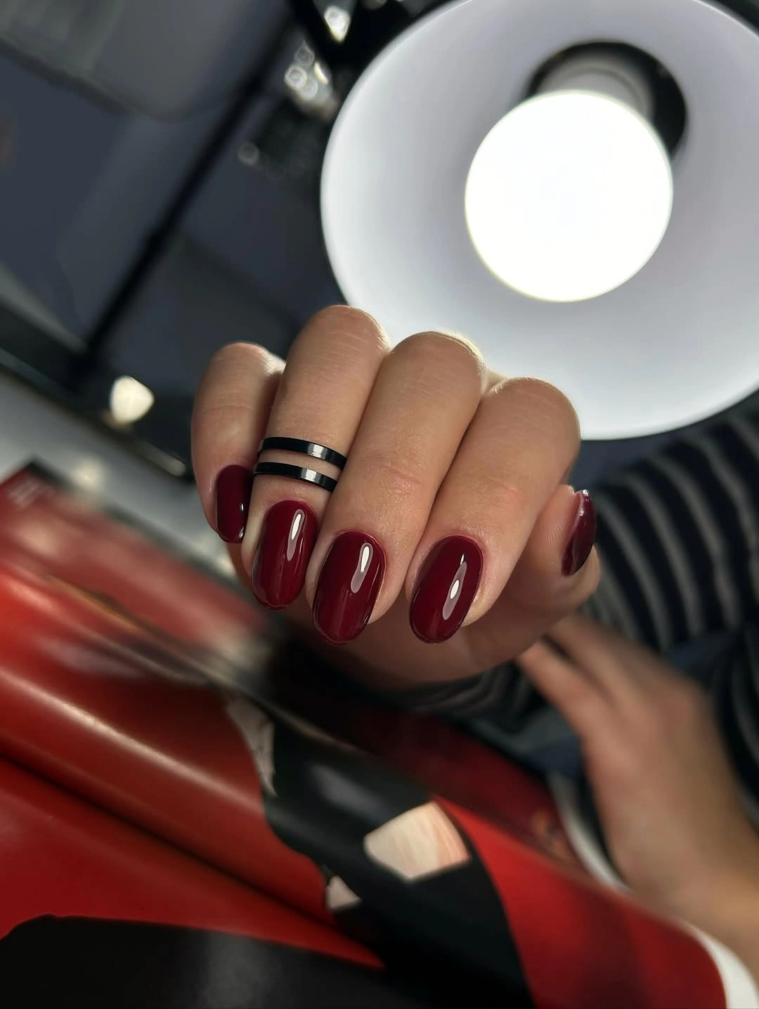
For a deep color to remain readable, choose a finish that creates a clear light source across the nail. That does not require an added shimmer; ordinary gloss is enough when the pigment is rich. A shorter almond would reduce the cinematic effect, while a longer almond increases it, so length is the most direct way to adjust the drama without changing the color.
The practical limitation is that very dark polish can look different in daylight and evening light. Instead of treating that as a flaw, use it as the reason to keep the design uncluttered. A solid maroon surface can shift from burgundy to almost black depending on the setting, whereas competing decals or glitter would make that subtle color movement much harder to notice.
Black-Cherry Squares With Strong Shine
Long square nails in black-cherry burgundy use pronounced reflection to make an almost-black shade look alive. The straight tips create an assertive silhouette, while the bright highlights break the dark color into visible planes. This is a design built on contrast between sharp geometry and fluid light, not on a decorative image or an accent nail.
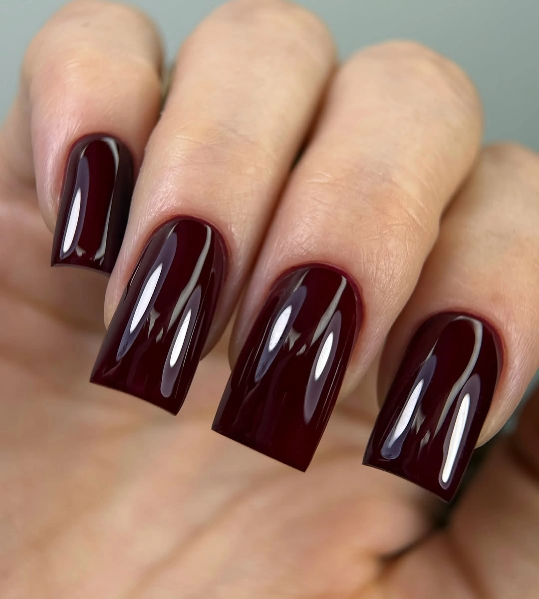
Square length amplifies a deep color, so it is the right choice when you want the manicure to be noticed before the details of an outfit. For a more restrained adaptation, keep the same black-cherry shade but shorten the free edge. The color will retain its depth, while the visual statement shifts from silhouette-driven to more compact and practical.
Adding French tips to a color this dark often creates more edge than the shape can comfortably carry. Let the gloss remain the only contrast. When light slides across a smooth black-cherry surface, it gives the hand enough movement and definition; extra pattern would only interrupt the clear architectural line that makes these long squares feel intentional.
Dark Maroon Beside Faded Denim
Short rounded-square nails in brownish maroon sit beside blue denim, and the cool fabric makes the red warmth easier to recognize. The contrast is useful because it shows how a dark manicure can work with casual texture without becoming too formal. The compact silhouette further relaxes the mood, keeping the deep shade close to everyday rather than evening-only territory.
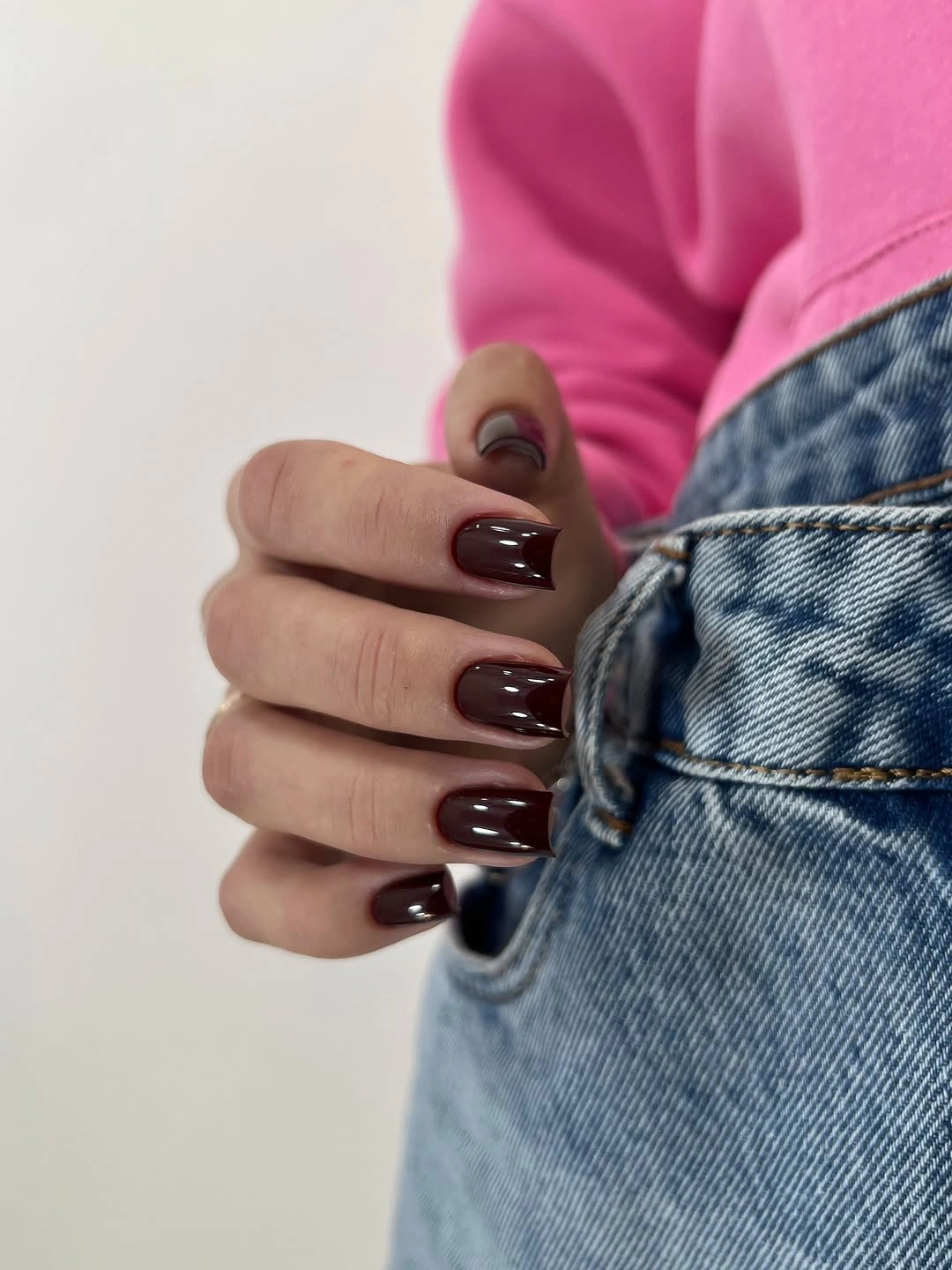
Denim is a practical styling partner for warm wine shades because its cool blue creates separation without demanding a color match. If you wear casual fabrics often, a shorter maroon manicure can provide the same depth as a long set with less visual formality. Leave the finish glossy or softly reflective so the brown-red undertone does not disappear against darker clothing.
The choice to keep these nails short matters as much as the shade. A deep red on a compact soft square can accompany a busy week without asking the manicure to dominate every outfit. There is no need to add a tiny jewel or pattern for interest, because the natural contrast with denim already gives the color a different, visible context.
Soft-Square Burgundy in Close Focus
Rich burgundy on short soft-square nails looks especially polished when each surface holds one small clean highlight. The softened corners keep the color from becoming too hard-edged, while the square base preserves a little structure. This balance makes the manicure feel composed but not severe, with the red tone doing all the visible work.
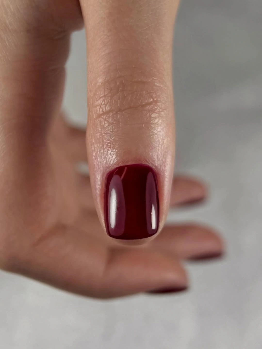
When a color is this saturated, consistency is more valuable than novelty. Keep the length even and the free edges similarly softened, then let the glossy surface provide the movement. A tiny shift toward plum would cool the look, while a redder wine would warm it, but either choice remains strongest when the design stays solid and quietly reflective.
Soft squares are forgiving for readers who like the presence of a squared nail but not a sharply blunt tip. That makes them a sensible match for dark burgundy, which already has enough visual intensity. Extra accents would introduce another focal point, whereas the clean highlight and rounded corner keep the manicure’s depth readable from every angle.
Tapered Wine Squares With a Sharp Finish
Long tapered square nails in deep red-maroon narrow slightly toward the tip, giving the glossy color a sharp forward motion. The shape is more directional than a soft square but less pointed than a stiletto, so the dark surface feels sleek rather than theatrical. Strong vertical reflections emphasize the length and keep the wine tone from looking flat.
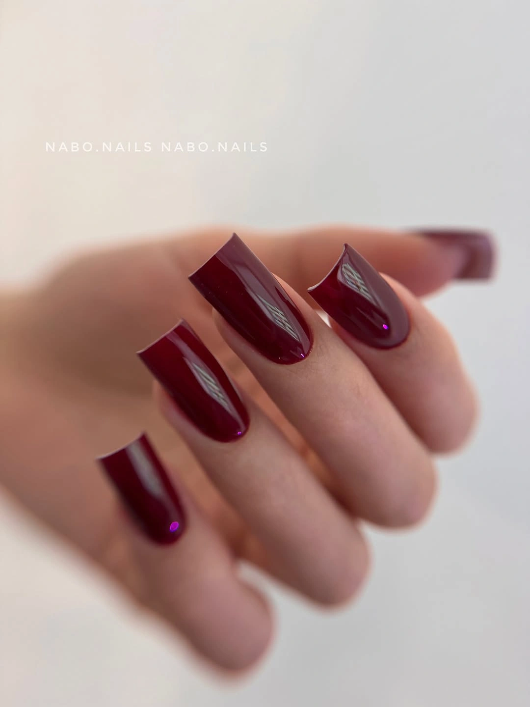
Choose this silhouette if you want a dark solid manicure with visible structure. The tapered edge adds interest without requiring a color change, and it can be shortened gradually if a full long length feels impractical. A high-gloss finish supports the geometry best, because it creates light streaks that follow the same direction as the narrowing sides.
The tradeoff is that the extended tip becomes the entire focal point. Large gems, wide French lines, or heavy swirls would compete with that shape and make the design feel overworked. Keep the pigment even and the edges clean instead. The maroon’s depth, the taper, and the reflected light already form a complete visual sentence.
Nude Squares With Diagonal Burgundy Tips
Long nude squares use diagonal burgundy French-style tips, exposing more of the light base than a straight horizontal tip would. The slanted boundary brings motion to the long shape and gives the dark color a smaller, more deliberate role. That negative space is what keeps the wine tone from visually shortening the nail or making the entire set feel heavy.
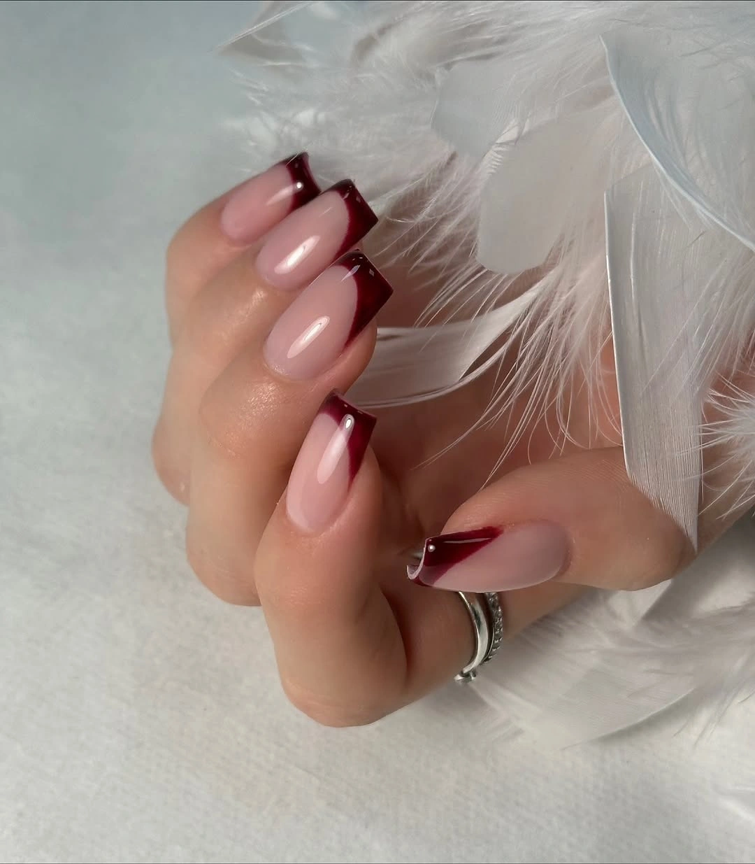
Diagonal tips are a useful way to introduce a dark fall color without committing to a full maroon surface. The nude base can be adjusted warmer or cooler to suit your skin tone, while the burgundy remains stable as the graphic edge. Pairing this look with a simple fall French nail design mindset keeps the contrast clean rather than ornamental.
Because the diagonal already creates a strong line, there is little reason to add dots or glitter above it. Let the nude area remain truly open, and keep the burgundy tip broad enough to be intentional but narrow enough to preserve the lightness. The appeal lies in the tension between a dark corner and a pale field, not in adding more separate details.
Near-Black Burgundy Against Warm Plaid
Medium soft-square nails in nearly black burgundy sit beside warm plaid, proving that a simple solid can be the right counterweight to patterned clothing. The deep polish creates a smooth, quiet surface while the fabric supplies the visual texture. That division of labor is useful: one element carries pattern, and the manicure gives the eye a dark, glossy place to rest.
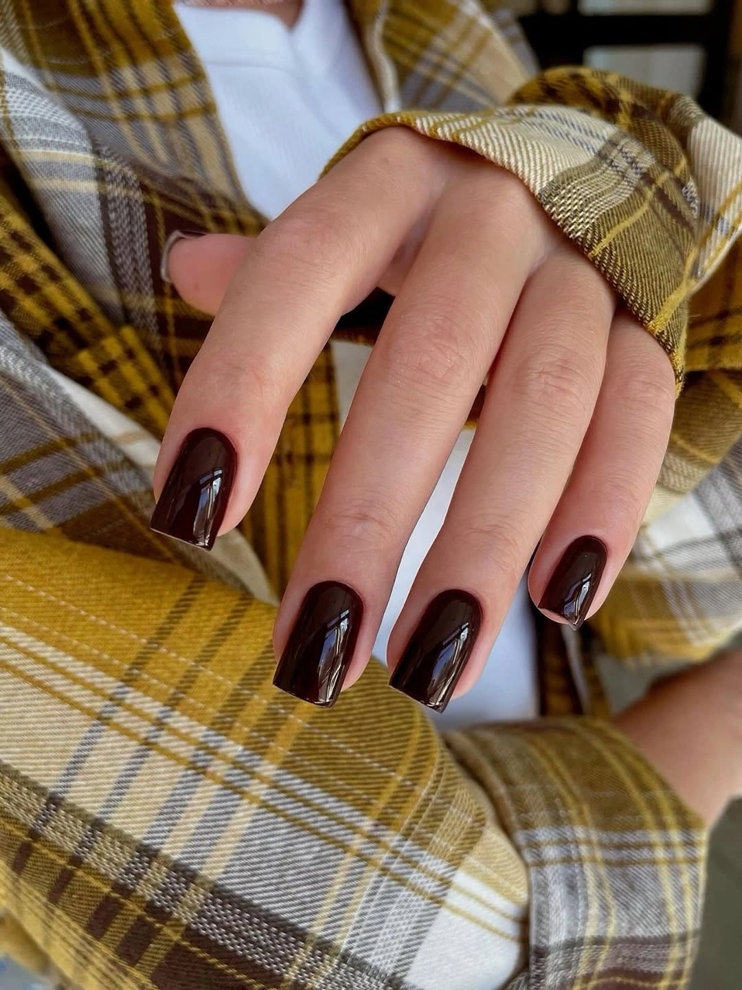
When an outfit includes checks, stripes, or a dense knit, a solid maroon manicure often feels more balanced than another printed nail design. The brown-red depth relates naturally to warm plaid without copying it. You can make the pairing cooler with charcoal clothing or softer with cream, but the clean nail surface should remain free of an additional competing motif.
The darker the burgundy, the more the finish matters. A slight reflection keeps the nails distinguishable from black, especially next to warm fabric where the undertone can otherwise disappear. Keep the shape modest and the color uninterrupted; that restraint allows the polish to read as a deliberate seasonal echo, not as a second pattern fighting for attention.
Pointed Maroon With a Long Glossy Line
Long pointed almond-stiletto nails in dark wine maroon use the silhouette itself as the most dramatic element. The glossy finish runs in a continuous line along each tapered surface, reinforcing the vertical pull of the shape. Because the color remains solid, the result is sleek and graphic rather than loaded with extra symbolism or an unnecessary pattern.
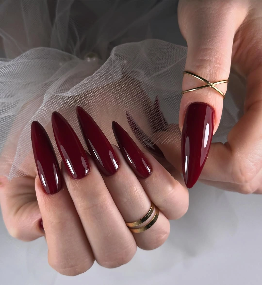
Pointed length is the clearest way to intensify maroon without changing its undertone. If you like the color but want less commitment, shorten the shape before adding decoration; a shorter almond will preserve the same elegant direction. The solid finish works because it gives the viewer one uninterrupted path from the deep cuticle area to the sharp tip.
This silhouette has limited need for embellishment. A large accent would interrupt the most compelling part of the design, which is the clean relationship between dark pigment and pointed form. Keep the reflection smooth, maintain the line, and let the wine shade do what it does best: move between red and shadow as the hand changes position.
Burgundy Squares With Silver Brush Strokes
Long burgundy squares gain a cooler interruption from silver or pale abstract strokes on selected nails. The accents appear as brief flashes across the dense red surface rather than as full coverage, so the color remains dominant. That limited placement is important because the cool metallic detail is visually sharper than the base and can easily take over if repeated everywhere.
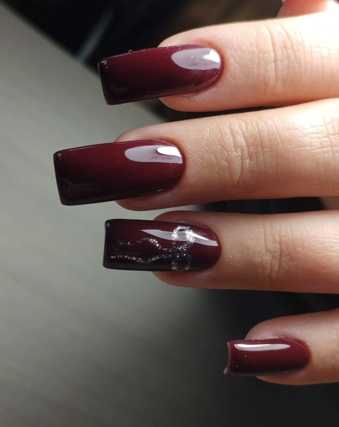
Silver works here because it changes temperature without changing the dark value of the overall palette. A reader who likes more subtle contrast could use a smoky gray stroke instead, preserving the directional line while reducing the reflectivity. The remaining nails should stay solid, giving the abstract accents enough surrounding maroon to read as intentional breaks in the surface.
The most successful version keeps the strokes loose but not crowded. One clear diagonal or curved pass on an accent nail has more impact than several small marks scattered across every finger. That restraint lets the long square shape keep its authority, while the silver provides a brief cool flash that makes the burgundy feel deeper by comparison.
Deep Burgundy Squares in Warm Light
Smooth deep burgundy on long squares looks different in warm light, where broad reflections reveal a richer red center beneath the dark edges. The effect is simple but not flat: light itself becomes the accent, traveling over the uninterrupted color. A crisp squared tip gives that moving highlight a structured surface and keeps the very dark pigment visually grounded.
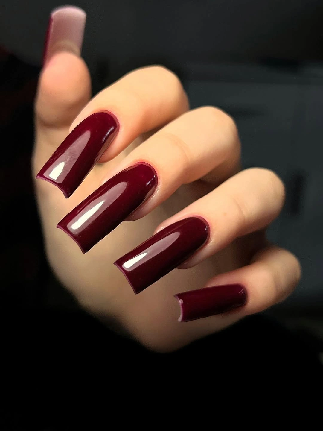
Warm lighting is a reminder that dark polish has more than one visible value. If you want the red undertone to show, choose a glossy finish and avoid overly opaque decoration that would block the surface. A medium-length square can deliver the same idea with less drama, while the long version makes the changing reflection the clear centerpiece of the hand.
There is no need to force an autumn motif onto a color that already changes with the light. The strongest choice is to keep the nails solid, then let the gloss show their red depth in motion. A consistent free edge is essential, because the clean geometric outline gives the shifting warm highlight a stable frame.
Plum-Maroon Almonds With Tonal Echoes
Muted plum-maroon almond nails sit near dark red dried fruit, and the tonal backdrop brings out their brown-red depth without requiring an exact color match. The almond form softens the muted plum cast, while the reflective surface prevents the shade from feeling dull. This is a good example of how nearby warm tones can make a dark manicure look more layered.
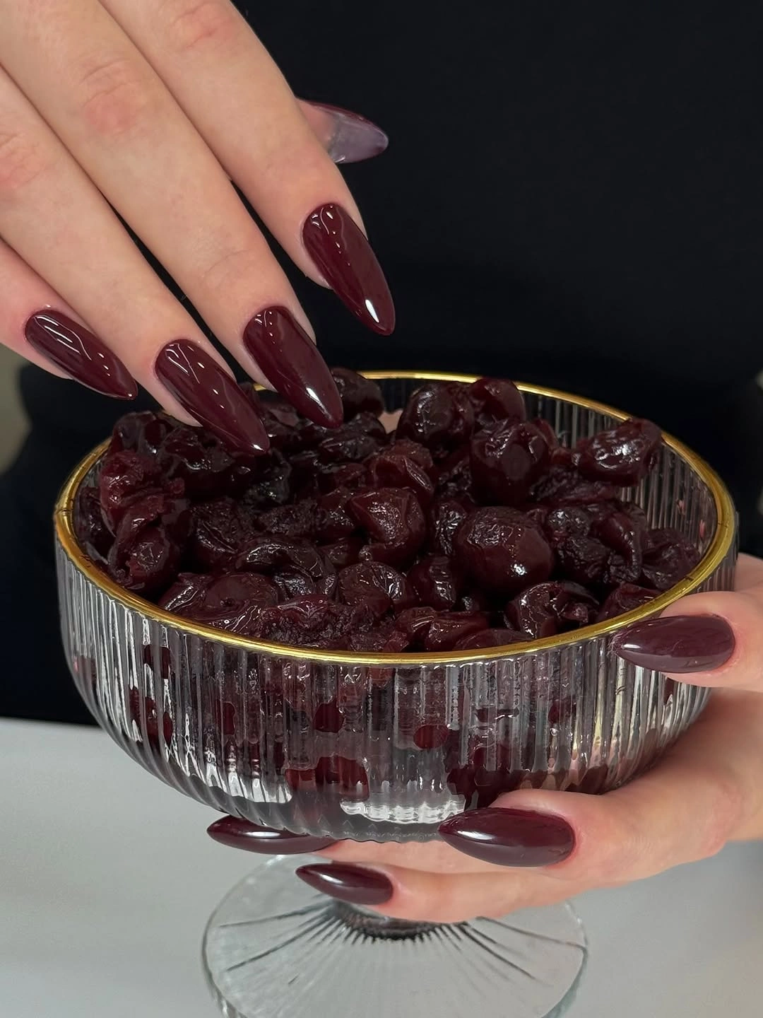
To style a similarly muted maroon, look for companions in wine, cocoa, berry, or rust rather than trying to match the polish perfectly. Related colors give depth to the hand, while exact matching can make the look feel too uniform. A medium almond keeps this palette approachable and lets the undertone read before the length becomes the primary visual message.
The important restraint is avoiding another high-contrast decoration. The color already carries a quiet complexity between plum, brown, and red, which is more interesting when it is allowed to remain visible. A smooth glossy finish and an uncluttered silhouette preserve that tonal movement, making the manicure feel rich through depth rather than through obvious sparkle.
Smoky Black-Red Marble on Long Squares
Long square nails combine deep burgundy, black, and red in a smoky marbled pattern that moves across the surface like layered shadow. The varied veins create more motion than a solid color, yet the palette stays coherent because every tone belongs to the same dark family. The squared length gives the irregular pattern a clear frame instead of letting it drift.
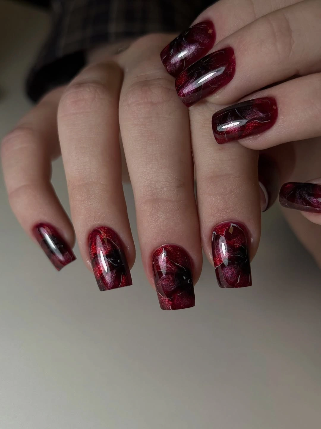
Marbling is most wearable when the palette is narrow. Keeping the reds dark and the black contained lets the layered surface read as depth, not a collection of unrelated lines. Someone who wants a simpler version could marble only two nails and keep the rest solid burgundy, preserving the visual tension while reducing the amount of pattern on the hand.
The tradeoff is density: dark veins need open areas around them so the design does not collapse into a single black patch. Let some burgundy remain broad and visible, and resist adding metallic glitter over the top. The marble already gives the long squares their movement; the strongest ending is where shadow, red, and glossy reflection remain separately readable.