
Matte Fall Nail Designs for 2026: Soft Color, Strong Detail
Matte polish asks for a different kind of confidence. Because it absorbs the flash of light that can make any color feel louder, a pale taupe, a dusky pink, or a deep blue has to rely on its own shape and balance. The result can feel wonderfully calm, but only when the color has a clear point of view instead of being decorated into noise.
Before choosing a detail, decide what you want the hand to communicate in ordinary daylight: softness, clean contrast, or a small interruption that rewards a closer look. That one decision prevents a design from feeling overworked. Browsing fall matte nail ideas is most useful when you notice how much of the surface has been left intentionally quiet.
Taupe Almonds With Gold Botanical Edges
The soft taupe almond shape is nearly monochrome until the fine gold botanical touches appear along a few tips. That contrast works because the metallic detail is narrow and the surrounding nails stay quiet, so the eye reads an elegant contour instead of a busy floral theme. On a longer almond silhouette, placing the shine near the edge also keeps the center of each nail visually calm.
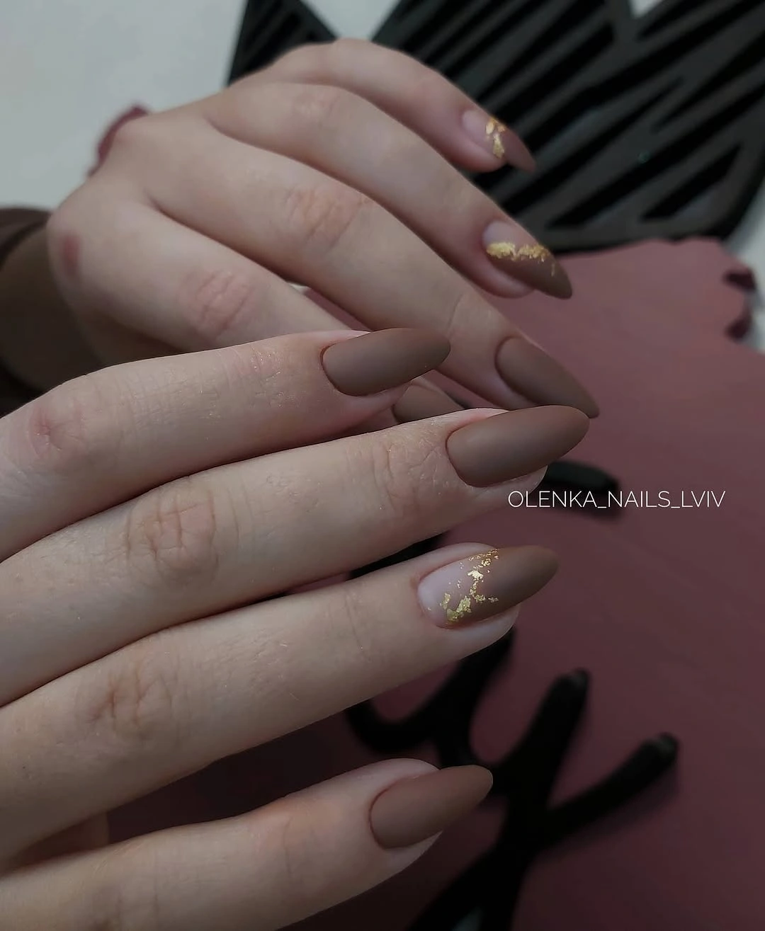
A neutral base like this gives a small accent room to feel intentional. If gold feels too warm for your usual jewelry, the same placement could be interpreted with a cool gray outline or a deeper brown detail, but the line should remain fine. Widening it would quickly turn the gentle botanical cue into a much heavier French-style effect.
Wearability here comes from restraint, not from the length alone. The long shape already creates a polished gesture, so two or three decorated nails are enough to establish rhythm. Keep the accents close in size and avoid adding an unrelated pattern on the remaining fingers, otherwise the soft taupe loses the quiet authority that makes the look memorable.
Lime and Blush Squares With Fine Borders
Bright lime and pale pink occupy separate short square nails, with a thin reflective-looking outline tracing their edges. The narrow border gives the two colors a common visual language, which matters because their temperatures are quite different. Compact squares keep that lively pairing grounded; on a much longer shape, the same high contrast could pull attention away from the clean outline.
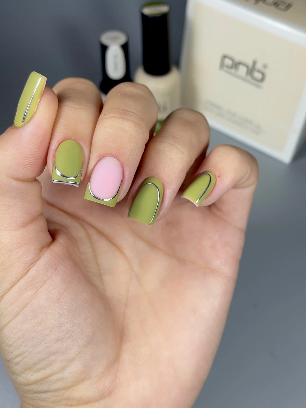
Color blocking is easier to wear when one element repeats across every variation. Here, the slim frame acts as that repeating element, while the lime and pink can alternate without looking disconnected. Someone who prefers less contrast could swap the lime for a muted olive, preserving the structure while moving the palette closer to conventional fall color relationships.
The limitation is that pale pink and bright green show uneven boundaries quickly, especially near a squared edge. A cleaner result depends on leaving each color area simple and letting the border do the decorative work. Adding dots, glitter, or extra art to this arrangement would compete with the precise division that makes the combination feel crisp rather than random.
Creamy Florals on Elongated Almond Nails
A creamy base gives the tiny orange and purple floral drawings a calm field, while small gold details keep the long almond nails from feeling flat. The flowers are not arranged as a matching stamp on every finger, and that variation is the reason the set retains a hand-drawn lightness. The pale background also makes the small motifs readable without relying on a heavy outline.
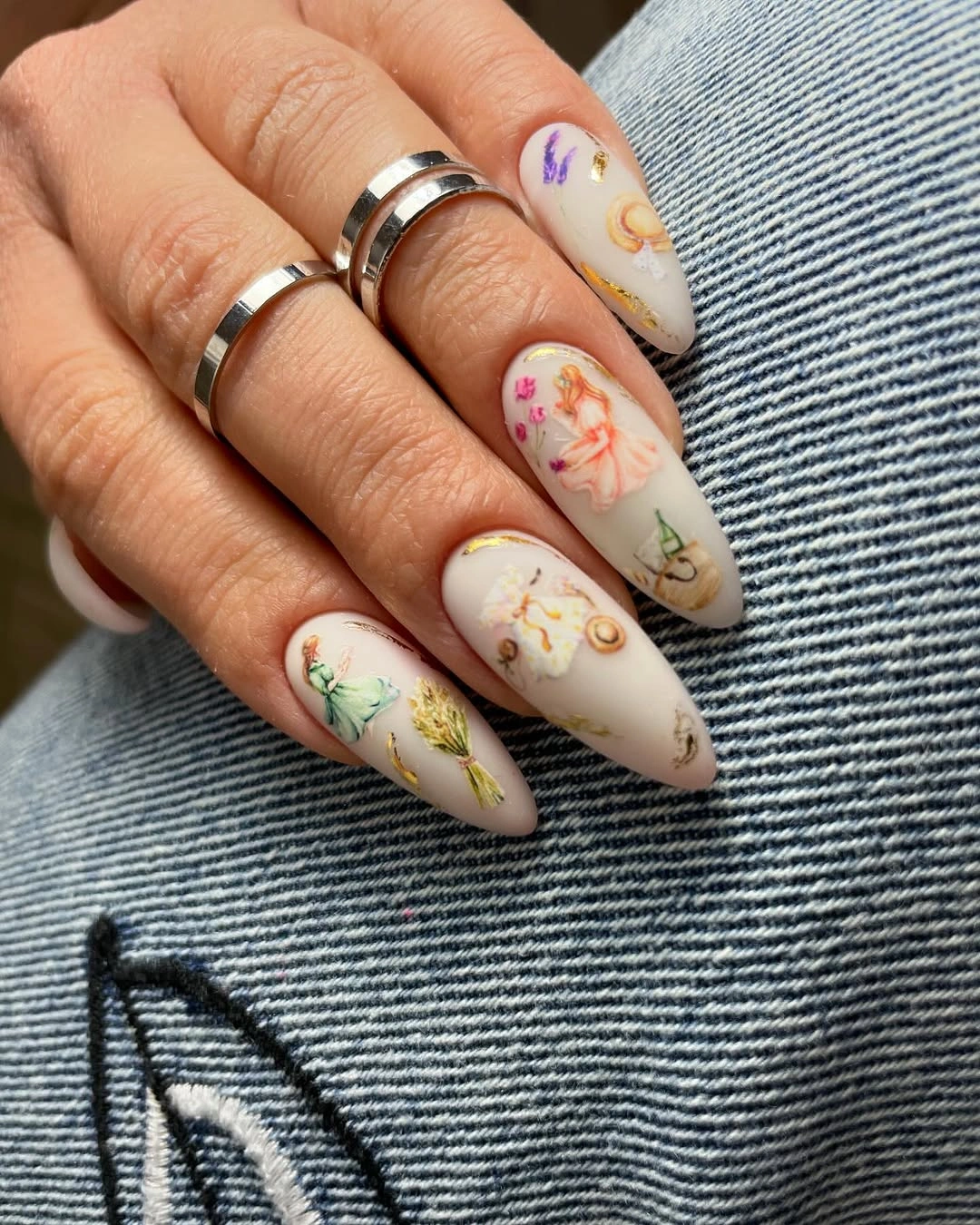
For a similar direction, choose one floral color as the visual anchor and let the secondary shade appear only in smaller marks. That approach preserves hierarchy, especially on longer nails where repeated motifs can multiply quickly. A cream base is forgiving with warm accents, but a cooler pale gray could create a quieter contrast if bright floral color is not your usual preference.
These details benefit from uneven spacing because the design is small enough to invite close looking. If every nail held the same flower in the same position, the set could read more rigid than delicate. Leaving one or two nails nearly plain creates a pause between the illustrated areas and makes the gold touches feel like a connection rather than a separate theme.
Nude Almonds Framed by a Wine Edge
The nude almond nails use a slim muted-wine edge instead of a full dark tip, so the base remains the dominant color. That proportion is especially useful on a long silhouette: the dark tone sharpens the outline but does not visually shorten the nail. The result has the seasonal depth of burgundy without committing every fingertip to a broad block of color.
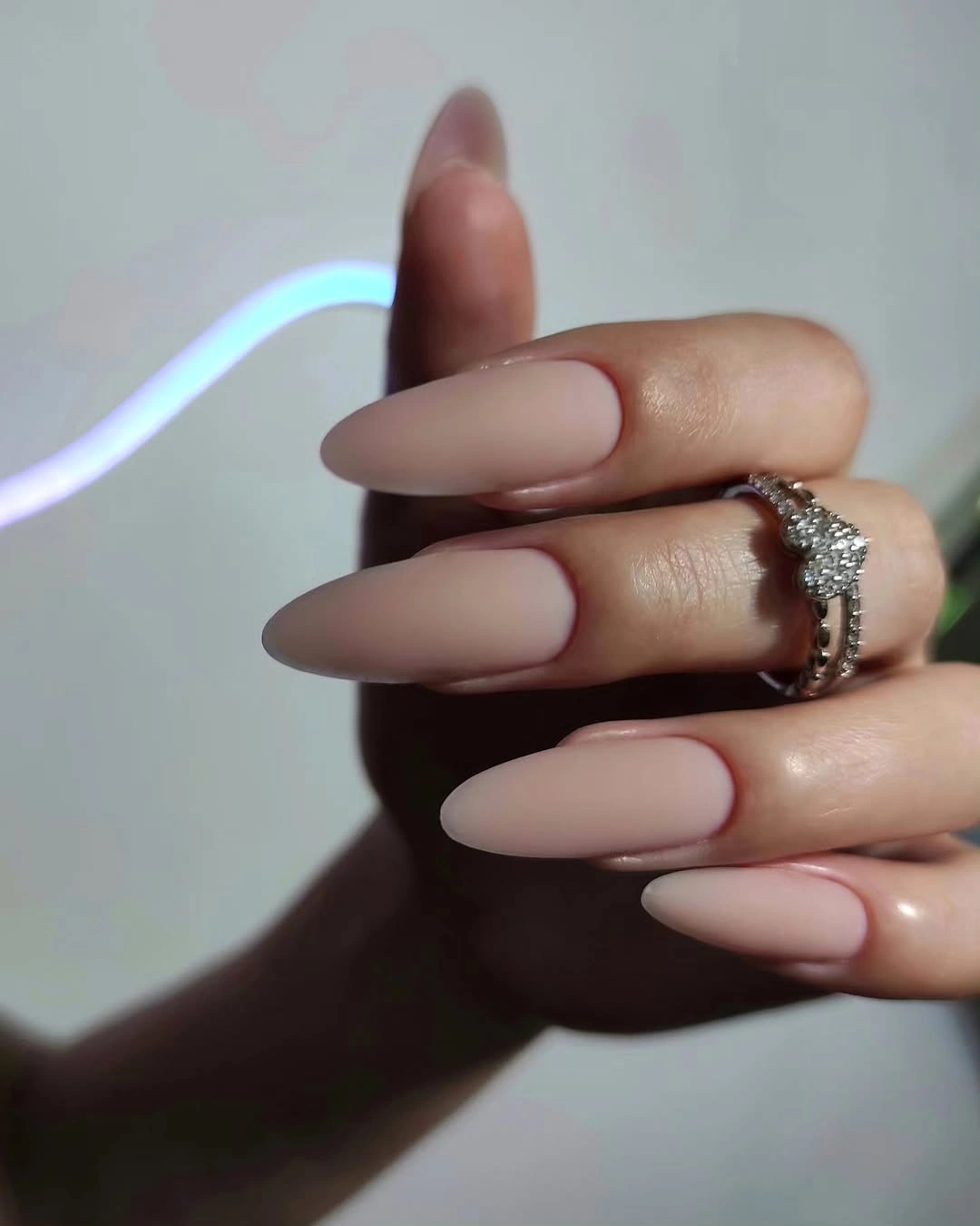
Fine edging is a practical option for readers who like dark fall tones but prefer a lighter overall hand. The visual trick is to keep the line consistently narrow and follow the existing curve rather than drawing a separate band. A deeper brown, charcoal, or plum could create a similar effect, although each will change how warm the nude base appears by comparison.
There is a tradeoff in choosing such a delicate border: its neatness is the whole point. A thickened or uneven edge can make the design look accidental rather than understated. Keeping the rest of the nails free of crystals and busy motifs allows the wine tone to function as a precise frame, not merely another color laid over the tips.
Pink Squares With Daisies and Character Detail
Bright pink square nails carry white daisies, tiny orange dots, and one illustrated character accent, creating a deliberately playful mix. The repeated flowers are what hold the idea together; they echo across several nails while the detailed accent gets its own space. That balance is important because the cartoon-style element would otherwise pull the entire manicure toward one finger.
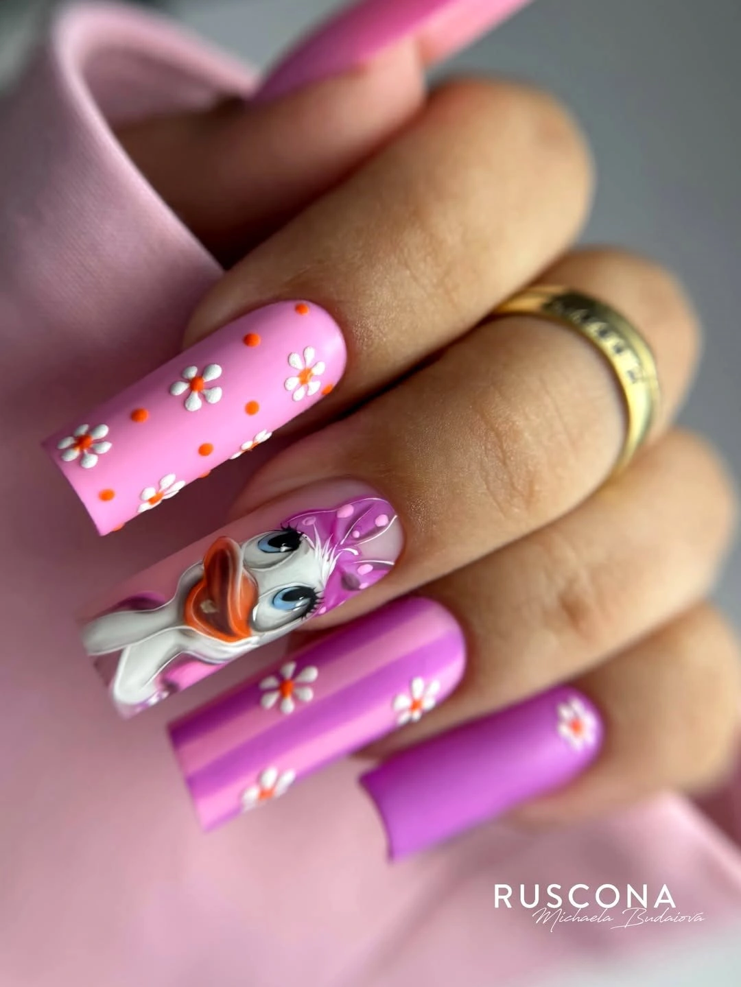
For a maximal look that still reads clearly, repeat one small motif more often than the most detailed motif. In this case, the daisy provides that steady repetition, while the character acts as a surprise. A shorter square length would make the same combination feel more compact and casual, but the long shape gives the floral marks enough room to remain separate.
Bright pink already carries a lot of visual energy, so the strongest adjustment is subtraction. Keep the dot colors limited and leave a few nails dominated by pink rather than covering every surface. That negative space prevents the manicure from becoming a collection of unrelated stickers and lets the white flowers register before the eye reaches the larger illustrated accent.
Neutral Nails With Black Ornamental Lines
Long neutral almonds are interrupted by dense black ornamental linework, concentrating the strongest contrast on selected nails. The pale base matters because it creates visible space around the pattern, allowing the curls and lace-like marks to stay distinct. With this kind of graphic detail, the undecorated nails are not empty; they are what stop the entire hand from becoming one dark mass.
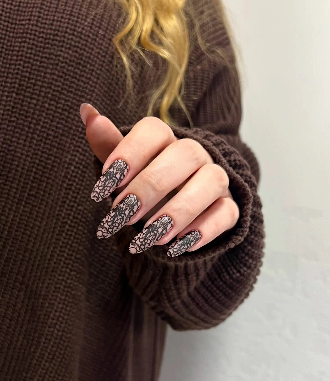
A controlled way to adapt the idea is to place the black detail on two nails and use a much smaller fragment on a third, rather than repeating a full motif five times. That creates a gradient of intensity across the hand. Readers drawn to fall leopard nail ideas may recognize the same principle: bold pattern reads better when a calmer base gives it room.
The main limitation is contrast fatigue. Dense black decoration beside a pale neutral has more visual weight than a delicate metallic accent, so it needs a deliberate stopping point. Avoid adding a colored French tip underneath the linework, because another border would blur the clean relationship between background and drawing that gives the manicure its refined edge.
Blush Squares With Curved Tip Lines
Pale pink long squares use narrow white and dark curved lines near the tips instead of a fully filled French edge. The small curves introduce movement without changing the soft tonal mood of the base. Because the lines do not all follow the exact same path, the design feels lighter and less mechanical than a rigid stripe across every squared tip.
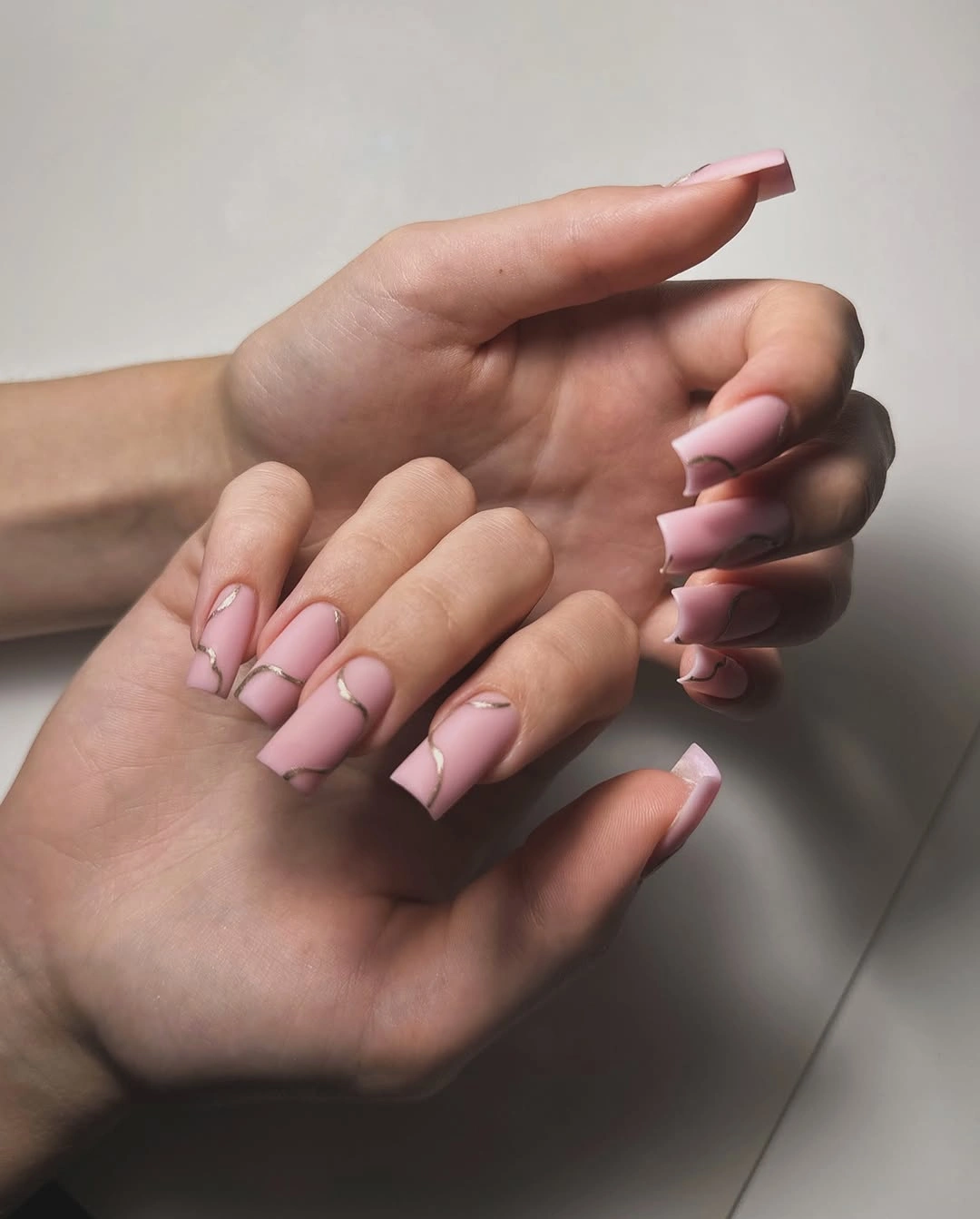
The appeal of this approach is that it treats the tip as an area for drawing rather than a block to fill. A reader who likes minimal manicure art can choose one curve color and leave the second line out, or make the darker line a muted brown for less contrast. The pink base remains useful because it keeps every variation connected to the natural nail area.
Long squares need clean sidewalls for these thin curves to look intentional. If the outline drifts too far toward the center, it can make the tip appear visually lopsided. Keeping the arcs close to the edge and varying only their direction preserves a loose, modern rhythm while maintaining the orderly silhouette that makes this manicure feel polished.
Deep Green Squares With Pale Marble Contrast
Deep muted green square nails sit beside pale accent nails with swirling, marbled-looking patterns. The contrast succeeds because the solid green functions as a frame rather than sharing equal attention with the lighter detail. A short-to-medium square length also makes the dark color feel grounded, while the pale accents prevent the palette from becoming too dense.
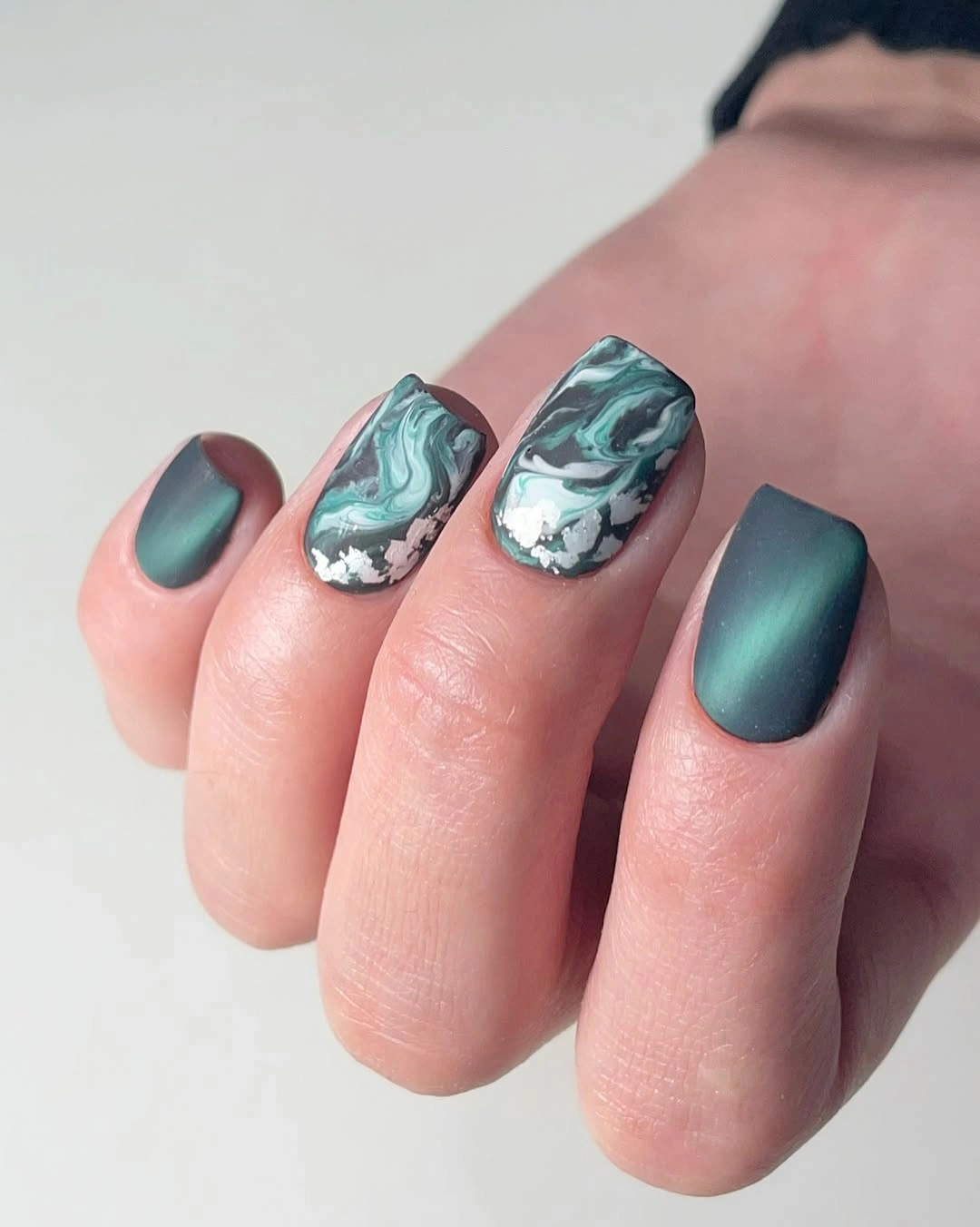
Dark green is a strong foundation when you want a fall manicure that is not built around red or brown. Keeping the accent nails noticeably lighter gives the eye an immediate resting point, and choosing a soft pale tone instead of sharp white makes the transition gentler. The marbled effect should stay confined to one or two fingers so its motion remains a contrast, not a background.
There is an honest tradeoff between the moody green and the busy accent surface. The more swirling detail appears, the less the design reads as a color story and the more it becomes pattern-led. For a simpler everyday version, use the green on every nail and save a pale, subtly veined accent for only one hand or one finger.
Silver Gray With a Lattice Accent Nail
Soft silver-gray rounded nails create a muted field for one red-and-gold lattice accent. The accent is visually richer than the surrounding finish, yet it works because it is isolated and the main color stays low contrast. The rounded shape makes the pale nails feel gentle, which gives the small red pattern room to supply the sharper seasonal note.
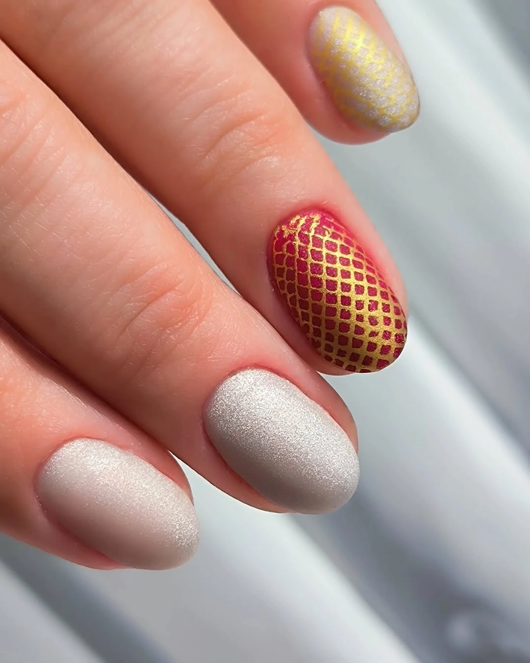
This is a useful design lesson in contrast budgeting. If a patterned nail includes both warm red and metallic gold, the neighboring nails do not need another major effect to look considered. A taupe, pale mushroom, or misty blue base could create a similar balance, provided the accent remains the only place where multiple colors meet.
On a shorter nail, lattice detail can blur if the lines are packed too closely. The motif reads best when each diamond shape remains visibly separated, even if that means using fewer intersections. Leaving the remaining nails plain is not a compromise here; it is what makes the small patterned surface look intentional rather than crowded.
Pale Pink Squares With One Reflective Accent
Almost every nail remains a soft pale pink square, while one carries a small curved reflective-looking embellishment. The restraint makes the surface detail more noticeable than a larger, repeated accent would be. Against a quiet base, even a compact metallic shape can create a focal point because the eye is not asked to sort through competing color or pattern.
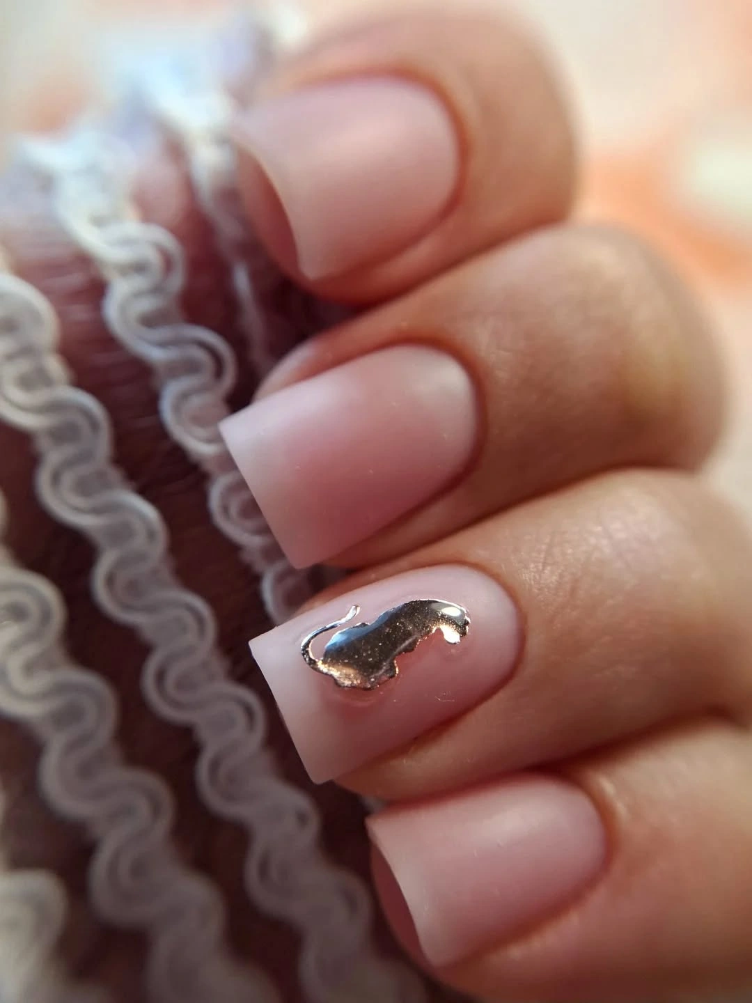
For a minimal manicure, it helps to choose an accent that changes texture or light rather than adding another full color. That keeps the palette coherent while still giving the hand something to catch the eye. If reflective detail feels too pronounced, a small tonal raised-looking curve or a fine outline could deliver the same placement idea with less contrast.
The practical limitation is that a single accent has nowhere to hide if its scale is wrong. Too large and it interrupts the clean pink field; too small and it disappears in normal light. Keeping it near one edge or close to the cuticle area creates a deliberate visual pause while letting the simple squared shape remain the primary message.
Pale Squares With Mixed Graphic Spots
Medium pale pink squares combine black spotted markings with a few small reflective details, creating a graphic pattern that is stronger than the base color but not completely opaque. The light background keeps the spots separated, so each mark reads as a distinct gesture instead of merging into a dark tip. That spacing is what makes the pattern feel modern rather than overly literal.
Patterned nails benefit from choosing one visual density and staying there. Here, the spots are bold enough to be seen at a glance, while the pale base supplies the contrast that keeps them clean. A reader could soften the idea by using chocolate brown instead of black, or by applying the pattern to only two nails and leaving the others solid.
Because the marks are irregular, the placement needs to look intentionally varied rather than simply scattered. Avoid crowding every spot at the tip, which can create a heavy band. Distributing a few along the side or center gives the eye a path across the nail and preserves the airy pink space that makes the contrast feel balanced.
Neon Orange With Pastel Sprinkle Details
Neon orange short rounded nails alternate with pale pink nails marked by tiny colorful speckles. The bright orange establishes the energy, while the softer nails give the miniature dots a cleaner place to appear. Shorter length is especially helpful here because it keeps the high-saturation color and scattered detail from stretching into an overly loud visual statement.
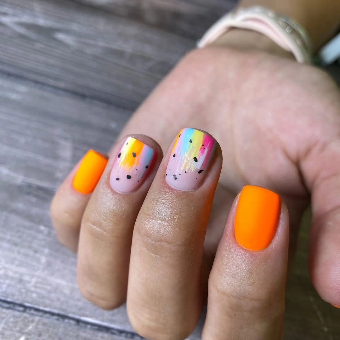
A playful palette does not need every nail to carry every color. Let one vivid shade appear in solid form and reserve the smaller hues for the speckled nails, so the set keeps a readable hierarchy. Swapping the orange for a muted pumpkin or rust would make the same layout feel more obviously seasonal without changing the useful contrast between solid and patterned surfaces.
The challenge is keeping the tiny marks from turning into visual noise. Dots that vary slightly in position feel lively, but adding too many colors or sizes can make the pale nails look cluttered. A limited sprinkle area, usually near the center or one side, gives the detail a clear boundary and lets the bright orange remain the first impression.
Red Nails With Dark Patterned Accents
Short red rounded nails are energized by black spotted and patterned accent areas, placing the darkest visual information on only part of the set. The red stays dominant because most surfaces remain solid, while the black marks introduce a sharper edge and a little texture. That separation keeps the design from becoming a full animal-print manicure disguised by a red palette.
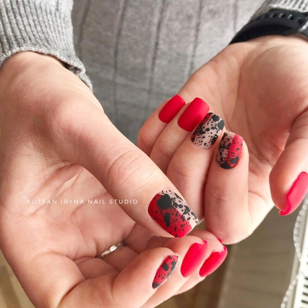
Red and black are naturally high contrast, so the practical choice is to make one color carry the bulk of the design and use the other in smaller doses. A deeper brick red could make the relationship feel quieter, while a bright red makes the graphic marks feel bolder. Either version benefits from leaving at least two nails completely free of pattern.
Short rounded nails make this contrast easier to wear, but they also give each accent less surface area. Large black spots can quickly look crowded if they gather near one edge. Smaller, more widely spaced marks maintain the lively texture while preserving enough red around them for the color to remain the clear lead.
Soft Matte Pink on Long Clean Squares
Long square nails in one soft matte pink shade rely on finish and proportion rather than decoration. The flat-looking surface removes the bright reflections that would make the color feel sweeter, so the result reads more graphic and controlled. With no accent nail to redirect attention, the straight free edge and consistent length become the central styling decision.
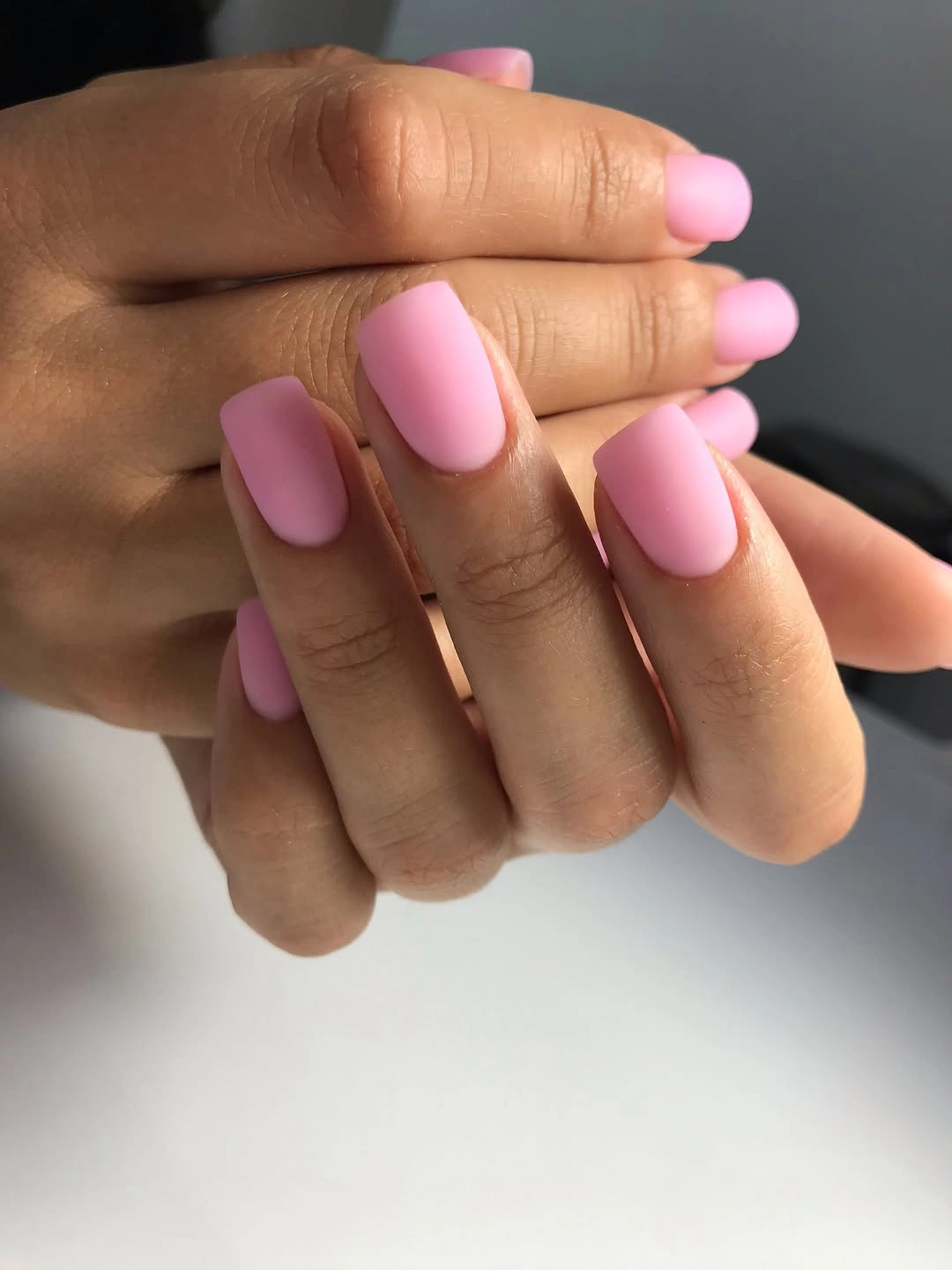
A single-color manicure is not empty when the finish has a clear point of view. Matte pink can work with both warm and cool clothing because its intensity is low, but the pairing looks best when surrounding accessories do not introduce an unrelated competing pattern. If you want variation, change only one factor, such as shortening the square shape or choosing a dustier pink.
The realistic limitation is maintenance of the outline. A monochrome long square shows a crooked edge or mismatched length more clearly than a patterned design would. That makes this direction best for someone who enjoys a crisp silhouette and wants the quietness of a solid color, not for someone hoping decorative detail will camouflage every small irregularity.
Olive Matte Nails With Zebra Contrast
Short olive matte nails are interrupted by one pale accent with black zebra stripes, creating a strong graphic contrast inside an otherwise earthy palette. Olive softens the impact of the black-and-white pattern because it brings a muted natural tone to the hand. The short shape helps the accent stay playful instead of letting the stripe pattern become the dominant visual mass.
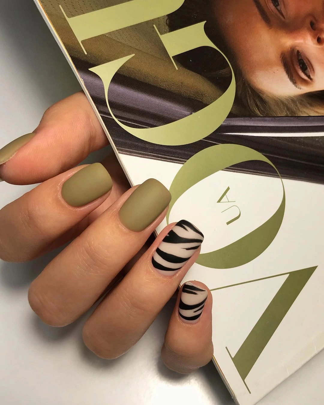
The clearest way to adapt this idea is to treat the striped nail as a punctuation mark. Keep the olive solid on most fingers, then decide whether one additional nail needs a tiny stripe fragment or whether the single accent has already said enough. Repeating black stripes across every finger would remove the calming role that the green is doing so well.
Pattern contrast works best when the base color does not try to compete with it. Avoid adding gold outlines, glitter, or another animal motif to the olive nails, since that would split the attention into too many directions. The value of this combination comes from the meeting of matte earthiness and crisp black linework, not from piling on separate fall references.
Nude Squares With Flowing Black Waves
Medium nude square nails use black wavy outlines that curve around the edges instead of filling the whole surface. The negative space is as important as the line itself, because it keeps the drawing airy and lets the nude base remain visible. Slightly different wave paths on each nail give the design movement without making it feel like a repeated printed pattern.
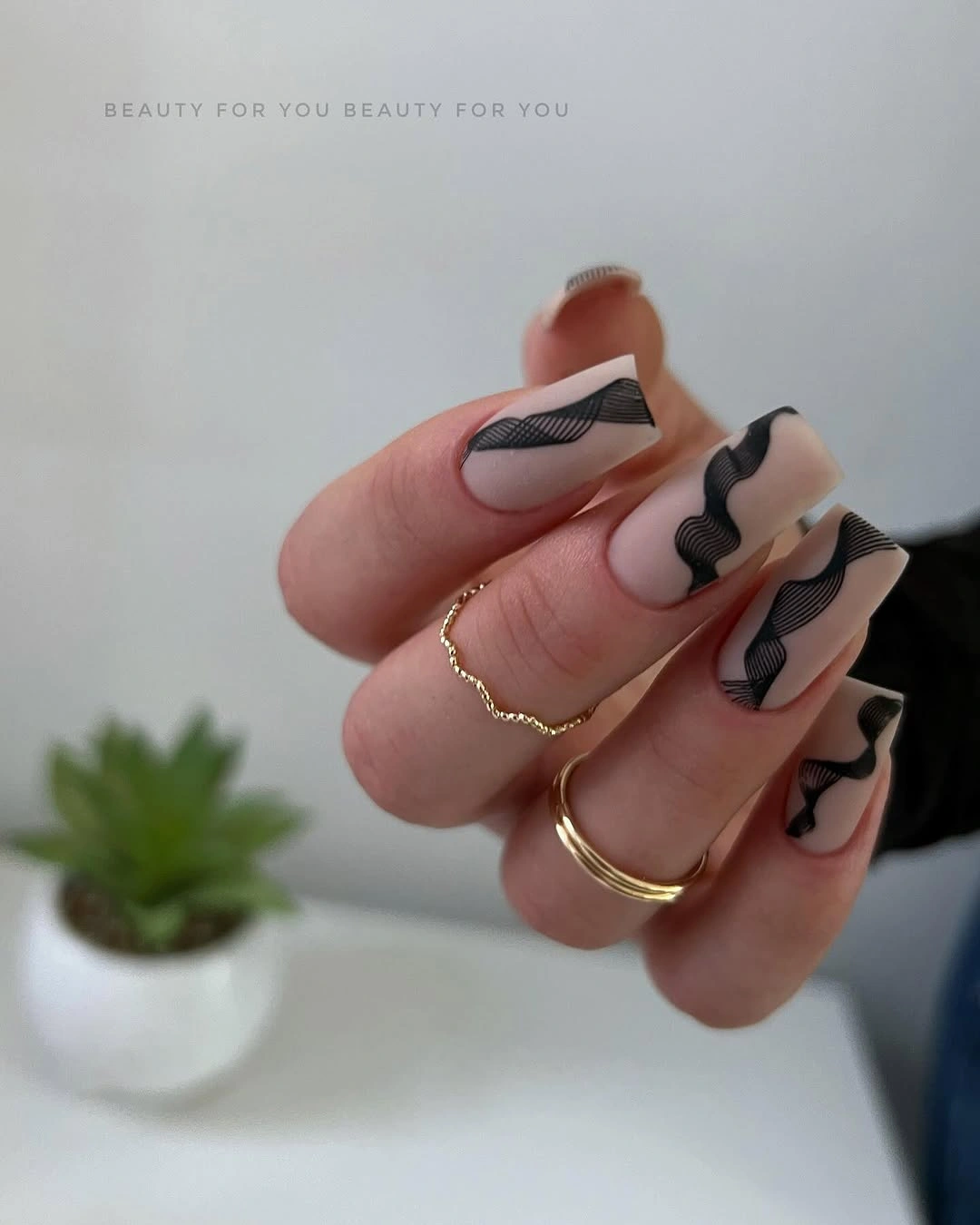
Graphic linework is a good alternative when you want pattern but do not want the density of a full color block. Keep the lines close to one side or the tip, then allow empty space to separate the curves. A warm brown line would make the contrast gentler, while black preserves the sharp, almost ink-drawn quality that gives the nude base its structure.
The potential misstep is making every wave identical. Perfectly matched curves can look stiff on a hand where each nail has a slightly different width and angle. Varying the direction while keeping a common line thickness is more forgiving and makes the manicure feel intentionally hand-led, with the negative space doing as much visual work as the black detail.
Lavender Matte Squares for a Cool Pause
Short lavender squares use a uniform matte-looking finish and no visible decorative interruption. The cool pastel has enough character to stand on its own, especially when the flat surface mutes any candy-like shine. A compact square shape keeps the color fresh and restrained, allowing it to function as a clean pause among more patterned fall manicure ideas.
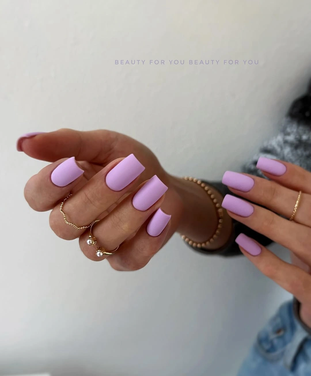
Lavender is useful when you want softness without leaning into beige or pink. It can sit beside charcoal, cream, denim, or dark green clothing because its value is light while its temperature remains distinct. For an even quieter variation, choose a grayer lavender; for more contrast, keep the color the same and switch to a short almond silhouette rather than adding decoration.
Minimal cool pastels reveal uneven coverage and shape quickly, so the appeal is tied to consistency. The nails need not be long to look considered, but their edges should be similarly rounded or similarly square. Leaving the finish plain is what lets lavender feel calm and deliberate, rather than turning it into a backdrop for details it does not need.
Light Squares With Botanical Black Line Art
Light square nails carry thin black leaf-like drawings, using line art to create an organic accent without covering the pale base. The open design keeps each botanical fragment readable, especially where the lines follow the side or tip instead of sitting in the center. That placement creates a useful balance between softness, structure, and a little graphic contrast.
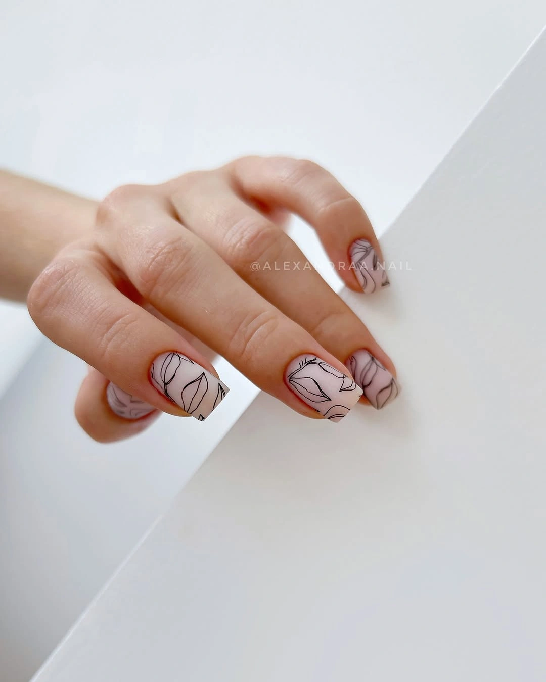
When using botanical linework, scale matters more than realism. A few clear leaf shapes can feel more elegant than a dense cluster of tiny marks that blend together from normal viewing distance. Readers who prefer a warmer version could replace black with deep brown, but the best result still comes from allowing ample pale space around the drawing.
The design becomes less effective if every nail receives a complete illustrated branch. Let one nail carry a fuller motif, use a partial curve on another, and leave the remaining nails lightly detailed or plain. That uneven distribution prevents the botanical idea from reading like wallpaper and preserves the clean square base that gives the lines their clarity.
Cobalt Almonds With a Softened Finish
Saturated cobalt blue on medium almond nails creates a strong color statement, while the matte-looking finish takes away some of the expected shine. That shift lets the blue read as a broad field of color rather than a reflective surface, which makes the almond silhouette appear even cleaner. No extra art is necessary because the hue and finish already create contrast with the hand.
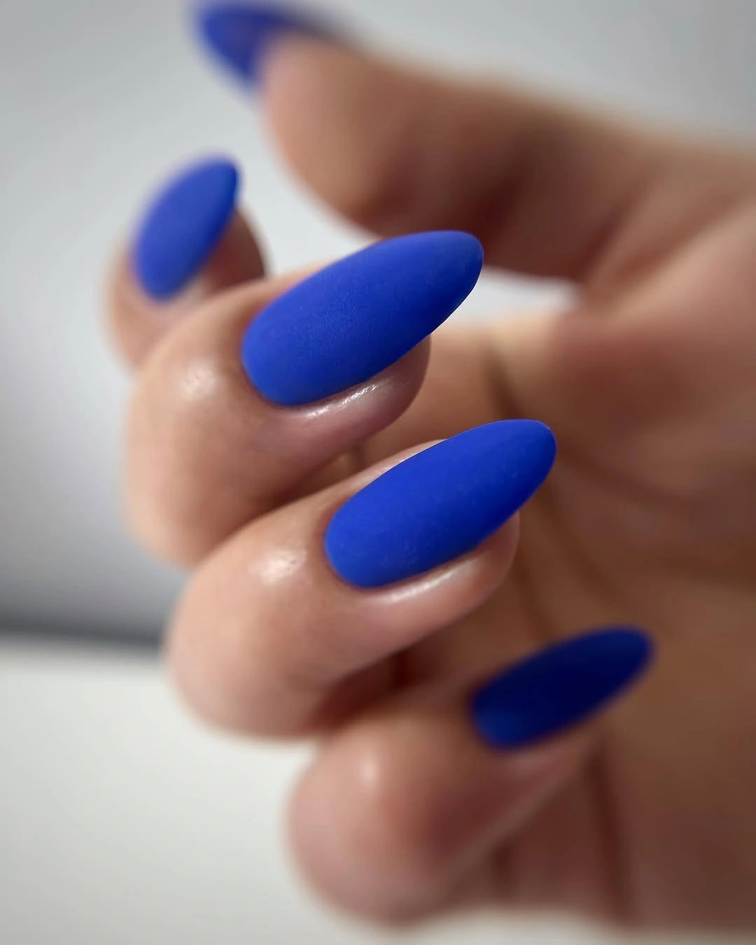
A vivid single color works best when you make one other choice conservative. Here, the almond shape is smooth and uncomplicated, so the blue can remain the focus without feeling overstyled. If cobalt is too bright for your wardrobe, a deeper navy or softened teal could preserve the cool direction, but adding a second bold accent color would dilute the disciplined effect.
The tradeoff is that saturated blue announces itself from a distance. That makes it a satisfying option when you want the manicure to be the focal point, but less useful if your style relies on subtle accessories. Maintaining the matte effect and avoiding metallic embellishment keeps the design coherent, because sparkle would change the visual language from calm color blocking to ornament.
Red Matte Nails With Fine White Threads
Medium red almond nails use fine white looping lines on selected fingers, bringing a thread-like sense of movement to the warm matte base. The white marks are thin enough that red remains the primary read, yet they break up the solid color in a way that feels more graphic than floral. Leaving several nails plain keeps the linework from turning into a full surface pattern.
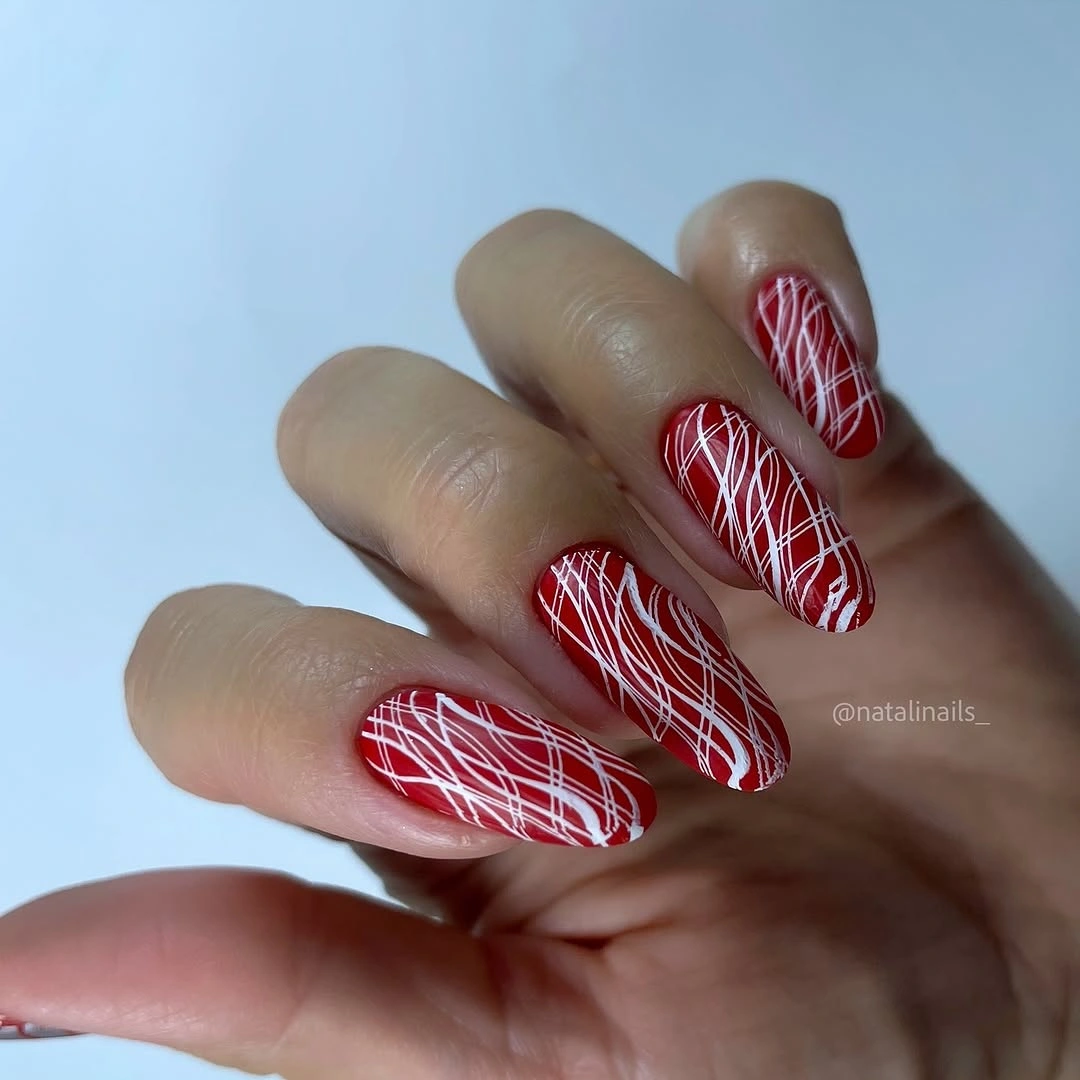
The useful idea here is contrast in small doses. White creates a crisp relationship with red, so it does not need to be broad or heavily repeated to be noticed. For a lower-contrast interpretation, try a pale blush line or a muted cream, but keep the path loose rather than perfectly symmetrical so the manicure retains its relaxed movement.
Fine white details ask for restraint because they can become visually tangled if too many loops intersect. Give each accent nail one clear direction, then let the solid red nails provide a reset between them. The almond shape helps by supplying a natural flow from cuticle to tip, which makes even an abstract line feel connected to the form rather than randomly placed.
Chocolate, Cream, and Blush Matte Blocks
Short rounded nails alternate muted chocolate, cream, and soft blush tones, creating a low-contrast color-blocked manicure. The palette feels cohesive because each shade sits near the others in softness, even though the brown provides the deepest value. Instead of relying on a drawn motif, the design uses adjacent colors to create rhythm across a compact, approachable shape.
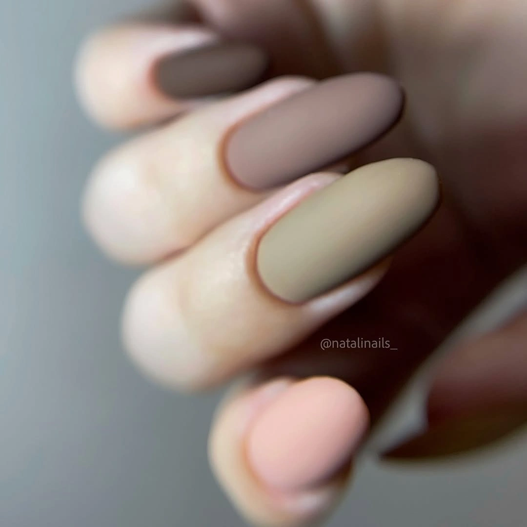
Color blocking becomes more wearable when the tones share a similar muted quality. A sharp white or neon accent would disrupt this quiet relationship, whereas a dusty rose or mushroom gray could extend it naturally. The goal is not to make every nail different for its own sake, but to repeat the color family enough that the hand still reads as one considered palette.
The honest limitation is that several soft colors can become visually vague if their values are too close. Keeping the chocolate clearly deeper than the cream gives the set an anchor, while blush functions as a transition between them. On short nails, that value difference matters more than complex pattern because the available surface already limits how much separation can be seen.
Pale Aqua Squares With Fine Shimmer
Pale aqua short squares carry a very subtle gold-fleck-like shimmer that appears within the cool pastel rather than sitting on top of it. The effect is gentle because the reflective points are fine and dispersed, allowing the aqua to remain the main color. A square shape gives this soft finish a little structure, preventing the light palette from drifting into an overly delicate look.
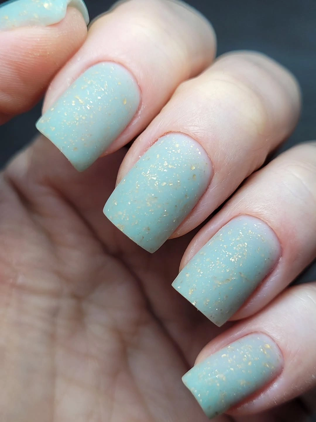
A cool pastel with restrained shimmer is a thoughtful alternative to a flat neutral when you want visible interest without a formal pattern. The small warm flecks create temperature contrast, but they do not overpower the base. If gold is not appealing, a silvery shimmer would keep the finish cooler, though it would also make the overall effect more icy and less balanced.
The shimmer needs to stay fine for the idea to work. Large glitter pieces would change the design from a barely textured color into a decorative surface, competing with the aqua instead of enriching it. This choice suits someone who likes a simple manicure but still wants light to reveal a second detail when the hand moves, not a constant sparkle.
Rosy Taupe Squares With Cloudy Texture
Short rosy taupe squares have a cloudy, pearly or metallic-looking texture that gives the neutral color more depth than a flat solid finish. The variation remains close in tone, so the surface reads as soft movement rather than a separate pattern. That low-contrast texture is especially effective on a short shape because it adds interest without asking the nail to carry a large illustration.
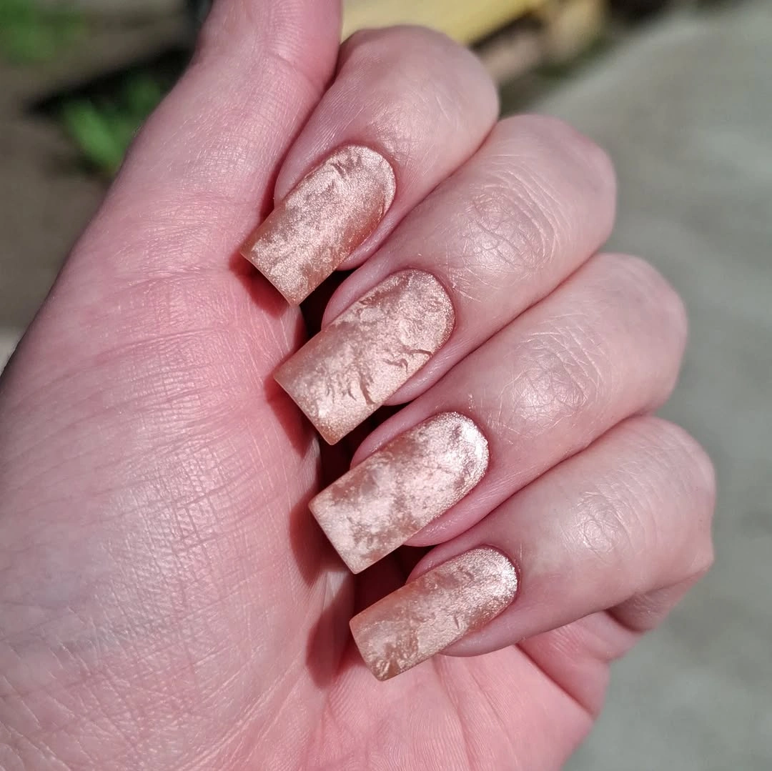
Textured neutrals are strongest when the color range stays narrow. A rosy taupe base can carry subtle lighter and darker patches because the shifts feel connected, while a sudden bright accent would break the quiet surface story. If you prefer less sheen, interpret the same idea with a softly mottled matte finish, keeping the tonal movement but reducing reflected light.
The final balance is between texture and clarity. If the cloudy effect becomes too high contrast, it can look accidental rather than deliberate; if it is too faint, the manicure simply reads as a plain neutral. Short squares offer enough clean edge to frame the surface, making this a useful option for anyone who wants a little dimension while keeping the overall mood calm.