
Fall Matte Nails 2026: Soft Texture and Strong Color Choices
Autumn can make a manicure choice feel harder than it should: a shade may look right in isolation but flatten against the wardrobe, feel heavy once it meets a long tip, or lose its character when a matte surface removes the shine. The useful clue is often the relationship between saturation and shape, not the name on the bottle. When the color already has presence, a quieter surface can make the hand look more considered; when the silhouette is dramatic, restraint lets it breathe.
Fall matte nails work best when the decision is made from the hand outward. Notice whether the color needs more space, more contrast, or less visual noise, then change one thing at a time so the result stays readable. A short outline can calm a strong shade, while a close tonal detail can add interest without asking the manicure to become a full statement.
Dusty Mauve Texture on a Short Rounded Shape
Dusty mauve gives these short rounded-square nails a softened starting point, but the surface is not completely plain. Fine tonal marks suggest petals or leaves across the pink base, and because they stay close in value, the manicure reads as texture before it reads as pattern. That restraint is what makes the color feel composed rather than sugary, even though the base sits on the lighter side of a fall palette.
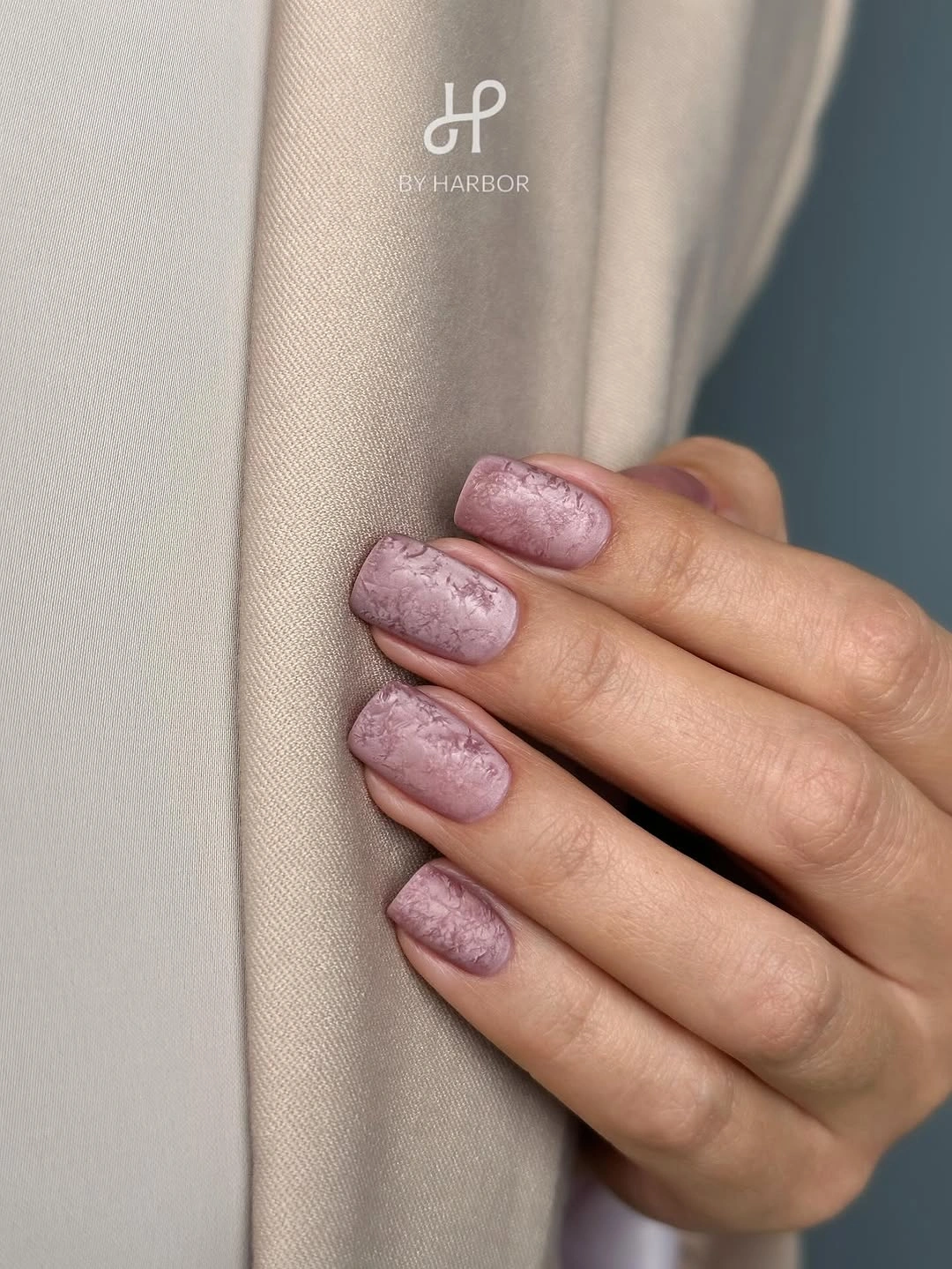
The short silhouette matters here: it keeps the low-contrast detail from becoming precious or overworked, and the repeated shape gives every nail the same visual weight. I would preserve the muted relationship if adapting the idea, using a slightly darker mauve for the marks rather than introducing black. On this length, the design belongs with a clean sweater, soft gray, or brown accessory because the manicure already supplies a quiet layer of interest.
For fall matte nails short ideas, this is a helpful model because the detail does not rely on extra length to be legible. The practical limitation is that a fine tonal pattern can disappear when the free edge grows unevenly, so the strongest version keeps the outline tidy and the texture sparse near the tip. It is a good choice when the wearer wants to notice the manicure up close without making it announce itself across the room.
Taupe Matte Nails Framed by Warm Small Accents
A mushroom-taupe base creates a neutral field for small gold- and amber-looking details that sit in loose clusters across the nails. The contrast is not coming from a bright background; it comes from the change in scale and reflectivity between the quiet base and the rounded accents. That is why the design feels more like jewelry placed over color than like a busy print covering every surface.
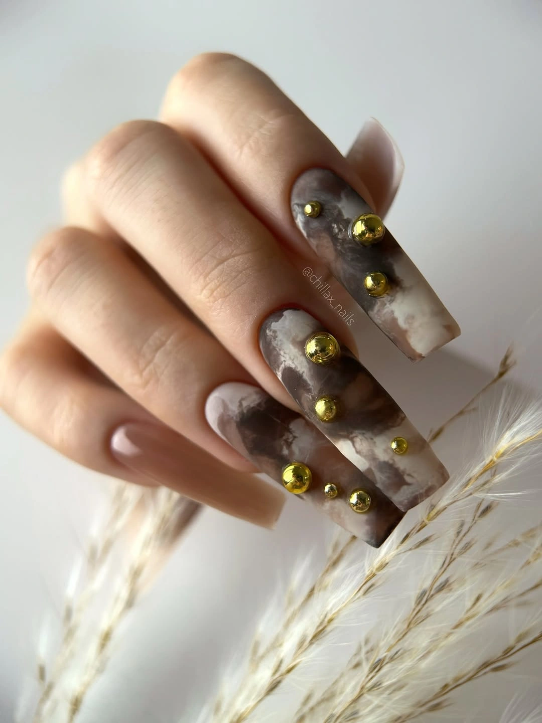
Keep the embellishment placement irregular but not random. A few details near the center or upper half give the eye somewhere to pause, while the matte-looking taupe keeps the hand from becoming too shiny overall. Medium square length offers enough room for the clusters, though it also means that any grow-out will be noticeable around the larger details sooner than it would on a short rounded shape.
If you want the same idea with less visual weight, use one accent nail and let the other nails remain taupe. The warm details work especially well beside cream, camel, or dark brown because those clothes repeat the base family without copying it exactly. I would describe the accents as gold- or bead-like rather than promise a particular material; the visible effect is clear, while the construction is not.
Lavender Marble Curves on Long Pointed Almonds
Long pointed almond nails give the lavender, blue, blush, and pale neutral colors a long path to travel. Instead of placing one block of color on each nail, the design connects patches with irregular flowing curves, so the eye moves from the base toward the tip. The palette remains coordinated because the cool purples repeat, while small changes from nail to nail prevent the set from feeling mechanically copied.
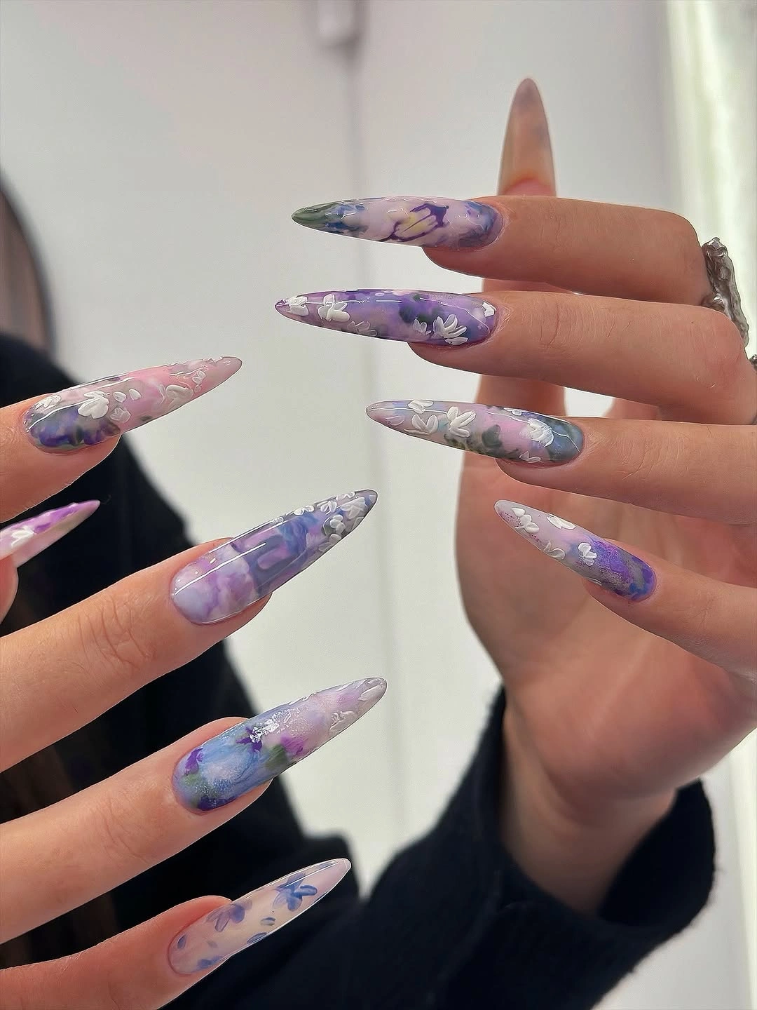
That movement is the design decision worth protecting. On a shorter almond, I would keep one broad sweep and two supporting colors rather than squeeze every visible shade into the reduced space. The pointed silhouette makes the marble feel dramatic and editorial, but it also creates a realistic upkeep tradeoff: the longer tip and the fine transitions demand more attention than a single matte color.
Use the colors as a controlled contrast exercise rather than treating the design as a reason to add more decoration. A pale lavender base with one blue and one dusty-pink accent will retain the airy movement, while a dark outfit can make the cool palette look sharper. This is one of the stronger fall matte nails colors shades directions to save if the goal is visual motion, and the guide to fall long nails offers another way to judge how much the pointed silhouette changes the message, although its surface here reads glossy rather than fully matte.
Blush French Tips with Tiny Seasonal Marks
A pale blush base and white tip keep this long square manicure open and familiar, while tiny yellow and green marks add a small change of temperature on selected nails. The little accents are important precisely because they do not cover the whole surface. They sit inside a clean French framework, so the eye registers a light floral-like note without losing the calm proportion between base and tip.
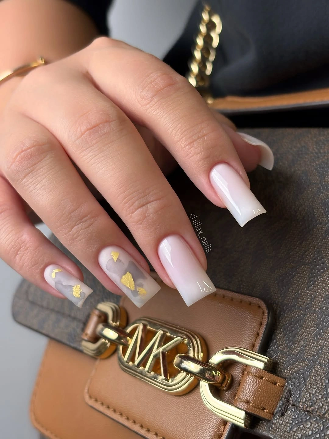
The balance depends on leaving enough pale space around each colored mark. If the design is adapted to a shorter square, a thinner white edge and one small yellow-green detail will preserve the same hierarchy. The tan bag in the styling echoes the warm side of the palette, but the manicure itself remains neutral enough for work clothes, denim, or a simple evening look.
Choose this direction when a full print feels too loud but a plain French manicure feels unfinished. The visible tip line needs to stay even, and the small marks should be treated as accents rather than a second pattern. A shorter version may actually look cleaner because the white edge and the tiny color notes remain close together, making the whole design easier to maintain as the nail grows. For another warm seasonal comparison, fall nails for tan skin tone is useful when judging how much contrast the base can carry.
Black Solids Paired with Curved Warm Print
Alternating solid black nails with tan and brown curved striping creates a stronger visual rhythm than using the print everywhere. The dark nails act as pauses between the warmer patterned accents, while the curved marks soften the severity of the black and echo the almond silhouette. Pale gaps inside the print keep the design from becoming a solid block of brown, cream, and black.
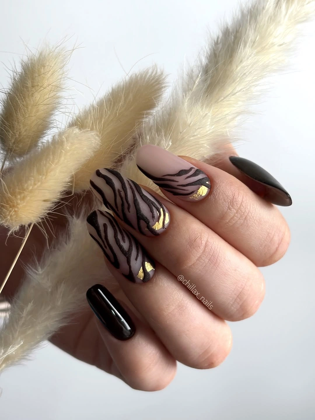
On a medium almond, the stripes have enough length to bend with the nail instead of sitting like a small sticker near the tip. If you want a more wearable version, keep two patterned accents and let the remaining nails stay black or deep brown. That change reduces maintenance pressure without losing the central contrast between a clean solid and a lively curved motif.
This palette pairs naturally with camel knitwear, charcoal, or a plain black coat because it already contains both the warm and dark anchors. The limitation is visual density: animal-like curves become harder to read when the nails are very short or the lines are too close together. Let the pattern breathe, and it will feel edited rather than merely busy.
Berry-Brown Relief Shapes on Short Nails
These short rounded-square nails use one deep berry-brown family for both the base and the rounded squiggles layered over it. Because the hue stays consistent, the design is discovered through surface difference and curved silhouette instead of color contrast. Small loops and oval forms make the manicure feel tactile-looking while the compact length prevents the effect from becoming too theatrical.
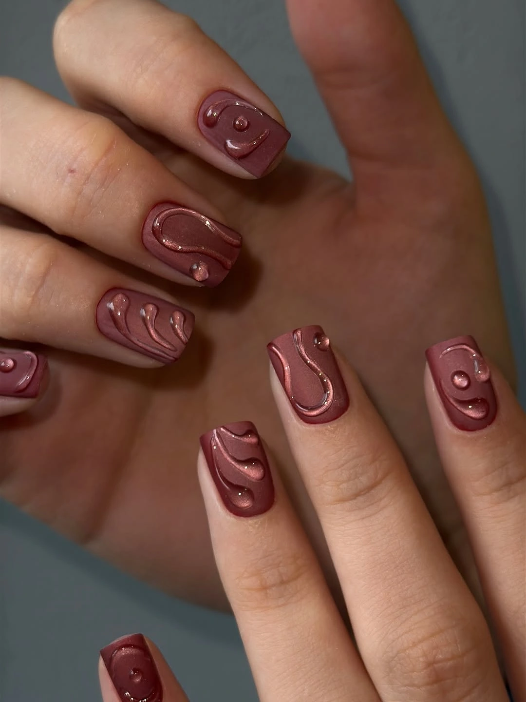
The color relationship is especially useful for someone who likes nail art but does not want several shades competing on the hand. On a short nail, keep the rounded shapes generous and separated so their outlines remain clear. A medium length could carry more detail, but it would also make the darker surface variation more noticeable at the edges as the manicure wears.
When saving fall burgundy nails with design, look for this kind of tone-on-tone logic if you want depth without sparkle. The exact surface construction is not something to assume from sight, so the safe takeaway is the visible pairing of a dark berry base and matching rounded forms. That is enough to recreate the mood with a flat accent line or a slightly lighter brown detail.
Smoky Gray-Lilac with Thin Silver Waves
Smoky gray-lilac softens the background while narrow silver-looking waves introduce a precise edge of contrast. The lines bend vertically or diagonally across selected nails, which gives the manicure direction without filling the surface with a dense motif. Against a dark sleeve, the muted base looks cooler and more understated, so the metallic-looking marks become small points of light rather than the whole story.
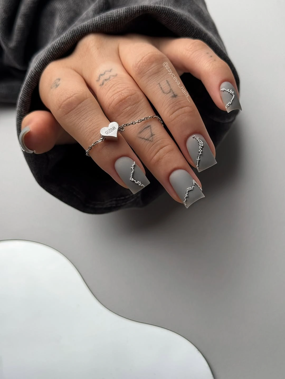
Placement matters more than adding another color. One clean wave on an accent nail can do the work of several scattered marks, and leaving the neighboring nails quiet makes the line easier to notice. Medium square length gives the curves space, although a shorter nail may be easier to keep neat if the design is meant for regular wear rather than a single event.
Use this as a controlled variation on a neutral manicure: preserve the smoky base, change the line color, and observe how quickly the mood shifts. Pale silver will keep it airy, while a darker graphite line will make it more graphic. The finish should be described from what is visible, so the useful idea is the contrast between a softened base and narrow reflective-looking curves, not a claim about a particular polish system.
Butter Yellow Carrying Bold Cobalt Patches
Butter yellow and cobalt blue form a deliberately high-contrast pair, and the broad irregular blue patches make the manicure look graphic rather than delicate. The shapes resemble drips or cutouts, but their real job is to break the yellow field into uneven blocks. Because both colors are saturated, the composition depends on generous patches and clear edges instead of fine decoration.
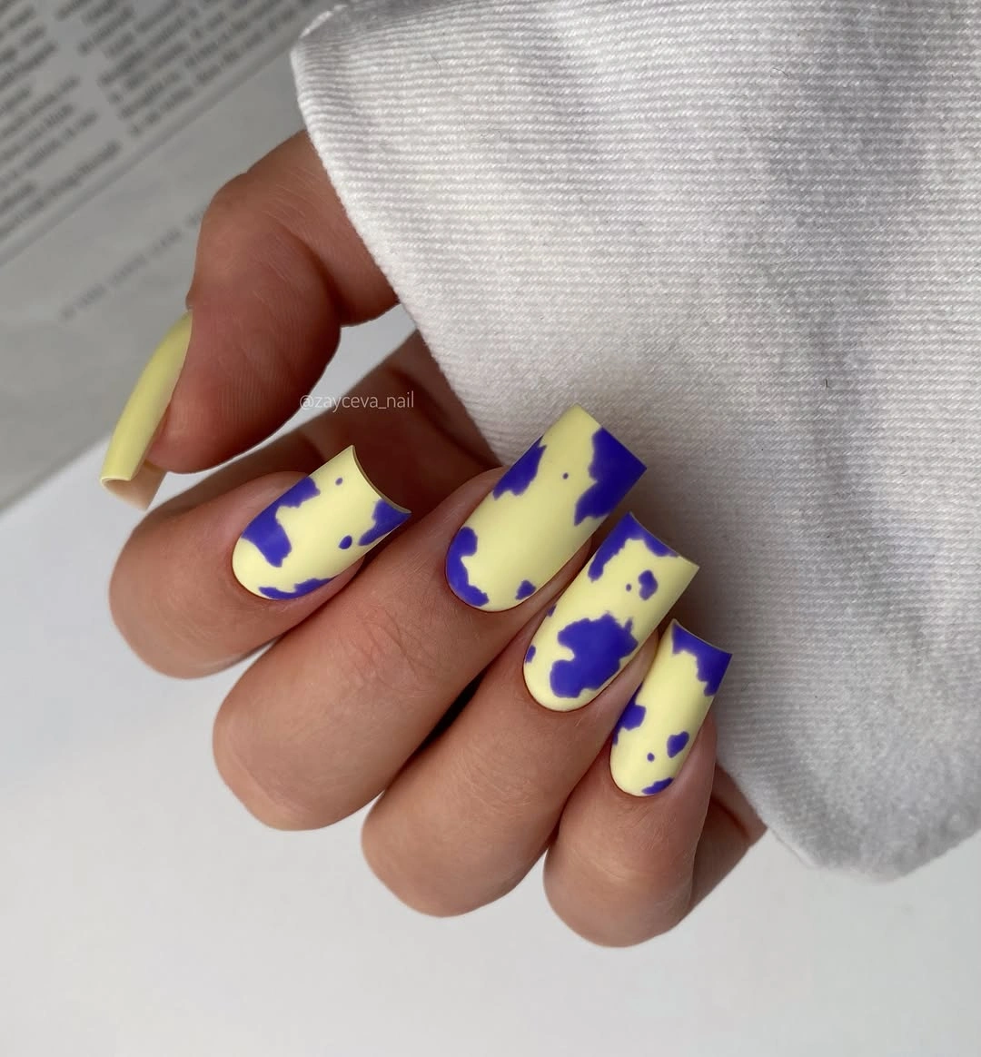
A shorter square can handle the same palette if the blue shapes stay broad enough to read from a distance. I would avoid adding a third accent color because the two existing shades already establish the strongest relationship in the set. The combination also asks for a relatively quiet outfit; denim, cream, or a single dark neutral will support it better than another bright print.
The practical choice is whether to keep the full two-color set or let the blue appear on one accent nail. The second option gives the eye a rest and makes the manicure easier to coordinate, while the full set has more editorial energy. Treat the edges as the feature to preserve, since loose or overly tiny patches would lose the graphic clarity that makes the design work.
Chartreuse Green as a Single Almond Statement
A vivid yellow-green shade carries the entire manicure on long almond nails, so there is no accent pattern competing with the color. The tapered shape gives the saturated green a sharper outline, and the glossy surface makes the shade appear even more active wherever light reaches the curve. This is a useful reminder that a simple design can still be visually forceful when hue and silhouette are both clear.
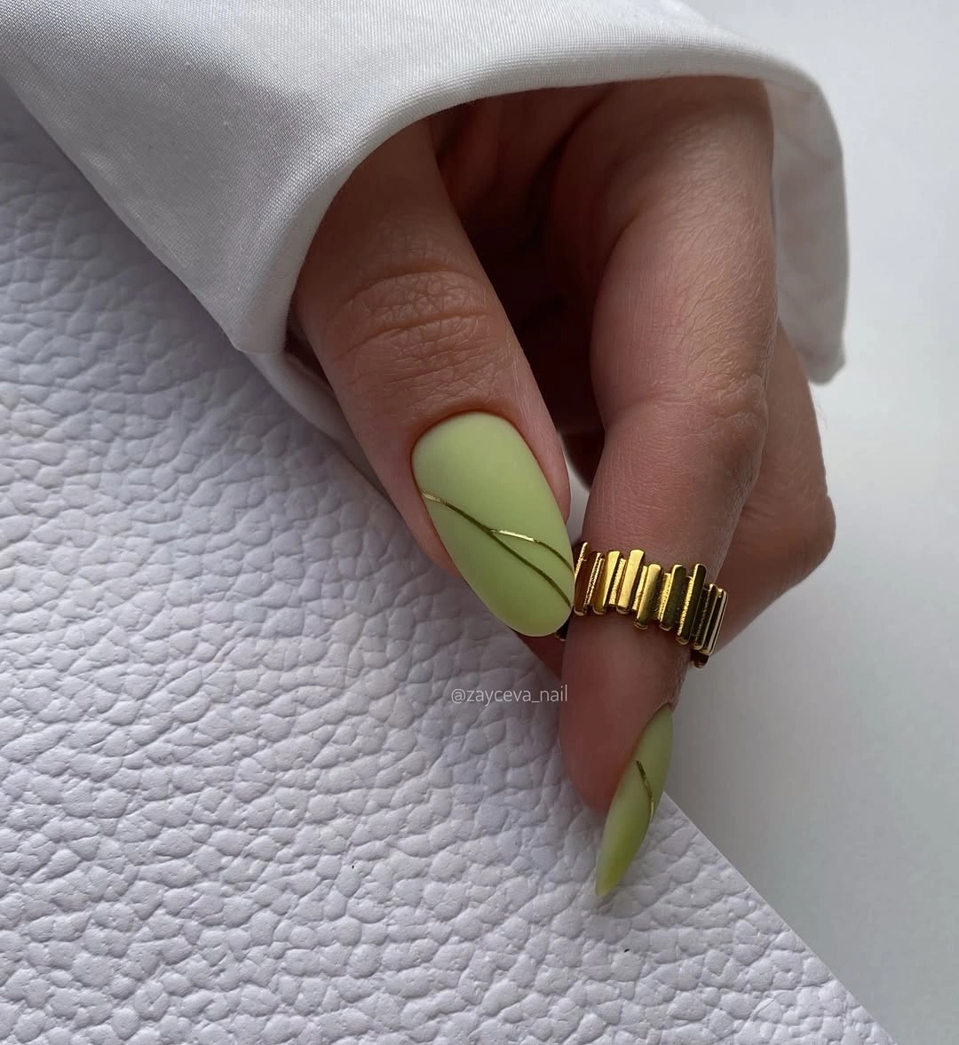
Length changes the message. Long almond makes the color feel assertive and fashion-led, while a medium oval would keep the same brightness with a softer, more practical proportion. The clean solid surface also means that uneven edges will be visible, so the manicure benefits from a careful outline more than from any additional decoration.
Use this as a one-variable experiment: keep the solid shape, then decide whether you want the shade warmer, dustier, or deeper. It sits well beside black, cream, denim, and muted brown because those neutrals do not compete with its saturation. If the color feels too loud across every nail, repeat it on two fingers and let the rest move toward a quiet olive or nude.
Pastel Lilac Keeping the Shape in Focus
Pastel lilac is used as a full glossy color on medium square nails, and the lack of visible art lets the silhouette do the explaining. The shade is soft enough to feel light, but its coolness separates it from a basic nude. Even the small accessory being adjusted in the styling stays secondary because the manicure has one clear decision and no competing focal point.
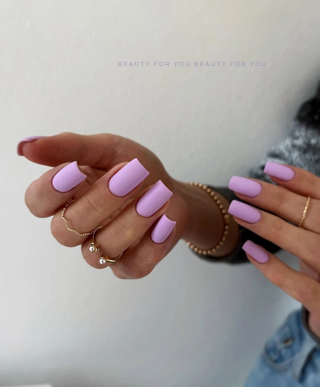
For this kind of solid, proportion is the practical variable to watch. Medium square gives the color enough surface to read while avoiding the sharper drama of a long tip, and the even reflection makes irregular edges easier to notice. If you want a more seasonal mood, move only the color toward a dusty mauve or gray-lilac instead of adding a pattern.
The result is calm without being blank, which is why it works for someone who wants a break from highly decorated fall designs. A clean pastel surface can be refreshed more easily than fine art, though it still needs careful attention at the free edge. In a wardrobe of cream, charcoal, denim, or silver jewelry, lilac supplies a cool note without forcing the entire outfit to follow it.
Muted Olive with Two Pale Patterned Accents
Muted olive solids create the main field, while two pale nails carry black curved lines that suggest a simplified animal-inspired print. The contrast is controlled because the pattern is confined to selected accents and the olive is softened rather than bright. This gives the hand a seasonal green note without making every nail carry the same amount of information.
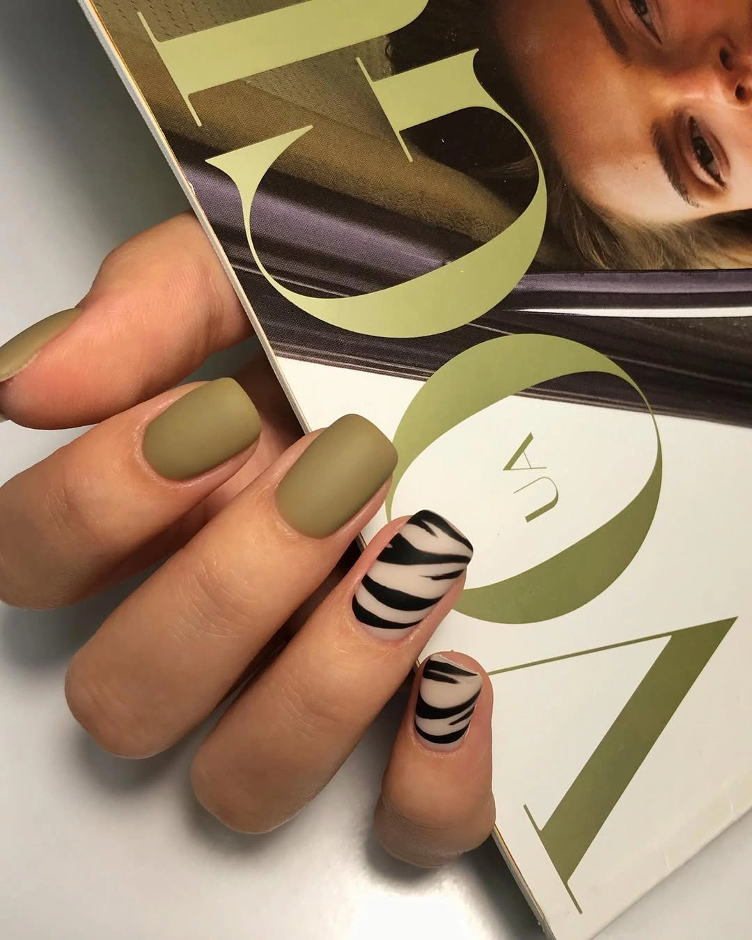
The strongest adaptation keeps the same division of labor: let the olive provide continuity and let the pale nails provide the pause. On a shorter rounded square, reduce the curved marks to a few separated stripes so the base remains visible. Dark matte edges can show wear, but the single-color olive nails are easier to refresh than a full-hand print.
For fall matte nails ideas that feel grounded, this is more useful than simply choosing the darkest shade available. The pattern becomes an accent because the surrounding color is quiet, and the design stays wearable with beige, denim, brown, or black. Avoid forcing a precise animal label; the visible lesson is the relationship between muted green solids and pale graphic lines.
Red and Orange Curves Following Almond Movement
Long almond nails make the red, orange, black, and nude bands feel directional because the curves stretch toward the pointed ends. Several nails are bright red solids, while the accents layer warm lines over a pale field, creating a rhythm of fullness and openness. The design is energetic without needing a separate motif; the repeated sweep already gives the set a clear visual language.
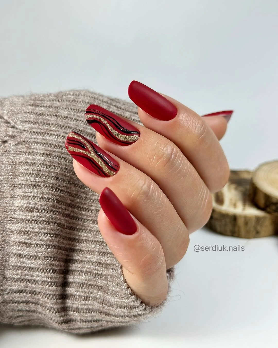
On a shorter almond, reduce the number of bands and widen the most important curve. That preserves the movement while preventing the colors from collapsing into a narrow stripe near the tip. The long shape is a real tradeoff here: it amplifies the artwork, but it also makes the manicure more demanding for daily tasks and more noticeable as the tip grows.
Keep the palette edited if you recreate it. Red with nude and one orange accent will still feel warm, while black can be reserved for a single line that sharpens the contrast. The result belongs among fall matte nails almond references even though this particular surface reads glossy, because the useful idea is the way color bands follow the shape rather than the finish label alone.
Blush Square Nails with Spaced Dark Print
A pale blush base keeps the manicure open while black irregular marks create a dark animal-like accent on selected nails. The print is broken into small areas instead of covering every surface, so the eye sees the base color first and the pattern second. That order matters on a medium-long square because a dense dark design could otherwise make the tips feel visually heavy.
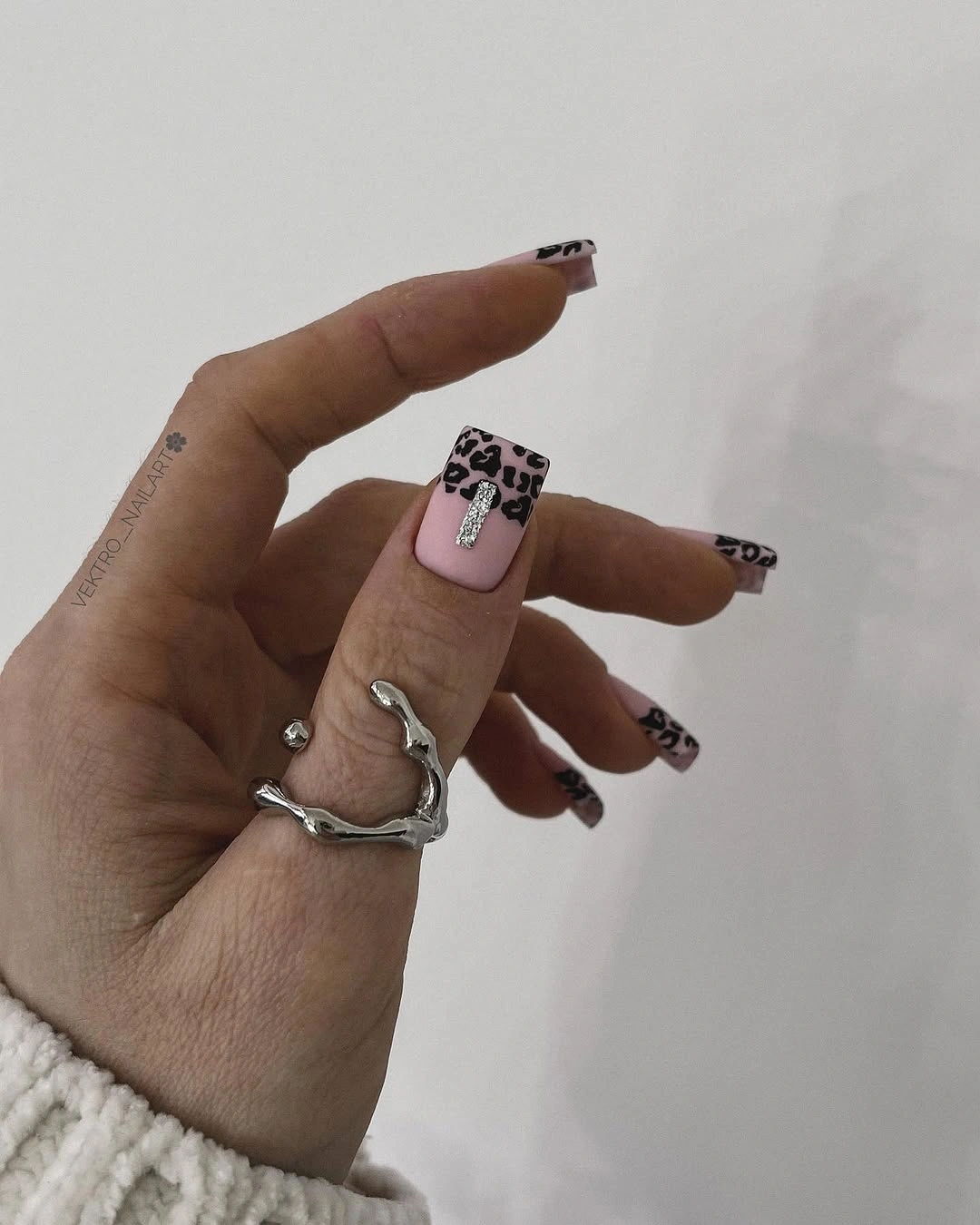
Leave real space between the marks when adapting the idea. One full accent nail plus smaller tip details on another can preserve the contrast more successfully than repeating a packed print across the whole hand. The squared silhouette gives the pattern room, but it also makes the edge geometry obvious, so a neat tip line will support the soft pink base.
This is a good middle ground between a plain blush manicure and the stronger black-and-tan print earlier in the article. It can sit beside a dark coat or a pale knit without needing another decorative accessory. If the exact pattern is uncertain, keep the description at the level of irregular black curves and spots; the visible spacing is the practical idea to carry forward.
Minimal Nude Pink with a Fine Gold Edge
Short rounded-square nails use a soft nude-pink base and a narrow gold-looking edge that follows the tip. The line is delicate enough to preserve the neutral field, but it still gives the manicure a point of light when the hand moves. Instead of competing with the shape, the metallic-looking detail clarifies it, which is why the design feels finished without becoming ornate.
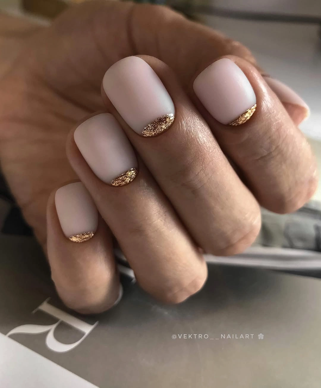
Short length is part of the appeal. A thin edge can look intentional on a compact nail, while a dense glitter band might shorten the appearance or make the surface feel crowded. Keep the base close to the skin tone and the tip narrow if you want the same easy proportion; changing the line to a muted bronze would warm it without changing the structure.
This is one of the cleanest fall matte nails with glitter directions to adapt, even though the visible edge is more fine and reflective-looking than a full glitter field. It works with cream, camel, black, and simple jewelry because the accent repeats a small warm note rather than demanding a new color story. The main upkeep point is the free edge: a tiny uneven section is more visible when the rest of the manicure is so restrained.
Pale Pink Lattice Keeping Contrast Deliberately Low
These pale pink medium-square nails use a fine lighter lattice or diamond-like pattern rather than a dark grid. The lines sit close to the base, so the manicure first reads as a soft solid and only then reveals the geometry. That low contrast keeps the pattern from shortening the nail visually, while the repeated crossing lines give the surface enough structure to avoid looking unfinished.
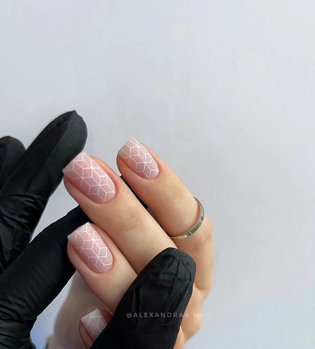
Open spacing is the important variable. On a shorter square, one or two larger diamonds will work better than a tight mesh, and the pale base should remain visible between them. Because the pattern is quiet, the design can accompany stronger clothing textures, although uneven line spacing would become the main thing the eye notices.
Use this approach when you want nail art that rewards a closer look. It is more delicate than the black animal-like print and less reflective than the gold edge, so it belongs with soft pinks, pearl jewelry, or gray layers. If maintaining a full lattice feels too demanding, keep it on one accent nail and let the remaining fingers return to the same pale base.
Mint Double French Lines on a Pale Almond Base
Pale almond nails leave most of the surface open while mint-teal curved tips and secondary lines repeat the edge. The color is cool and visible, but the base remains light enough that the manicure does not become a full saturated block. That spacing makes the double French detail feel deliberate: the second line echoes the first rather than introducing an unrelated decoration.
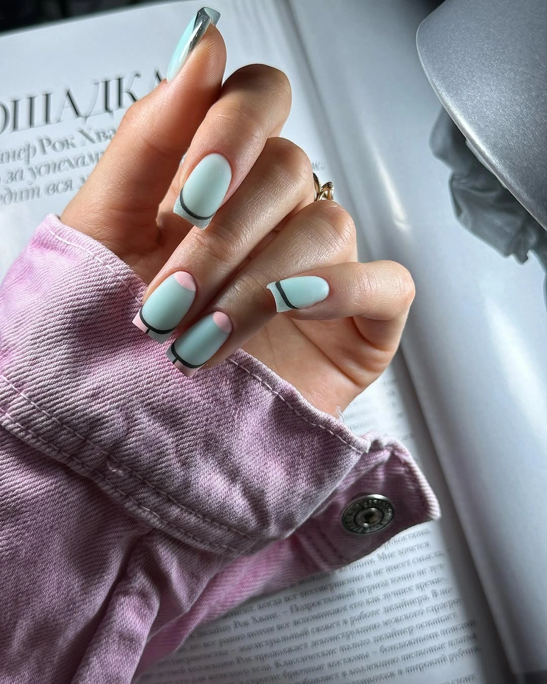
On a shorter almond, keep the two curves close together and avoid pushing them too far down the nail. The design works through the relationship between negative space and edge placement, so filling the base would remove the reason it feels light. A muted green or blue can replace mint if you want a more autumnal reading without changing the layout.
Choose this for a clean reset when a solid color seems too plain but dense art feels impractical. The line work benefits from a steady curve, and the pale base will show any unevenness, yet the limited palette makes correction easier than a multicolor marble. The final impression should remain open, with the mint acting as a border rather than taking over the nail.
Matte Cobalt Blue Sharpening a Simple Silhouette
A saturated cobalt blue covers medium-long almond nails from base to tip, and the matte surface softens the reflection without reducing the color’s intensity. There is no accent nail or extra motif to distract from the relationship between a vivid cool hue and a tapered shape. The close view makes the even surface feel almost architectural, with the almond curve acting as the only outline.
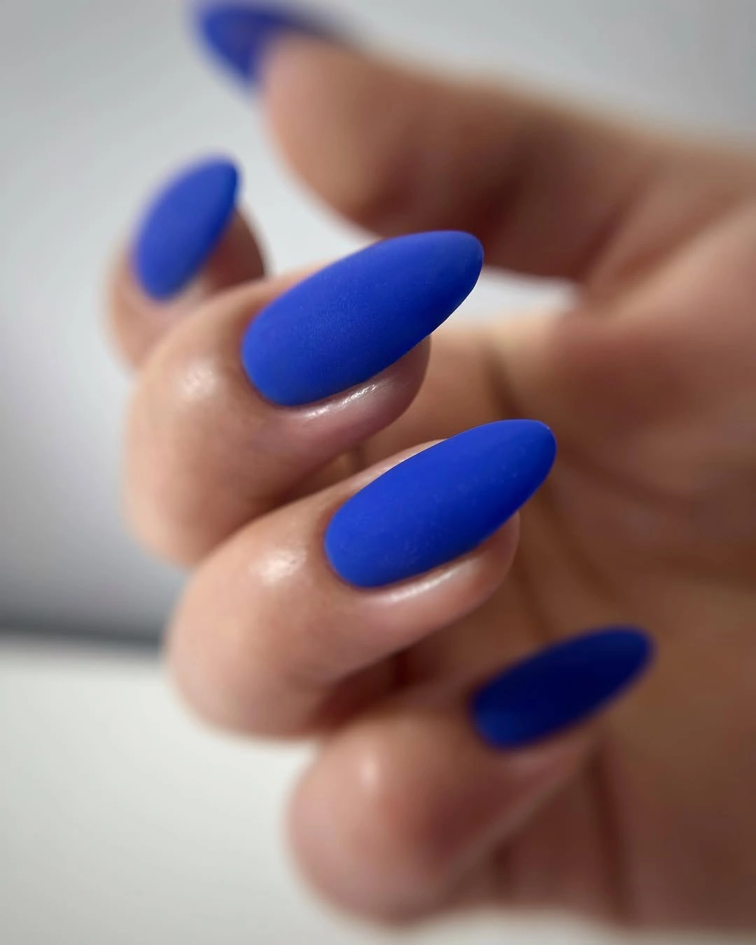
Keep the silhouette clean if adapting the design. Dark or vivid matte colors expose uneven sidewalls, while the long almond makes the manicure feel sharper and more editorial than the same shade on a short round nail. If the blue is already a strong statement, shortening the length is the most useful change because it preserves color impact without adding visual drama.
Use this as a one-color answer when the wardrobe is built from cream, gray, denim, or black. It gives a cooler alternative to brown and burgundy without needing sparkle, print, or a complicated finish. Avoid promising a particular matte formula; the supportable point is simply that the softened surface lets cobalt stay bold while appearing less reflective.
Deep Plum with One Pale Botanical Detail
Deep plum and black solids create a dark base, while one close accent introduces pale white and dusty-rose petal or leaf-like forms. The light detail is concentrated rather than repeated everywhere, so it works as a small interruption in the darker palette. This placement lets the botanical suggestion add softness without turning the manicure into a full floral collection.
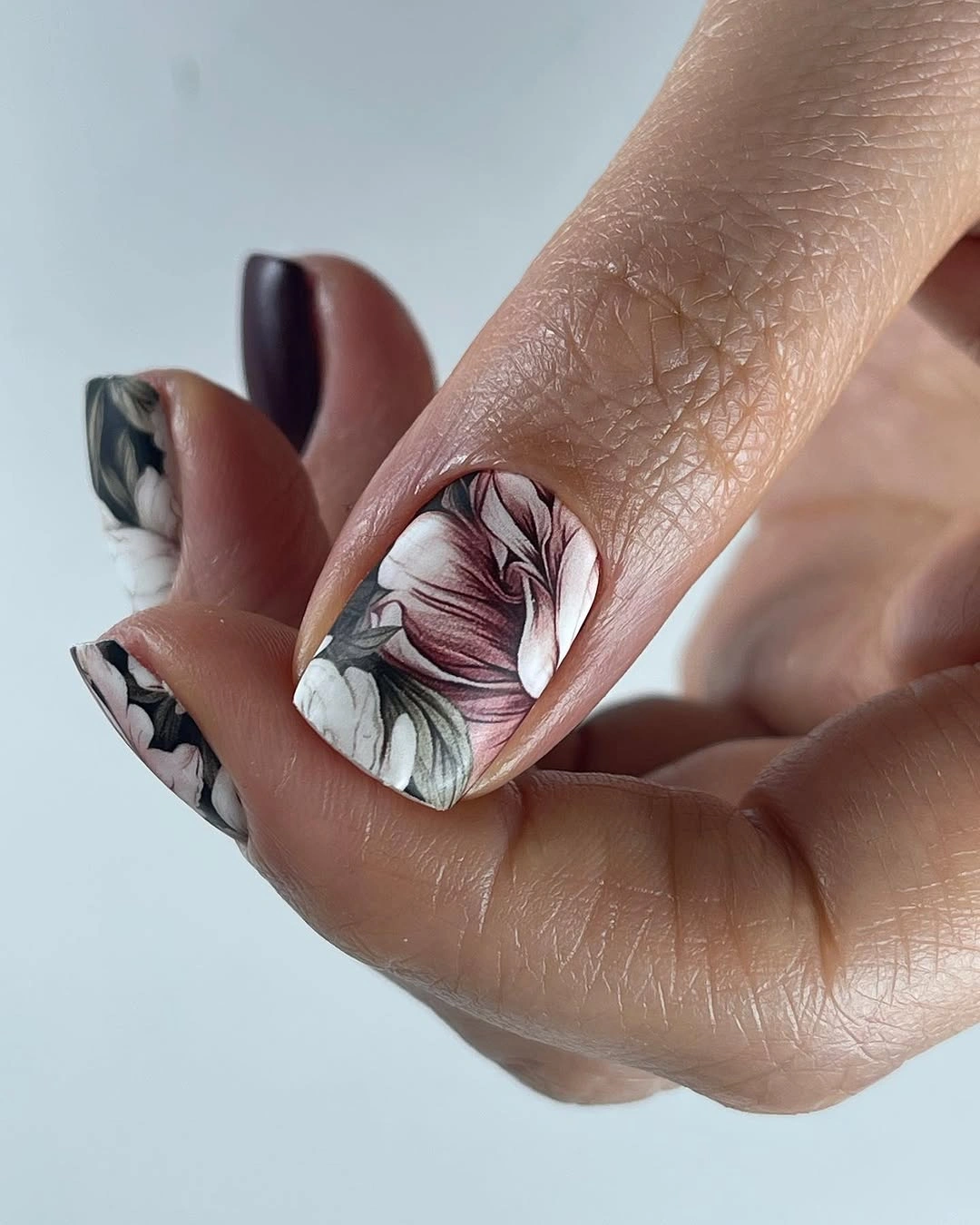
Preserve the contrast between the anchor nails and the accent. If every nail receives the pale artwork, the dark solids lose their role as visual support; if the accent becomes too tiny, it will disappear into the surrounding color. Medium square length gives the focal detail room, but the pale marks may need more careful edge maintenance than the deep solids.
Pair this direction with a dark plum sweater, a pale scarf, or simple silver jewelry so the accent has a quiet echo. The exact flower identity is not important, and it would be safer to keep the motif broadly botanical. What makes the manicure useful is the way a light organic note changes the emotional temperature of an otherwise deep, graphic set.
Short Color Blocks with One Clear Role per Nail
Short rounded-square nails use a varied palette of pink, cobalt, green, orange, and a small black-white-red combination, but each nail largely gives one color the lead. That organization is what keeps the manicure from becoming noisy. The colors are playful, yet the blocks are distinct enough that the eye can read them one at a time instead of searching for a single dominant motif.
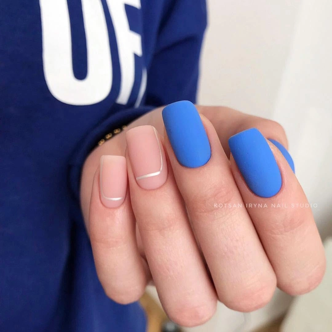
When adapting the set, choose three shades that already relate through warmth or saturation and repeat one of them. A short shape makes the bright palette easier to wear, while a longer nail would give each color more visual volume and could make the same mix feel louder. Keep complex color combinations on one accent if the wardrobe already contains prints.
This is a practical answer for someone who enjoys variety but does not want detailed line work. It also makes future changes simple: one nail can be refreshed without redesigning the whole hand. The limitation is coordination, not technique; too many unrelated colors can compete with clothing, so let one shade act as the anchor even when the rest are different.
Pastel Lavender with One Bright Printed Accent
Soft lavender-pink solids create a calm base, and one pale nail carries brighter pink irregular spots that read like a loose animal-inspired print. The accent is effective because it is saturated and patterned while the surrounding nails stay quiet. That difference in visual density gives the hand a focal point without asking every nail to participate equally.
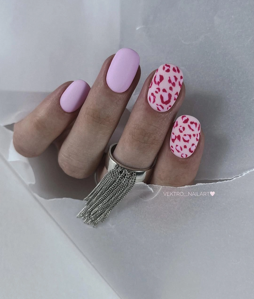
One accent is enough on a medium rounded square. Keep the spots separated and allow the pale base to show, then let the solid pastel nails provide the breathing room around them. If you prefer a subtler version, move the accent toward a darker mauve rather than adding more designs; that keeps the contrast while lowering the brightness.
The idea is especially useful when a full patterned manicure feels too committed. Pastel lavender works with gray, cream, denim, and soft brown, while the printed nail supplies the small seasonal turn. Do not rely on a precise animal label; the supportable lesson is the contrast between a gentle color field and one concentrated, brighter mark.
Deep Indigo Violet Finishing the Color Story
Deep indigo-violet covers medium squared nails in an even matte block, and the close crop makes color depth more important than any artwork. It is cooler than burgundy and darker than the pastel lilac earlier in the set, so the manicure closes the palette by changing value rather than adding another motif. The squared outline keeps the saturated shade grounded instead of pointed.
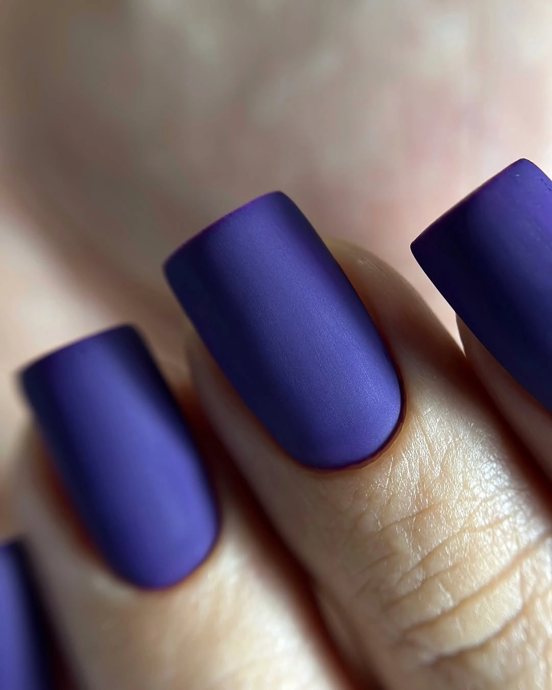
A dark matte solid is simplest when the edges are clean. Medium length offers enough surface for the violet to look intentional while avoiding the severe effect a very long nail could create, and a shorter square would make the same shade feel more compact. If the color reads too cool against the skin or wardrobe, a muted plum can shift the temperature without changing the one-color structure.
Save this when you want drama without glitter, print, or a complex accent. It pairs with pale knitwear, silver, denim, and black, and it can stand alone because the shade has enough saturation to hold attention. The practical conclusion is to protect the even matte field and the crisp square shape; those two decisions are doing all the editorial work.
Warm Peach Waves on a Light Short Base
Short peach-pink nails carry narrow yellow, coral, and brighter pink curves, so the design feels warm without using a dark autumn base. The lines move across a light field in a small repeating rhythm, and their limited width leaves the base visible. That contrast between an airy background and warm wave accents creates energy while keeping the compact rounded-square shape approachable.
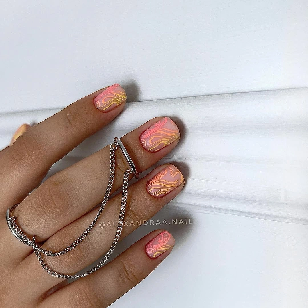
Keep the curves flowing in one direction on a short nail and reduce the palette to two accent colors if the surface begins to feel crowded. The light base makes the manicure easy to pair with cream, denim, or soft brown, but it will also show smudged edges more readily than a deep color. A careful outline matters more than adding another line.
This ending is useful because it shows that seasonal color does not have to mean burgundy, olive, or black. The warm notes can be repeated in a scarf, bag, or small accessory, while the manicure remains lighter and more playful. Preserve the open space between the waves; that is what lets the short shape look intentional rather than overdecorated.