
Fall Accent Nail Designs 2026: Bold Details, Smart Balance
A nail becomes an accent the moment it changes the pace of the hand. The detail does not need to be louder than everything around it; it needs enough quiet space to be noticed, and enough repetition elsewhere to avoid looking accidental. That tension is what separates a deliberate focal point from decoration that keeps adding itself.
Choose the strongest contrast only after deciding what you want to keep calm. The right question is whether the detail still earns attention when your fingers are relaxed, your clothing is not coordinated, and the manicure has lost its first-day shine. That test keeps fall accent nail designs 2026 grounded in proportion and use rather than in the pressure to make every surface perform.
Green Tips And Tiny Pink Flowers
Sheer pale nails with soft green tips make a light background for small raised pink flowers on selected almond nails. The green stays near the edge instead of filling the entire surface, so the floral accents remain the first detail the eye notices. The medium almond shape adds a little length while keeping the palette delicate rather than dramatic.
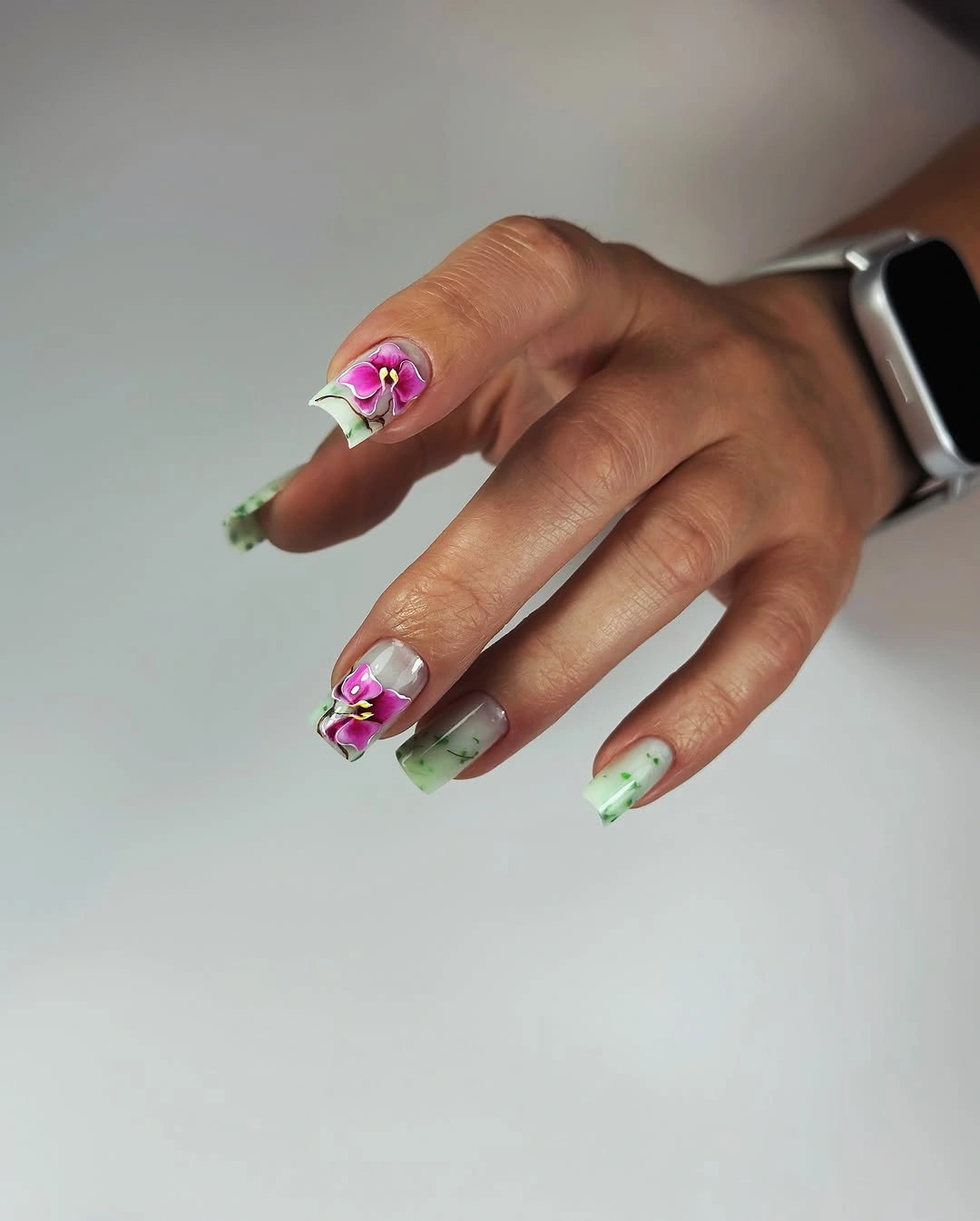
The color placement is what makes this accent feel fresh. A translucent center leaves space around the flowers, and the green edge gives the hand a repeated detail without turning every nail into a miniature garden. If you want a flatter or easier version, keep the flowers on two nails and use a thin green tip on the rest.
Raised details can catch on fabric, so the selective layout has a practical advantage beyond its appearance. It limits the number of textured surfaces that need attention and keeps the design readable as it grows. A shorter almond would still carry the same pale contrast, but the flower placement should stay slightly larger so the accents do not disappear. The same placement question comes up in fall nail art ideas when a detail needs to stay visible without taking over the hand.
Blue Violet Waves Over A Long Square
Saturated blue-violet covers these long square-to-coffin nails, while lighter wavy lines travel along the surface in a repeated vertical rhythm. The color remains the dominant decision, and the pale curves work like a secondary texture that catches light as the hand moves. The length gives the lines enough room to stretch without crowding one another.
Because the accent stays within one color family, the design feels more coordinated than a multicolor set even though every nail carries movement. The waves soften the strong squared outline and keep the glossy blue from becoming a completely solid block. For a shorter adaptation, use the line work on two nails and let the remaining blue surfaces stay smooth.
The long shape is the honest tradeoff here. It makes the repeated curves expressive, but it also means the free edge will be more noticeable during everyday tasks. A medium square can preserve the same blue-and-wave relationship with less commitment, especially if the lines are spaced farther apart rather than compressed into a smaller surface. That is the practical balance behind fall nails with accent details that still feel manageable outside a posed photo.
Burgundy Waves With A Pale Focal Nail
Glossy burgundy gives this medium square manicure a deep seasonal base, while two pale accent nails carry sweeping white and pink bands with a small silver sparkle near the tips. The light sections interrupt the dark color without abandoning it, so the set feels designed around contrast instead of decoration added at random. The squared outline keeps the flowing accents from looking too soft.
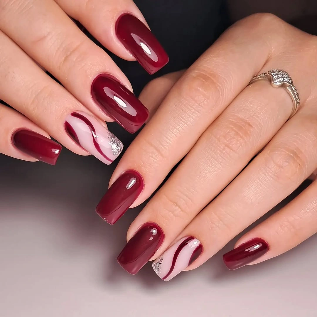
The focal nails work because the other fingers stay mostly solid. A curved pale band is easier to read when it sits beside uninterrupted burgundy, and the silver detail remains a small glint rather than a second main color. If you prefer less intensity, keep one pale accent and let the remaining nails repeat the burgundy with a simpler glossy finish.
This design sits close to the logic of fall French nails because the lighter color is concentrated toward the edge, but the loose curves make it less formal than a straight tip. A shorter square will still hold the contrast if the bands are made wider and fewer. The key is to protect the open burgundy space around each line.
Pale Blue With Sculpted Looking Curves
Short pale blue square nails gain their accent through white and lilac curves that appear raised across selected surfaces. The lines sweep in different directions, giving the light base a soft sculptural effect without changing the main color. The compact shape keeps the delicate palette grounded and makes the movement feel intentional rather than overly ornate.
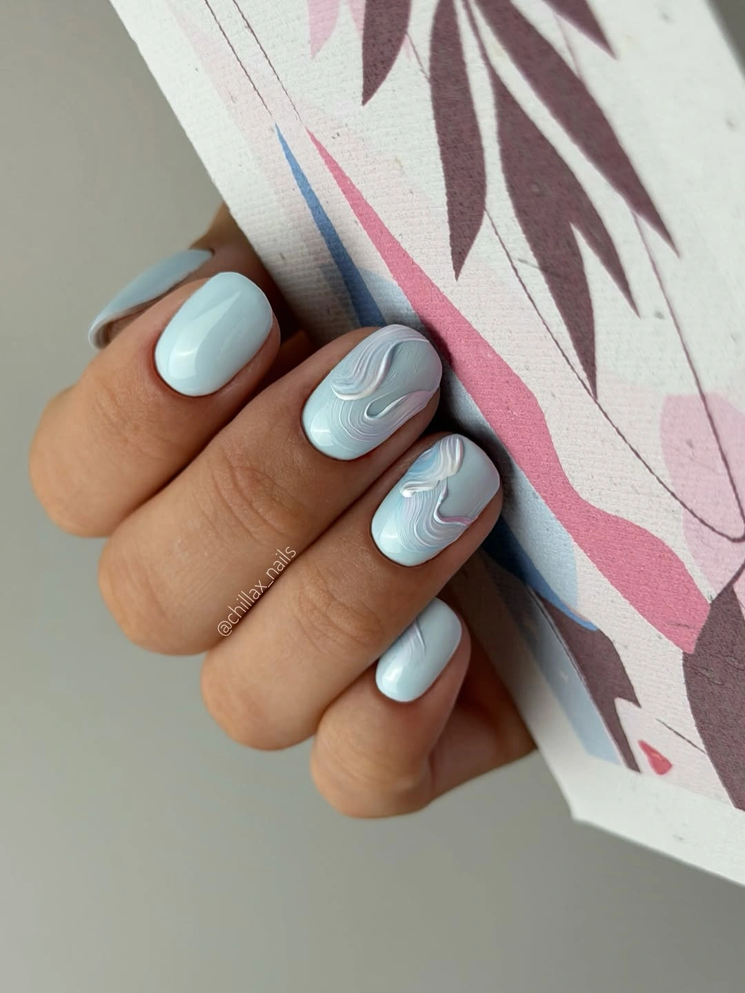
The layered curves are strongest when the blue base remains visible between them. That spacing lets the surface read as one pale color first and a detailed accent second, which is why the design does not feel overloaded even with several lines. A simpler version can keep the raised-looking treatment on two nails and leave the rest glossy blue.
Light colors show uneven edges, and texture can make small changes in the surface easier to see as the manicure grows. The short length helps limit that issue, while the soft blue keeps the overall result forgiving in clothing combinations. If the nail plate is smaller, reduce the number of curves instead of shrinking them until they blur together.
Berry Shimmer With Tiny Water-Drop Detail
Deep berry nails with a subtle shimmer look mostly solid at first glance, but selected medium square nails carry small rounded droplets that catch the light. The tiny raised accents create a close-up moment without changing the rich color family. A dark surface makes the texture visible, while the simple shape stops the droplets from turning the whole set into a heavy embellishment.
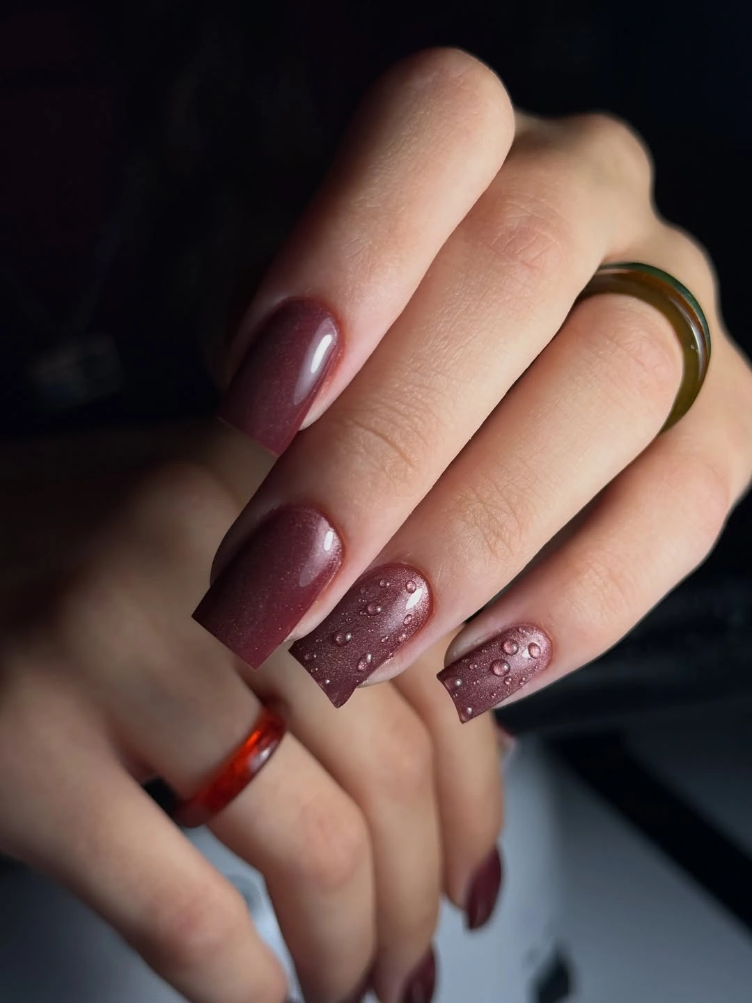
The contrast comes from finish rather than pigment. Shimmer gives the berry base a soft glow, and the rounded details add small points of reflection that appear only when the hand moves. Keep the plain berry nails in the majority for a wearable version, then place the droplets on one or two accents where they can stay deliberate.
Raised details are more sensitive to fabric and daily work than painted lines, so their limited placement is practical as well as attractive. The medium square is a reasonable compromise because it gives the accent enough room without requiring a dramatic length. If you shorten the nails, keep the droplets larger and fewer so they remain separate.
Cream Almonds With Blue Botanical Sketches
A creamy pale base gives these medium almond nails a quiet background for blue botanical line drawings and fine gold marks. The art is visible because it stays linear rather than filling the surface with opaque color, and the almond shape gives the branches a natural direction. The gold adds warmth, but the blue remains the main accent language.
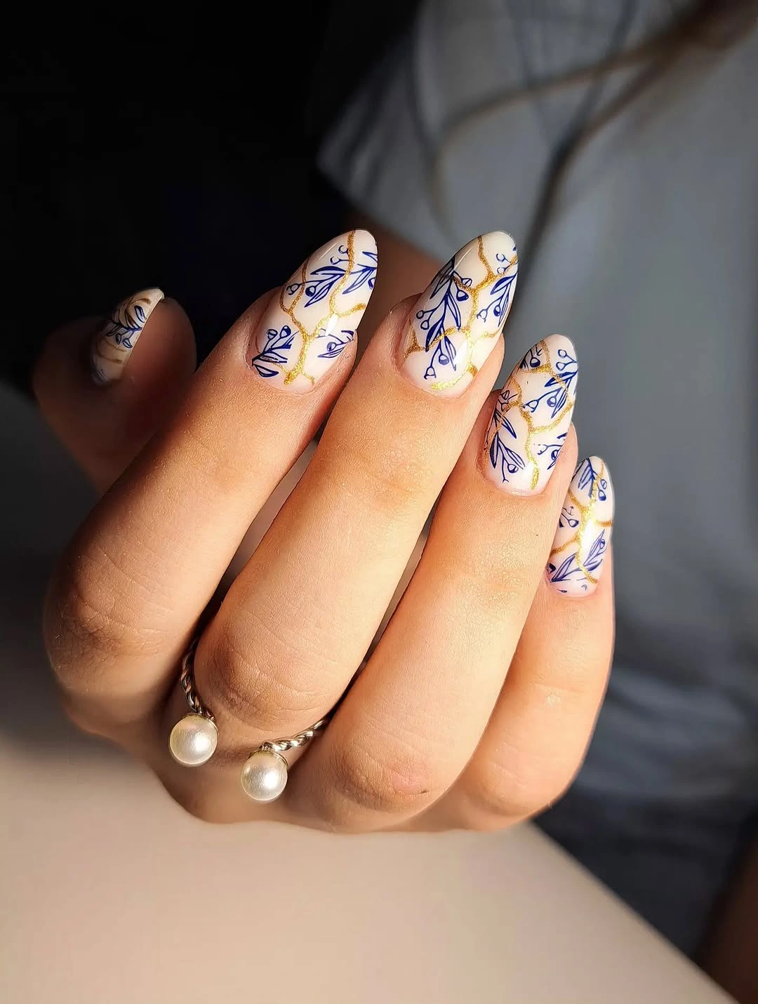
The design feels collected rather than uniform because the drawings shift slightly from nail to nail. That variation creates interest while the shared cream base keeps the hand cohesive. If the full set feels too detailed, use the illustrated pattern on two nails and keep the remaining almonds plain cream with one tiny gold mark.
The pale palette is easy to pair with denim, knitwear, or darker autumn clothing, but the fine line work asks for enough surface to remain legible. A medium almond is already a useful middle ground; shortening it too far may force the botanical marks into a crowded cluster. Let one larger branch replace several tiny fragments when adapting the design.
Hot Pink Marble Against Solid Fuchsia
Medium square nails alternate solid hot pink with pale panels carrying white-and-pink marbling and small glittery areas. The strong fuchsia nails establish the main color, while the lighter accents add movement and stop the hand from reading as one uninterrupted block. The pattern remains soft around the edges, giving the bright palette a little breathing room.
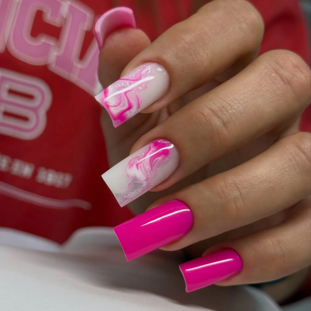
Marble works here because it repeats the base color instead of introducing a completely unrelated shade. The white sections catch light and create a visual pause, but the pink lines bring the accents back into the same family. Use one marbled nail per hand for a more controlled set, or keep glitter near the tip so the center stays readable.
The bright color will be noticeable with almost any outfit, so reducing the number of accents can make the design easier to style rather than less interesting. A shorter square keeps the fuchsia crisp, though the marbled panel should not be filled with too many fine lines. Broad swirls will survive the smaller surface better than tiny repeated marks.
Neon Yellow Waves On Short Pink Nails
Glossy hot pink covers the short rounded-square nails, while selected fingers carry bright yellow looping waves. The two colors are direct opposites in energy, but the compact shape keeps the contrast playful rather than overwhelming. Solid pink nails create pauses between the wavy accents, so the yellow does not have to appear everywhere to be memorable.
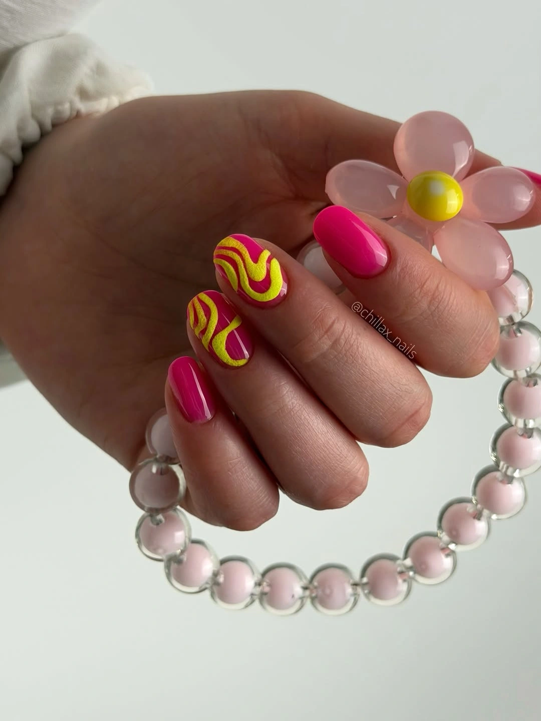
The wave is a simple motif with a strong graphic effect. It can follow the center of the nail, sit near one side, or be stacked into a small repeat, and each choice changes how much pink remains visible. For a more wearable adaptation, place the yellow on two nails and keep the rest solid, letting the color pairing do the work.
Neon shades can shift under different lighting, and the high contrast makes uneven curves easy to notice. That is the main precision tradeoff, especially on a shorter rounded square. Keep the waves broad and the number of turns limited, then the design will retain its cheerful rhythm without becoming a tiny maze of lines.
Clean Sky Blue With No Extra Motif
This short square manicure uses one glossy pale sky blue across the hand, proving that an accent-focused article does not require every design to carry visible art. The color has enough brightness to stand alone, while the compact outline keeps it neat and easy to read. Its simplicity makes the surface a useful visual rest after more detailed choices.
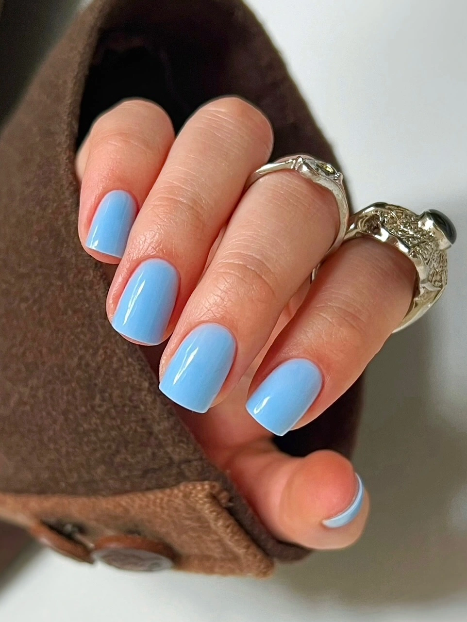
The absence of a motif is part of the balance. A single color can act as the background for jewelry, clothing, or one future accent nail, and it will not fight with a patterned outfit. If you want to connect it to a more decorated hand, add one tiny white line or a single pastel charm instead of rebuilding the whole set.
Light blue can show chips and uneven corners, but the short square shape makes regular upkeep relatively simple. It is also easy to shorten without losing the color’s identity. Compared with a textured accent, this choice offers fewer maintenance surprises and lets the shade itself decide whether the manicure feels soft, crisp, or cool.
Blue Violet Waves With A Cozy Contrast
Long square nails are painted a saturated blue violet and crossed with lighter wavy lines that look visibly textured against the glossy base. The design has a cozy seasonal setting, but the manicure itself stays focused on color and movement rather than background styling. The repeated curves make the long shape feel intentional, giving the eye a path from the base toward the edge.
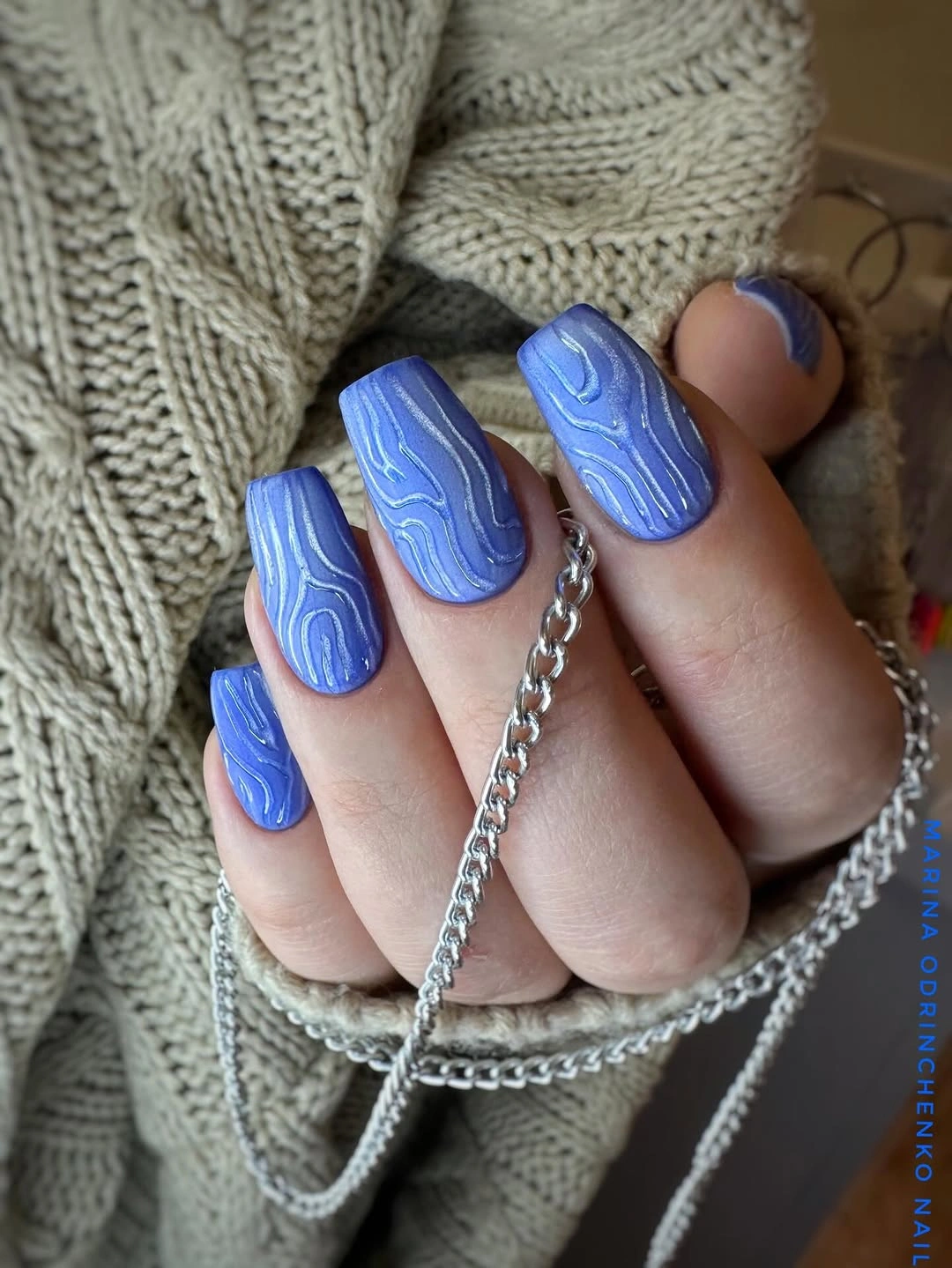
The lighter lines are not competing motifs; they are a second layer within the same cool palette. That choice allows the blue to remain the first impression while the waves appear as the hand moves closer. A medium square can keep the same rhythm with fewer curves, and a plain blue nail beside one textured accent will make the contrast even clearer.
Long square length creates strong visual impact but also makes the free edge more involved in daily tasks. If that feels impractical, shorten the nail without changing the base color, then keep the wave pattern on the two middle accents. The finish will still have a tactile-looking surface, but the hand will feel less committed to a statement silhouette.
Orange Solids With Neon Abstract Flames
Glossy orange fills most of this medium square set, while selected nails carry neon pink, green, and yellow abstract swirls over a darker ground. The solid orange fingers keep the composition organized even though the accent surfaces are energetic and multicolored. The result is bright, but the repeated orange anchor gives the hand a clear center of gravity.
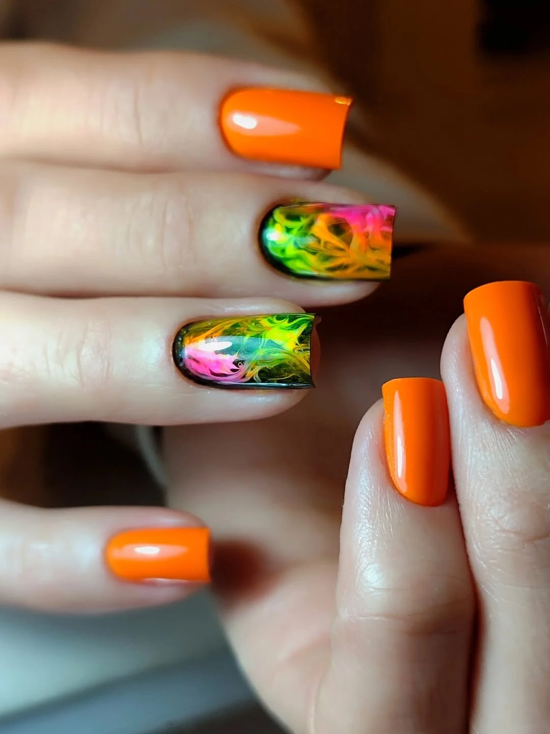
The strongest feature is the difference between a clean block of color and a crowded moving accent. The neon marks look more intentional because they are limited to a few nails, and the darker background gives the bright lines a clear boundary. On a shorter square, use one large swirl instead of several small ones so the colors do not merge.
This is a high-energy choice, so styling becomes easier when the clothing stays simple or repeats one of the accent colors. The manicure can be toned down without losing its identity by keeping orange on most nails and choosing one neon shade for the art. A matte orange would change the mood, while glossy orange keeps the contrast sharp.
Muted Geometry Over A Soft Neutral Base
Short square nails combine translucent nude, olive-yellow, black marks, and small metallic pieces in separate graphic accents. The colors are muted enough to relate, but the lines and blocks still create a visible change from nail to nail. Because the shape is compact, the varied palette feels edited rather than like a collection of unrelated samples.
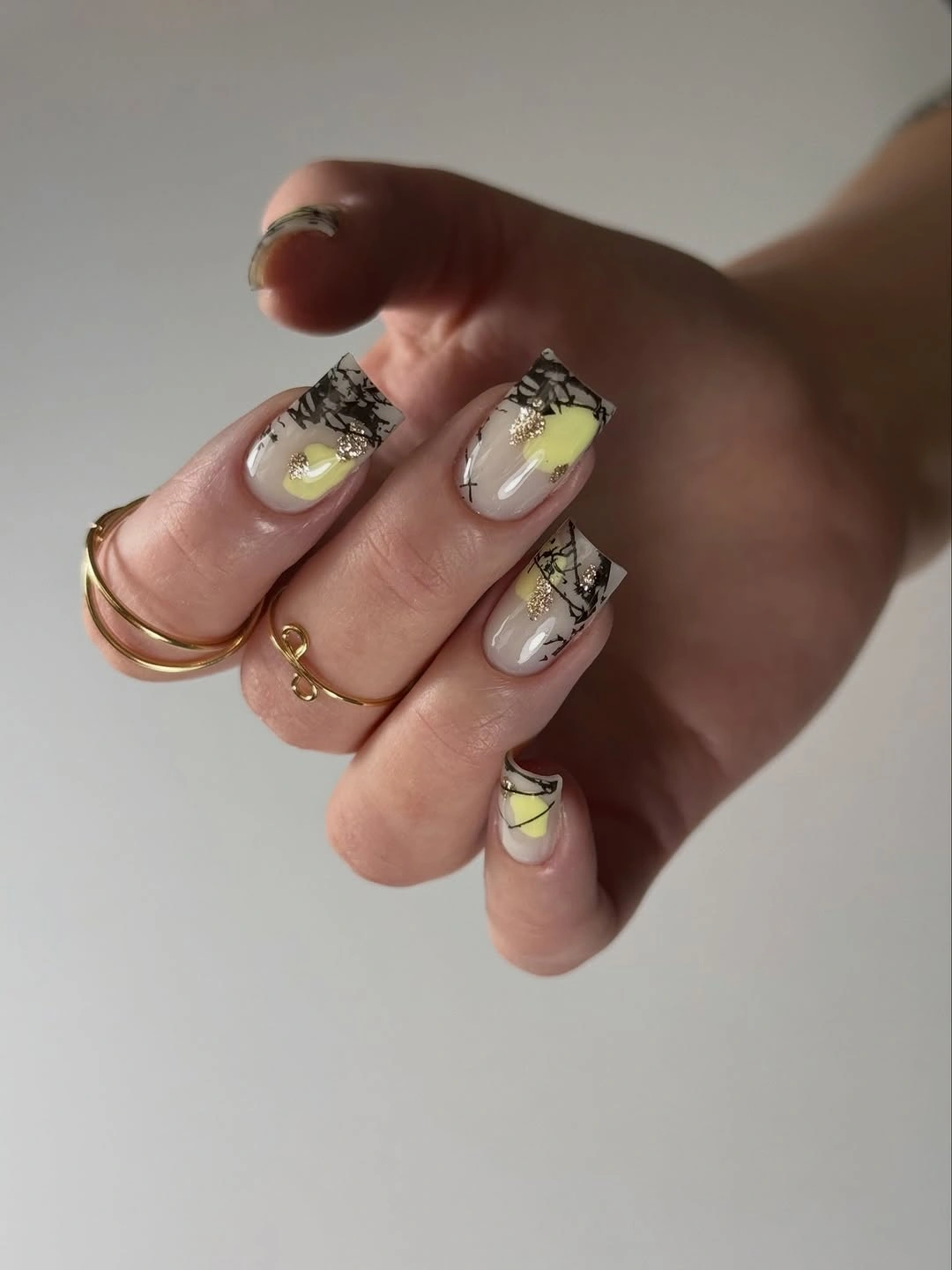
The neutral base does most of the balancing. It leaves room for olive and black to show clearly, while the metallic details add a quick flash instead of becoming a second dominant surface. If you want the design to feel calmer, keep the black graphic on one nail, repeat the olive on another, and let the remaining nails stay translucent.
Small graphic marks need enough width to remain readable, so a very short nail may require fewer shapes rather than smaller ones. The medium-to-short square shown here gives the palette structure without relying on a long silhouette. Keep the metallic pieces isolated, because spreading them across every accent would make the muted colors feel busier.
Silver Waves On A Dark Graphic Base
Medium square nails use a dark base with bright silver and gray waves that bend across the surface in an abstract zebra-like rhythm. The lines vary in thickness and direction, creating movement without settling into a rigid stripe pattern. The high contrast makes the manicure noticeable, but the limited palette keeps it from becoming multicolored noise.
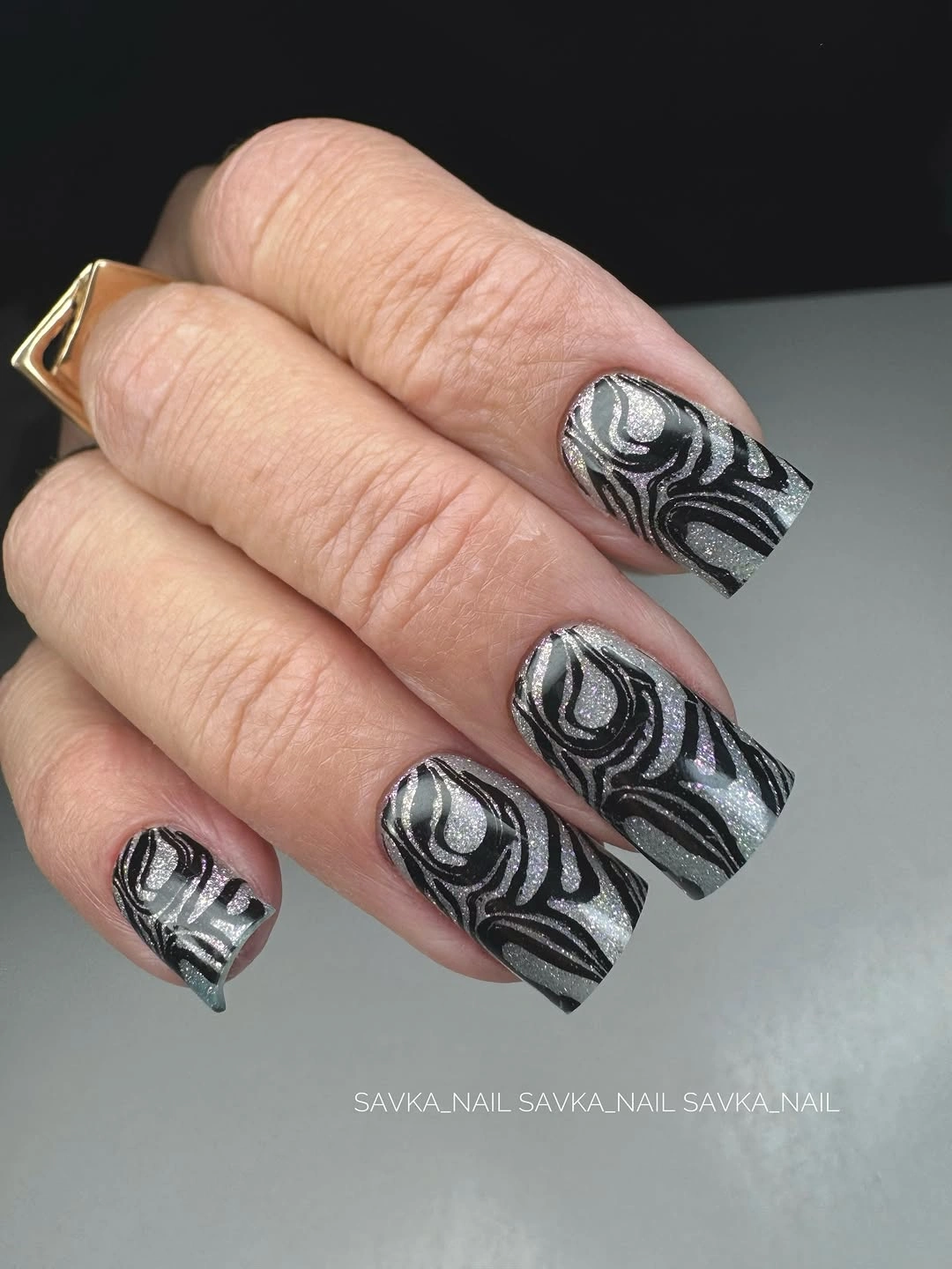
The waves are most effective when their spacing changes. Wider bands can define the outer edge, while narrower lines create a softer transition toward the center, giving the eye several speeds to follow. A practical adaptation is to put the graphic treatment on two nails and leave the rest in a smooth charcoal or silver finish.
Dark-and-silver contrast highlights scratches and uneven line edges, so the design asks for a little more precision than a plain metallic color. The medium square shape helps by providing a stable frame, and the strong pattern can be shortened without losing its direction. Avoid adding another bright hue, because it would weaken the clean relationship between shadow and reflection.
Different Accent Languages Across One Hand
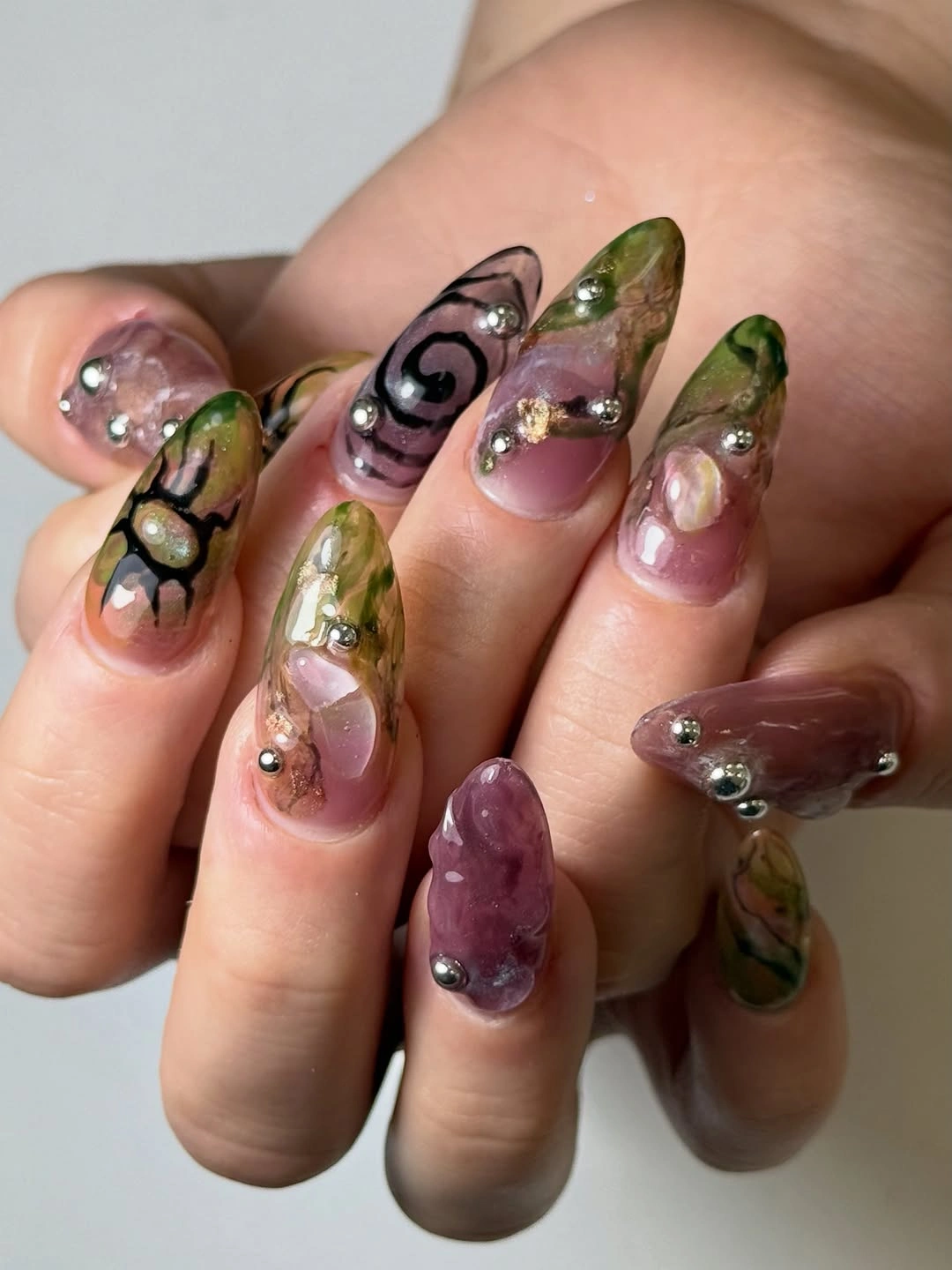
This mixed manicure gives each short nail a separate idea: orange with small marks, purple with pale waves, green with dark lines, and black-and-white curved patterning. The variety is intentional, but the compact length stops the designs from feeling disconnected. Instead of one repeated motif, the hand is organized by a shared willingness to let every accent be slightly different.
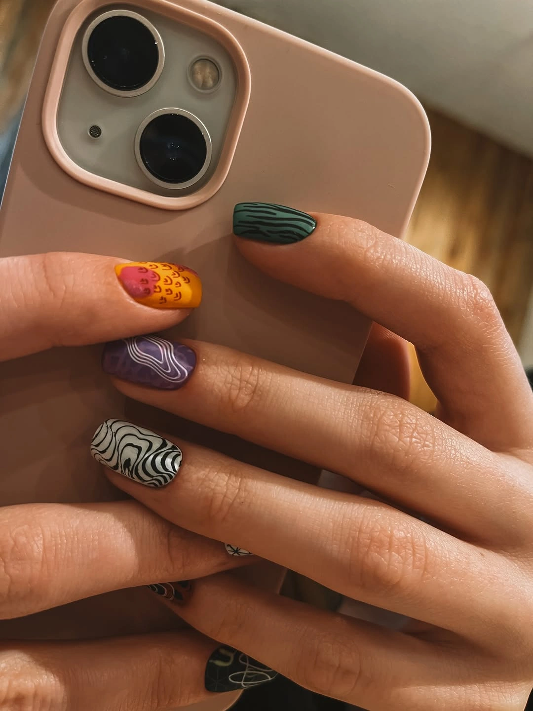
A mismatched set works best when one decision remains stable. Here, the nail length stays short and the accents remain graphic rather than becoming heavy three-dimensional pieces, which gives the separate colors a common scale. To edit it, keep three accent languages and repeat one color on two nails so the eye has a clearer route across the hand.
The practical advantage is flexibility: if one design grows out or no longer feels right, it can be replaced without changing the entire concept. The limitation is that styling requires a little more attention because the hand already carries several colors. Neutral clothing, repeated jewelry metal, or one shared line shape can make the mix easier to wear.
Metallic Silver With A Tiny Dotted Mesh
Medium rounded nails turn metallic silver into an accent through a dense field of tiny dark dots that resembles a fine mesh. The surface stays within one cool color family, but the repeated marks change the way light breaks across it. The shape is rounded enough to soften the technical pattern while giving the dotted texture a clean border.
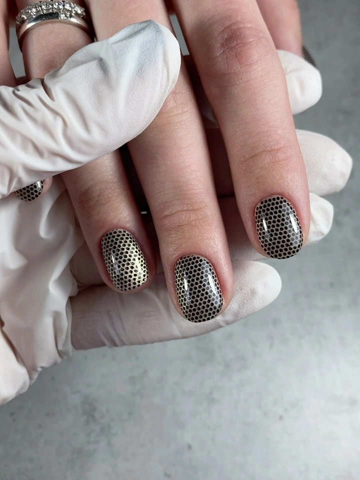
The small scale of the pattern is the main visual decision. A large motif would compete with the reflective base, while the tiny dots add depth without taking away the silver glow. Use the mesh on one or two nails beside plain silver if you want an easier interpretation, or keep it on a short oval where the surface remains compact.
Micro-details can lose clarity from a distance and may require more careful upkeep than a smooth metallic finish. That is balanced by the fact that the palette remains simple and works with cool jewelry or dark clothing. If the full grid feels formal, keep the accent but switch the remaining nails to a soft gray or clear neutral.
Deep Green With White Hand-Drawn Lines
Deep green oval nails carry fine white botanical and sketch-like lines, with a lighter accent surface that includes darker doodled marks. The white drawing is legible because the base is dark, while the lighter nail gives the eye a place to pause before returning to the green. The shape keeps the illustrated details soft around the edges instead of making them feel like rigid panels.
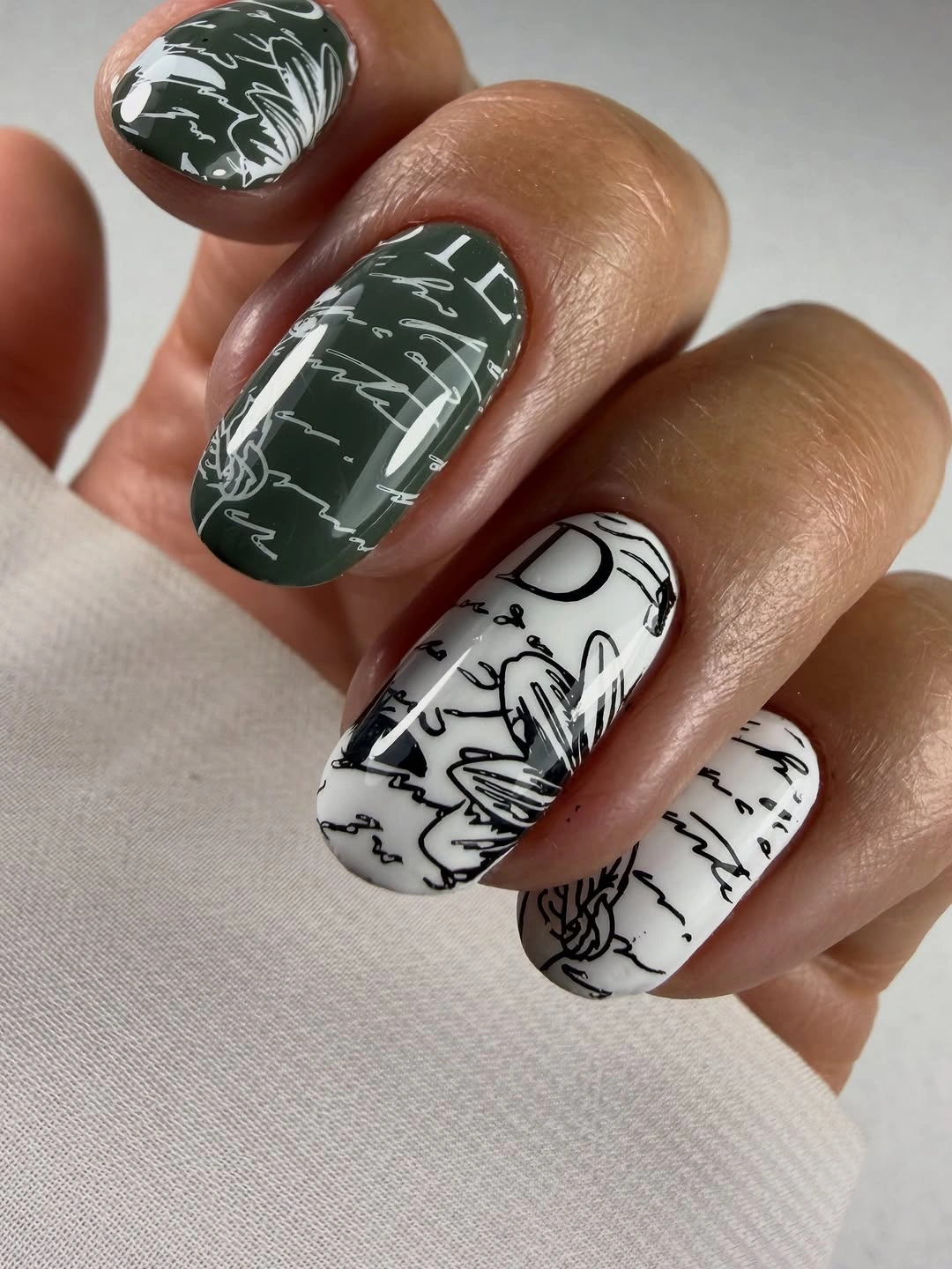
The contrast between a calm solid base and a hand-drawn accent creates the design’s personality. The marks do not need to match perfectly because the shared white line weight makes them feel related, and the dark green keeps the overall palette grounded. For a quieter set, keep one illustrated nail per hand and let the rest remain plain green.
Thin drawing can become harder to read as the nail grows or when the surface is viewed from far away, so larger strokes are a practical adaptation. The medium oval offers enough room for a few clear leaves or lines without requiring an extended length. Keep the background dark and resist adding extra metallic accents that would compete with the sketch effect.
Warm Tortoiseshell In A Medium Oval
Glossy tortoiseshell uses amber, brown, cream, and black patches across medium oval nails, with each surface carrying a different balance of light and dark. The pattern looks organic because the shapes do not repeat like a regular checkerboard. The oval outline gives the warm palette a soft frame and keeps the contrast from feeling too severe.

There is enough variation between the patches to make the set feel rich without adding another motif. Light cream areas open the darker nails, while black marks supply definition against the warm amber background. If you want a lower-density accent, alternate the tortoiseshell with a plain caramel nail and keep the glossy finish consistent.
Because the pattern is irregular, it is forgiving about exact matching but less forgiving about an overly crowded color mix. Leave some warm base visible and keep the oval medium rather than extremely long. That proportion lets the tortoiseshell remain the focus while making the design easier to combine with autumn brown, cream, or denim.
Transparent Tips With Pale Floral Detail
Long square nails combine pale pink or white solid sections with transparent-looking tips that contain soft blue-green and floral details. The clear zones act like small framed areas, while the solid base gives the hand a cleaner structure than a fully transparent set. The accent is delicate, but the length makes it impossible to miss.
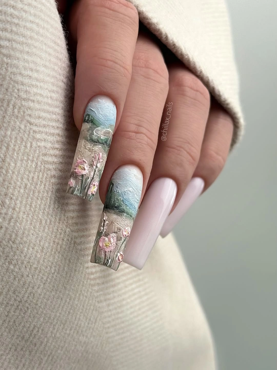
The tip carries the visual story, so it should not be crowded with too many colors. Pale blue-green marks sit lightly inside the transparent area, and the pink base keeps the whole design from feeling cold. A shorter square can use one clear tip accent and leave the remaining nails pale, preserving the idea with less surface to maintain.
Transparent-looking details can show grow-out more clearly than a solid color because the boundary is part of the design. That is the main practical limitation, along with the long square edge. If you want a softer commitment, shorten the nail first and keep the accent area open rather than replacing it with a dense floral print.
Red French Edges With Tortoiseshell Contrast
Long almond nails pair a nude base with sharp cherry-red French tips and one warm tortoiseshell accent. The red edge gives the tapered shape a clear outline, while the mottled brown detail shifts the mood toward autumn without changing the whole palette. The contrast is graphic, but the nude center keeps enough lightness between the two stronger decisions.
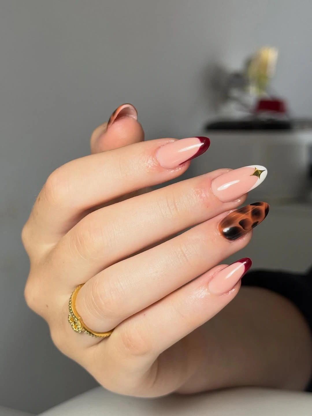
The accent works because each element has a separate role. Red defines the tip, tortoiseshell supplies variation, and nude keeps them from merging into one dark surface. For a shorter adaptation, thin the red edge and keep tortoiseshell to one nail; the hand will still have the same red-and-brown conversation without the extra length.
This combination sits naturally beside the kind of practical, wearable structure discussed in fall nail inspiration, but its success depends on keeping the red line crisp. A slightly uneven tip can change the visual balance quickly on an almond shape. Let the nude base remain visible, and avoid adding a second bright accent that would compete with the tortoiseshell.
Long Graphic Nails In Red Black And White
Extra-long nails use nude, red, black, and white in pointed graphic sections with small chrome-like or raised details. The color contrast is sharp, but the repeated directional tips create a shared structure across the mixed set. Length is part of the design language here, giving the pointed blocks room to stretch and making the accents feel deliberately dramatic.
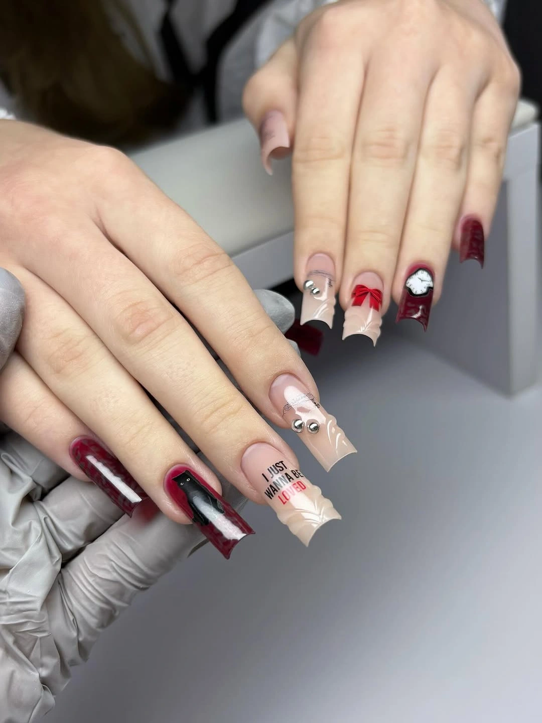
The palette stays controlled even though the shapes vary. Nude areas soften the transition between darker blocks, white adds a bright break, and red supplies the strongest seasonal note without taking over every nail. A shorter almond can keep the same idea by using red on one or two tips and simplifying the raised details.
The practical limit is clear: extra-long points are more demanding than the medium shapes elsewhere in the group. That does not make the design unusable, but it does make proportion the first decision. If you want the graphic impact with less daily interference, shorten the nails and keep the color blocks large enough to remain readable.
Matte Burnt Orange With Black Leaves
Medium nails in burnt orange use a matte-looking surface as the background for black leaf marks, fine lines, and small warm metallic details. The low-shine base makes the dark drawing feel more intentional because it does not compete with a glossy reflection. The orange is strong, but the botanical accents connect it to a seasonal palette without relying on a literal illustration.
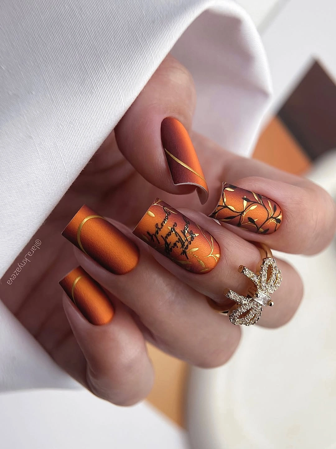
The design is balanced by keeping some nails plain orange. Those solid surfaces make the leaf details look like accents instead of wallpaper, and the fine gold lines provide just a small glimmer between the matte and black. If you need a simpler version, use the botanical marks on two nails and leave the rest in a smooth low-shine orange.
Matte surfaces can reveal scuffs differently from gloss, while fine lines may become less crisp if too many details are placed close together. A medium length gives the accents enough room, but a shorter nail should use larger leaves and fewer gold strokes. Keep the orange warm and the black clear, because adding another bright color would weaken the seasonal focus.
Pastel Charms In A Cool Mixed Palette
Short rounded-square nails rotate lavender, pale blue, and lilac with small pearls, chrome-like shapes, dots, and raised charm details. The accents are varied, but the cool pastel family links them and keeps the hand from feeling visually scattered. The compact shape gives each small detail a clear boundary and makes the playful composition feel controlled.
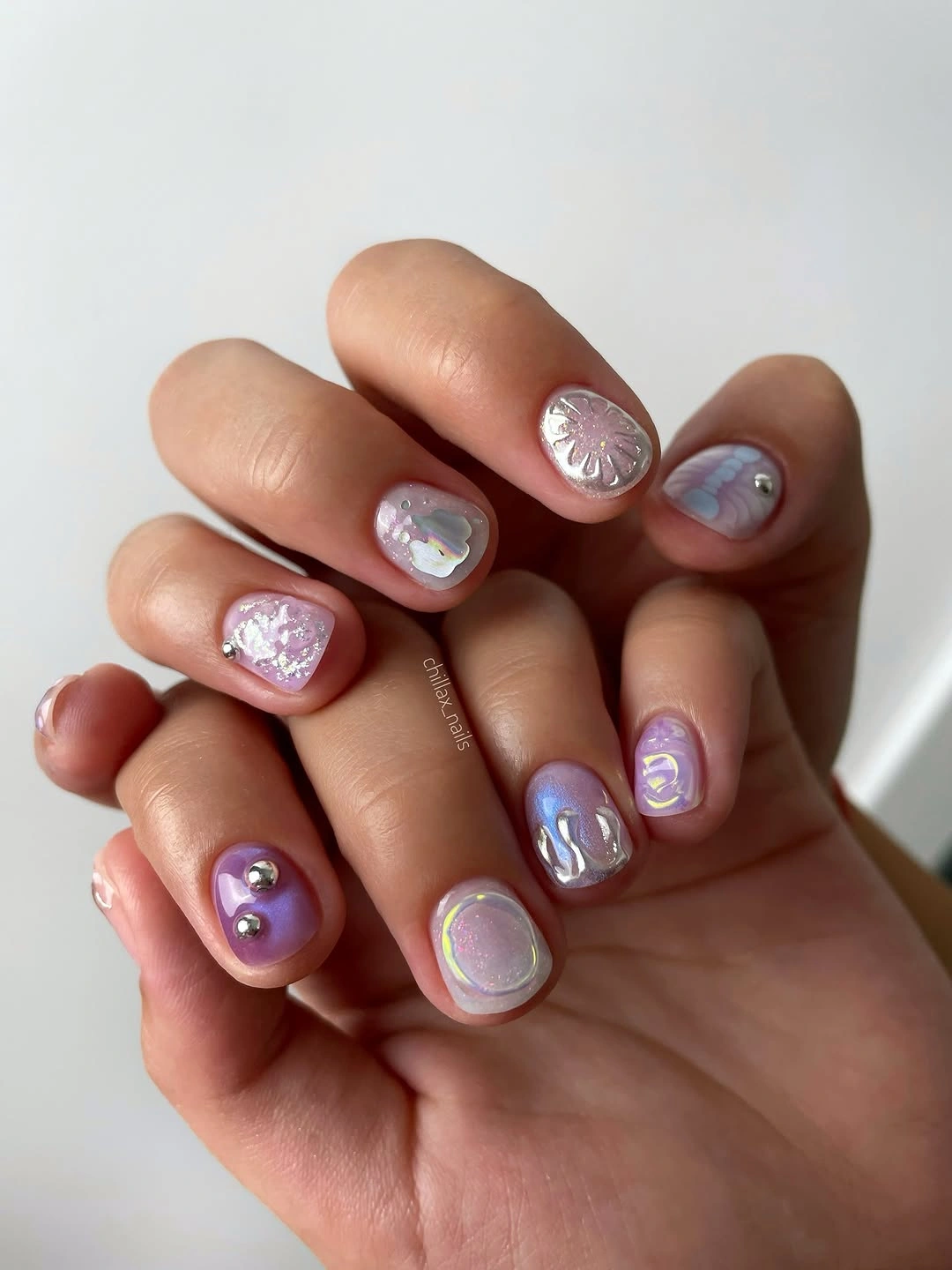
The scale is what makes the mismatch work. Each nail offers one or two small points of interest instead of a full dense scene, and the repeated cool colors provide a quiet background relationship. For a calmer version, choose two shades and one accent type, such as pearls or chrome dots, then repeat them selectively.
Small raised elements can be more noticeable during daily tasks, but the short length reduces some of that risk. The main styling challenge is the number of cool tones, so neutral clothing or silver jewelry will let the manicure look intentional. If the hand feels too busy, remove a charm before changing the entire palette.
Hot Pink With White Marbled Panels
Glossy hot pink covers most of these medium square nails, while selected surfaces carry white-and-pink marbled panels with soft curved movement. The solid color gives the set its energy, and the lighter panels create a visual pause without abandoning the bright palette. The square outline keeps the marbling graphic enough to balance the sweetness of the pink.
The accent is strongest when the marbled lines remain broad and open. White space lets the pink swirls show clearly, while the solid nails repeat the dominant tone and keep the hand cohesive. A shorter square can use one marbled panel per hand and leave the remaining nails glossy pink for a simpler interpretation.
This is a bright choice, so it benefits from a clear decision about how much color you want to carry. If the full hand feels too loud, reduce the accents rather than muting the hot pink; the contrast between solid and marbled surfaces is the reason the set works. The result still sits comfortably within current fall nail trends because the details are placed with purpose.